> Portal Navigation:
>
> - Append `.md` to any URL under `https://dev.wix.com/docs/` to get its markdown version.
> - Pages are either content pages (article or reference text) or menu pages (a list of links to child pages).
> - To get a menu page, truncate any URL to a parent path and append `.md` (e.g. `https://dev.wix.com/docs/sdk.md`, `https://dev.wix.com/docs/sdk/core-modules.md`).
> - Top-level index of all portals: https://dev.wix.com/docs/llms.txt
> - Full concatenated docs: https://dev.wix.com/docs/llms-full.txt
## Resource: Design Your Site Extensions
## Article: Design Your Site Extensions
## Article Link: https://dev.wix.com/docs/build-apps/develop-your-app/frameworks/self-hosting/supported-extensions/deprecated/iframe/design-your-site-extensions.md
## Article Content:
# Design Your Site Extension
**Warning:** The features discussed in this article are deprecated. If you have questions or concerns, [contact us](https://www.wix.com/support-chatbot?nodeId=25a57397-ccf7-4376-8b74-48d51edf7159&referral=devRels).
Keep these guidelines in mind when you design your widget and page extensions.
## Size
Use these guidelines to determine the size of your iframe website extension.
### Widgets
* **Decide on an initial size**: We recommend making the widget small, with a max height of 650px (since the most common screen resolution is 1366×768). Set the initial width and height in your app's dashboard.
* **Adjust the iframe’s height dynamically**: Base this on the app’s content (Note for Developers: use the [setHeight](https://dev.wix.com/docs/client/api-reference/deprecated/iframe-sdk-deprecated/wix.md#setheight) SDK method). Don’t add scroll bars.
* **Make your app responsive and optimize for mobile**: Make sure your app looks great at any size, and on any device. [Learn more](#responsiveness) below.
* **(Optional) You can make your app full-width**: If your app is _fully_ responsive, you can allow users to extend your app to the full width of the browser window – or you can make the app full width by default. [Learn how](#full-width) below.
### Pinned Widgets
* **Decide on an initial size**: We recommend making the widget small, with a max height of 650px (since the most common screen resolution is 1366×768). Set the width and height in your app's dashboard. Note that users can’t resize fixed-position widgets in the editor.
* **(Optional) Expand your app when site visitors use it**: You can [resize the widget](https://dev.wix.com/docs/client/api-reference/deprecated/iframe-sdk-deprecated/wix.md#resizewindow) when site visitors interact with it – like a chat window that’s usually minimized, but “pops out” when a site visitor clicks on it.
### Pages
* **Keep the default width in mind**: The default width of the page extension is 980px, just like every other page in the site.
* **Adjust the iframe’s height dynamically**: Base this on the app’s content (use the [setHeight](https://dev.wix.com/docs/client/api-reference/deprecated/iframe-sdk-deprecated/wix.md#setheight) SDK method). Don’t add scroll bars.
* **Make your app responsive and optimize for mobile**: Make sure your app looks great at any size, and on any device. [Learn more](#responsiveness) below.
* **(Optional) You can make your app full-width**: If your app is _fully_ responsive, you can allow users to extend your app to the full width of the browser window – or you can make the app full width by default. [Learn how](#full-width) below.
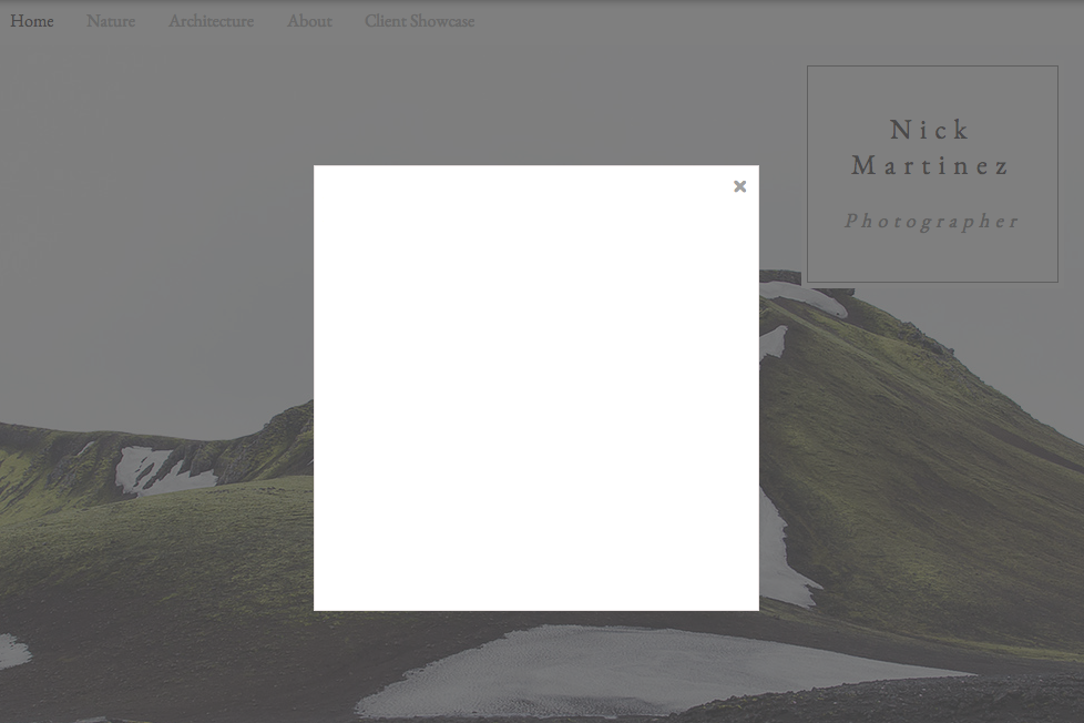
## Popups/Modals
The Wix popup is a window that opens over the user’s Wix site (live or preview). Site visitors can close it by clicking the close button, and you can close it within the app. Use the Wix.openPopup SDK method. Here’s an example of a Wix popup:
> **Note:**
>
> Have your own popup style? You can open our popup in a “bare style” – without a border, shadow, or close button – and put your own instead.
**Wix Modal:** The Wix modal is a popup-style window that opens over the Wix site. Site visitors can close it by clicking anywhere outside of it or clicking the close button, and you can close it within the app. Use the [Wix.openModal](https://dev.wix.com/docs/client/api-reference/deprecated/iframe-sdk-deprecated/wix.md#openmodal) SDK method. Here’s an example of a Wix modal:
## Preview
As Wix users edit their site in the Wix Editor, they can switch from “editing mode” to “preview mode” to see what their live site will look like. Make sure your app looks the same in “preview mode” as it does in the live site (Note for Developers: You can detect when the user is in preview mode – listen for the EDIT\_MODE\_CHANGE event in the addEventListener method. Then just display your app the same way you do in the live site).
## Responsiveness
Make sure your app looks great at any size, and on any device. When the size of the iframe or device changes, adjust the layout and design to best fit the new size. Set the initial width and height of your app in your app's dashboard. Adjust the layout and design dynamically:
* As the user resizes your app in the Wix Editor
* According to the site visitor’s device (mobile or desktop)
Your app must look good and work well in at least 3 sizes – small, medium, and large screens. Here’s what we suggest:
1. **Design for mobile first, then think about bigger screens**: We recommend using a [grid-view](https://www.w3schools.com/css/css_rwd_grid.asp) to prepare your app’s layout for the following sizes:
1. 320px and less – follow our [mobile design](#mobile-design) guidelines
2. Between 321 and 550px
3. Between 550 and 980px
2. **Adjust the layout dynamically, as the iframe size or device changes**: Resize images, content, and sidebars to fit the new dimensions. We recommend using [media queries](https://www.w3schools.com/css/css_rwd_mediaqueries.asp) to display the best layout for the current width.
3. **Optimize your app for mobile**: [Check the device type](https://dev.wix.com/docs/client/api-reference/deprecated/iframe-sdk-deprecated/wix-utils.md#getdevicetype) using our SDK, and make sure the app works well on mobile (e.g., by supporting swiping and tapping actions). [Learn more](#mobile-design) about mobile design.
4. **(Optional) You can decide on a minimum height and width for your app**: If the user makes the app smaller, you can snap the extension back to the minimum size.
Note: use the [resizeComponent](https://dev.wix.com/docs/client/api-reference/deprecated/iframe-sdk-deprecated/wix.md#resizecomponent) SDK method.
**Important:** When adjusting your app, change the app’s **layout** **only** – the functionality must be the same in all sizes.
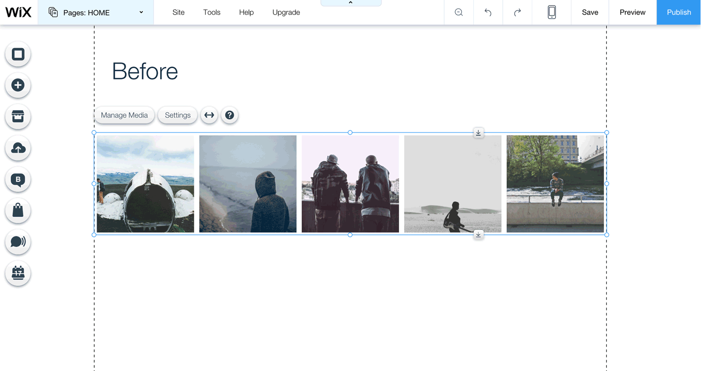
### Example
This is how the app looks when it’s added to the site:
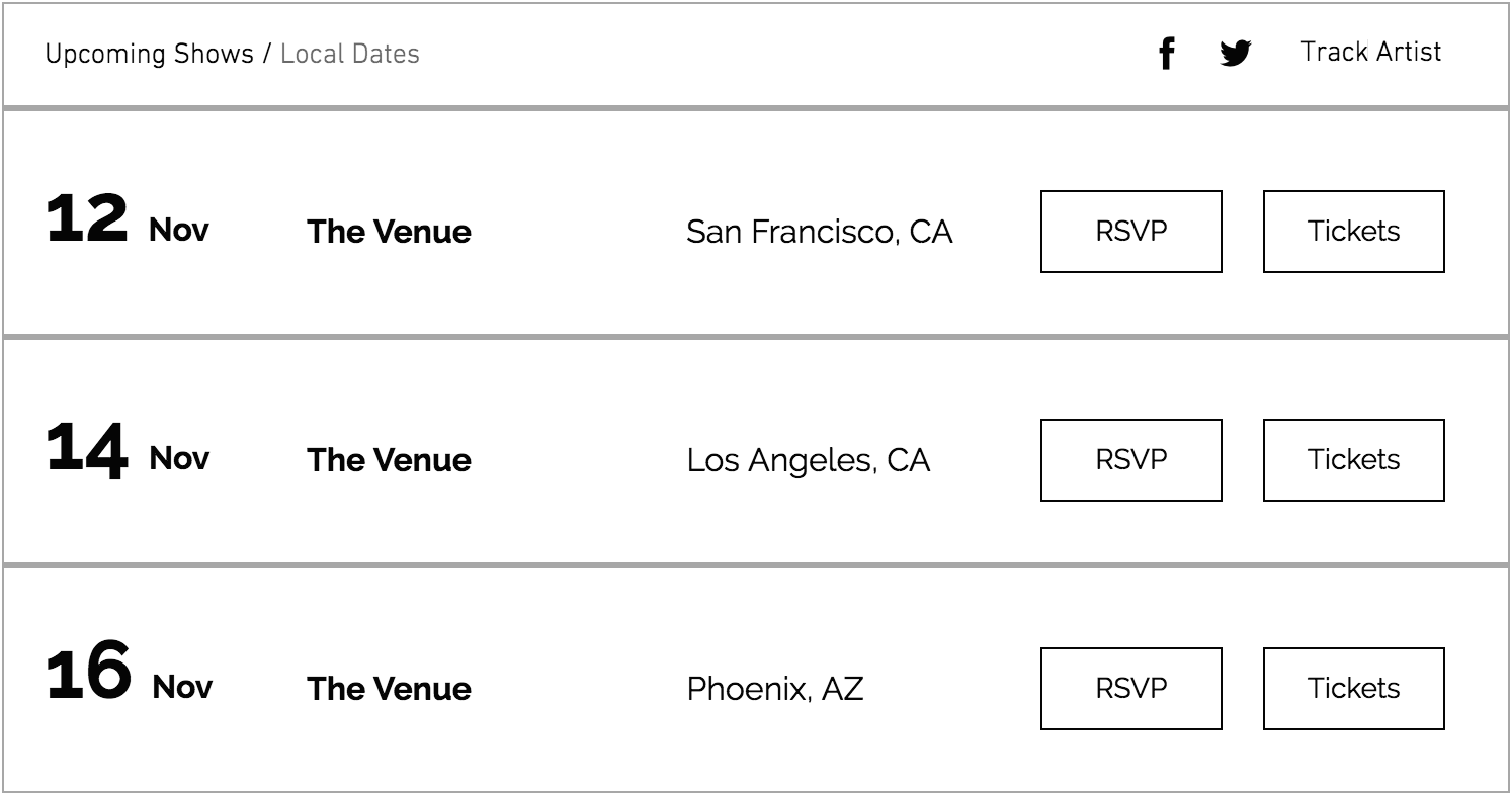
If the user increases the iframe width, the height changes and the layout is adjusted accordingly (also note that there is now more white space).
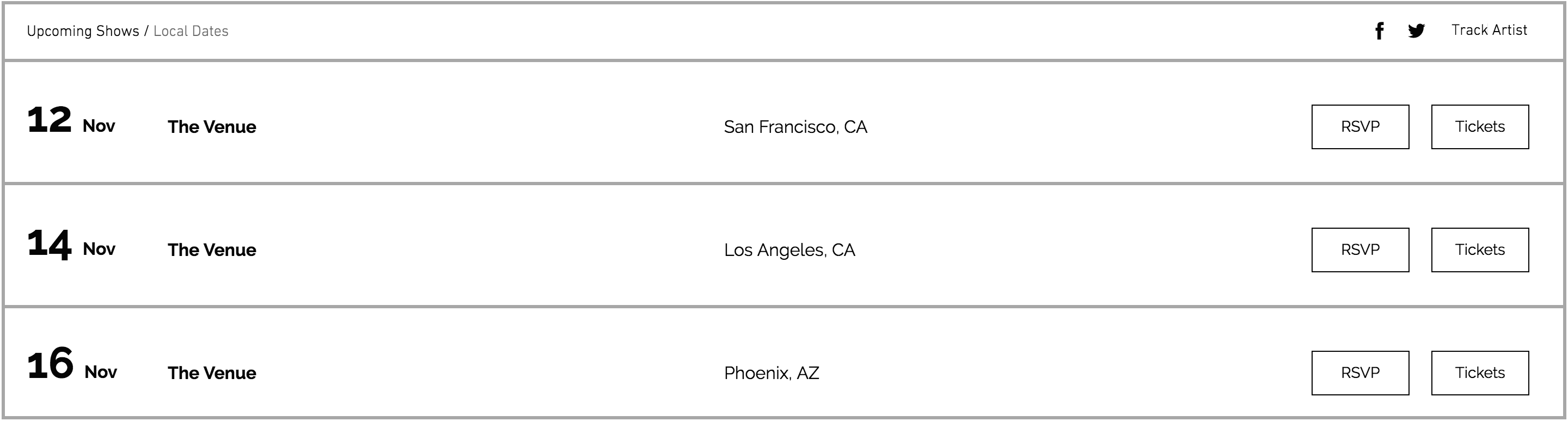
When the user decreases the iframe width, the height automatically changes and the content is adjusted accordingly.
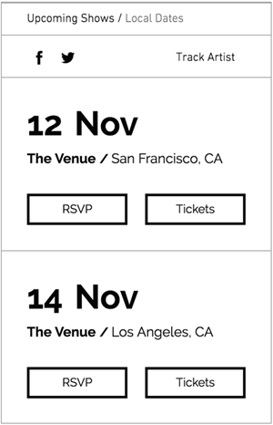
You can see that the functionality of the app remained the same, even when shrinking the app to its minimum size.
## Mobile design
Optimize your app for mobile devices. A great mobile experience is important to Wix users, because many site visitors browse on a mobile device.
How to design your app’s mobile layout:
1. **Limit the width of the app to 320px, and the content to 280px**: This leaves enough white space so that the mobile view looks clean and clutter-free.
2. **Keep it short**: If there’s a lot of data, you can provide a link, add pagination, or allow visitors to expand/collapse. If needed, you can adjust the app’s height by pushing other extensions further down the page (Note for Developers: use the [setHeight](https://dev.wix.com/docs/client/api-reference/deprecated/iframe-sdk-deprecated/wix.md#setheight) SDK method and set overflow to false).
3. **Make your text readable**: Use the following font sizes -
1. Page title (for page apps only): 34-30px
2. Heading: 24-30px, depending on the hierarchy
3. Main title: 20px
4. Subtitle: 16-18px
5. Paragraph: 14-16px
6. Button text: 16px
4. **Keep your buttons large enough to click**: Buttons should be at least 80px wide, and the height should be between 36-42px.
5. **Leave enough space between elements**:
1. Add at least 20px between two elements, for example: between text and image, between buttons, between button and text, etc.
2. Add space between two lines of text:
1. 1.4 em for running text
2. 1.2 em for titles
Here’s a style guide to help you follow the guidelines above:

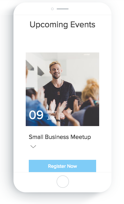
6. **Make important elements easily clickable**: Use single-tap buttons or horizontal bars. For example, the most important action in our Events app is to register for an event, so we made it really easy for visitors to do:

7. **Support common mobile actions**: Meet user expectations by supporting these actions:
* **Tap** – Allow site visitors to tap on all interactive elements, like buttons and links.
* **Swipe** – Allow site visitors to swipe right/left in slideshows and similar elements.

### Mobile Design Example
Add our [Events](https://www.wix.com/app-market/web-solution/events) app to your website, and switch to mobile view in the editor to see an example of an optimized mobile app. Note that while the layout of the app is different between the two views, the functionality is the same.
Check out the images below and compare the desktop and mobile views.
**Desktop view:**

**Mobile view:**
## Full Width
If your widget/page extension is fully responsive – meaning that it looks good in a wide range of different sizes that the user might choose – then you can allow users to extend your app to the full width of the browser window.
If it makes sense for your app, you can also make your app full width by default.
### Give users the option to make your app full width
Your app is added with the default dimensions you set in your app's dashboard, but you can allow users to extend your app to the full width of the browser. There are two ways to do this, and it depends on the layouts you’re offering for your app in the App Settings panel:
* **If all of your layouts are fully responsive**: The Wix Editor already has the full-width option, so users can extend your app directly from the Editor. All you need to do is let us know that your app is fully responsive:
1. Select your app from the [Custom Apps page](https://manage.wix.com/account/custom-apps) in your Wix Studio workspace.
2. Go to **Extensions** in the side menu (under Build Your App).
3. Click the relevant extension.
1. For Widgets: Under Width Settings, select **Custom**.
2. For Pages: Under Page Width, select **Keep default and let users stretch page to full width**.
* **If only some of your layouts are fully responsive**: You can offer an option in your App Settings panel that allows users to extend the widget to full width – just make sure to only show this option if the user chose one of the responsive layouts! (Note for Developers: Use the [setFullWidth](https://dev.wix.com/docs/client/api-reference/deprecated/iframe-sdk-deprecated/wix-settings.md#setfullwidth) SDK method.)
### Make your app full width by default
You can also make your app full width by default, so that it’s already stretched to the full width of the browser when the user adds your app. Here’s how:
1. Select your app from the [Custom Apps page](https://manage.wix.com/account/custom-apps) in your Wix Studio workspace.
2. Go to **Extensions** in the side menu (under Build Your App).
3. Click the relevant extension.
1. For Widgets: Under Width Settings, select **Full-Width**.
2. For Pages: Under Page Width, select **Set page to full width**.
4. Make sure that your app’s default layout is fully responsive and looks good in full width. If the user changes the layout to one that isn’t fully responsive, you should change the app size to the default dimensions you set in your app's dashboard.
## Color
### Integrate with the site’s colors
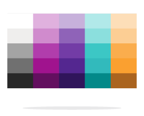
We have a collection of different color palettes that users can choose for their site. Each color palette is a set of colors that work well together. For example:
Choose your app’s colors dynamically, according to the site’s color palette. This way, your app integrates seamlessly and looks great right away – which means less work for the user.
Here’s a quick look at what you need to do:
1. **Create the initial color scheme for your app**: We have a template for our color palette, and we’ll explain how it works below. Use this template to create your app’s initial color scheme.
2. **Allow users to change the app’s colors**: In the App Settings panel, add a color picker for each element in your app.
During development, you need to set the initial color scheme in two places – in the color picker and in the app itself.
### Get to know our color palette template
Not only do you want your app to integrate with the site’s color palette – but it’s also important that all of the colors used in your app look good together. For example – the text should always be readable against the background, the main action should stand out, etc.
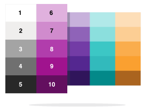
To make this convenient for you, we created a template that’s based on the **two left columns** of the color palette.
Use this template to create your app’s color scheme. Here’s how it works:
1. **Understand the palette structure**:
1. Each number represents a color. The actual color will depend on the specific color palette used in the site. For example: color-8 in the palette above has a purple hue, but can be blue in a different palette.
2. The first column is grayscale.
3. The second column is a range of tints for the “brand color”. The color varies, depending on the color palette.
2. **Assign a number to each element in your app**: Follow our color reference guide to create your color scheme. You can use the same color for a few different elements – we call this the “master color”. Here’s a quick preview:
(We don’t recommend using a third color – but if needed, you can use the third column.)
**Tip:** Add any app (for example, the [Events](https://www.wix.com/app-market/web-solution/events) app) to your Wix site, and then change your site’s color palette so that you can see how the app changes according to different color palettes.
Here’s an example to show you how it works. You can see the app’s color scheme and how it looks with the color palette shown:
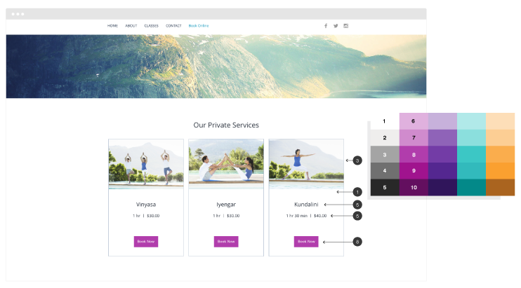
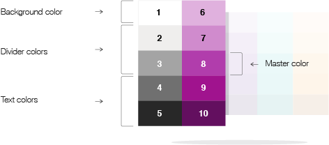
### Color reference guide
Use this table as a guide to choose a “color” for each element in your app.
**Important:** Stick to the color values that we list below. We specifically chose these values so that the colors in your app will work well together and there will be enough contrast.
|Element |Value |
|---|---|
|Master color (if using)|color-8
|App background|color-1
|Border|color-2 or color-3
|Dividers|color-2, color-3, or color-4
|Title/heading text|color-5
|Running text|color-5 (for softer text, use 3 or 4)
|URL / link|color-8 On hover: add a black layer with 20% opacity to text color
|Button background|color-8 Special states: On hover: add a black layer with 20% opacity to bg colorDisabled buttons: add 50% opacity to the bg color
|Button text|color-1On hover: add a black layer with 20% opacity to text color