Tutorial | Set Up an App With the CLI
This tutorial demonstrates how to use the Wix CLI to build an app named Business Buddy. The app provides an AI assistant for products in a site's Wix Stores catalog, accessible from the site owner's dashboard.
Important: The chat endpoint calls OpenAI as its AI provider. To complete this tutorial, you'll need an OpenAI account with prepaid API credits. See Step 9 for setup details. The same pattern applies to any AI provider with an HTTP API (Anthropic, a self-hosted model, etc.).
Business Buddy consists of:
- Two dashboard pages: a Product page for selecting a product and chatting with the AI about it, and a Settings page for configuring the AI's behavior.
- A backend that handles chat requests and stores per-install AI behavior directives.
By following this tutorial, you'll learn how to:
- Build dashboard pages using the Wix Design System, the Wix Dashboard SDK, and CSS.
- Work with apps built by Wix such as Stores using the Wix JavaScript SDK.
- Add backend logic using HTTP endpoints in your CLI project.
- Identify the current app install on the backend to support per-install data.
- Call an external AI service (OpenAI) from your backend, with the API key managed as a Wix CLI environment variable.
The end result will look like this:
We'll use the following steps to build the Business Buddy app:
- Initialize the app.
- Create the dashboard pages.
- Run a local development server.
- Install dependencies.
- Design the Product page.
- Set up calls to Wix SDKs.
- Set up communication with the backend.
- Design the Settings page.
- Add backend HTTP endpoints.
- Build and deploy the app.
Before you begin
Before getting started, make sure that:
- You install Node.js (v20.11.0 or higher).
- You install npm or yarn.
- You’re logged into your Wix Studio account. If you don’t already have one, sign up for a Wix Studio account.
Step 1 | Initialize the app
We use the Wix CLI to initialize our Business Buddy app. In the process of initializing our app, the Wix CLI automatically:
- Creates a new app in the Custom Apps page of your Wix Studio workspace.
- Sets up a new folder for your app in your local file system. The folder includes:
- A
srcfolder containing initial boilerplate code for an app with a dashboard page. - A
package.jsonfile containing your app dependencies.
- A
- Creates a local Git repository for your app.
To initialize the app:
-
Open a terminal and navigate to the folder where you want to create your app.
-
Run the following command:
CopyIf prompted to install the
@wix/create-newpackage, pressy. -
Select Create a new Wix App.
-
Select Create a basic app.
-
Enter a name for your app. Let’s name our app
Business Buddy. -
Press
Enterto accept the default folder name (business-buddy). -
When asked to configure Wix MCP for your IDE, select your preferred MCP.
A green Success message confirms that your app has been registered in the Custom Apps page.
-
Press
Enterto accept the default namespace (business-buddy). -
Press
Enterto accept the default code identifier (business_buddy).
You now have a new app in the Custom Apps page, a new folder in your local file system, and a local Git repository for developing and testing your app.
Step 2 | Create the dashboard pages
In the app, we want the dashboard pages to appear in the dashboard like this:
To create this structure, we use the CLI's generate command to generate dashboard page extensions. This places dashboard page files in subfolders of the dashboard/pages folder.
Create dashboard page files
-
Run the following command and follow the prompts to create a dashboard page extension:
Copy -
When prompted for the kind of extension, select Dashboard Page.
-
When prompted for a page title, enter Product.
-
When prompted for the page route, press
Enterto accept the default (product). The route is the path that is appended to the dashboard base URL to access the dashboard page. Learn more about page routes.Upon completion, the extension files will be created in your local app files under the chosen route with the following structure:
CopyFor more information about these files, see Dashboard Page Extension Files and Code.
Each dashboard page is defined by a
product.extension.tsfile and aproduct.tsxfile. The product.extension.ts file defines the page metadata and theproduct.tsxfile defines the page UI and functionality.Each file pair exists in a folder that determines the route to a page.
-
Repeat the above steps for a second page: title Settings, route default
settings(pressEnterto accept).
Tip: The CLI's default scaffold also created a my-page extension at src/extensions/dashboard/pages/my-page/. You can leave it (it won't interfere with this tutorial) or delete the my-page/ folder to keep the dashboard sidebar showing only the Product and Settings pages.
Step 3 | Run a local development server
Now that you’ve initialized the app, you can run a local development server to see the app in action, and view local changes as you develop it.
To run a local development server:
-
Navigate to your newly created folder for your app.
Copy -
Run the following command:
Copy -
The CLI prompts you to choose a development site (test site), which you’ll use throughout this tutorial to run and test your app. You can choose an existing Wix site as your development site, or create a new one. Let’s Create a new Development Site. The newly created development site is automatically named Dev Sitex followed by a number (for example, Dev Sitex 12345), and can be found in your Wix account’s list of sites.
-
Follow the prompt to open the app installation page in your default browser. If the browser doesn’t open, install your app on your test site manually and skip the next step.
-
Click Agree & Add to install your app on your development site.
-
In the terminal menu, select Dashboard to open your development site’s dashboard.
-
In the dashboard sidebar, click Apps to see your newly created app’s dashboard pages. We add the content of our app’s dashboard pages in step 5.
Your app is now running on your development site. As you develop your app, any changes made to your app’s code are reflected in real time on your development site.
If your changes don’t show up, try refreshing the page, or closing and reopening the development site.
Step 4 | Install dependencies
Before we start coding our app, we need to install some npm packages. In your terminal, run the following commands:
Note: The @wix/dashboard, @wix/design-system, and @wix/essentials packages come pre-installed in the project that the CLI generated, so you don't need to install them.
The purpose of each of these packages will become clear as we progress.
Step 5 | Design the Product page
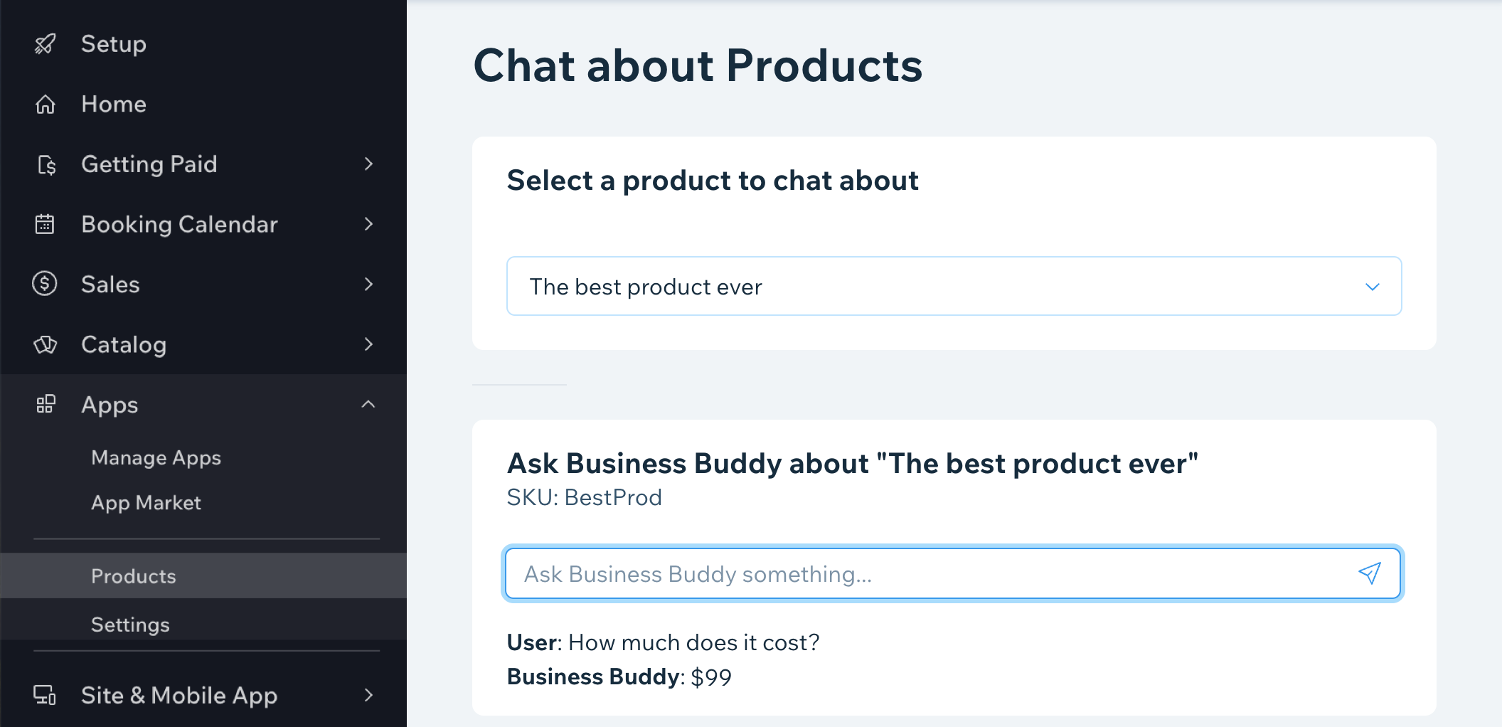
In our app, we want the Product page to look like this:
This design is consistent with the rest of the pages in the dashboard. To create it, we’ll use the React components provided by the Wix Design System.
The Product page is built from:
- 2 main React components.
- One wrapper component for initializing React context providers.
- CSS styling.
The Product page UI is defined in several files in src/extensions/dashboard as follows:
/pages/product/product.tsx: The header and the top cell that it used for selecting the product to chat about./pages/product/ProductChat.tsx: The bottom cell that displays the selected product and the chat./pages/product/ProductChat.module.css: CSS for the ProductChat component./withProviders.tsx: A wrapper that providesWixDesignSystemProviderfor WDS styling andQueryClientProviderfor data fetching.
Let's take a look at the code used to build the page's UI. We'll take a look at the code for the page's functionality a bit later.
product.tsx
Notice how the code uses components from the Wix Design System to build the page. Other than that, it's a standard React component. For more information about each component, see AutoComplete, Card, TableActionCell, Divider, Layout, and Page.
Note: At this point, we're showing the code with a hardcoded, dummy product object just to demonstrate how the page will look once a product is selected. We'll add real products to the page later in the tutorial.
Open src/extensions/dashboard/pages/product/product.tsx and replace its contents with the following:
ProductChat.tsx
Here again, the code uses Wix Design System components to build the component UI. For more information about each component, see Text, Box, Card, Input, and Loader.
Create a new file at src/extensions/dashboard/pages/product/ProductChat.tsx with the following content:
ProductChat.module.css
This file defines the width of the input element for the ProductChat component.
Create a new file at src/extensions/dashboard/pages/product/ProductChat.module.css with the following content:
withProviders.tsx
This file wraps components with WixDesignSystemProvider for WDS styling and QueryClientProvider for data fetching.
Create a new file at src/extensions/dashboard/withProviders.tsx with the following content:
Step 6 | Set up calls to Wix React SDKs
In our app, on the Product page, users can choose a product from the site's Store.
To work with the Stores app on a user's site, we use the Wix Dashboard SDK and the Wix SDK. We already showed how to set up your dashboard page extensions with the Dashboard SDK in the previous section. In this section, we'll use the SDK to retrieve site data to display in the app.
Install Wix Stores on your development site and make sure the store has at least one product.
Permissions
Before getting started making calls with the SDK, you need to request the proper permissions.
The permissions your app needs are listed in the Permissions section of each API reference page. Our app calls queryProducts, which requires the Read Products permission.
To add the permission:
- Open the
queryProductsAPI reference and scroll to the Permissions section. - Click the READ PRODUCTS badge. An app selector opens.
- Select your app. The Permissions page for your app opens.
- Click Add Permissions, search for Read Products, and add it.
Get products
After setting up permissions, our app can retrieve a list of products from the site's store.
In src/extensions/dashboard/pages/product/product.tsx, add the following imports:
These imports give us access to the functionality we need for retrieving products.
Once we import everything, we’ll add the following hooks to our ProductPage component:
-
We use the React
useQuery()hook to query for products whose names start with a query string. This string will be set based on what the user types in ourAutoCompletecomponent. We use the V1queryProducts()builder pattern: callqueryProducts()with no arguments, chain.startsWith()to filter by name, then call.find()to execute the query. We also make sure to handle any errors.Copy -
Finally, let’s replace our dummy current product with the proper type now that we have it.
Copy
Populate products
Now that we have access to a list of the site’s products, we can use them to populate the AutoComplete component and define what happens when a user selects a product.
-
First, we set the
AutoCompletecomponent'sstatus.Copy -
Then, we set the
AutoCompletecomponent'soptionsto the products we got from the query by mapping them to a list of options objects withidandvalueproperties.Copy -
Next, we set up the
AutoCompletecomponent'sonSelectfunction to set the component's current product.CopyWhile we're at it, we also set the
AutoCompletecomponent'sonChangefunction to set the search query and clear the current product.Copy -
Finally, we set the
AutoCompletecomponent'svalueto the current product if there is one.Copy
After completing the steps above, your src/extensions/dashboard/pages/product/product.tsx file should look like this:
Step 7 | Set up communication with the backend
In our app, the Product and Settings dashboard pages communicate with backend HTTP endpoints: one for chat messages and one for the AI behavior settings. The endpoints live in the same CLI project, in src/pages/api/. We set them up in Step 9; in this step, we set up the frontend code that calls them.
When you call your endpoint with httpClient.fetchWithAuth() from @wix/essentials, the Wix user's access token is attached to the request automatically, and the backend can extract the app instance ID from it without you having to pass it manually.
Send the chat request
We use the ProductChat component to send and receive chat messages.
Open src/extensions/dashboard/pages/product/ProductChat.tsx and make the following changes:
-
Import
httpClientfrom@wix/essentials.Copy -
Add a
submitMessagefunction inside theProductChatcomponent. This function sends the user's message to the/api/chat/productendpoint and updates the chat state with the response.CopyWe build the full endpoint URL with
new URL(import.meta.url).originso it works in both local development and production. -
Wire up
submitMessageto the send icon and to the Enter key on theInputcomponent.CopyCopy
After completing the steps above, your src/extensions/dashboard/pages/product/ProductChat.tsx file should look like this:
Step 8 | Design the Settings page
Open src/extensions/dashboard/pages/settings/settings.tsx and replace its contents with the following:
As usual, the code uses Wix Design System components to build the component UI. For more information about each component, see Button, Card, FormField, InputArea, Loader, and Page.
@tanstack/react-query
In this code, we import useMutation and useQuery from @tanstack/react-query:
-
useQueryis used to fetch data from the server and handle caching.useQueryfetches the currentbehaviorDirectivefrom the server and stores it indata.Copy -
useMutationis used to update data on the server.useMutationsends a newbehaviorDirectiveto the server via a POST request:Copy
Adding a toast
When a user changes the behavior setting on the Settings page, we want to show a toast at the top of the dashboard page.
To show toasts, update dashboard components based on state changes, and open and close dashboard modals, we use the Wix Dashboard SDK.
-
Import the
dashboardmodule from the Dashboard SDK.Copy -
Call
showToast()in theonSuccesscallback of the mutation. This shows the toast when the Save button's request completes successfully.Copy
Step 9 | Add backend HTTP endpoints
The app's backend logic, handling chat requests by calling the OpenAI API and storing the per-install AI behavior directive, runs as HTTP endpoints inside our CLI project. There's no separate server. Each file we create in src/pages/api/ is auto-discovered and exposed at /api/<file-path>. No registration step is required.
The httpClient.fetchWithAuth() call we used in Step 7 and Step 8 attaches the user's access token to each request automatically. On the server, we extract the current app install's ID from that token using auth.getTokenInfo() from @wix/essentials. We don't need to set up CORS, manage an app secret key, or parse instance strings manually.
This tutorial uses OpenAI as the AI provider for the chat endpoint. The same pattern applies to any AI provider with an HTTP API, such as Anthropic, OpenRouter, and Hugging Face. Refer to your provider's documentation for the SDK and call shape.
Set up your OpenAI API key
-
Go to platform.openai.com and sign up. This is OpenAI's developer platform; it's separate from chatgpt.com, and an existing ChatGPT subscription doesn't grant API access.
-
Add a payment method and credits to your account. OpenAI API access is pay-per-use; the model used below (
gpt-4o-mini) costs fractions of a cent per chat message, but OpenAI requires a pre-funded balance. Adding a payment method alone isn't enough. We recommend a small initial deposit and a low usage limit (e.g., $5) as a safety net. -
Go to platform.openai.com/api-keys, click Create new secret key, give it a name, and click Create. Copy the key (it starts with
sk-...). It's only displayed once. -
Declare the key as a secret environment variable. Add an
envblock toastro.config.mjs:Copy -
Store the key with the Wix CLI and pull it locally:
Copywix env setuploads the key to Wix's servers; it's never written to a file in your project, so you can't accidentally commit it.wix env pulldownloads it into your local environment sowix devcan use it. Runwix env pullagain whenever you change the key on Wix's servers or pull the project to a new machine. For more, see Manage Environment Variables.
Tip: To use an OpenAI-compatible provider, set an OPENAI_BASE_URL environment variable using the same wix env set / wix env pull flow as above, and pass it as baseURL when constructing the OpenAI client. This works for providers such as Azure OpenAI, OpenRouter, and self-hosted models.
Shared in-memory store
Both endpoints we're about to create read and write the same AI behavior directive, keyed by app instance ID. We put the store in its own module so both endpoints can import it.
Create the file src/lib/directives-store.ts:
Note: This in-memory store is for demonstration only. It loses data when the server restarts and isn't shared across server replicas. For production, replace it with a Wix data collection or your own external database.
Settings endpoint
The settings endpoint stores and retrieves the AI behavior directive for the current app install. The Settings page (Step 8) calls this endpoint via GET to load the saved directive and POST to save a new one.
Create the file src/pages/api/settings.ts:
auth.getTokenInfo() decodes the access token attached to the request by httpClient.fetchWithAuth() on the frontend, and returns information about the current install, including the instanceId we use as the storage key. Each app install gets its own directive.
Chat endpoint
The chat endpoint receives a chat message and product context from the Product page (Step 7), looks up the current install's behavior directive, calls OpenAI with the directive as a system prompt, and returns the assistant's reply.
Create the file src/pages/api/chat/product.ts. The file's path under src/pages/api/ (chat/product.ts) determines its URL: /api/chat/product.
The directive saved on the Settings page becomes a system prompt, the product info is passed as additional context, and the chat history is the conversation. Because the endpoint runs server-side, your API key never reaches the client.
After completing the steps in this section, restart wix dev (kill the running process and re-run, because the schema change and the new astro:env/server import need a clean restart). Try a chat message in the Product page; you should get a real AI-generated reply that reflects the Business Buddy persona, talks about the selected product, and honors any directive you've set on the Settings page.
Step 10 | Build and deploy the app
After testing your app and seeing that it works as expected, you can create a public preview of your app, build your app, create and manage app versions, and deploy your app. For more information on these tasks, see Build and Deploy an App with the CLI
Summary
After completing this tutorial, you have a working AI chatbot Wix CLI app with two dashboard pages, backend HTTP endpoints calling OpenAI, and per-install storage so each app instance can shape Business Buddy's behavior with its own directive.
At this point, you have all you need to know to develop an app. Feel free to play around with the example app some more, or get started on writing your own app.
Last updated: 22 June 2026