Tutorial | Create a Custom Products Catalog App with the CLI
This tutorial demonstrates how to use the Wix CLI to build a Custom Products Catalog app on the Wix Platform. The app contains a dashboard page that lists, searches, sorts, adds, and deletes products in a Wix Stores catalog.
Note: This tutorial uses the Stores Catalog V3 API only. This is sufficient for private apps. However, apps published to the Wix App Market should support both the V1 and V3 Stores Catalog APIs. For more details, see Exposing Apps Publicly and Privately.
By following this tutorial, you'll learn how to:
- Build a collection-style dashboard page (with toolbar, filters, sorting, bulk actions) using the Wix Design System and Wix Patterns.
- Read, write, and bulk-delete products using the Wix Stores Products V3 API.
- Manage SDK call state with React Query.
The end result will look like this:
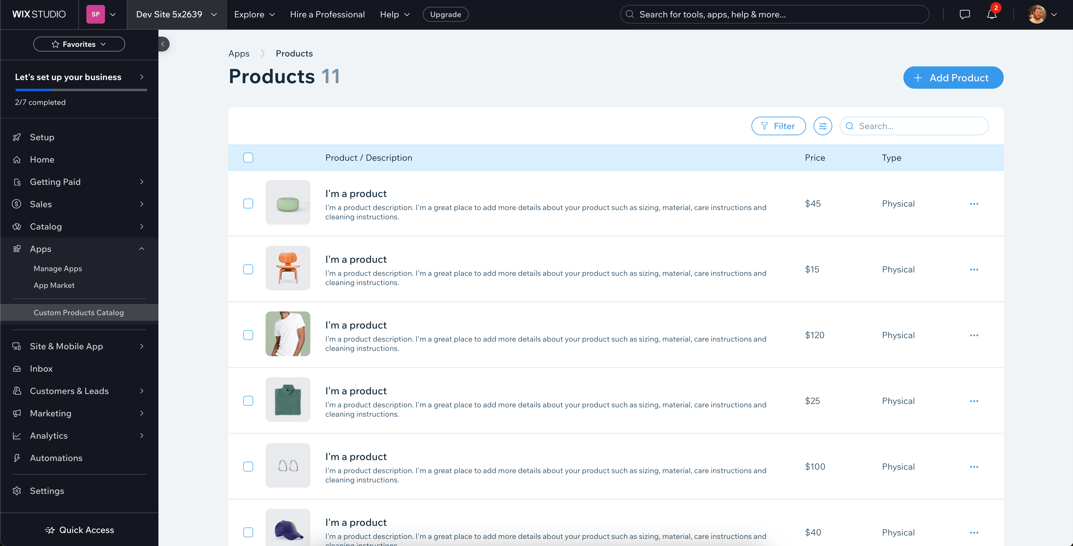
We'll use the following steps to build the Custom Products Catalog app:
- Initialize the app.
- Create the dashboard page.
- Run a local development server.
- Add permissions.
- Set up Wix Stores.
- Install dependencies.
- Set up wrappers for our dashboard page component.
- Create hooks for our SDK calls.
- Create a "Create Product" modal.
- Create a dashboard page component.
- Test the app.
- Build and deploy the app.
Before you begin
Before getting started, make sure that:
- You install Node.js (v20.11.0 or higher).
- You install npm or yarn.
- You're logged into your Wix Studio account. If you don't already have one, sign up for a Wix Studio account.
We also recommend that you check out the Patterns documentation. Patterns is a complex React library. Familiarizing yourself with the basics will help you better understand the code in this tutorial.
Step 1 | Initialize the app
We use the Wix CLI to initialize our Custom Products Catalog app. In the process of initializing our app, the Wix CLI automatically:
- Creates a new app in the Custom Apps page of your Wix Studio workspace.
- Sets up a new folder for your app in your local file system. The folder includes:
- A
srcfolder containing initial boilerplate code for an app with a dashboard page. - A
package.jsonfile containing your app dependencies.
- A
- Creates a local Git repository for your app.
To initialize the app:
-
Open a terminal and navigate to the folder where you want to create your app.
-
Run the following command:
CopyIf prompted to install the
@wix/create-newpackage, pressy. -
Select Create a new Wix App.
-
Select Create a basic app.
-
Enter a name for your app. Let’s name our app
Custom Products Catalog. -
Press
Enterto accept the default folder name (custom-products-catalog). -
When asked to configure Wix MCP for your IDE, select your preferred MCP.
A green Success message confirms that your app has been registered in the Custom Apps page.
-
Press
Enterto accept the default namespace (custom-products-catalog). -
Press
Enterto accept the default code identifier (custom_products_catalog).
You now have a new app in the Custom Apps page, a new folder in your local file system, and a local Git repository for developing and testing your app.
Step 2 | Create the dashboard page
We use the CLI's generate command to create a dashboard page for our app.
To create the dashboard page:
-
Navigate to your newly created folder for your app.
Copy -
Run the following command and follow the prompts:
Copy -
When prompted for the kind of extension, select Dashboard Page.
-
When prompted for a page title, enter Custom Products Catalog.
-
When prompted for the page route, press
Enterto accept the default (custom-products-catalog).
Upon completion, the extension files are created at src/extensions/dashboard/pages/custom-products-catalog/:
For more information about these files, see Dashboard Page Extension Files and Code.
Tip: The CLI's default scaffold also created a my-page extension at src/extensions/dashboard/pages/my-page/. You can leave it (it won't interfere with this tutorial) or delete the my-page/ folder to keep the dashboard sidebar showing only the Custom Products Catalog page.
Step 3 | Run a local development server
Now that you’ve initialized your app, you can run a local development server to see the app in action, and view local changes as you develop your app.
To run a local development server for your app:
-
In the terminal, from your app's folder, run the following command:
Copy
Important: This tutorial uses Stores Catalog V3. New Wix sites use V3 by default. If you choose an existing site instead, confirm it uses V3 with the Catalog Versioning API.
-
The CLI prompts you to choose a development site (test site), which you’ll use throughout this tutorial to run and test your app. You can choose an existing Wix site as your development site, or create a new one. Let’s Create a new Development Site. The newly created development site is automatically named Dev Sitex followed by a number (for example, Dev Sitex 12345), and can be found in your Wix account’s list of sites.
-
Follow the prompt to open the app installation page in your default browser. If the browser doesn’t open, install your app on your test site manually and skip the next step.
-
Click Agree & Add to install your app on your development site.
-
In the terminal menu, select Dashboard to open your development site’s dashboard.
-
In the dashboard sidebar, click Apps > Custom Products Catalog to see your newly created app’s dashboard page. We add the content of our app’s dashboard page in the next step.
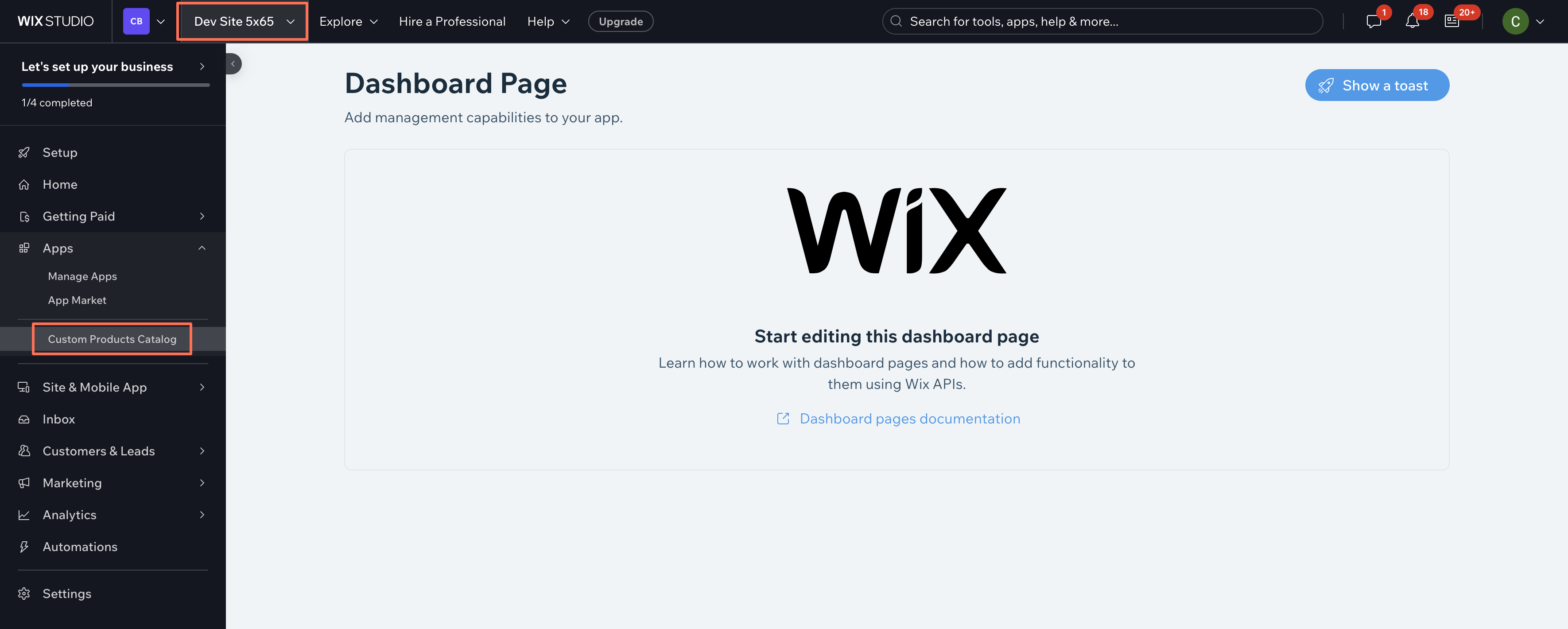
Your app is now running on your development site. As you develop your app, any changes made to your app’s code are reflected in real time on your development site.
If your changes don’t show up, try refreshing the page, or closing and reopening the development site.
Step 4 | Add permissions
In this step, we'll add permissions for the app. Every SDK API requires specific permissions to use. In this app, we will use the searchProducts(), createProduct(), and deleteProduct() functions in the Wix Stores Products V3 API to get a list of all products, and to add and delete them.
To use these functions, we need to give our app permission requirements in the app dashboard. Once we do this, anyone installing the app will be prompted to grant the specified permissions.
Our app calls searchProducts() to read products and createProduct()/deleteProduct() to add and remove them, so it needs both a read and a write product scope. Each method's reference page (linked above) lists the exact scope it requires in its Permission Scopes section, including the scope's ID (for example, SCOPE.STORES.PRODUCT_READ).
To add a scope:
- Go to the Permissions tab in your app's dashboard.
- Click Add Permissions.
- Search for the scope. Several scopes can have similar names, so match the one whose ID matches the scope ID shown on the method's reference page.
- Check its checkbox under Choose Permission Scopes and click Save.
- Repeat for each scope your methods require: a read scope for
searchProducts(), and a write scope forcreateProduct()anddeleteProduct().
For more information on configuring permissions, see Configure permissions for your app.
Step 5 | Set up Wix Stores
Our app integrates with Wix Stores, so we need to set up Wix Stores on our site, then reinstall the app so that our site requests the required permissions:
- Install the Wix Stores app on your test site. You can create some new products, or use the sample ones provided by Wix.
- Open your app’s dashboard in the Custom Apps page.
- Click Test App, then select Test on dev site. In the Select a development site dialog, choose your dev site and click Test App. The app is reinstalled on your dev site with the latest permissions.
Step 6 | Install dependencies
Before we start coding our app, we need to install some npm packages. The @wix/dashboard and @wix/design-system packages come pre-installed in the project that the CLI generated.
In your terminal, run the following commands to install the remaining packages:
The purpose of each of these packages will become clear as we progress.
Step 7 | Set up wrappers for our dashboard page component
It’s finally time to start writing some code!
Our plan in this tutorial is to create a React component that defines our dashboard page. We’re going to wrap this component with providers that will manage our data fetching and provide Wix styling for our dashboard page component.
To do this, we’ll create a higher-order component that will accept our dashboard page component and return it wrapped in the necessary providers.
To create the higher-order component:
-
Create a new file in your app's repo under
src > extensions > dashboardnamedwithProviders.tsx. -
Import
FCfrom React,WixDesignSystemProviderfrom the design system, andWixPatternsProviderfrom Patterns:CopyWixDesignSystemProviderprovides styling for Wix Design System components.WixPatternsProviderprovides styling and data manipulation for Wix Patterns components.
-
Write a function named
withProvidersto wrap our dashboard page component inWixDesignSystemProviderandWixPatternsProvider:Copy
Your complete withProviders.tsx file should look like this:
Step 8 | Create hooks for our SDK calls
Our dashboard page component will need to make SDK calls to create and delete Wix Stores product data using React hooks. To simplify our component code, we define these in a separate TypeScript file.
To create your app’s React hooks:
-
Create a new folder in your app's repo under
src > extensions > dashboardnamedhooks. -
Create a new file in
src > extensions > dashboard > hooksnamedstores.ts. -
Import
productsV3from Wix Stores so we can use the Wix Stores Products V3 API:Copy -
Import
useCallback:CopyuseCallbackis a react hook that caches a callback function, returning a memorized version of the function that changes only if one of the dependencies has changed.We use this hook to define how a new product is created and how a product is deleted using the
optimisticActionsprop andcreateProduct/deleteProductfromproductsV3. Whenever any of these dependencies change,useCallbackredefines the callback function. -
Import
CollectionOptimisticActions:CopyCollectionOptimisticActionsis a class that provides a set of utilities for managing optimistic actions on a Wix Collection. It allows us to perform various actions, such as adding, updating, and deleting items from a collection while assuming that these actions will succeed, even before confirming with the server. Learn more about the CollectionOptimisticActions class. -
Create a function to create new products named
useCreateProduct:CopyInside this function:
-
Use
productsV3to get thecreateProduct()function.Copy -
Use
useCallback()to manage ourcreateProduct()call:CopyNote: The Products V3 API requires several fields on every product:
productType- The matching properties block (
physicalPropertieswhenproductTypeisPHYSICAL) variantsInfo.variantswith at least one variant
A production app would normally collect these values from the user. To keep the Create Product modal minimal, this tutorial only asks for a product name and hardcodes the rest in
useCreateProduct, so every new product is a physical product priced at $10.Let's break down the above code:
- Lines 2-14: Define the properties of the new product. Only
namecomes from user input; the other fields satisfy the V3 API's required-fields contract with fixed defaults. - Lines 16-27: Use
optimisticActions.createOne()to create the new product.- Lines 17-20: Define the
submitfunction.createProducttakes the V3 product object directly and returns the created product, so we passnewProductfrom the closure and wrap the response in an array for the optimistic collection. - Lines 21-24: Define the toast to show when a product is created successfully.
- Line 25: Define the toast to show when product creation fails.
- Lines 17-20: Define the
- Line 28: Define the dependencies for
useCallback().
Your function should look like this:
Copy -
-
Create a function to delete products named
useDeleteProducts():CopyInside this function:
-
Use
productsV3to get thedeleteProduct()function.Copy -
Use
useCallback()to manage ourdeleteProduct()calls:CopyLet's break down the above code:
- Lines 2-17: Use
optimisticActions.deleteMany()to delete the products.- Lines 3-7: Define the submit function to handle product deletion. This function iterates over the array of products to delete and calls
deleteProduct()for each one.deleteProducttakes the product ID directly as a string. - Lines 8-13: Define the toast to show when products are deleted successfully.
- Lines 14-16: Define the toast to show when product deletion fails.
- Lines 3-7: Define the submit function to handle product deletion. This function iterates over the array of products to delete and calls
- Line 18: Define the dependencies for
useCallback().
- Lines 2-17: Use
Your function should look like this:
Copy -
Your complete stores.ts file should look like this:
Step 9 | Create a "Create Product" modal
We need a modal where the user can enter the name of the new product and confirm or cancel. This modal will be opened using a button on the dashboard page. To build this modal:
-
Create a new folder in your app's repo under
src > extensions > dashboardnamedcomponents. -
Create a new file in
src > extensions > dashboard > componentsnamedcreate-product.tsx. -
Import:
React,useEffect, anduseState.- The components of the Wix Design System required to create our modal. Learn more about the
Modalcomponent.
Copy -
Create a
CreateProductModalcomponent to define the appearance and functionality of the modal. Use the following code:CopyLet’s break down the above code:
- Lines 2-3: Initialize state variables to manage the product name and the visibility of the modal.
- Lines 5-7: Use
useEffect()to ensure that when theshowModalprop updates, theshownstate variable aligns with it. - Lines 9-12: Set up a function to toggle the visibility of the modal and reset the product name input whenever the modal is shown or hidden.
- Lines 15-20: Configure the modal to close when it’s toggled or if the site owner clicks outside of it on the page.
- Lines 21-42: Configure the modal’s layout and content.
- Lines 23-30: Add a primary Save button that is enabled when a product name has been entered. When clicked, it creates a product, and then resets
productName. - Lines 31-32: Add a secondary Cancel button. When clicked, it closes the modal.
- Lines 35-40: Add a
FormFieldcomponent that takes an input for the product name.
- Lines 23-30: Add a primary Save button that is enabled when a product name has been entered. When clicked, it creates a product, and then resets
Your complete create-product.tsx file should look like this:
Step 10 | Create a dashboard page component
Finally, we have all the pieces in place to set up our dashboard page.
Open the custom-products-catalog.tsx file at src/extensions/dashboard/pages/custom-products-catalog/.
-
Delete all the contents - we're starting from scratch.
-
Add the following import statements:
CopyThis file is where we start to use Patterns.
Patterns is a React library with advanced components that extend the functionality of the core UI React components from the Wix Design System. It simplifies Wix app development by enabling you to easily and consistently implement complex functionalities like querying, displaying, and filtering collection data from remote servers.
In our code, we use Patterns components to create a table of products that you can query, filter, and sort. The table also has functionality to create new products, delete existing products, and choose which columns to display.
-
Import everything we set up in the previous sections:
Copy -
Define a type for filtering the table's data:
CopyThis is the product property by which the table can be filtered. We'll pass this type to the
useTableCollectionhook later. -
Define a map from column IDs to the field paths that
searchProductsaccepts for sorting:CopyThe
SortableFieldtype narrows the allowed values to the field paths that the V3searchProductsendpoint accepts as sort fields. The map then translates between the table column'sid, which we use as a short human-friendly slug, and the API's full field path.For example, the Price column has
id: 'price', but the SDK expects the full pathactualPriceRange.minValue.amountwhen sorting by price. The map entryprice: 'actualPriceRange.minValue.amount'makes the translation explicit. Columns whoseidalready equals a sortable field path don't need an entry. -
Map product types to strings so that they display in a readable way in the table:
Copy
Create the Products() component
It's finally time to make our dashboard page component. We will:
- Define and export our dashboard page component
- Define the component's states, hooks, and functions
- Create the page structure
Define and export our dashboard page component
-
Create a function for our dashboard page component named
Products:Copy -
Export the component wrapped by
withProviders():Copy
The rest of the code on this page will be written inside the Products() function.
Define the component's states, hooks, and functions
-
Initialize the
shownstate variable to manage the visibility of the modal we created earlier.Copy -
Use
productsV3to get thesearchProducts()anddeleteProduct()functions.Copy -
Create the
tableStateusinguseTableCollection.useTableCollectionis a hook that returns atableStateobject. This is where we define:- Where to retrieve the data from to display in the table.
- How much data to retrieve.
- How to build the search request that retrieves the table data, depending on what filters and sorting are applied in the table.
- The error message to display if no data is found.
- How the filters are applied.
CopyLet's break down the above code:
- Lines 2-5: Define basic data necessary for retrieving and identifying the items used to populate the table.
- Lines 7-46: Define the function that fetches the collection data used to populate the table. It receives a
queryobject and returns the matching products plus a total count.- Line 8: Deconstruct the
queryparameter. It contains the requestedlimit, the activesort, and anyfiltersthe user has applied. - Lines 10-25: Build the filter object. If the user has applied a Last Updated range, translate it into the V3 search filter syntax. A range with both
fromandtobecomes two separate_updatedDateconditions combined with$and, because the V3 search filter requires a single operator per field per condition. - Lines 27-31: Build the sort spec. For each sort entry from the table, look up the column's
idinsortFieldByColumnIdto get the field path the SDK accepts, and translate the order from the patterns library's lowercase format (asc/desc) into the SDK's uppercase enum (ASC/DESC). - Lines 33-40: Call
searchProducts. Pass the cursor paging limit, the filter, and the sort spec as the first argument. In the second argument, request the additional response fieldsTHUMBNAILandPLAIN_DESCRIPTION. These aren't returned by default, but the Avatar and Description columns need them. - Lines 42-45: Return the items. This sample fetches a single page of up to 20 products. V3 cursor-paginated responses don't include a total count, so we use the length of the returned page as
total. A production app should implement cursor-based pagination usingpagingMetadata.cursors.nextfrom the response, and callcountProductsto display a true total.
- Line 8: Deconstruct the
- Line 48: Define the error message that will be shown if the fetch fails.
- Lines 50-52: Define which filter factories are used with the filters. The
updatedDatefilter uses thedateRangeFilterfactory.
-
Create the
optimisticActionsclass usinguseOptimisticActions.useOptimisticActionsis a hook that returns aCollectionOptimisticActionsclass. The code below defines logic that anticipates the results of the query that we defined in the previous step. When there is a change that sends a new query to the server (for example, a new filter), this logic will be applied to the data already in the page's memory while we're waiting for the server's response.CopyLet's break down the above code:
- Line 3: Define that there is no default sorting for the data, apart from what is defined in the query.
- Lines 5-22: Define a function that simulates the filtering on the server, as defined in the
tableStateabove. It returns a function that returnstrueif the product would pass the filters, andfalseif it wouldn't.- Lines 7-18: Return
falseif the product wouldn't pass the Last Updated filter. - Line 20: Return
trueif the product would pass all of the filters.
- Lines 7-18: Return
-
Define the
createProduct()anddeleteProducts()functions using the hooks we created in Step 7:Copy
At this stage, your Products() function should look like this:
Create the page structure
We define our page as follows:
-
Define the
CollectionPagecomponent that will wrap all our components on this page:Copy -
Add a
CollectionPage.Headercomponent that contains the page title, breadcrumbs, and a button that opens our Add Product modal:Copy -
Add a
CollectionPage.Contentcomponent below theCollectionPage.Header. This will wrap the rest of the components on this page.Copy -
Add the
CreateProductModalcomponent that we created in Step 8:Copy -
Add a
Tablecomponent.The following code displays a table containing our columns and fetched data. When no items are selected, there is also a button that opens an accordion to customize the columns displayed, and a button that opens an accordion to filter the data. When at least one product is selected, the table displays the number of selected products, the maximum number of products that can be selected, a Select All option, and a Delete button.
CopyLet's identify where some of our key functionality is implemented in the above code. For more information on all the
Tableprops, see Patterns Table Component.- Lines 4-12: Define the table's filters. We use a
CollectionToolbarFilterscomponent to display an accordion with the filtering options. The Last Updated filter uses theDateRangeFiltercomponent. - Lines 13-35: Use the
MultiBulkActionToolbarcomponent to create a button in the toolbar that deletes all selected products. When the button is clicked, the user is asked to confirm their decision in a modal (line 25). - Lines 37-94: Define the table's columns.
- Lines 39-47: Product avatar - Use the
Imagecomponent from the Wix Design System and feed it the URL from the product'smedia.main.thumbnail.urlfield. To make this field appear in the response, we requested it via theTHUMBNAILfield in thesearchProductscall. - Lines 48-64: Product name and description - Use a
Boxfor layout with direction set toverticaland gap to3px, indicating vertical stacking with a gap of 3px. Inside this box, add twoTextcomponents for the product'snameandplainDescription. The description comes from thePLAIN_DESCRIPTIONrequested field. - Lines 65-74: Product price - Read the product's price from
actualPriceRange.minValue.amountand prefix it with a dollar sign. The column issortable: true; sorting maps to theactualPriceRange.minValue.amountfield path viasortFieldByColumnId. - Lines 75-83: Product type - Format the
productTypefield usingproductTypeToDisplayNamewhich we defined earlier. If there is no product type, return an empty string. - Lines 84-93: Product last updated date - Format the product's
_updatedDateas a readable date. This column isdefaultHidden: true, so the user must opt in via the columns control to see it.
- Lines 39-47: Product avatar - Use the
- Lines 96-113: Create a Delete action in the per-row action menu (line 99). Add success (lines 107-110) and error (line 111) toasts.
- Lines 4-12: Define the table's filters. We use a
Your page structure code should look like this:
Complete page code
Your complete code should look like this:
Step 11 | Test the app
Now that the app’s code is ready, you can test it locally using the Wix CLI.
To test your app, do the following:
-
Run a local development server for your app using the
wix devcommand in your terminal. Your app’s dashboard page will now look like this: -
Click the Add Product button and use the modal to add a product.
-
Select some products and click the Delete button.
-
If things don’t look right, open your browser’s developer tools and check for errors in the console.
Step 12 | Build and deploy the app
You have now fully developed an app that allows users to add or remove products from a Wix Stores products catalog through a dashboard page.
After testing your app and seeing that it works as expected, you can build and deploy your app.
Last updated: 13 July 2026