Editor React Components
An Editor React Component is a custom site widget built in React that integrates natively with the editor. A declarative manifest tells the editor which parts of the component are customizable, so the editor sets up its own panels and controls around the component automatically. Wix users get the same editing experience as with built-in Wix elements.
Editor compatibility: Editor React Components are built for Wix Harmony. They aren't supported on Wix Editor or Wix Studio sites.
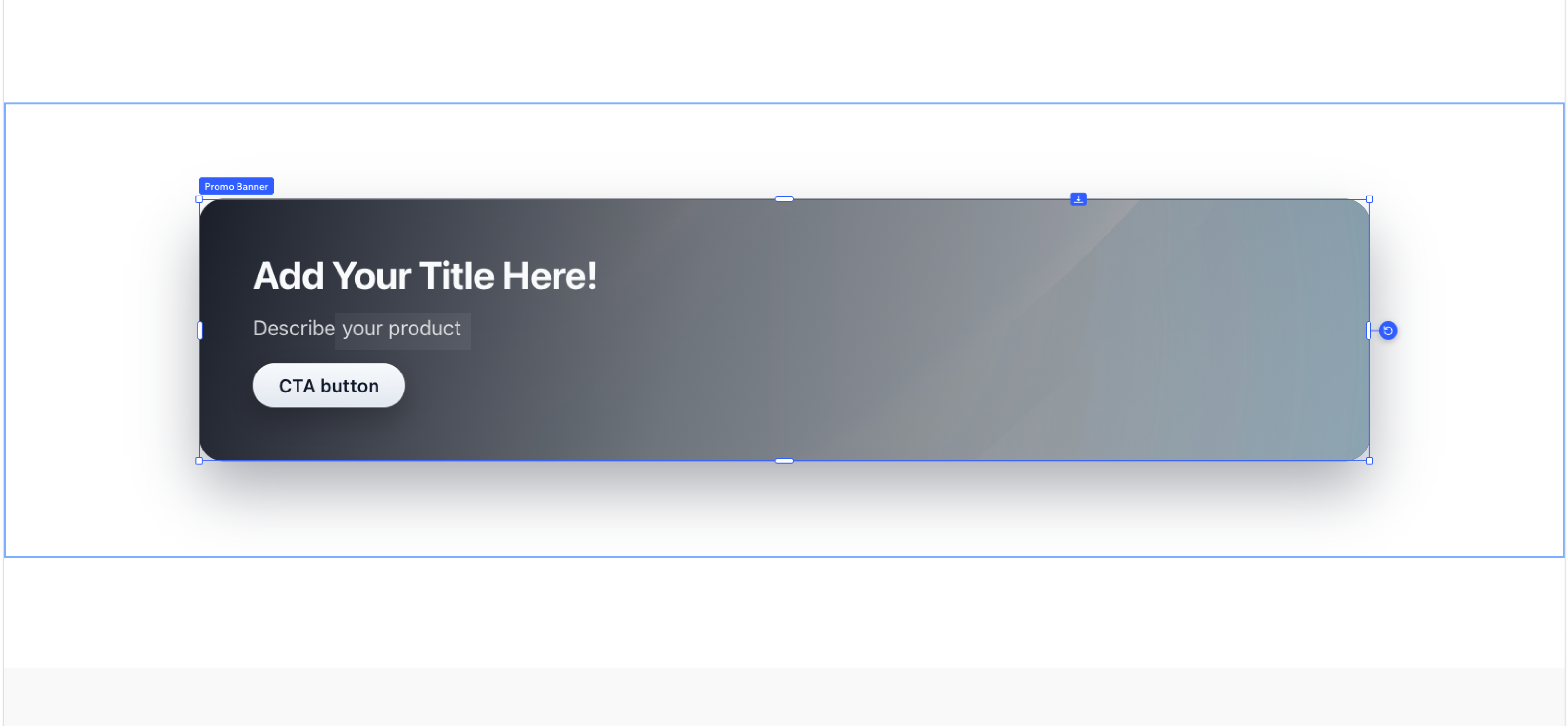
When to use an Editor React Component
Use an Editor React Component when you want a custom widget to feel like a native Wix element in the editor, without having to build and maintain your own settings panel. Common cases include:
- Building a reusable component with rich design controls, like a testimonial card with editable text, image, and color presets.
- Offering a content-driven widget where Wix users edit data inline, like an event lineup or a pricing table.
- Providing a layout block whose styling Wix users can adjust through the editor's standard design panels, like a feature grid or a hero section.
Tip: For widgets that need to work across Wix Editor, Wix Studio, and Harmony, use a site widget instead.
Component and manifest
An Editor React Component has 2 main parts:
- React component: The UI code that renders in the editor and on the live site.
- Manifest: A configuration object that describes the component to the editor. The manifest lists which props are customizable, how they map to editor controls, and which DOM elements receive Wix-user style changes.
You build the React component first, then write the manifest to match it. The manifest is what gives Wix users an editing experience that matches Wix's built-in elements, without you having to design or maintain custom settings panels.
Runtime model
Wix users place an Editor React Component on a Harmony page like any other component, through the editor's component picker. From there:
- The editor reads the manifest to determine which parts of the component are customizable.
- The editor configures the appropriate panels and controls in its UI based on the manifest.
- As the Wix user makes changes, the editor stores those values. Data changes are passed to the component as React props. Style changes are applied as CSS directly to the DOM elements that match the selectors in the manifest.
The component renders the same way in the editor and on the published site, with whatever props and styles the Wix user has configured.
Authentication and permissions
Editor React Component code runs in 2 contexts, each with its own identity:
- In the editor, the component renders for the Wix user editing the site, with that user's identity.
- On the live site, the component renders for the visitor or member viewing the page, with that visitor or member's identity.
What the component can do is bounded by the active identity's permissions, plus the app's permission scopes when the component belongs to an installed app.
For some restricted methods, you can elevate the call from backend code that the component invokes to gain higher authorization than the calling identity has.
Editor React Components across development paths
- Sites: Don't add Editor React Components directly. To create a reusable custom component on a Harmony site, site developers can use a custom element. To use an Editor React Component specifically, create a private app that registers the extension and install that app in your site.
- Wix-managed headless projects: Don't support Editor React Components. Headless projects use a custom frontend, so there's no Wix editor for an ERC to integrate with.
- Self-managed headless projects: Don't support Editor React Components.
- Wix-managed apps: Build Editor React Components with the Wix CLI. See Add an Editor React Component Extension with the Wix CLI in Build Apps.
- Self-managed apps: Don't support Editor React Components.
- Blocks apps: Blocks apps don't support Editor React Components.
Last updated: 22 July 2026