Tokens and Theming Basics
1. Introduction
Design tokens and theming play a key role in bridging the gap between design and code. This guide explains how tokens and theming work, why you should use tokens, and how they are structured in the Wix Design System.
1.1 Who should use this guide?
This guide serves as a general introduction to tokens and tokenization. It is intended for both designers and developers looking to understand how tokens work in the Wix Design System.
1.2 What are tokens and themes?
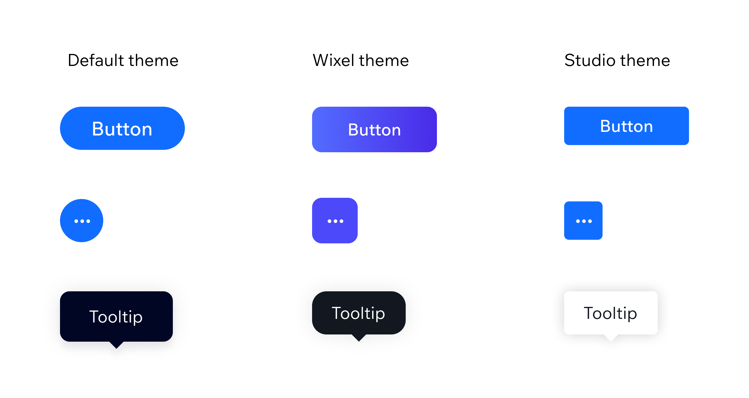
Tokens store design-related values and can be applied consistently across different themes. They provide a consistent structure while allowing values to change per theme.
Themes are collections of visual attributes assigned to the tokens to create a specific aesthetic.
Design tokens are reusable CSS variables that store design decisions such as colors, typography, spacing, and shadows. Instead of manually setting these values in designs or code, tokens act as a single source of truth. This ensures consistency across products and platforms through a theme.
1.3 Why use tokens?
Consistency: Tokens enforce uniformity across UI components, reducing visual discrepancies.
Scalability and easier maintenance: Updating a token propagates changes across the system without requiring manual adjustments to multiple components.
Efficiency: Tokens allow developers to start implementation early, even when a product's theme is still being refined by designers. This speeds up development without compromising design accuracy, as the components used remain the same.
Brand consistency: Creating new products, maintaining uniformity, and managing a brand is becoming more accessible, faster, and cheaper with a transparent visual hierarchy system. This allows each Wix Editor or dashboard to have a distinct UI while preserving a unified UX and behavior.
1.4 What can be controlled with tokens?
- Colors
- Spaces
- Border width
- Corner radius
- Shadows
- Text - size, weight, line height (see guide on Typography)
Tokens control visual aspects like color, spacing, and typography, but not structural properties. For example, a component's default behavior, such as a prefix being enabled, can't be toggled using tokens and must be adjusted via the component's properties.
2. Tokens structure
The Wix Design System is built on three levels of tokens: foundation tokens, semantic tokens, and component-level tokens.
These levels are interrelated. Foundation tokens define raw design values, such as colors, spacing, and typography, which serve as the base of the system. Semantic tokens reference these foundation values and apply them contextually across the product to express design intent.
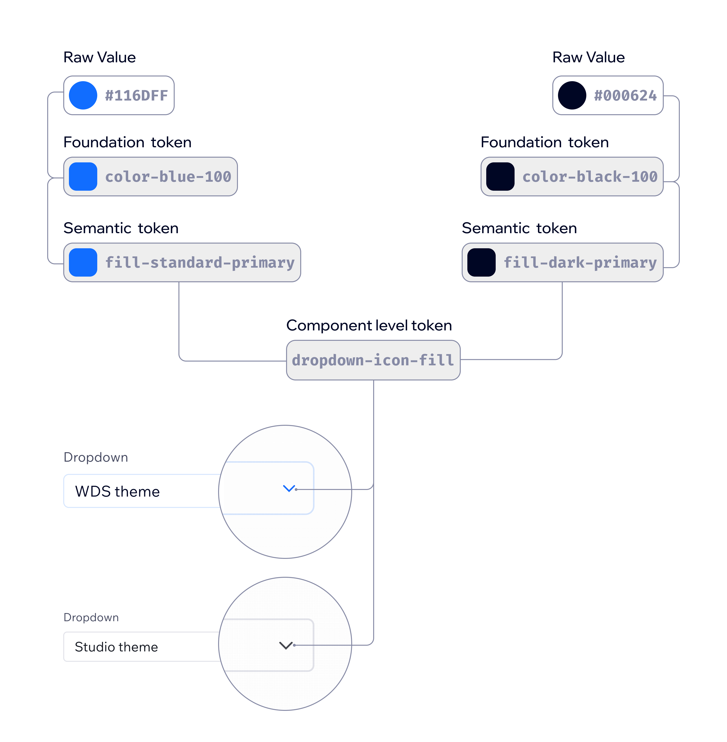
Component-level tokens are used more selectively. They reference semantic tokens but are introduced only when a very specific part of a component needs to be styled differently. An example is the chevron icon in a dropdown. In such cases, instead of creating a semantic token for a single-use scenario, a component-level token is created to handle the exception without polluting the broader semantic layer.

2.1 Foundation Tokens
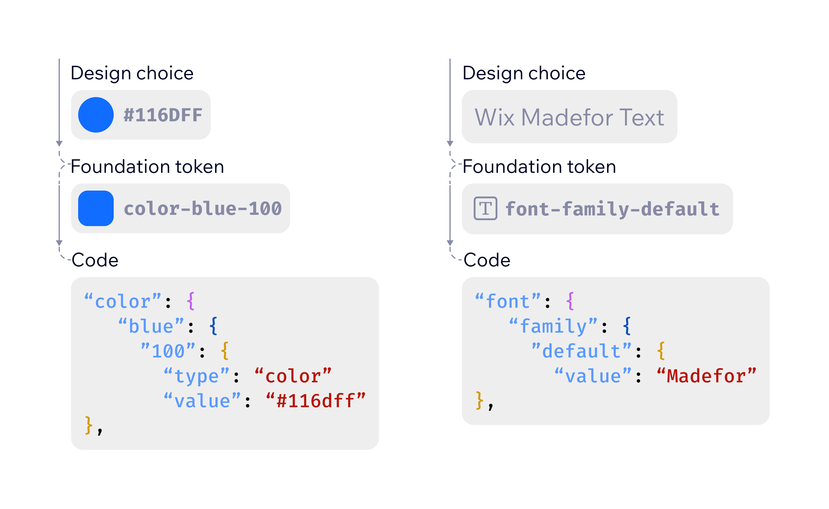
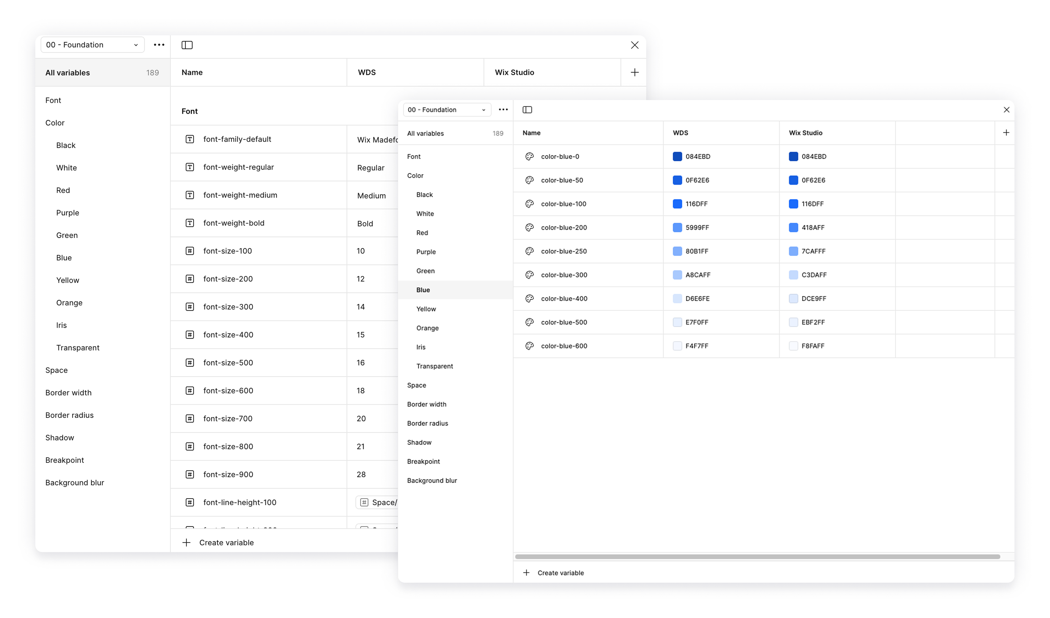
These tokens use raw values (for example, colors, spacing, typography) that serve as the core building blocks of the design system theme. For example, the main blue color used in the Wix dashboard is #116DFF, so it would be defined as color-blue-100 foundation token.
These are the base values, that define your color pallet, spacing grid, font type etc. They serve as the single source of truth for the system.
We use a formula to define the naming conventions for foundation tokens: category -> sub-category -> scale
Numeric scaling keeps clarity and consistency (100-900 for colors and 0-64 for spacing).
2.2 Semantic Tokens
These are contextual tokens that describe the intended use, not a raw value. They reference foundation tokens and apply them contextually. For example, the color-blue-100 value is the primary color for the Wix Business Manager theme. Therefore, the semantic token fill-standard-primary references color-blue-100.
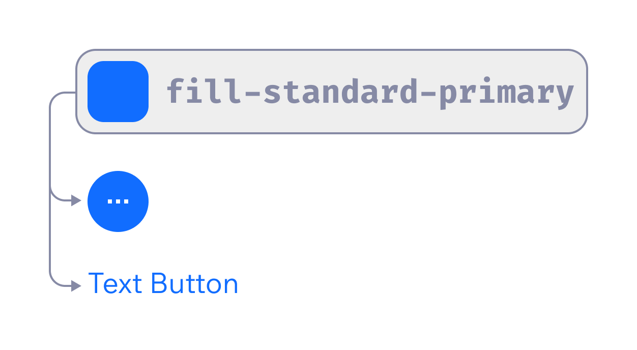
Semantic tokens make it easier to adapt to future changes in branding, accessibility, and design trends without refactoring the entire codebase.
For example:
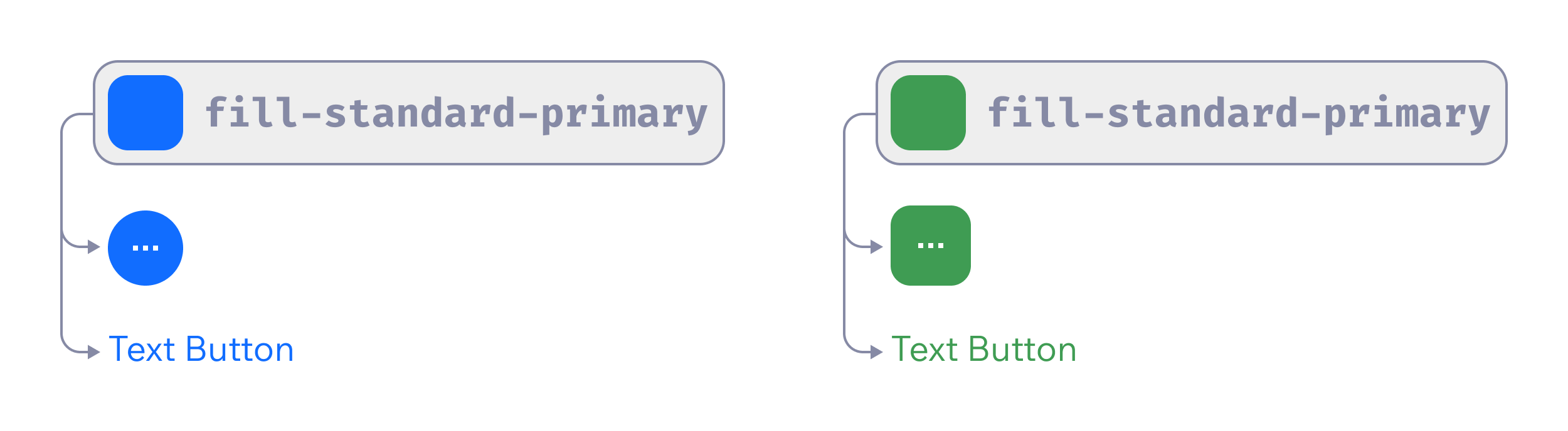
- If a company rebrands and its primary color changes from blue to green, update the definition of the
standard-primarytoken. Without tokens, you would search for and replace every hardcoded#116DFF.
- If accessibility guidelines change, you could adjust
color-destructive-primaryto meet new contrast requirements without touching every error state in the UI.
2.2.1 Semantic tokens naming convention:
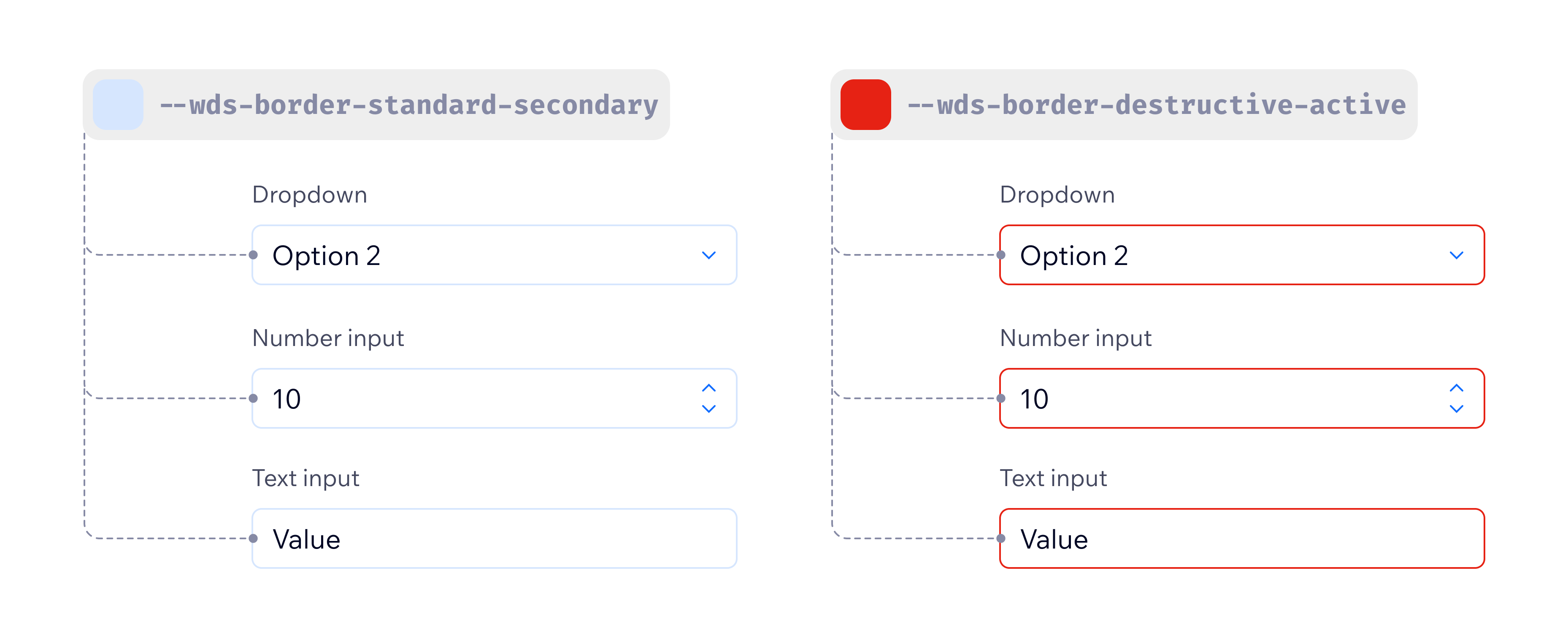
The naming convention for semantic tokens: category -> sub-category -> skin -> priority -> state
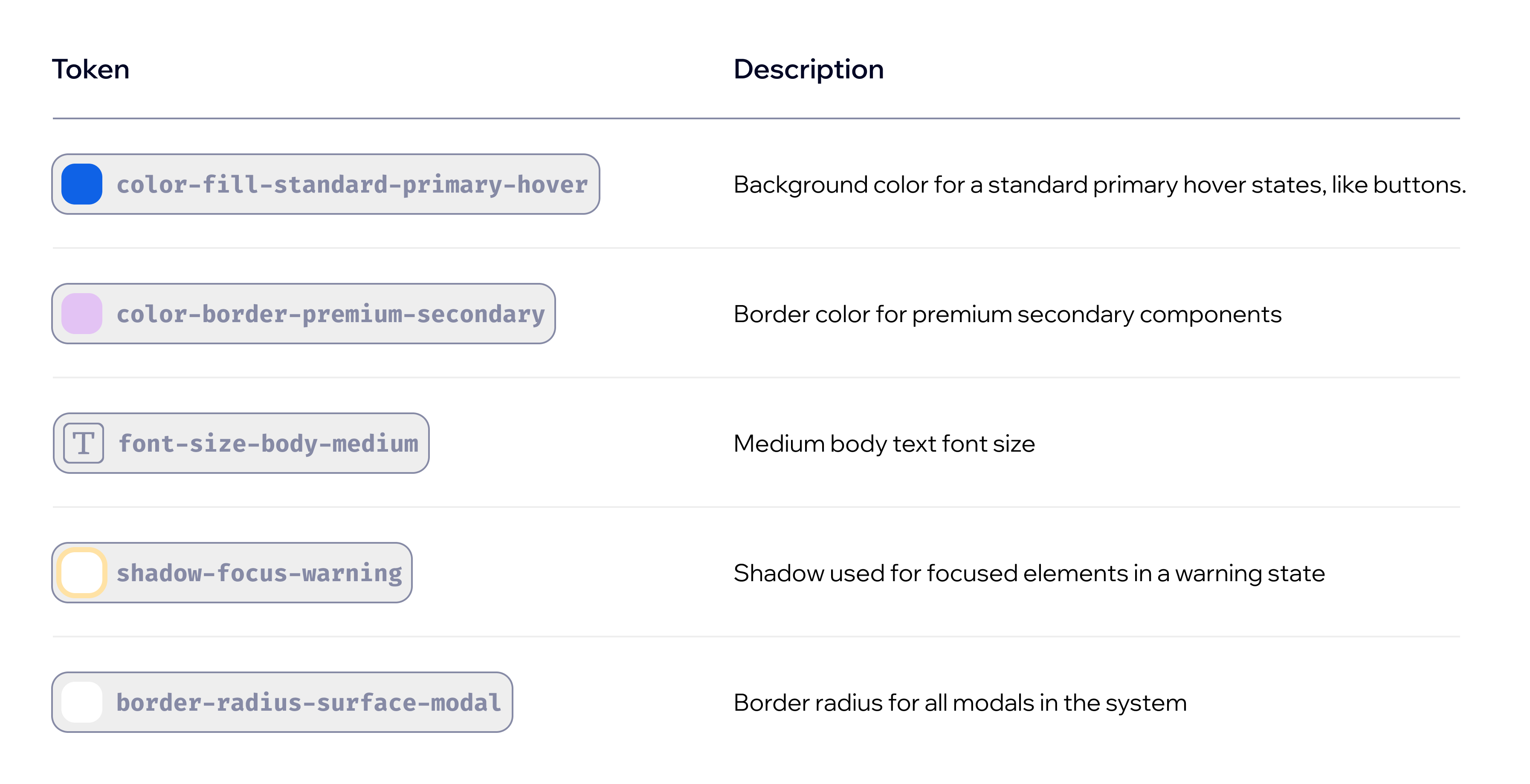
Naming convention deepdive:
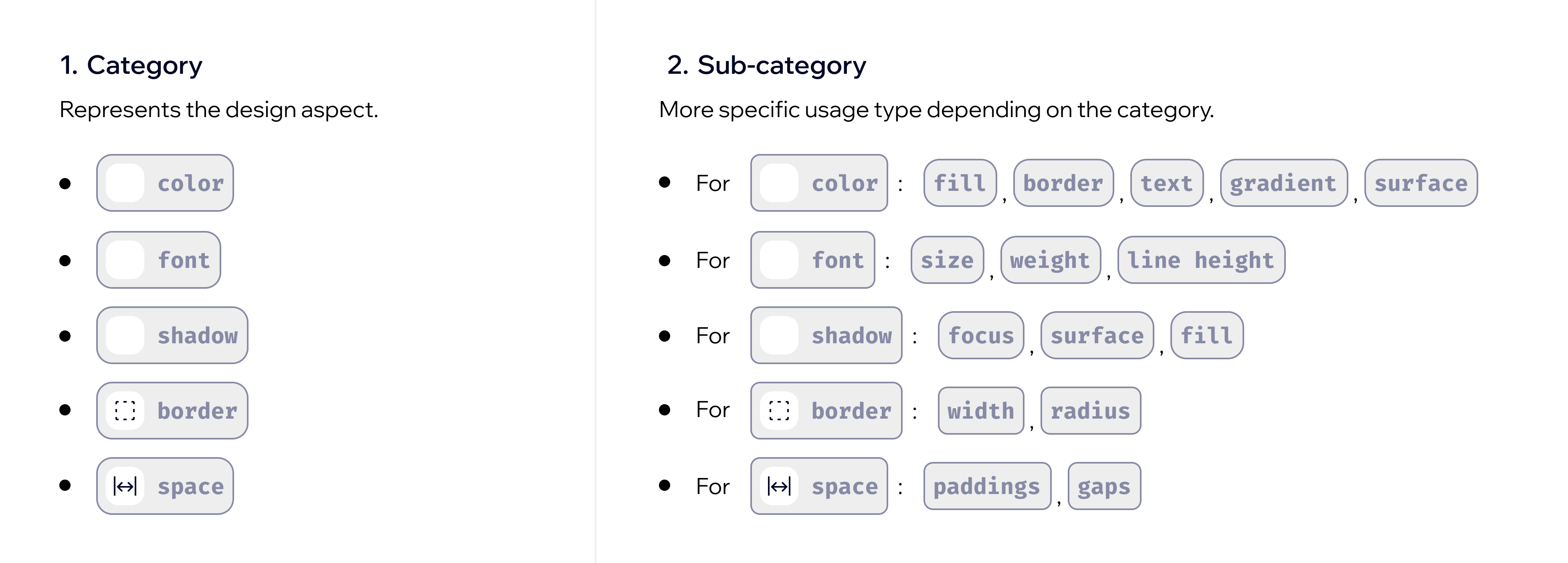
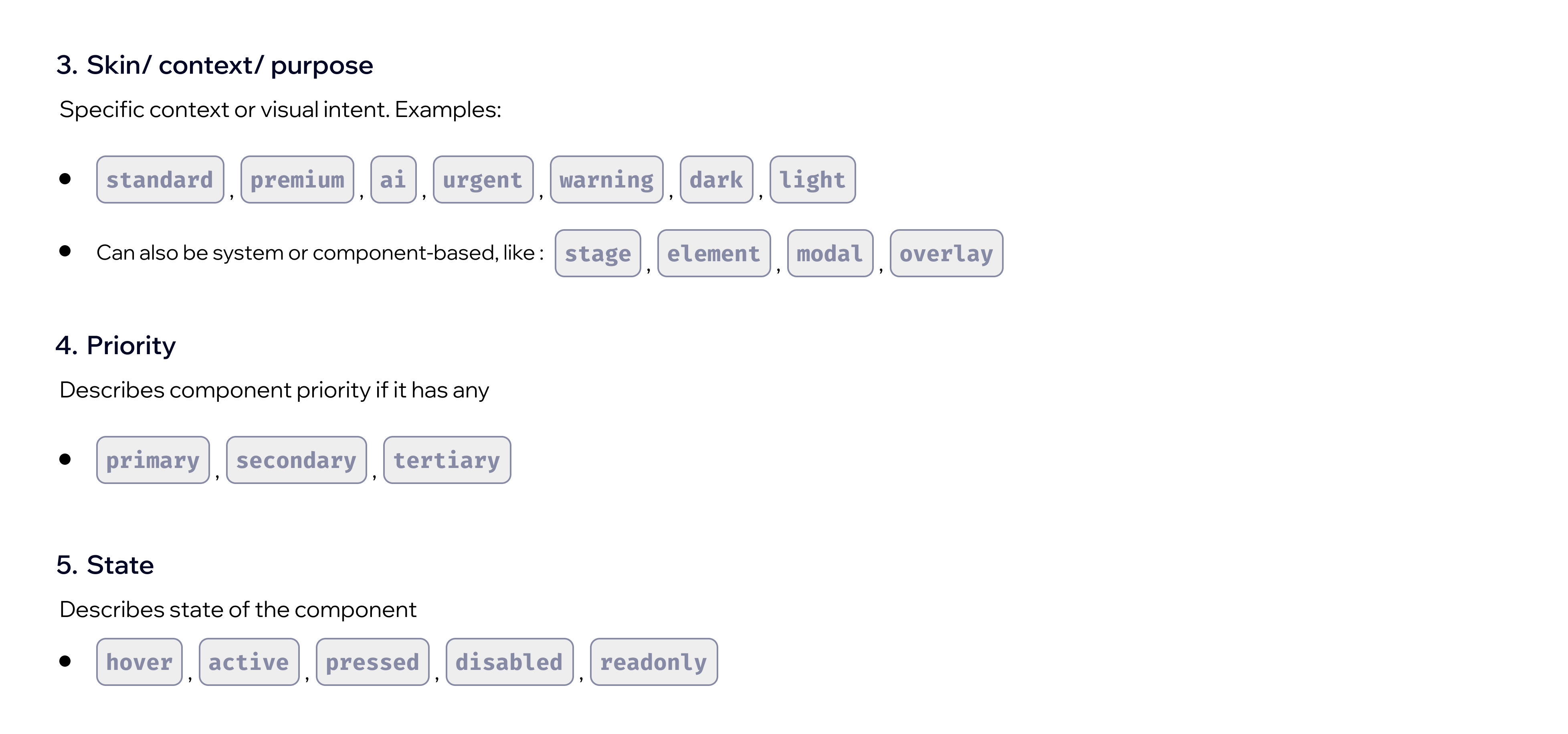
By separating design intent (semantic tokens) from design values (foundation tokens), we created a more maintainable, future-proof system that evolves without breaking consistency across components.
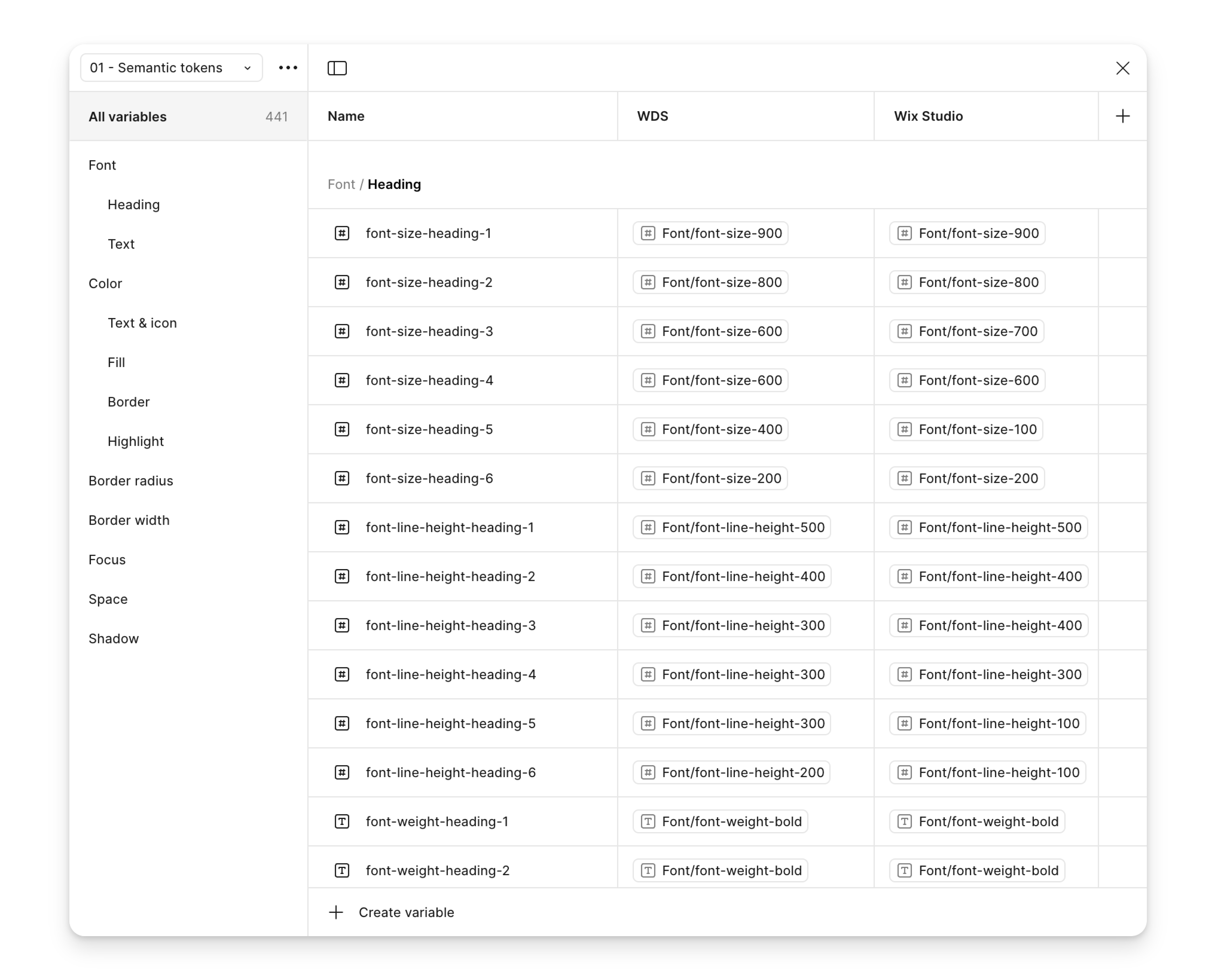
2.3 Component level tokens
These tokens are specific to components. Component tokens should reference semantic tokens, which map to foundation tokens.
-
Use component tokens when components have unique design needs that can't be solved purely through semantic tokens.
-
We need to keep them documented and limited to where they add value.
For example:
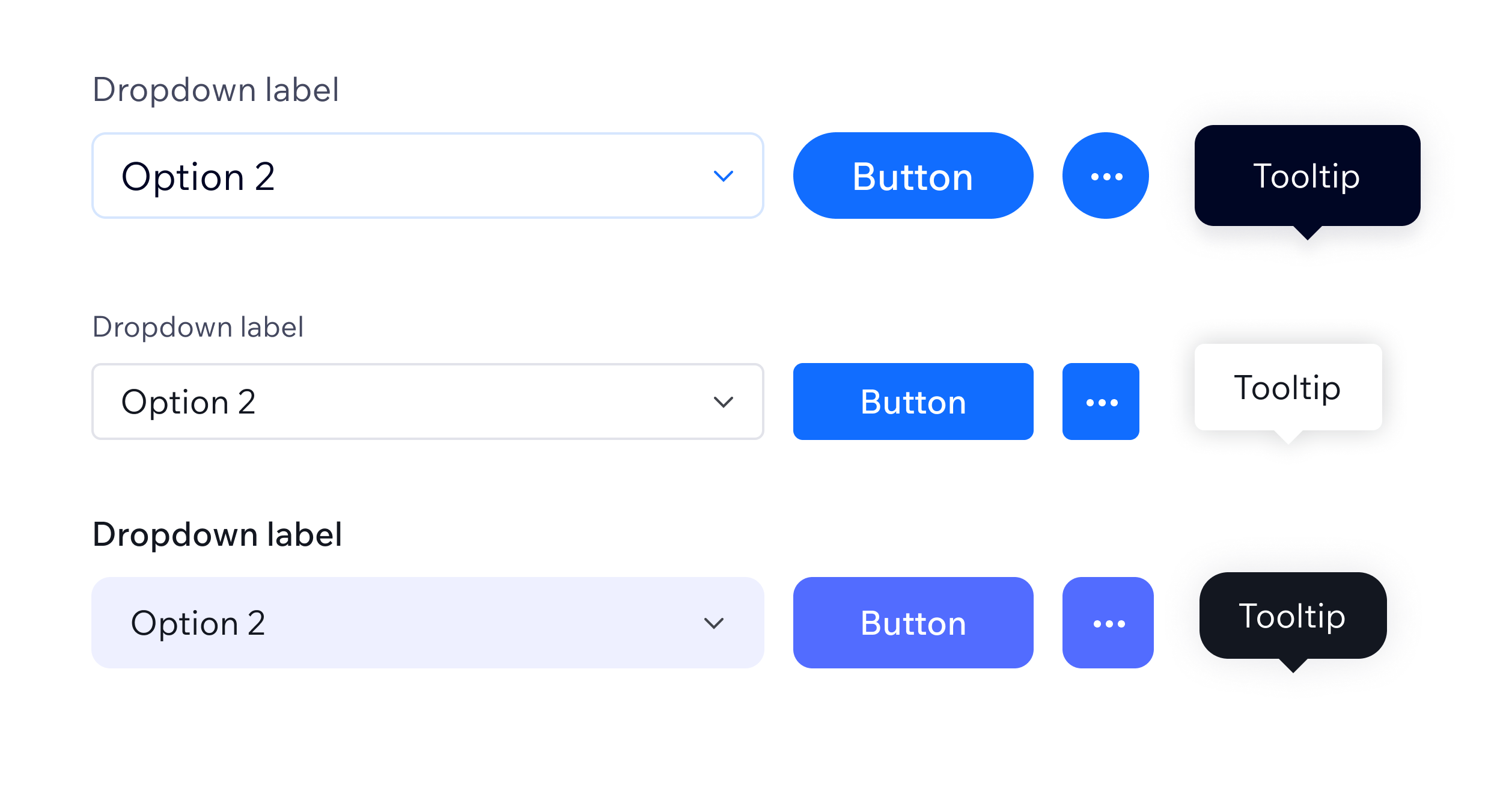
- The dropdown chevron should stay blue in the "Default" theme, but should switch to black in the "Studio" theme. As there is no semantic token that would carry such a meaning with blue and black colors under the hood, a component level token
dropdown-icon-fillwas added.
Naming convention: the name should include a component name and the part of the component it affects, for example, vertical padding, label or border. If it is applicable to a certain skin or property, that should also be included in a token name. For example: button-padding-horizontal-medium.
Component level tokens can be problematic:
- Overuse / duplication: If every component has unique tokens for colors, spacing, etc., it becomes hard to maintain and defeats the purpose of a centralized system. If a required change is repetitive, it is better to request a semantic token change instead.
- Inconsistency: Too many component tokens can cause drift from semantic tokens, breaking consistency across the UI.
- Harder to theme: If component tokens don't map to semantic tokens, you'll need to update the theme of each component, instead of making the update in one place.
3. Theming System
3.1 What is a Theme?
A theme defines a set of visual styles applied to a product, environment, or brand variant. In the Wix Design System, themes allow the same component structure to be used across different experiences while maintaining distinct visual identities.
Use cases for theming, current and potential:
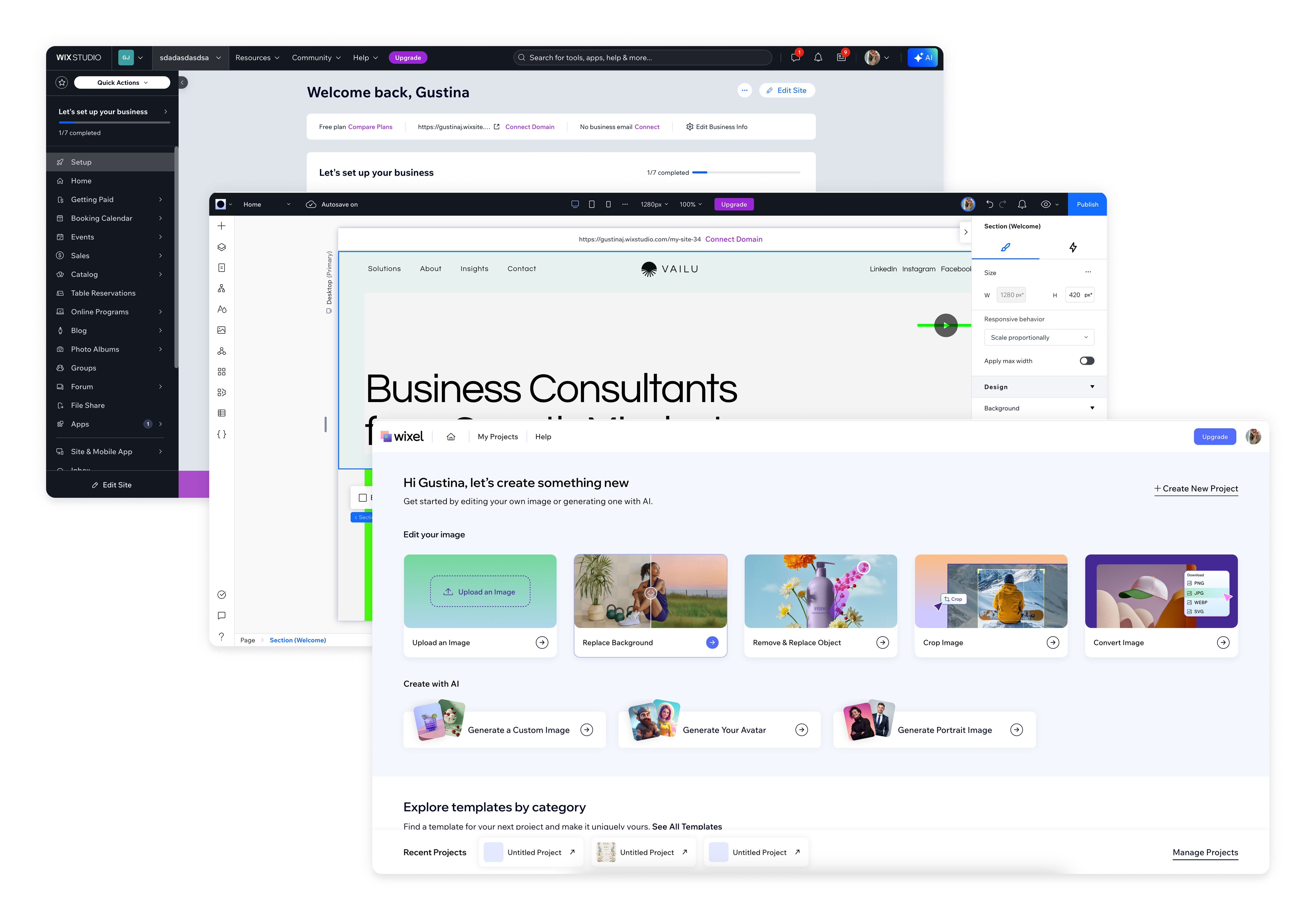
- Product variants: There are different themes for the Wix Dashboard, Wix Studio and other Editors while using the same component library.
- Branding customization: Allows partners or businesses to apply their brand identity without changing component behavior.
- Dark Mode / accessibility: Supports high-contrast or dark/light themes through token modifications.
- Localization adaptation: Adjusts for different cultural color meanings or typographic preferences.
3.2 How themes are structured
Themes in Wix are structured the same way both in code and Figma to ensure consistency across design and development. The naming is also consistent between code and design.
Both the code repo and Figma are tokenized using three levels of tokens:
- Foundation tokens: Remain unchanged across themes (for example, raw colors and spacing values).
- Semantic tokens: Can be modified per theme to reflect brand or contextual differences (for example, "Corner radius" in Dashboard vs. Editor).
- Component-level tokens: Should be used sparingly for specific component adjustments.
3.3 Theme Switching
Theme switching allows real-time adaptation of UI elements based on user preferences or product contexts.
Implementation in Wix Products:
- Current themes provided by the Wix Design System are defined globally and can be applied dynamically.
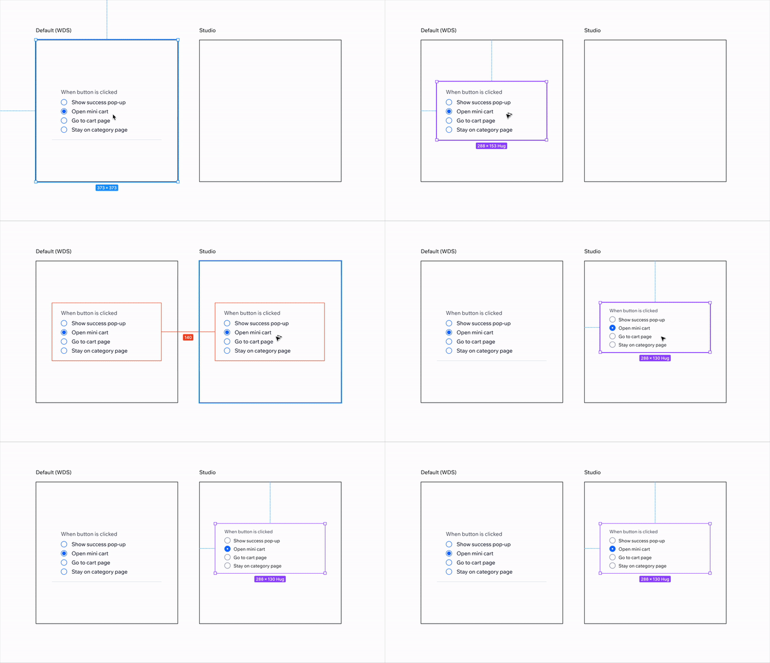
- When a theme switch occurs, token values update, while components remain unchanged.
- Example: Switching from the Dashboard theme to the Wix Studio theme updates colors, spacing and typography, but keeps the UI components structurally identical.
3.4 Custom Themes
Design system consumers can create their own theme if they have a business reason or are building for a new environment. However, adjustments to existing themes shouldn't be made in ways that deviate from the design system guidelines.
-
If a theme already exists for an environment (for example, Dashboard), modifications should align with the established design language and need to be approved by the Wix Design System team.
-
Custom themes should be created only when necessary and should follow the token hierarchy and theming principles outlined in this guide.
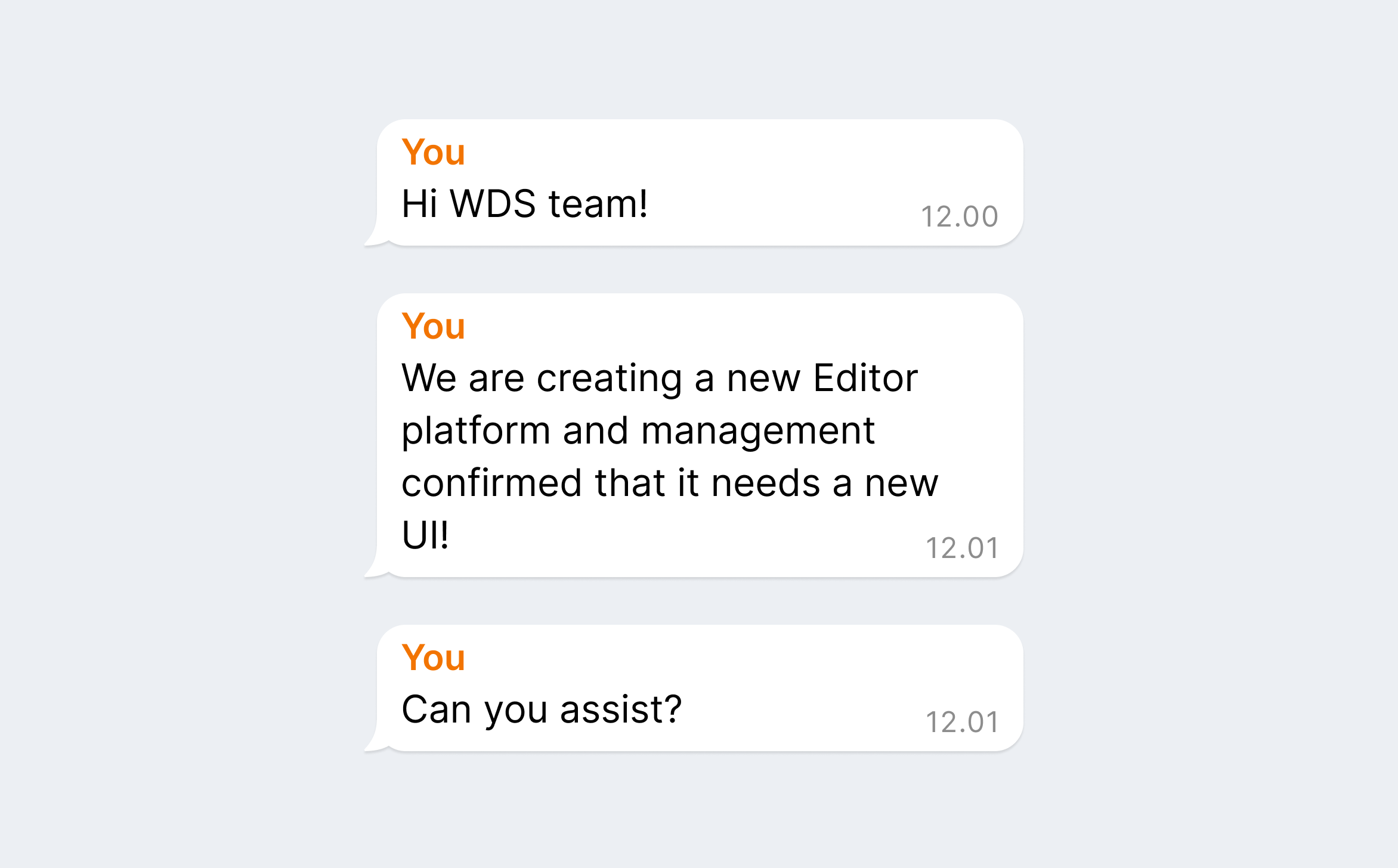
Do
Align with the Wix Design System team before creating a new theme or token overrides.
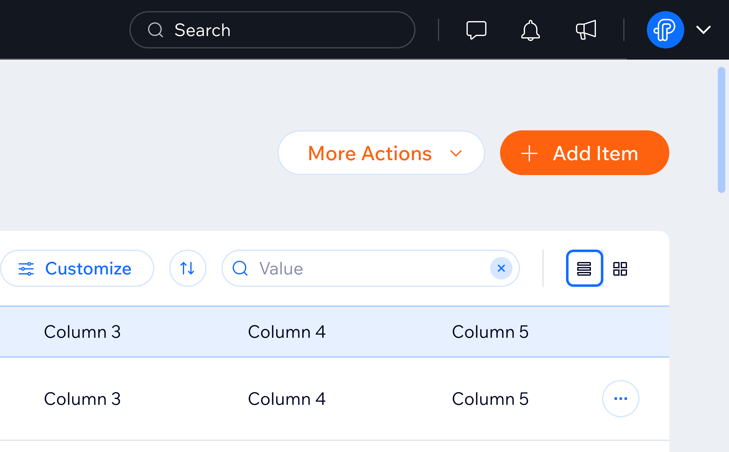
Don't
Create custom UI in existing environments with a distinct style guide.
3.5 Guidelines for theme-safe design
To ensure flexibility and maintainability, follow these guidelines:
- Avoid hardcoded colors: Always use tokens instead of direct HEX/RGB values in the code and Figma.
- Use semantic tokens for UI elements: This ensures colors adapt correctly across themes.
- Minimize component-level token overrides: Keep theme changes at the semantic level whenever possible.
- Test across themes: Validate designs in multiple themes to catch inconsistencies.
4. Tokens in Figma
4.1 How to check tokens in Figma?
All Wix Design System components in Figma use tokens. When you inspect a component, the inputs show their values in small white squares. All values like padding, fills, and text will have tokens already applied, so you don't need to apply them yourself.
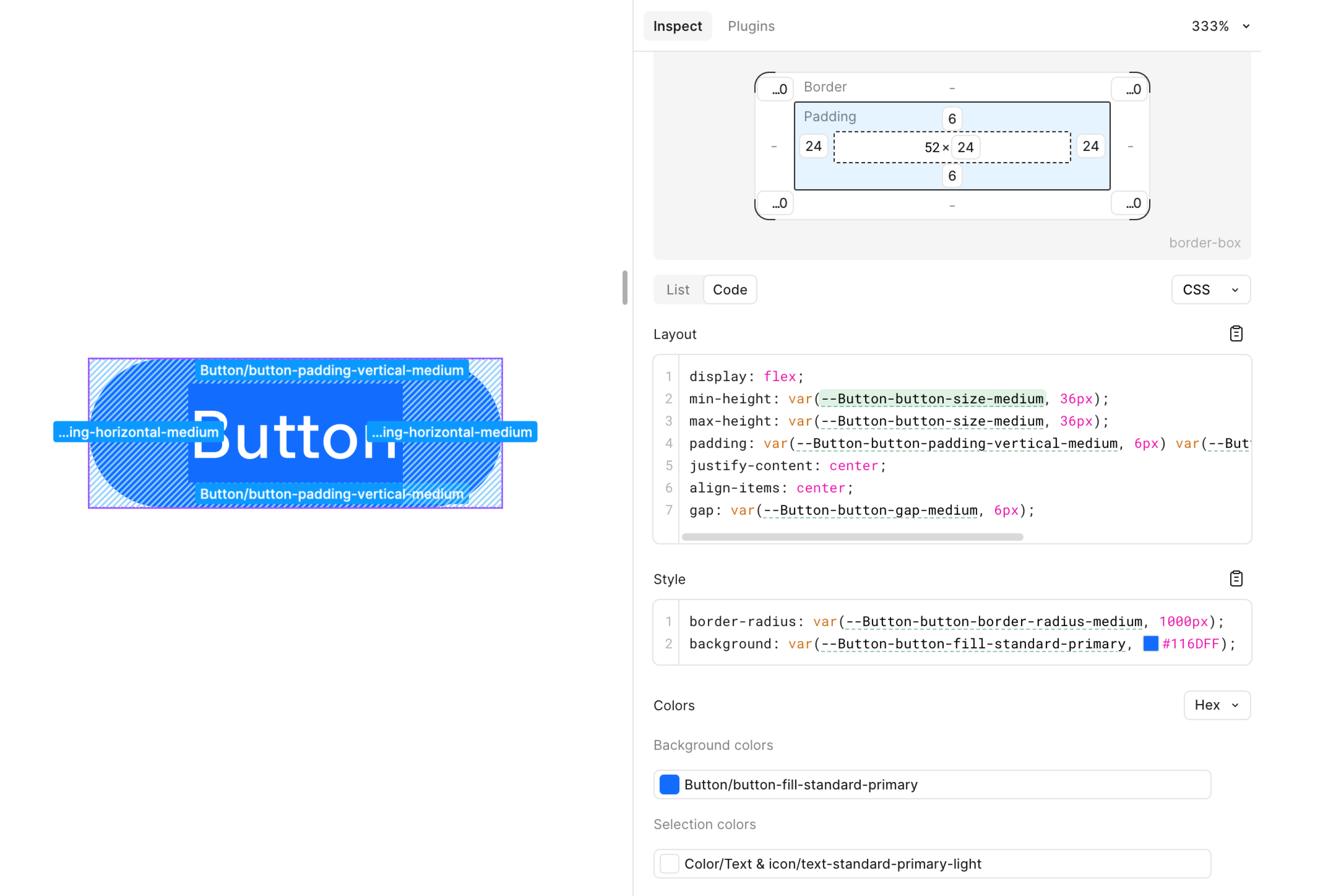
Keep in mind that switching between tokens in Figma isn't available in the code. Verify how components look and what properties or skins they support in the Storybook documentation.
If there is a need to create a new theme or make changes to an existing theme, reach out for more guidance.
4.3 How to switch between themes
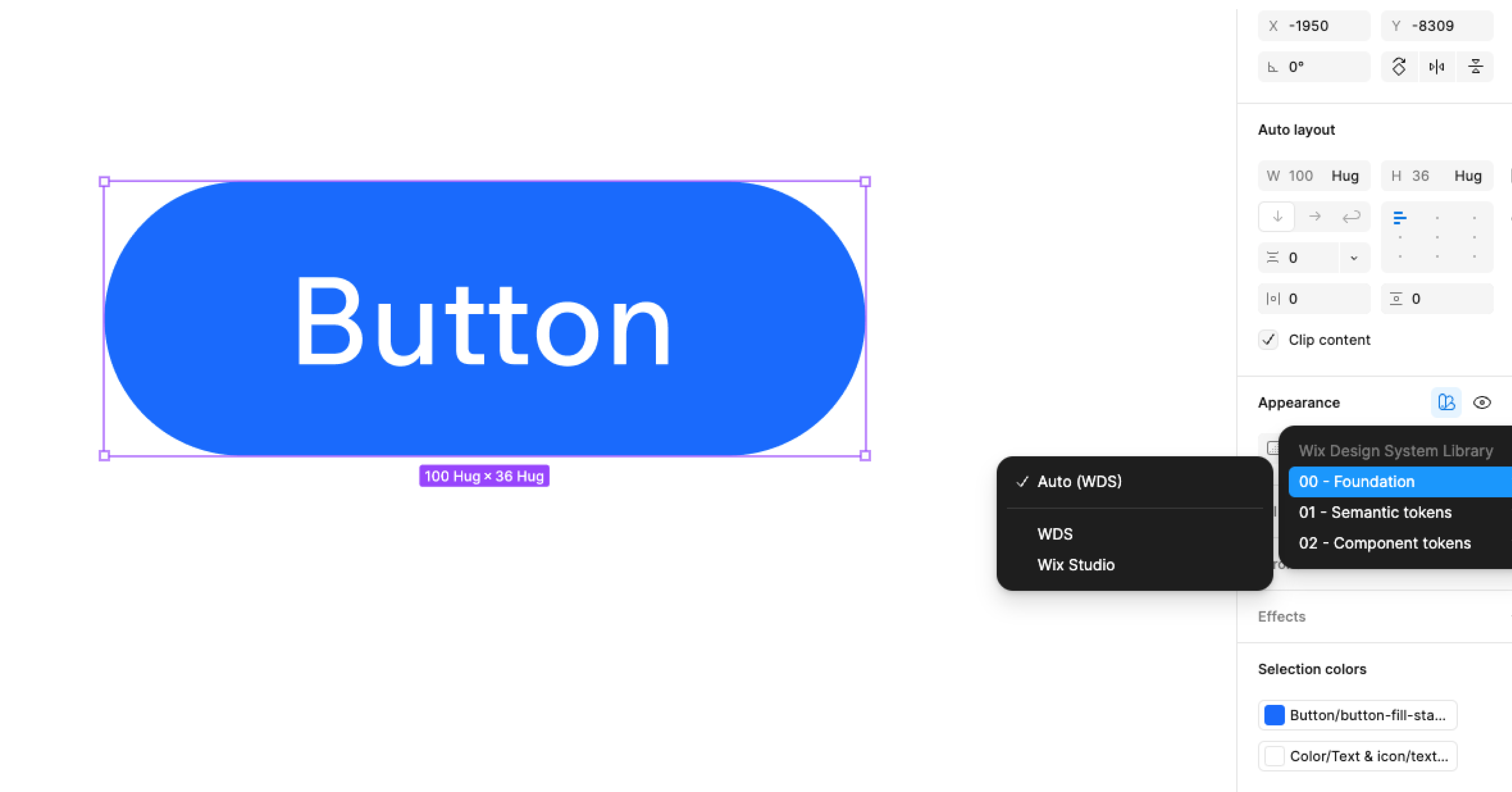
The Wix Design System is the default theme in the main Figma library. All of the components are already styled in this theme, but carry other themes under the hood. Different themes can be applied to a whole page, an artboard or a single component. When you have any components that are tokenised in your page, a "color pallet" icon will appear, that allows you to "apply variable mode" and switch between themes. All three levels (foundation, semantic, component) of tokens need to be selected to apply the theme correctly.
5. Tokens in code
For a more detailed guide on how to apply tokens in the code refer to this theming guide.
For any further questions, reach out to us through #wix-design-system.
Last updated: 15 October 2026