Notifications and States
A UI state is a representation of an app or system status at a given point in time.
Defining clear and helpful UI states lets users understand the current system status and feel in control (see the first of 10 Jakob Nielsen's usability heuristics: visibility of system status.
Principles
A well designed UI state in any Wix product follows two main principles:
1. Contextual
The status is communicated as soon as possible. When possible, a status indication is placed next to the "source" of the issue.
2. Clear
The status messages are straightforward. When there's an issue, they offer a way to solve it.
States
The following guidelines outline the best practices for design loading, success, warning, and error states at Wix:
1. Loading
Users are informed that the system is in the process of loading data or performing tasks. Requires no user action.
2. Success
Users are informed that the system has completed their task as intended. Typically requires no user action.
3. Warning
Users are advised about possible unintended consequences of continuing with their task. Invites but doesn't require to take an action.
4. Error
Users are blocked from continuing their task because of their error, product limitations, or system failure. Requires immediate user action.
1. Loading
Loading state notifies users that the system is currently loading data or performing tasks. It needs to show that the system isn't unresponsive, but instead it is working to complete the requested action.
It's our responsibility to design loading experience intentionally and make the best use of waiting time. Wix users' median internet speed varies from 50 to 192 Mbps.
As a base point, utilize the most fitting loading techniques like prefetching and caching data, pagination, or progressive disclosure to decrease waiting time. The UI should supplement these techniques by keeping users involved and preparing them for what's ahead.
1.1. Loading a page
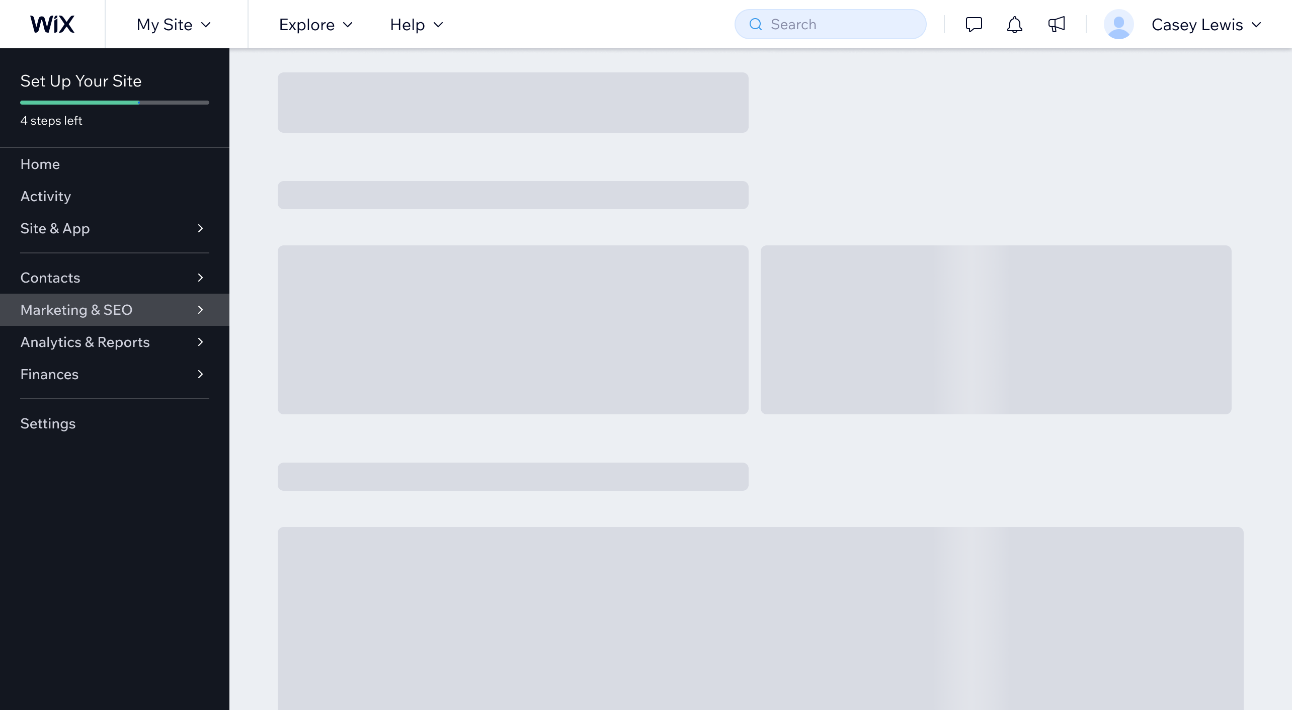
When a page is initially loading, look for ways to keep users engaged. Use animated skeleton shapes to mimic the basic page structure and decrease the perceived waiting time.
Do
Use skeleton shapes to mimic the basic page structure.
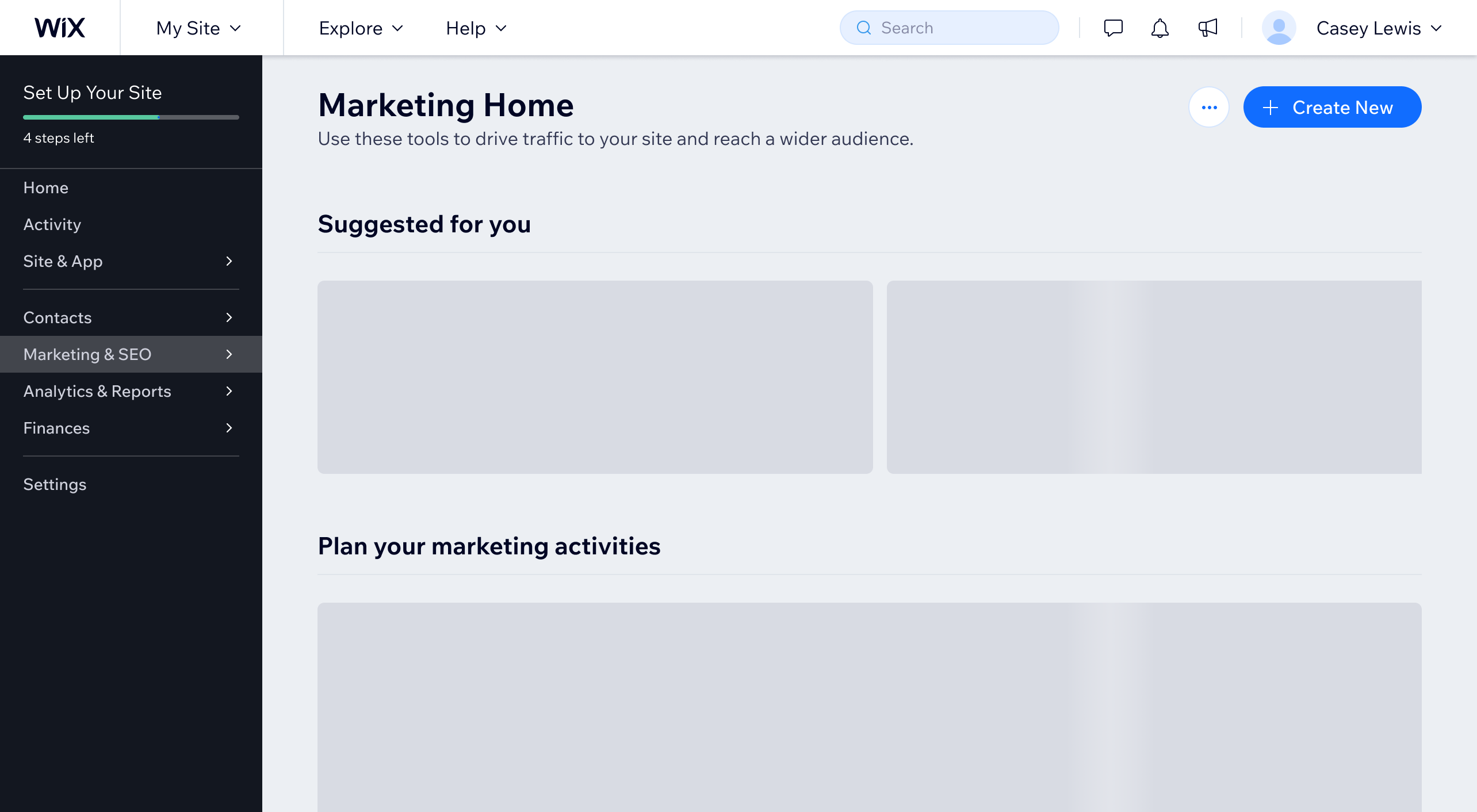
Reveal parts of page content as soon as they're loaded:
- Show page header and section titles first to let users orient themselves on the page.
- Show the main CTA immediately so some users can continue their journey without waiting for the whole page to finish loading.
Do
Reveal parts of the page content as soon as they are loaded.
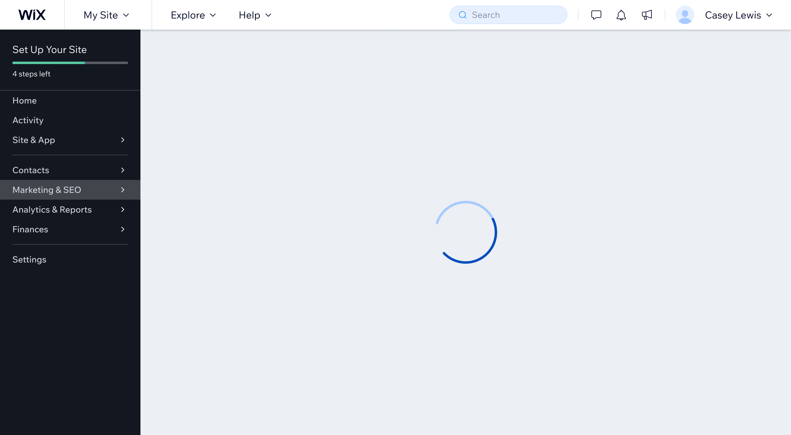
Avoid using spinning loaders with no additional content on the page during the initial page load. This can create an impression of being stuck and fails to provide helpful information to the user.
Don't
Don't show loader animation without additional content on the page.
1.2. Loading data in phases
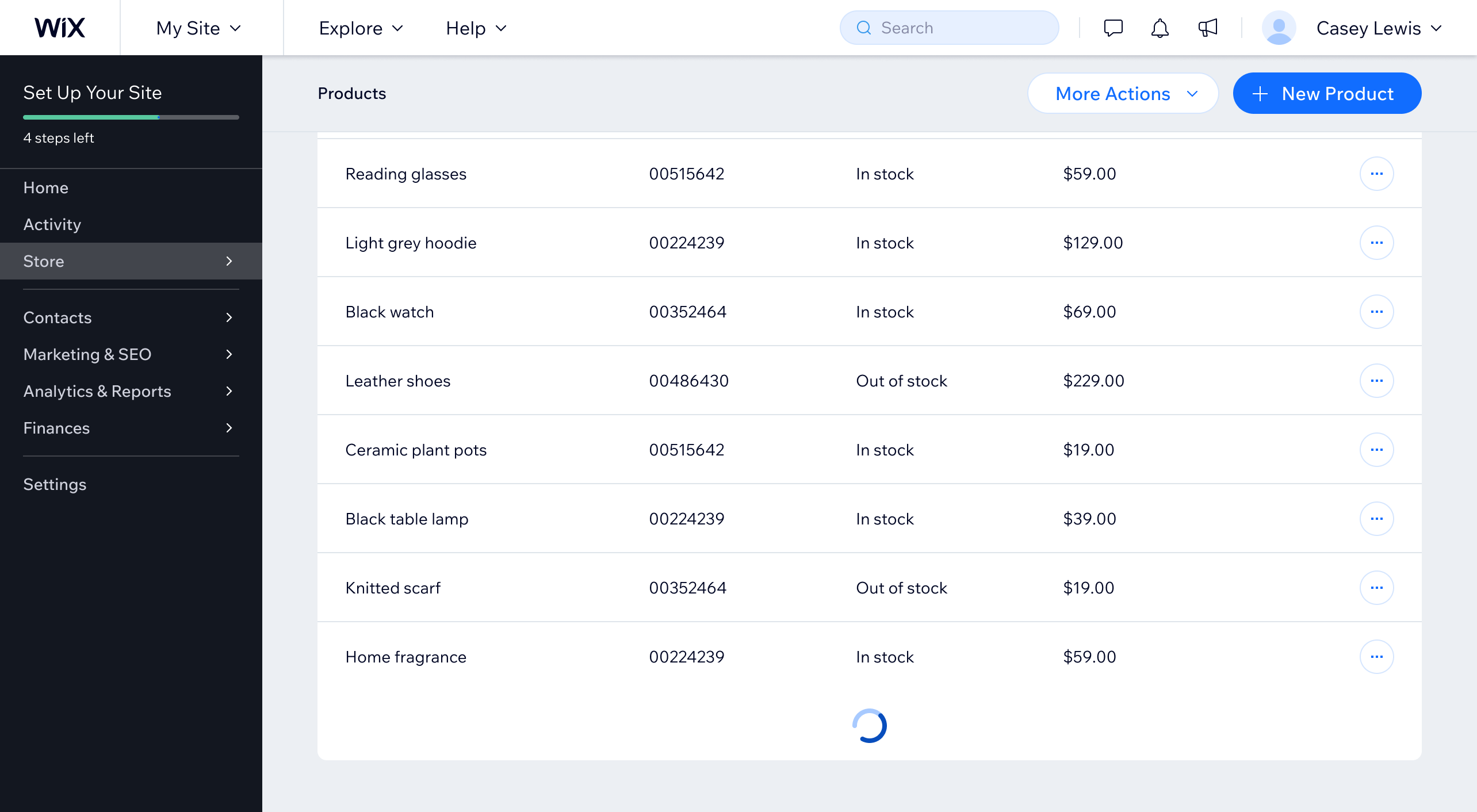
When an app is loading additional data to the page (for example, more items in a table), use a loader animation or skeleton shapes in the area where page content will display.
Do
Show the loader animation in the central area where the page content appears.
Spinning loaders are only effective for processes which take less than a couple of seconds. If it takes a bit longer, add a line of text nearby to indicate what's loading (for example, "Loading more products...").
However, when loading takes more than 10 seconds, reconsider your loading strategy or contact the Wix Design System team to discuss alternatives.
1.3. Loading after submit action
When users' data is being submitted to the system (for example, after a click on a "Save" button), the UI needs to reassure users that their work was received and is being processed.
When designing such loading states, consider what's the expected duration of loading:
- Short: 1 to 2 seconds
- Medium: 2 to 10 seconds
- Long: 10 seconds and more
When expected loading time is short, show the loader animation inside the submit button and disable its click actions. The button illustrates that the app is working and shows its status in context.

Do
When loading time is short (1 to 2 seconds), show a loader animation inside the submit button.
Disabling page or modal actions during loading is an anti-pattern. It's not descriptive enough, it shifts the focus to the start of the page for keyboard users, and the button "disappears" for those using a screen reader.

Don't
Don't disable the page or modal actions during loading.
When the expected loading time is longer (2 to 10 seconds), illustrate that the system is busy by placing a loader animation with short text description inside a full page overlay. It doesn't allow users to make changes on top of what's being saved, since it might be lost after the load is complete.
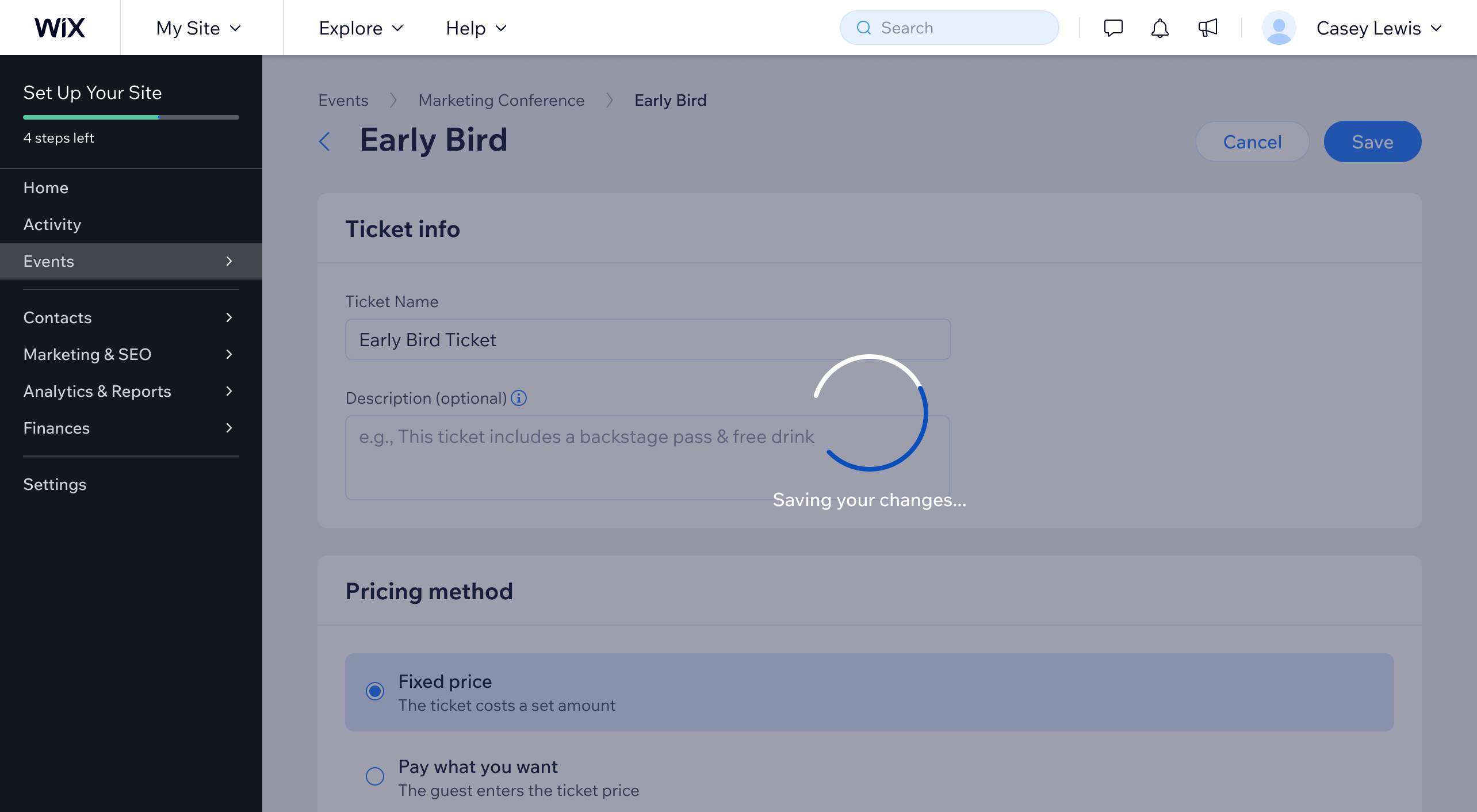
Do
When loading time is longer (2 to 10 seconds), show a loader animation inside a page overlay.
For lengthy loading (10 seconds and more), show real progress when possible. Use percent or other units in a progress bar.
Tell users what the system is working on and continuously update the loading message, like "Saving your ad campaign..." or "Launching the first ad...".
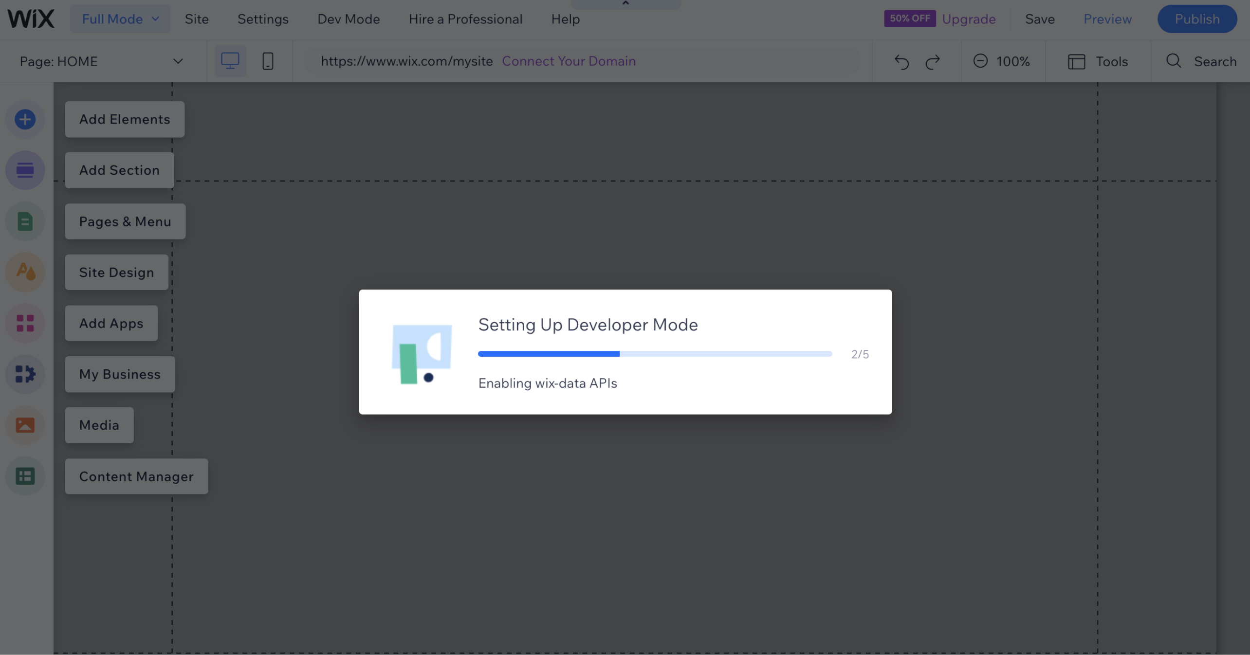
Do
For long loading, show real progress when possible.
1.4. Loading background tasks
Background tasks don't block users from continuing their journey in the app, such as uploading files or syncing data.
Keeping users informed about the progress of a background task and managing their expectations is essential. Progress indicators also need to block as little surface as possible, allowing users to continue their work.
Depending on your product needs, consider adding other useful features. For example, you may want to inform users what happens if an app is closed, or add a collapse/expand loading widget.
See how the Wix Media Manager created a new UI widget that keeps users informed about the progress of uploading items.
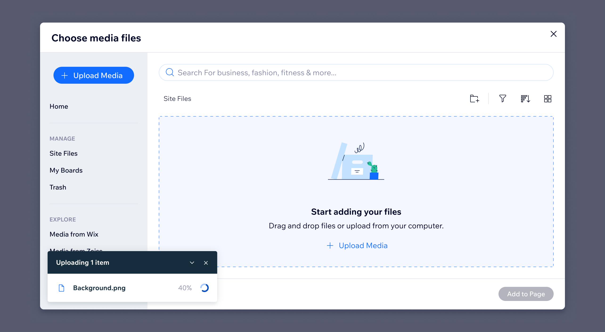
Do
For background tasks, keep users informed about the progress and block as little surface as possible.
2. Success
When an app or system is in a success state, it confirms that the user's task has been completed as intended. For example, after clicking on a "Save" button, show that "Changes were saved."
Confirming success creates a smooth experience for the users. It "serves to reassure" that their tasks were handled and builds their trust.
2.1. Success after submit actions
When users need to click on a submit action to process their data (for example, "Save" in Business manager pages or modals), show a status toast immediately after the task is done.
Use the status toast in "success" state and allow users to close it. Because success communication isn't critical to the user's flow, use notification timeout and set it to 7 seconds.
Success status toast is only one part of the UI that shows users that their progress is saved. Users are also looking for updates in the page content, such as viewing newly uploaded items or a change in a switch that was toggled on.
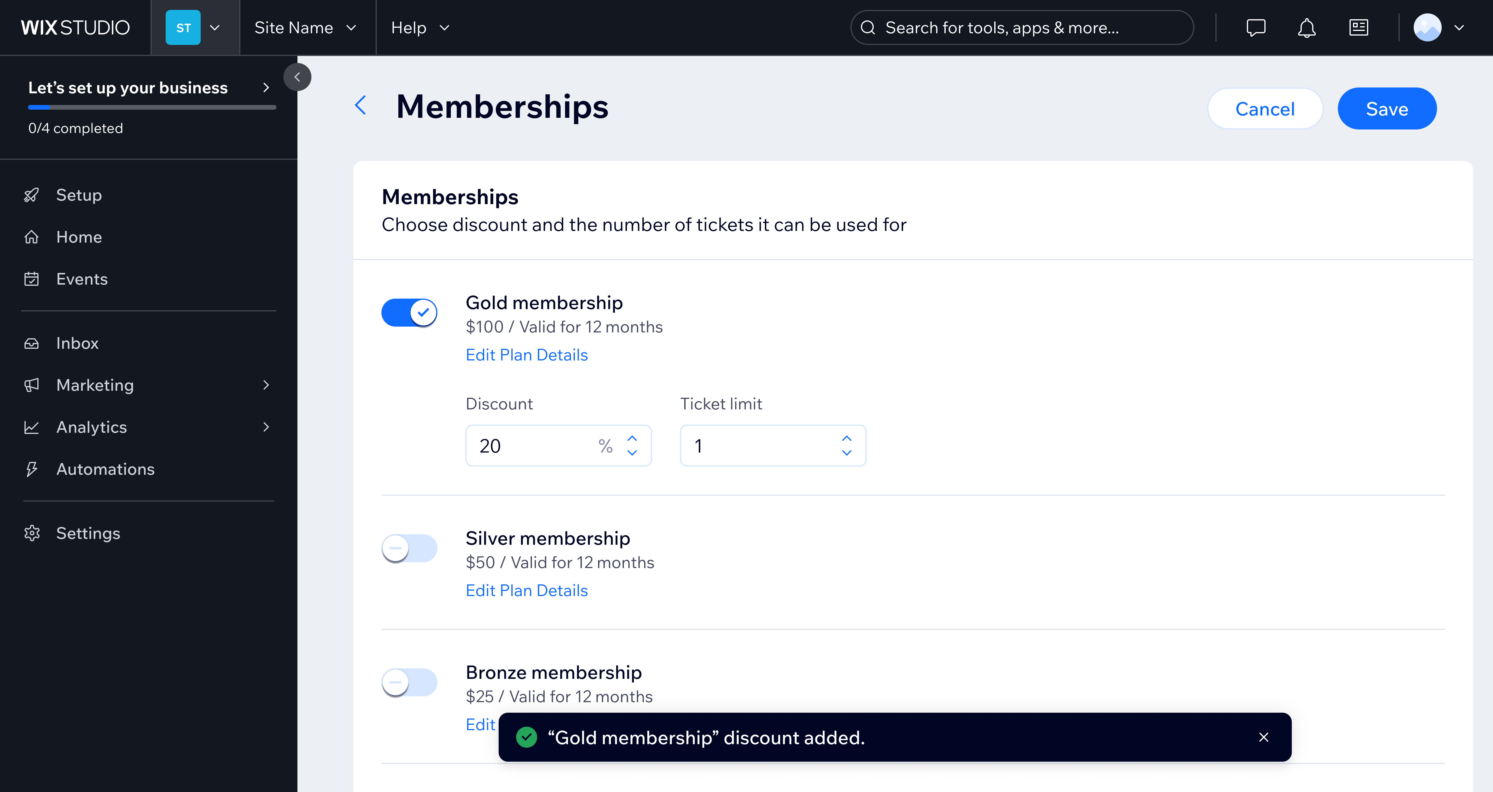
Do
When users submit their data, show a toast immediately after it is successfully processed.
Don't disable or hide submit actions until users have made changes in the page or modal.
Notes about disabled CTAs:
- They can create additional cognitive load for users who wonder how they can enable the action.
- They can be difficult to read, since they don't have sufficient contrast.
- They are often skipped by screen reader users.
Instead, allow users to submit their progress at their own pace, even when they haven't changed anything. Show success or error feedback immediately. Learn more in Disabled elements in the Business manager.
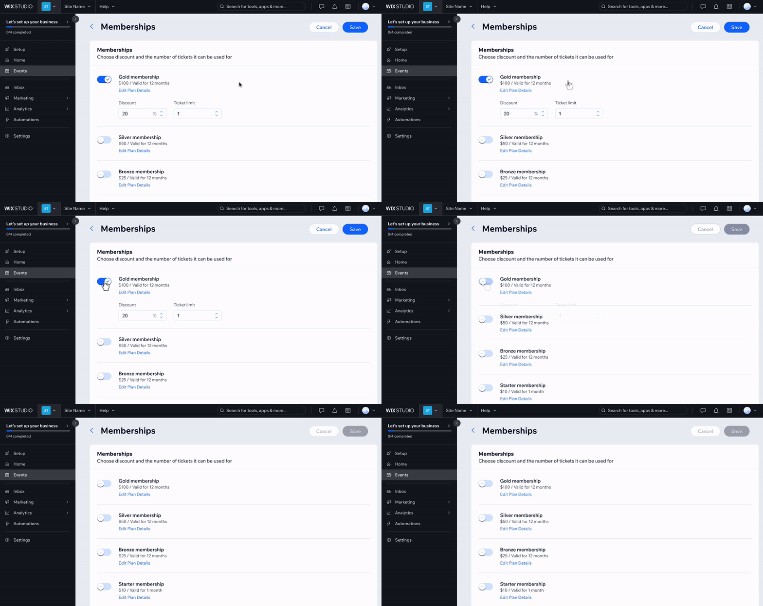
Don't
Don't disable or hide submit actions until users have made changes in the page.
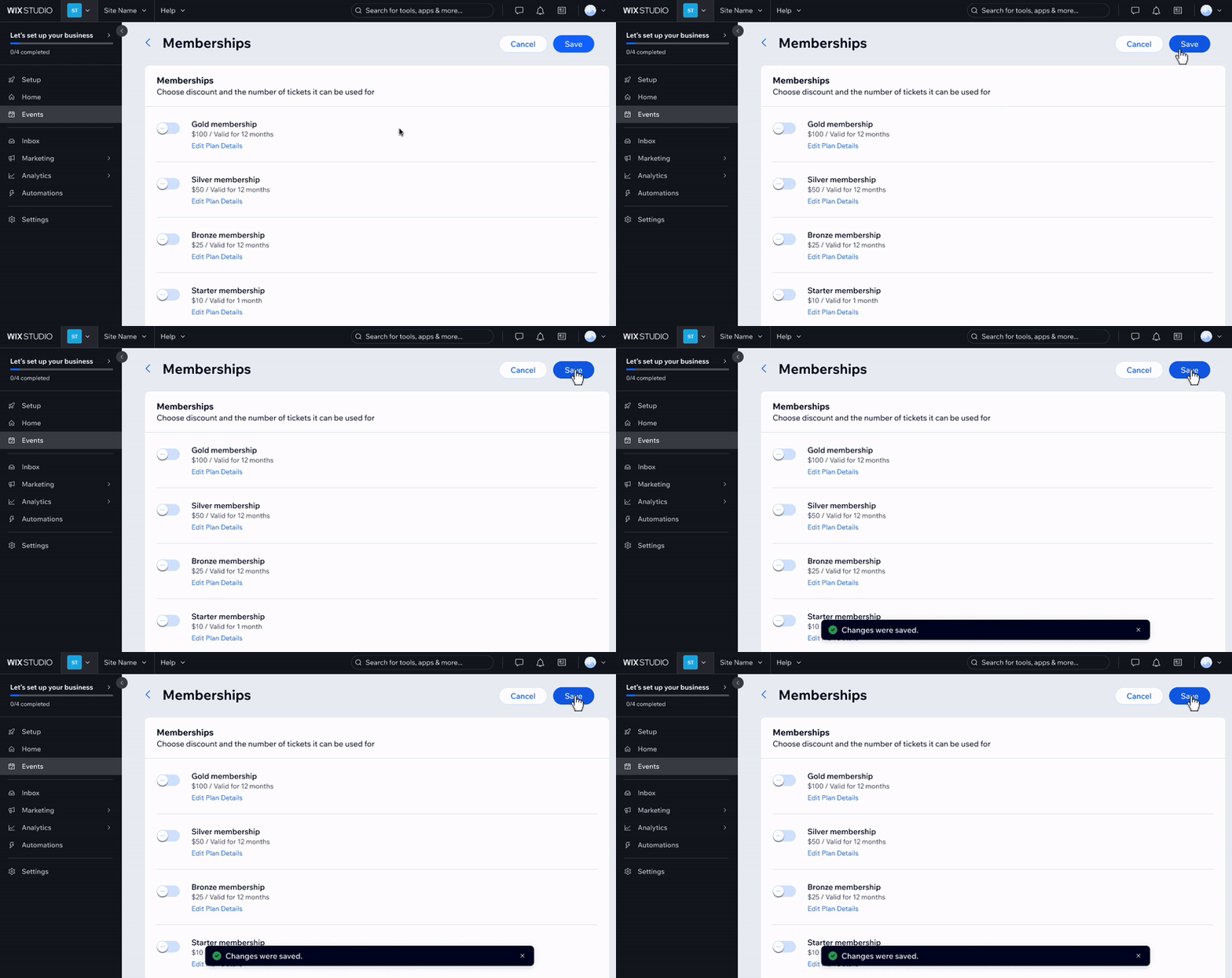
Do
Allow users to submit their data with no changes and show feedback immediately.
Success messages should be short, clear, and specific. For example, "Contact was added" instead of "A new contact was successfully created on your site."
In the notification, add a button only if it's directly related to the completed task, like "Undo."
Don't add any buttons that promote other features or serve as gateways to other flows, for example, "Manage Settings" or "Go to Editor." Because success notifications disappear quickly, these buttons aren't discoverable. Data from Wix shows that one such button was clicked 79 times out of 9 thousand cases (that's a 0.8% click-through rate).
Instead, promote related features using section helpers or floating helpers inside the main page layout. They won't disappear after a timeout, ensuring better exposure and giving users the ability to dismiss them on their own time.
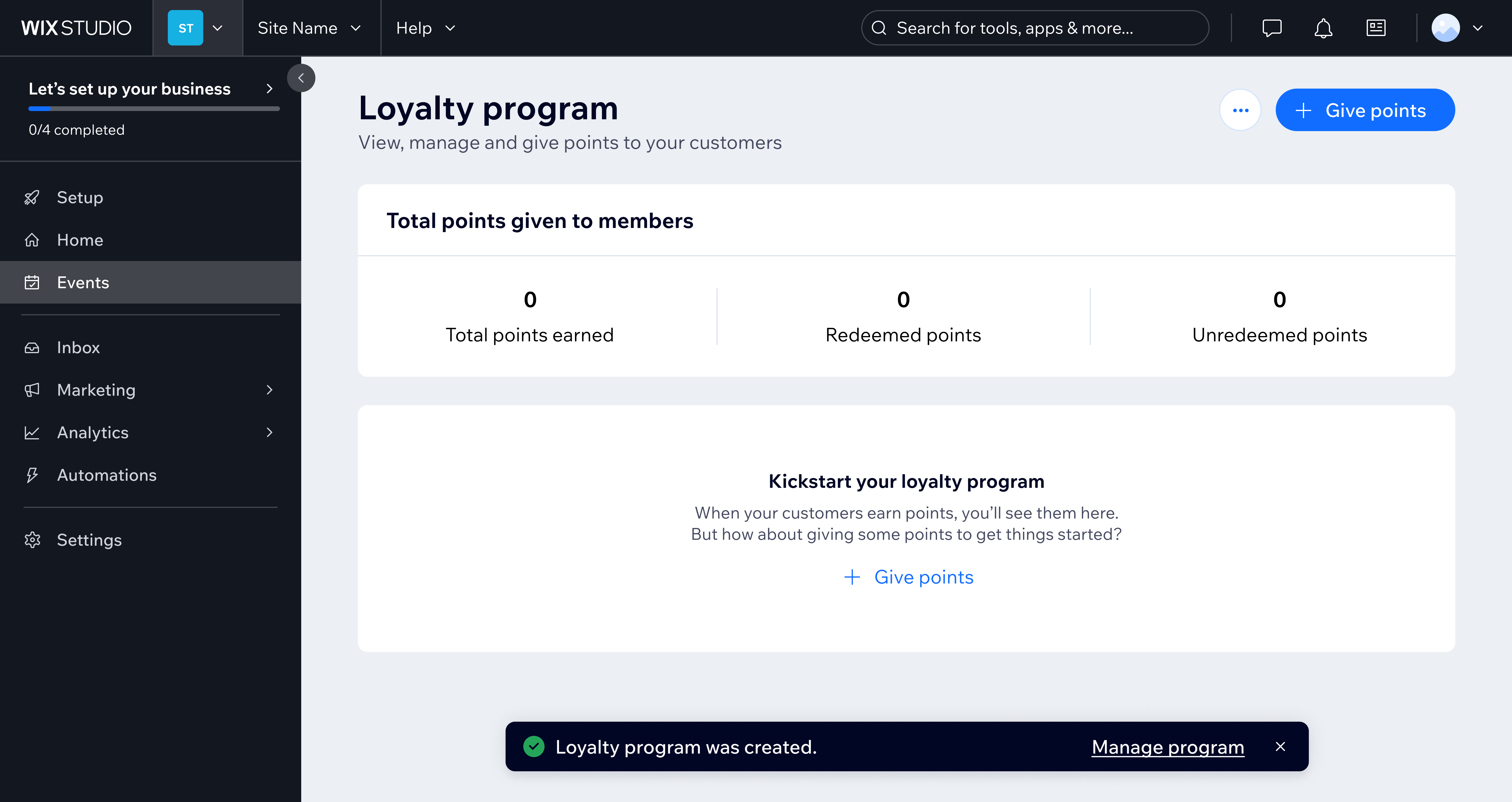
Don't
Don't add buttons that promote further actions inside a success notification.
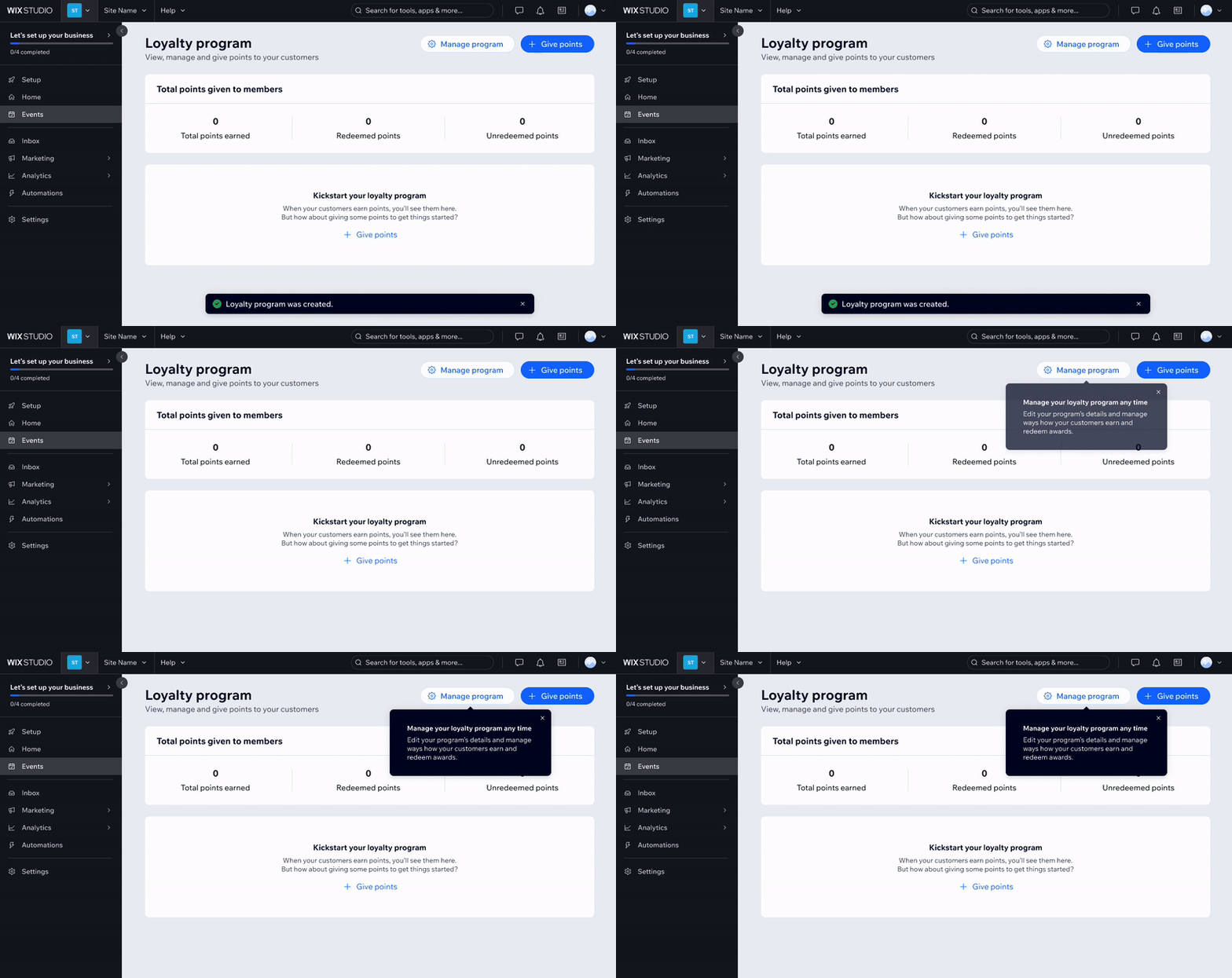
Do
Promote further actions using banners or floating helpers inside the main page layout.
2.2. Success after autosave
When a page doesn't have a submit action and autosaves changes, display a success notification after the first change has been processed. Such a success message informs users that all their changes are being saved.
Be sure to display the notification one time and not for subsequent or similar actions.
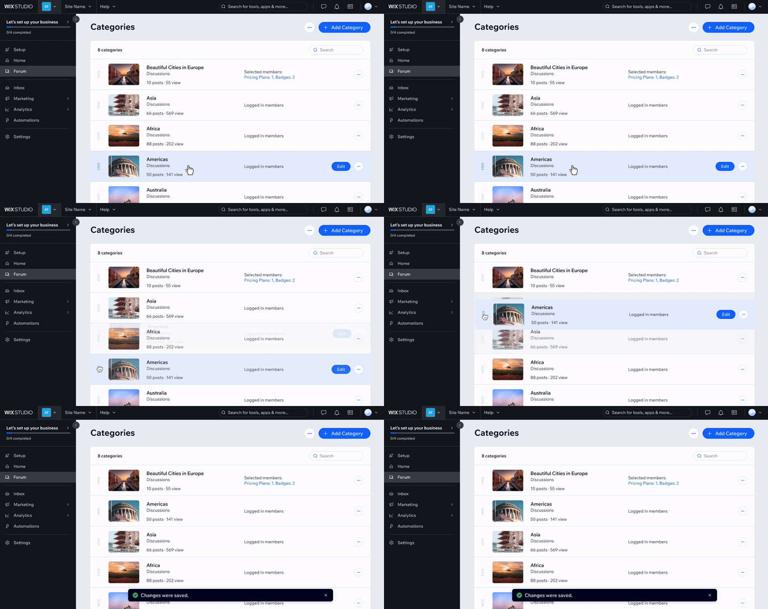
Do
In pages with autosave, show a success notification once and immediately after the first change is saved.
When changes affect the user's live site, autosaving them inside the Business manager is highly discouraged. Process their changes after a submit action like "Save" instead.
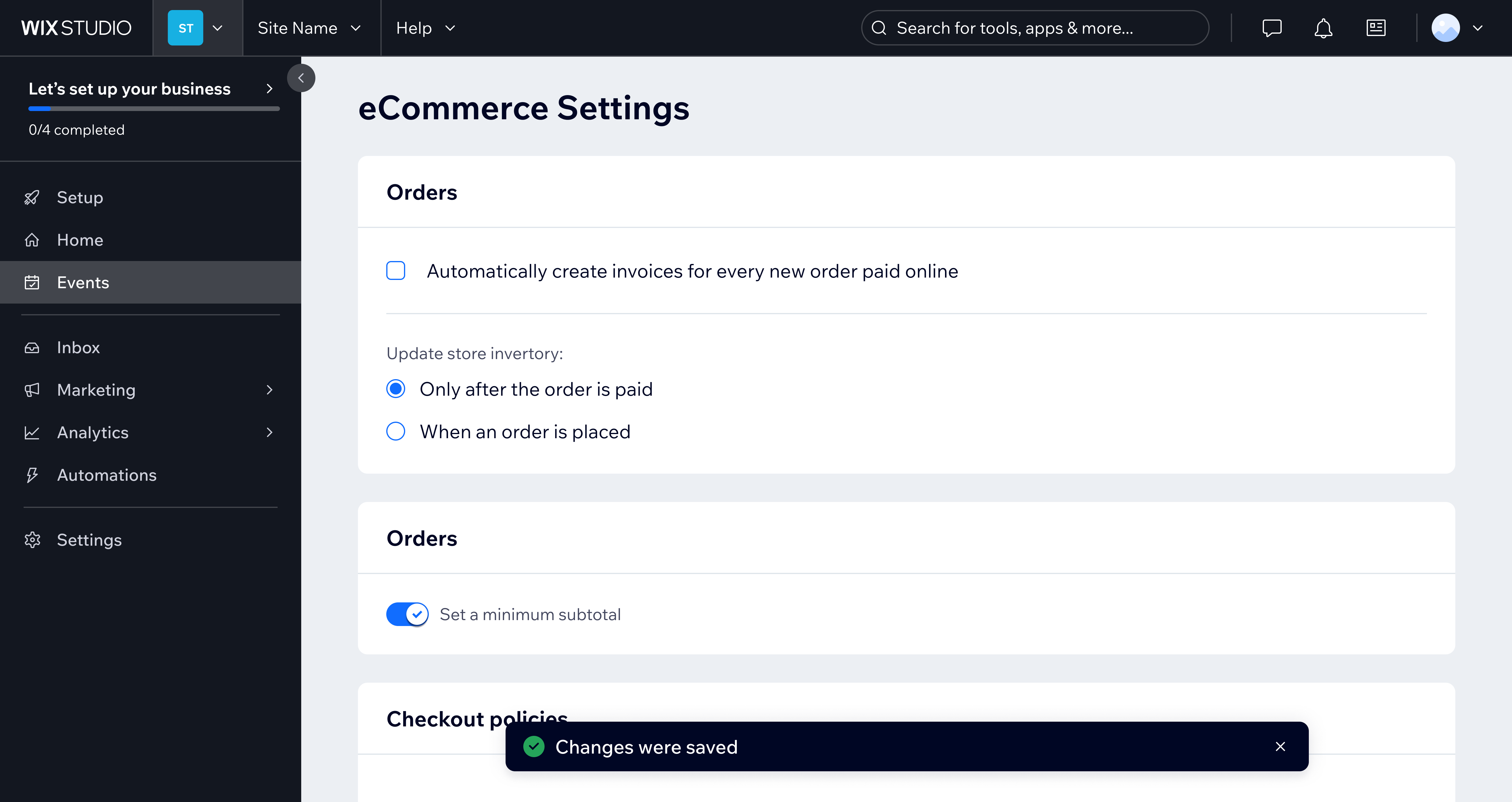
Don't
Don't autosave user changes when the actions affect their live site.
Inside modals, use a success toast as well. It always overlays other items and sits 26px from the bottom of the screen, keeping the consistency with other locations where status toast is shown. It will timeout after 7 seconds, but users should still be able to close it.
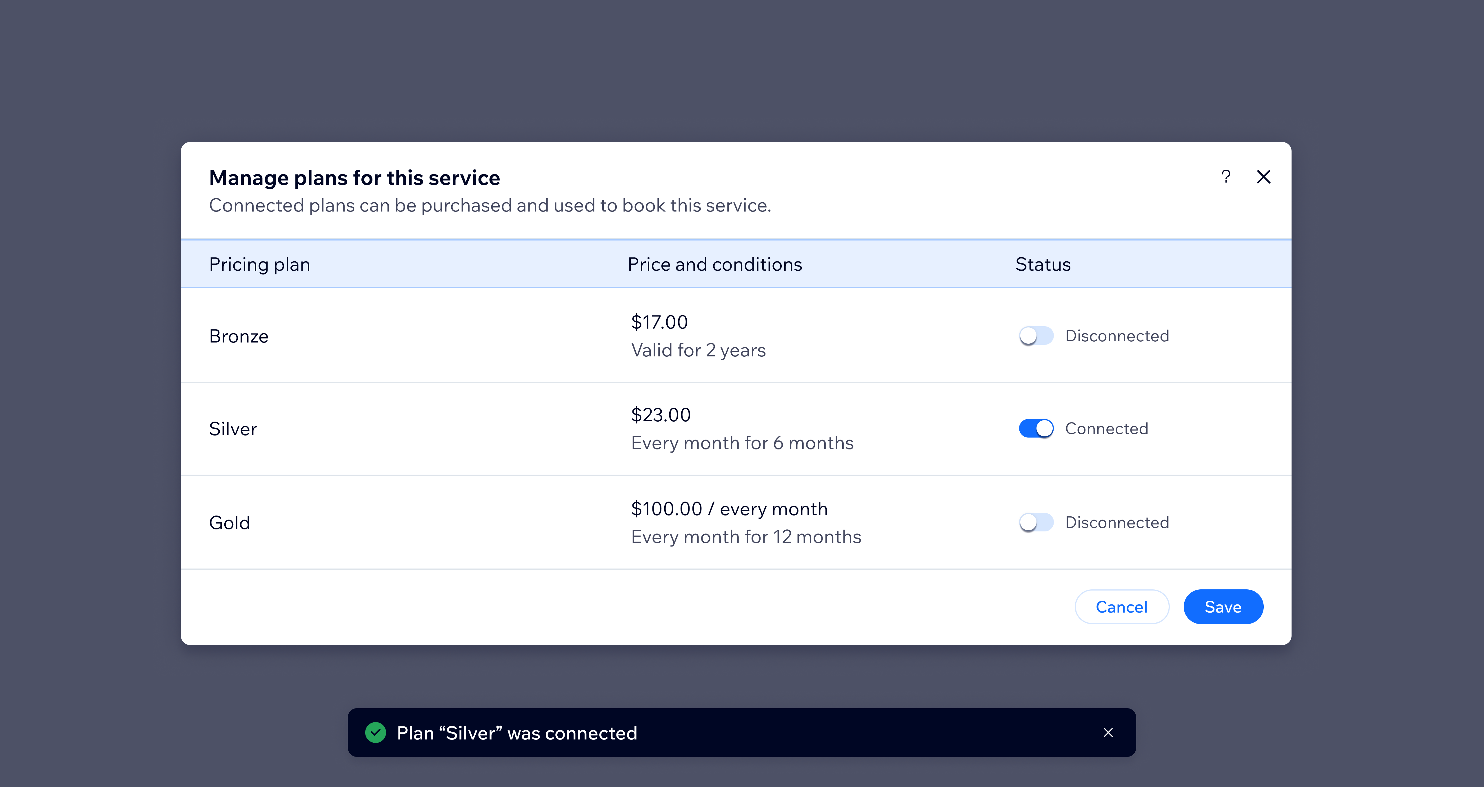
Do
Inside modals, display success messages using a status toast component.
However, autosave in long tasks, such as creating a logo or writing a blog post, shouldn't "get a huge party" each time changes are autosaved. Instead, show save status in the main page layout at all times.
In Wix composers, for example, there's a dedicated space for the save status in the composer header component.

Do
For long tasks with autosave, always display the save status in the main page layout.
2.3. Success in background tasks
When an app or system performs tasks in the background, expect some users to continue their work in other flows or pages. That's why it's important to keep showing success messages in the UI until users close them.
Wix Media Manager informs users that files were uploaded, even after closing the app. The status indicator inside the upload widget shows a successful upload until users close it.
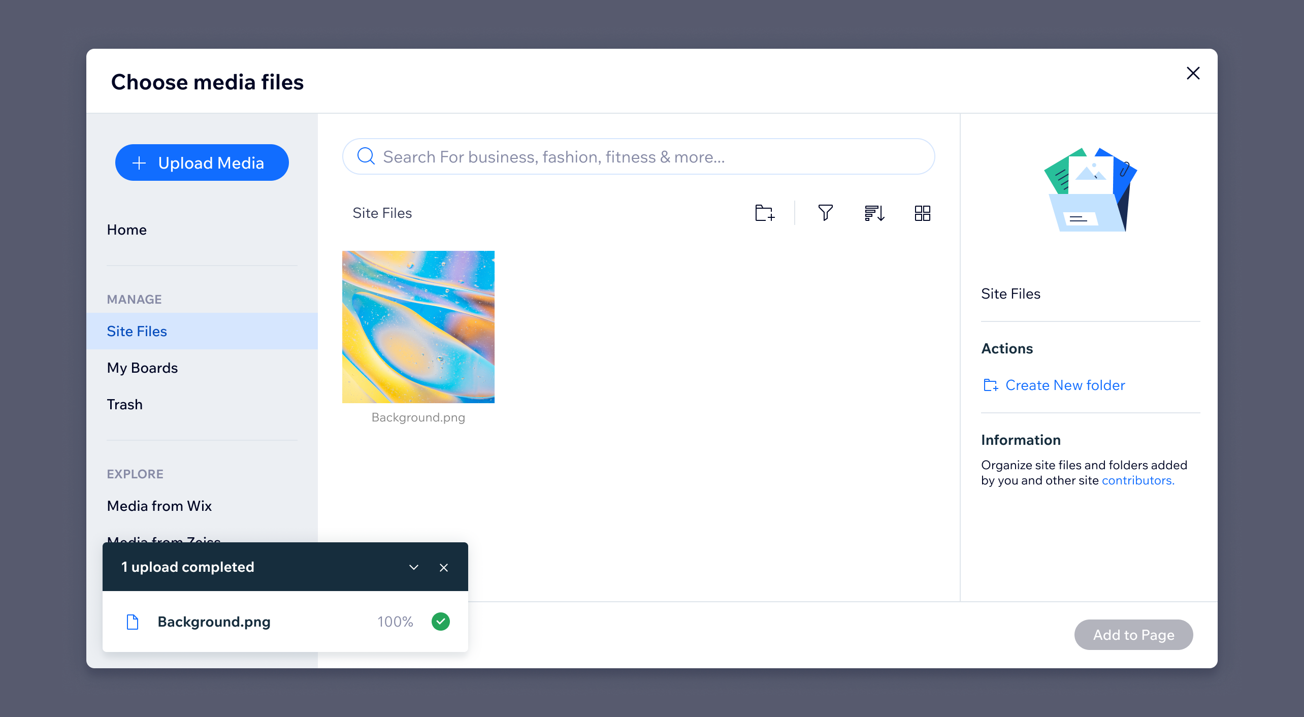
Do
For background tasks, leave success messages in the UI until users close them.
If the background task is especially lengthy, such as connecting a new domain which may take up to a day, consider using different notification channels. For example, send an email once the task is done or place a green success banner in the main page layout.
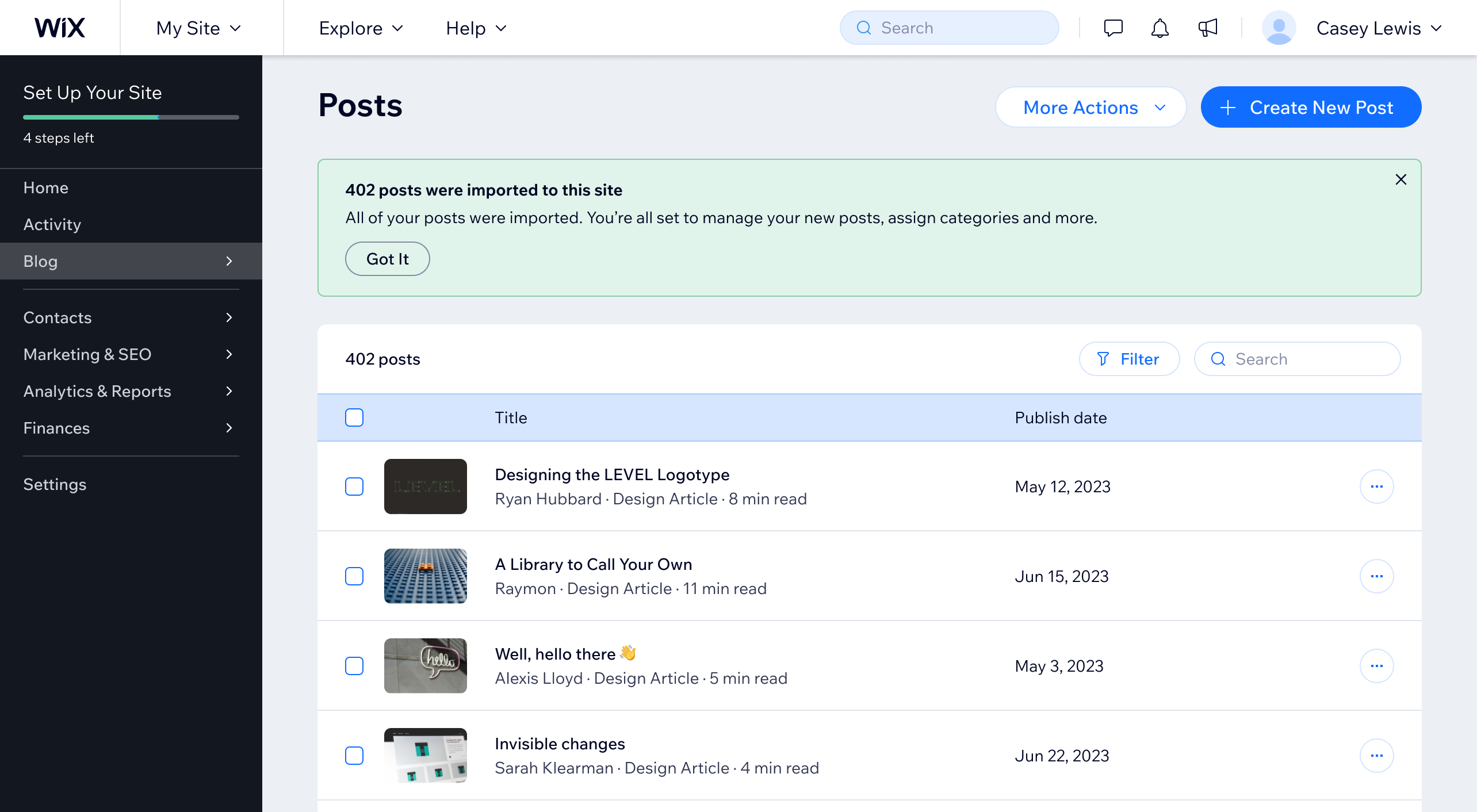
Do
For lengthy background tasks, use success banners.
3. Warning
A warning is a message that alerts users about a potential problem or unexpected results of their action, such as possible loss of data, upcoming expirations, or pending requests. It helps users avoid future interruptions and unintended consequences.
Warnings are different from error messages because they appear before a potential issue takes place. When users are unable to proceed without fixing the issue first, a warning becomes an error.
3.1. Application warning
An application level warning is a message that applies to the whole app or page. For example, it warns users of payment issues due to disconnected payment methods, meanwhile users can still continue to manage their settings.
Because such issues usually occur or start in the background, they need to be visible immediately after users arrive at the app. To give an app level warning, place a yellow section helper right below the page header.
Include an action that assists users in resolving their issues and allow them to close the helper. If the warning is still relevant when the page is reloaded, show it again.
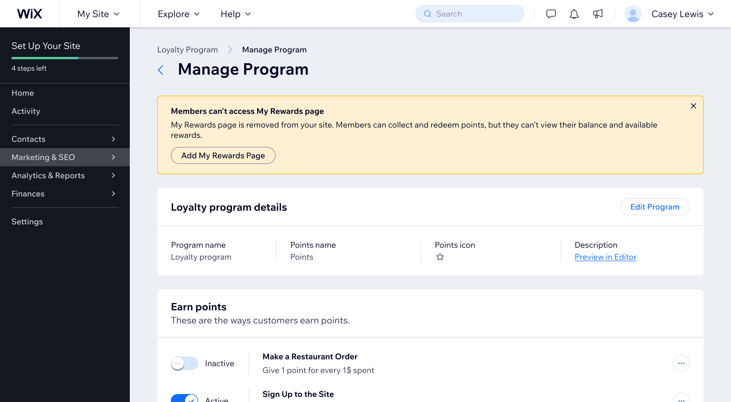
Do
Place an app level warning below the page header.
Don't use status toast to inform users about issues that have occurred or started prior to their arrival on the page. Instead, reserve notifications only for immediate feedback on recent user or system actions.
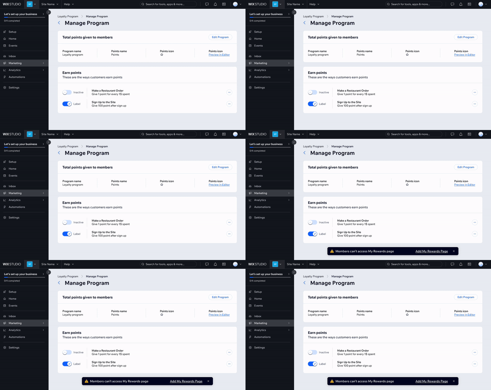
Don't
Don't use status toast for app level warnings.
3.2. Section warning
Some warnings only apply to specific sections of a page or an app, for example, a single card.
Aim to place such a warning first in the section that it applies to. Add a section helper in "warning" skin right below the page section heading, card header, or modal header.
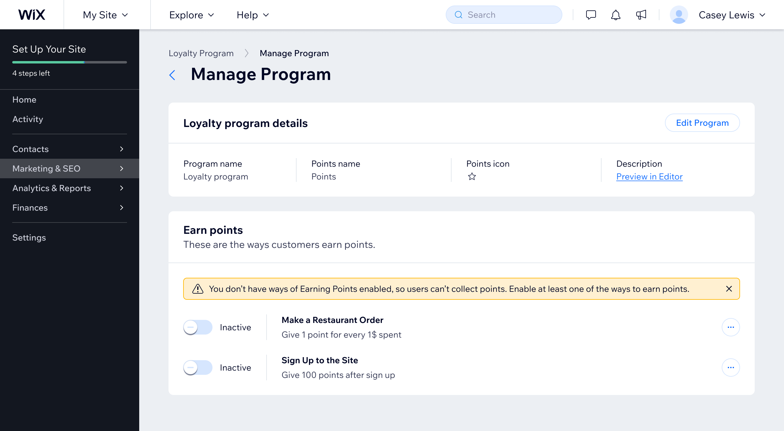
Do
Place section warnings first in the related section.
3.3. Inline warning
Warnings can also stem from individual data values in form inputs and controls, such as a number input or a date picker. In these cases, the data that users provide is valid, but they need to be aware of possible unexpected consequences.
Keep the warning close to its source by adding an inline warning message below the input or control. Reveal the inline warning message as soon as possible.
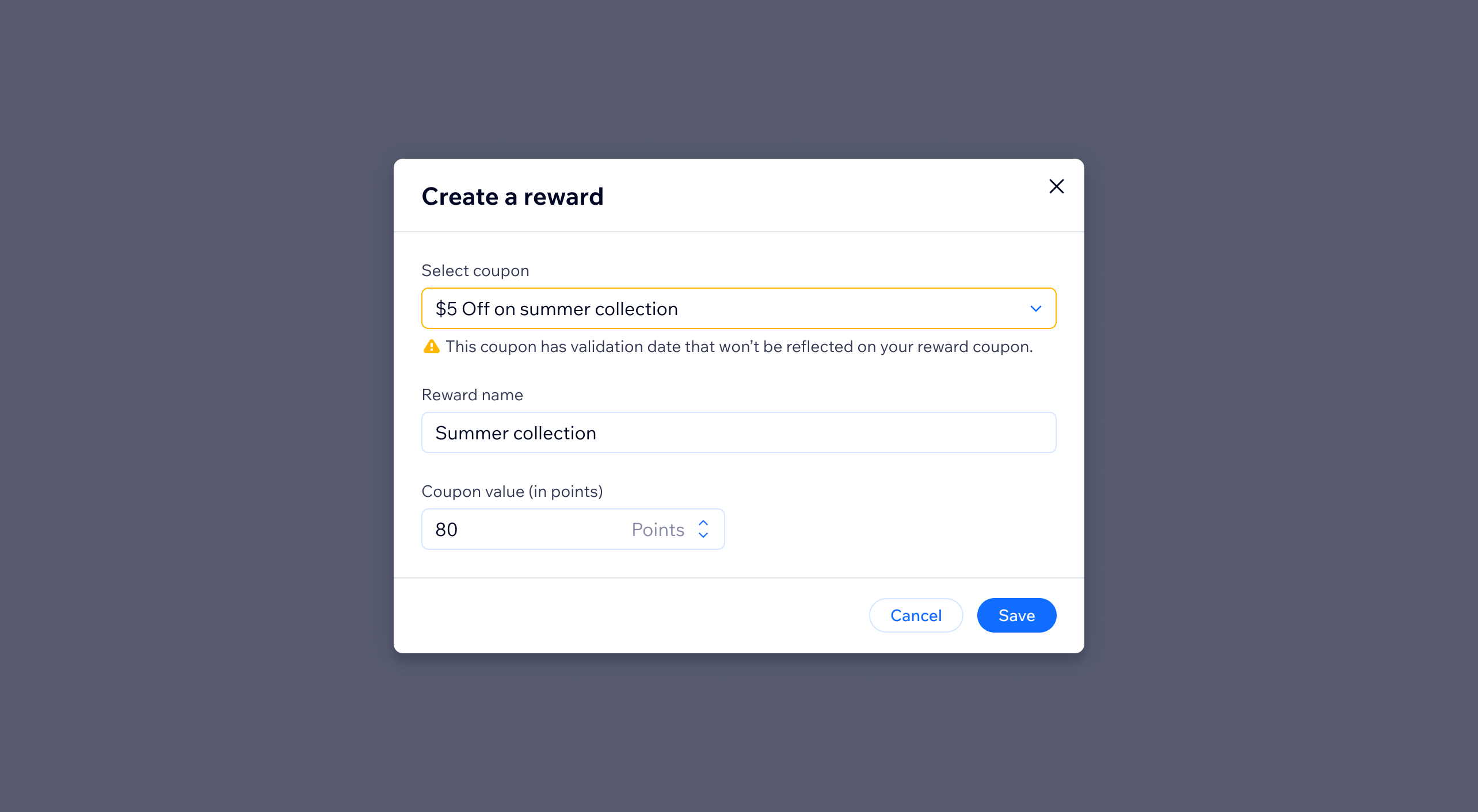
Do
Add an inline warning message below the input or control.
4. Error
An error state happens when users can't continue their work or their task hasn't been completed or saved. Errors usually occur because of technical issues, app limits, or invalid data entries.
Designing error states requires extra effort, because the interface not only needs to clearly communicate the problem, but also offer actionable steps to correct it. It needs to answer user questions, such as:
- "What went wrong?"
- "What happened?"
- and, most importantly, "How can I fix it?"
4.1. Prevent errors by design
As stated in Jakob Nielsen's usability heuristic #5 Error prevention, "Good error messages are important, but the best designs carefully prevent problems from occurring in the first place."
Employ any of the time-tested techniques to prevent user slips and mistakes:
1. Constraints
Apply helpful constraints, for example, don't allow users to schedule their blog post publication on a day in the past.
2. Input size
Match field size to the length of the expected input, for example, make number inputs much shorter than text inputs.
3. Default values
When possible, pre-populate inputs and selections with reasonable default values.
4. Labels
Include descriptive labels and only include helpful placeholders.
5. Required vs. optional
Indicate all required fields with the asterisk symbol.
6. Hint text
Give useful details about inputs or selections using hint text below the field. For example, show the expected date format ("mm-dd-yyyy") below a date picker.
7. Previews
Offer real-time previews of user-work when possible, for example, show users how their pricing plan will look on their site as they create it in the Dashboard.
8. Double check
Ask users to confirm before destructive and irreversible actions, such as deleting data.
9. Undo
Give a chance to "Undo" the most recent action inside its success notification.
10. Iteration
Test and iterate the product to identify and fix the sources of common user errors.
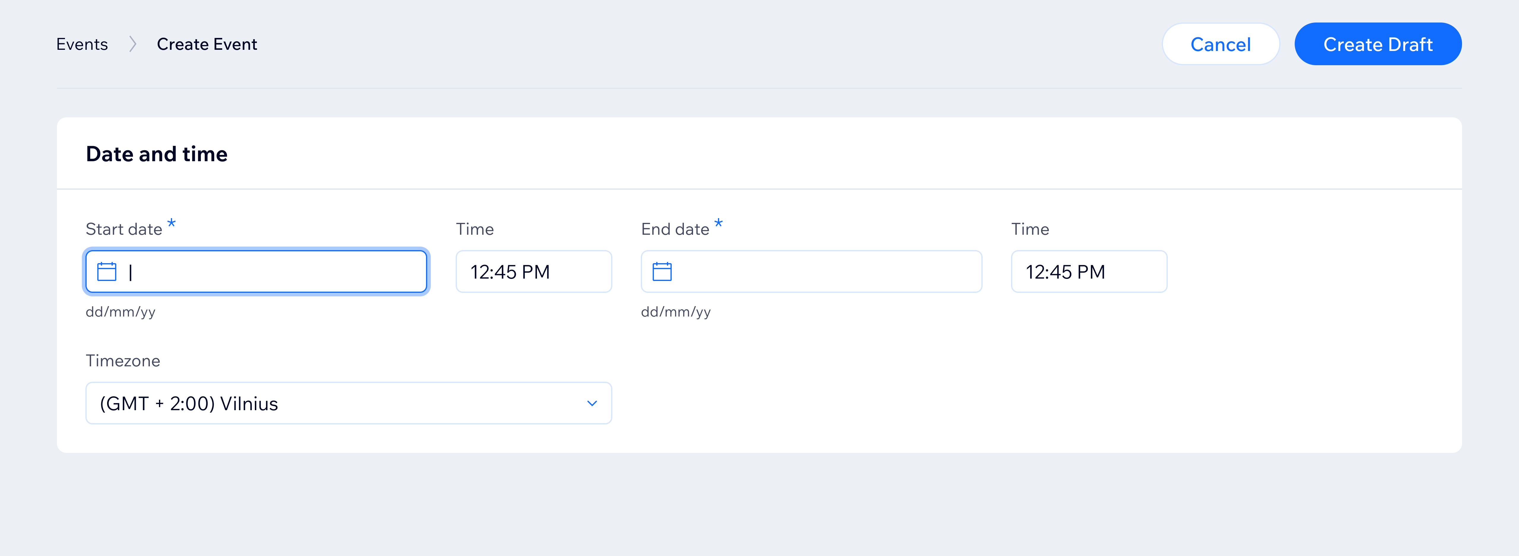
Do
Give useful details about inputs or selections using hint text below the field.
Don't disable submit actions, such as "Save" or "Continue," before required fields are completed as a way to prevent errors.
Disabled actions have a number of shortcomings related to their ambiguity and low accessibility:
- They don't explain what is wrong and create added cognitive load for the users.
- They don't have sufficient contrast and are hard to read.
- They are often skipped by screen readers.
Instead, keep submit actions enabled and allow users to save their progress at their own pace. Show error or success feedback immediately to "communicate to the user what's actually wrong."
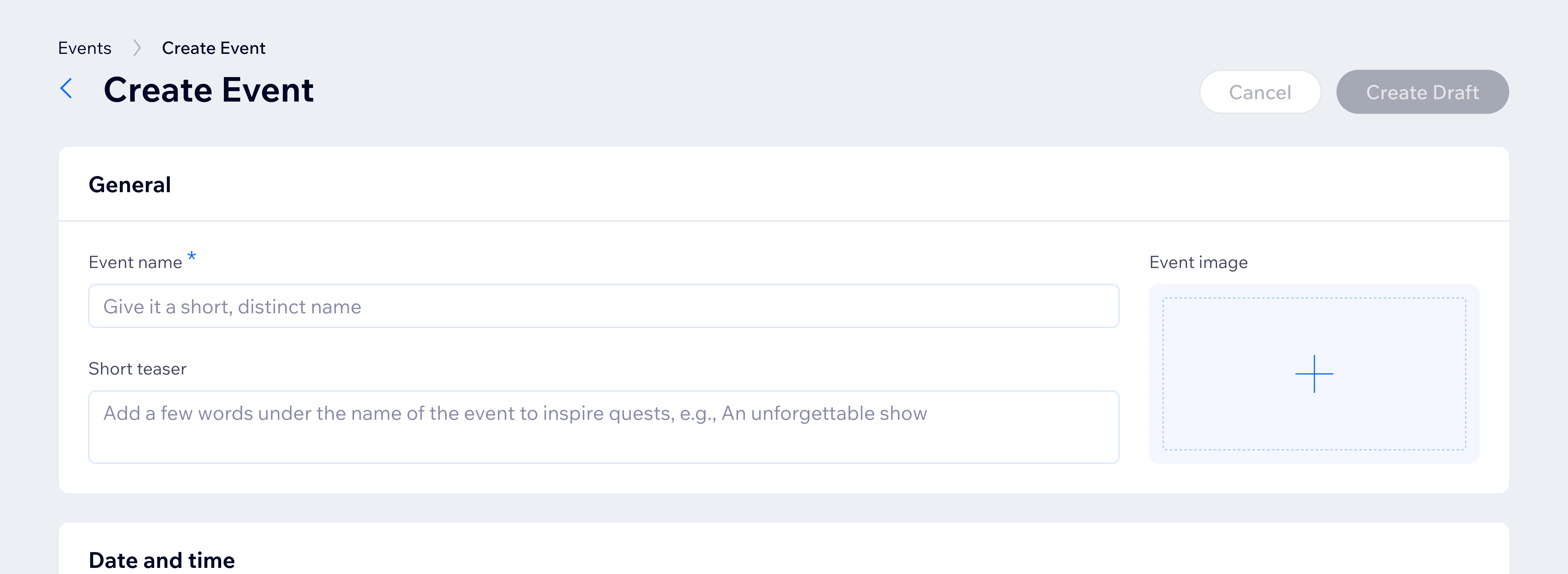
Don't
Don't disable submit actions as a way to prevent errors.
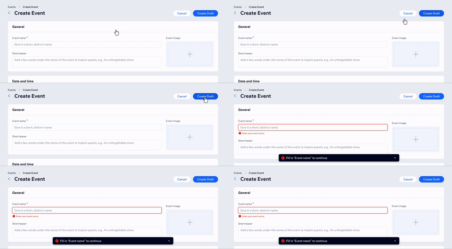
Do
Allow users to save their progress at their own pace. Show error or success feedback immediately.
4.2. Validation errors
Validation errors happen when users input information that doesn't meet the expected format or criteria. For example, when a required field is left blank.
Notify users of validation errors immediately:
- Either when users click away from the field ("on blur"),
- or after they submit data to the server.
Community resources offer varied recommendations for both methods. Here are some general guidelines:
- Validate "on blur" in fields with high error rates or specific formatting requirements, such as a credit card number, time, or date inputs.
- Avoid validating "on blur" excessively in long forms, as it may distract users from completing the form.
- Validate required empty fields on submit only.
Test and iterate to find what works best for your product.
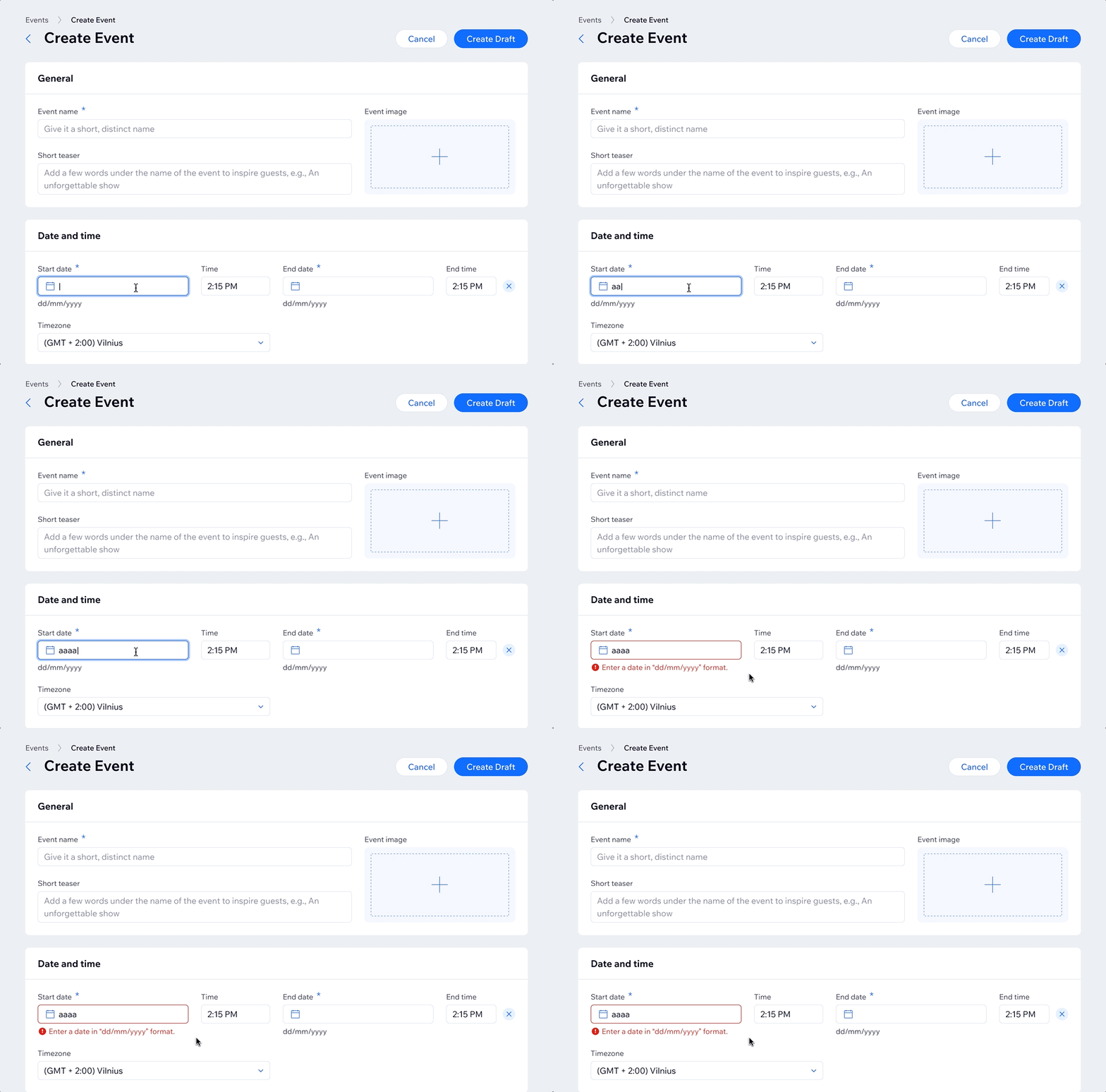
Do
For fields with high error rates or specific formatting requirements, validate "on blur."
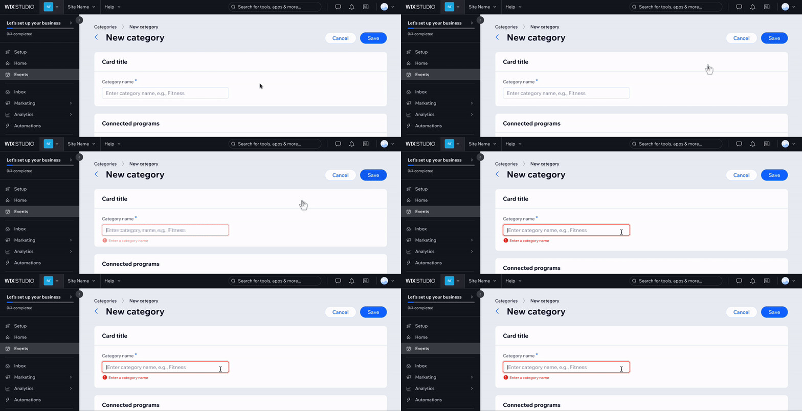
Do
Validate required empty fields only after data is submitted.
Based on the Wix Design System usability test, users primarily pay attention to error messages that are placed next to the source of the issue. For example, if a required text input is left empty, the first thing that catches their attention is the red input border and the inline error message.
When validating form fields, change their status and place the status message below them as the primary means of error communication.
Give additional feedback with an error status toast that persists until all issues are resolved.
When a page has a single validation error:
- Show an error message below the field,
- anchor (fast-scroll) and set the focus to the field after the page loads,
- and summarize the problem in the status toast ("Fix the issue to continue").
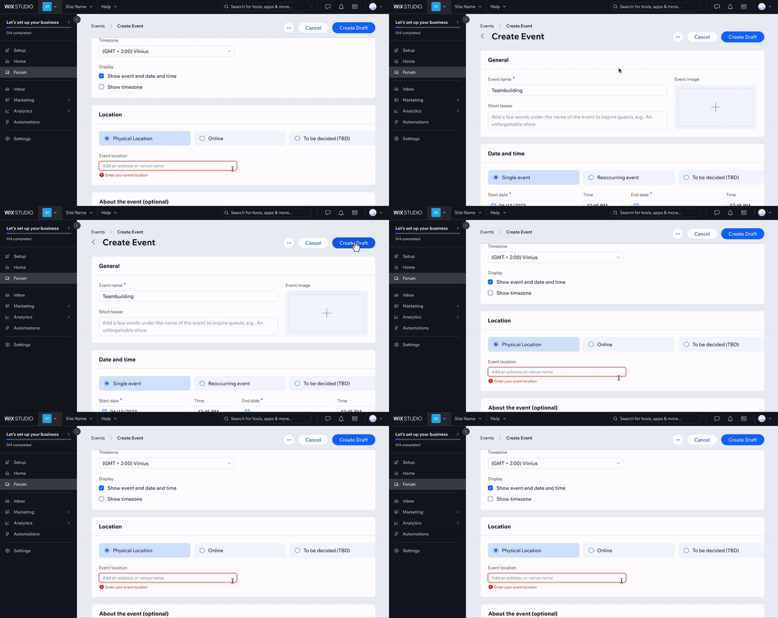
Do
For a single validation error, display a status message below the field, set focus to the field, and summarize the problem in the notification.
When a page has multiple validation errors:
- Show error messages below each field,
- anchor (fast-scroll) and set the focus to the first error or warning field after the page loads,
- and summarize the problem in the error toast. For example, "Fix what's needed to continue."
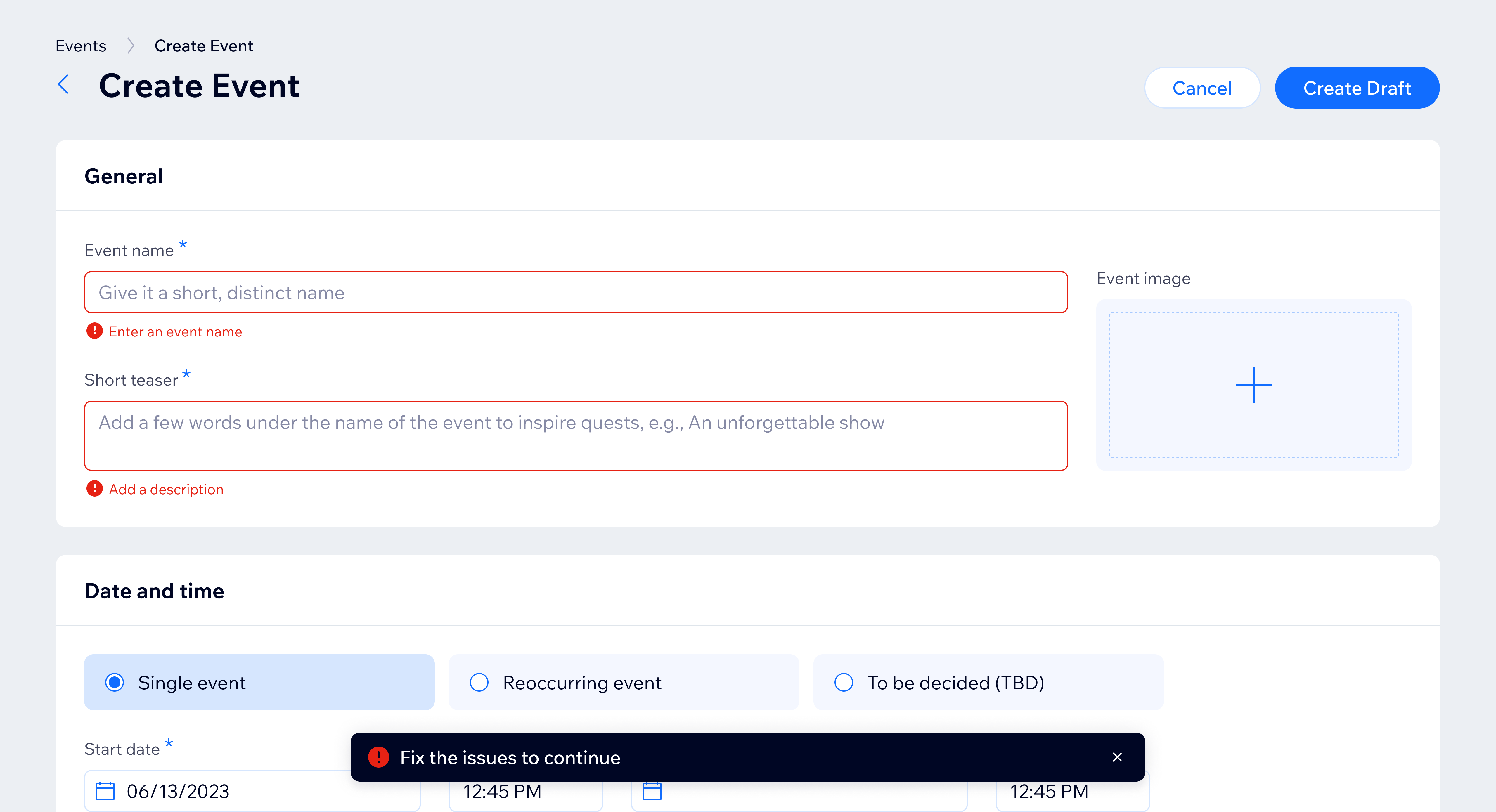
Do
For multiple validation errors, display status messages below each field, set the focus to the first error field, and summarize the problem in the notification toast.
In modals, summarize using status toast at the bottom of the screen as well.
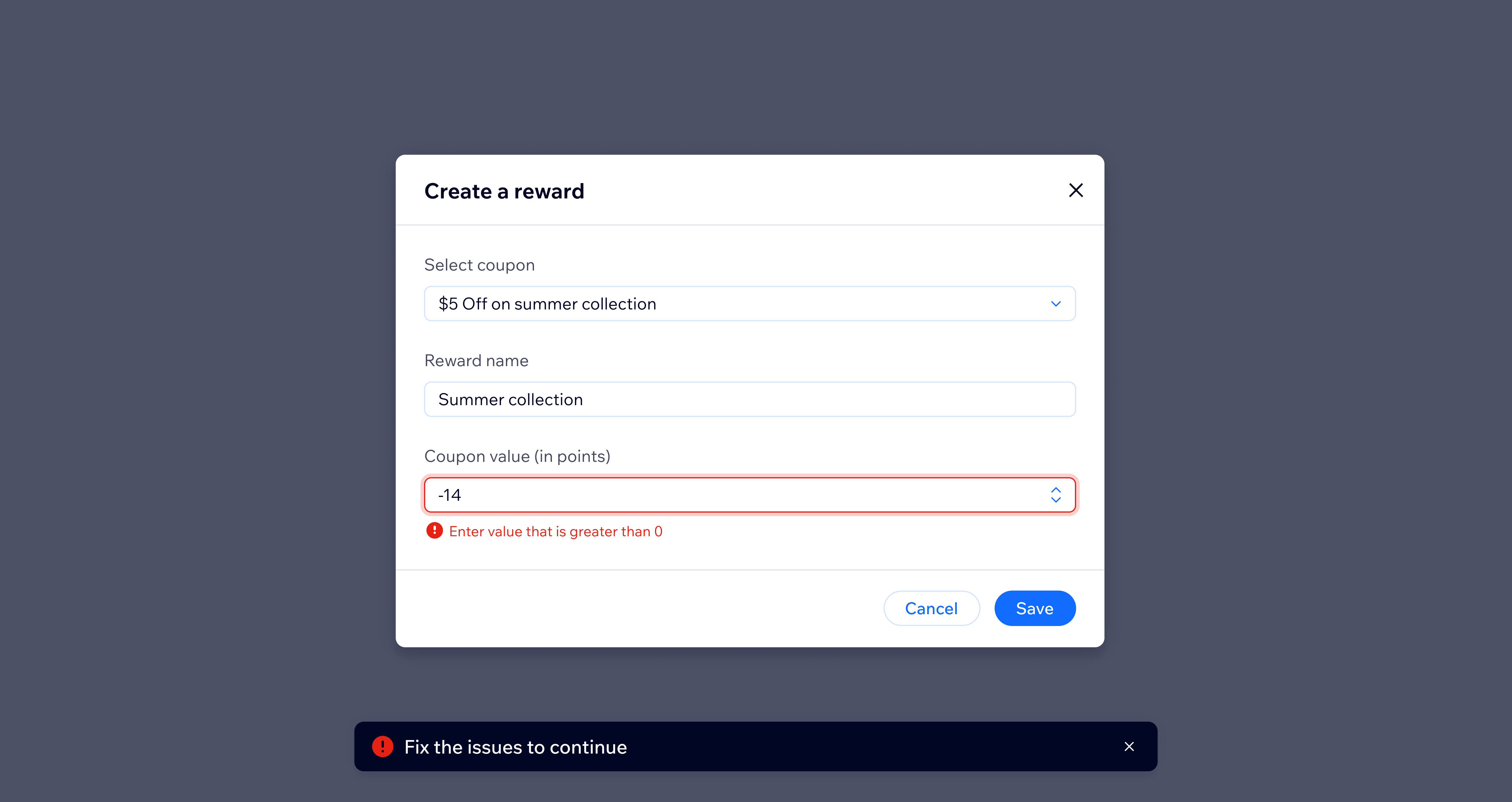
Do
In modals, summarize the problem using a status toast component.
4.3. Application errors
Errors also occur because of breaches in application logic or conditions, for example when users reach storage limits or their payment method has expired. Such errors usually occur before users even open the app or a specific page, making it essential for them to be visible upon arrival.
Place app errors first in the page, right below the page header using the error banner.
Provide a helpful action or a link for users to resolve issues quickly. Keep the banner visible until the issue is resolved and don't allow users to close it.
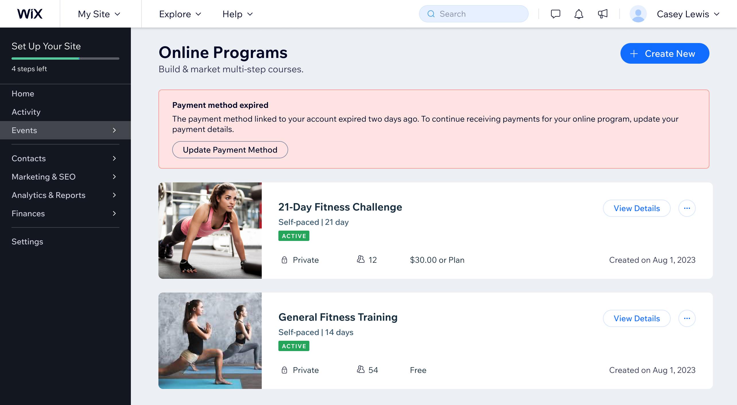
Do
Place an app level error below the page header.
4.4. Background task errors
If a system or an app is performing tasks in the background, it's likely that some users will navigate away to other flows or pages while waiting. Thus, it is crucial to keep displaying error messages in the UI until users resolve them.
Wix Media Manager notifies users of upload errors even after they have closed and reopened the app:
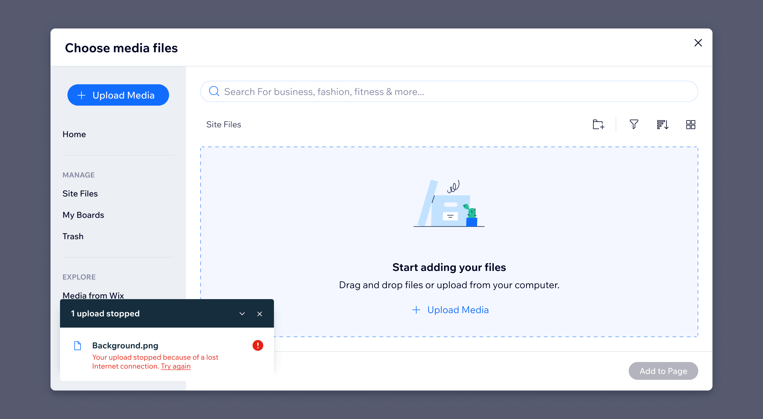
Do
For background tasks, show the error message in the UI, until users choose to close it.
When the background task is particularly lengthy, like connecting a domain, consider using alternative notification channels. For example, send an email if the task fails or display a prominent red error section helper on the main page layout.
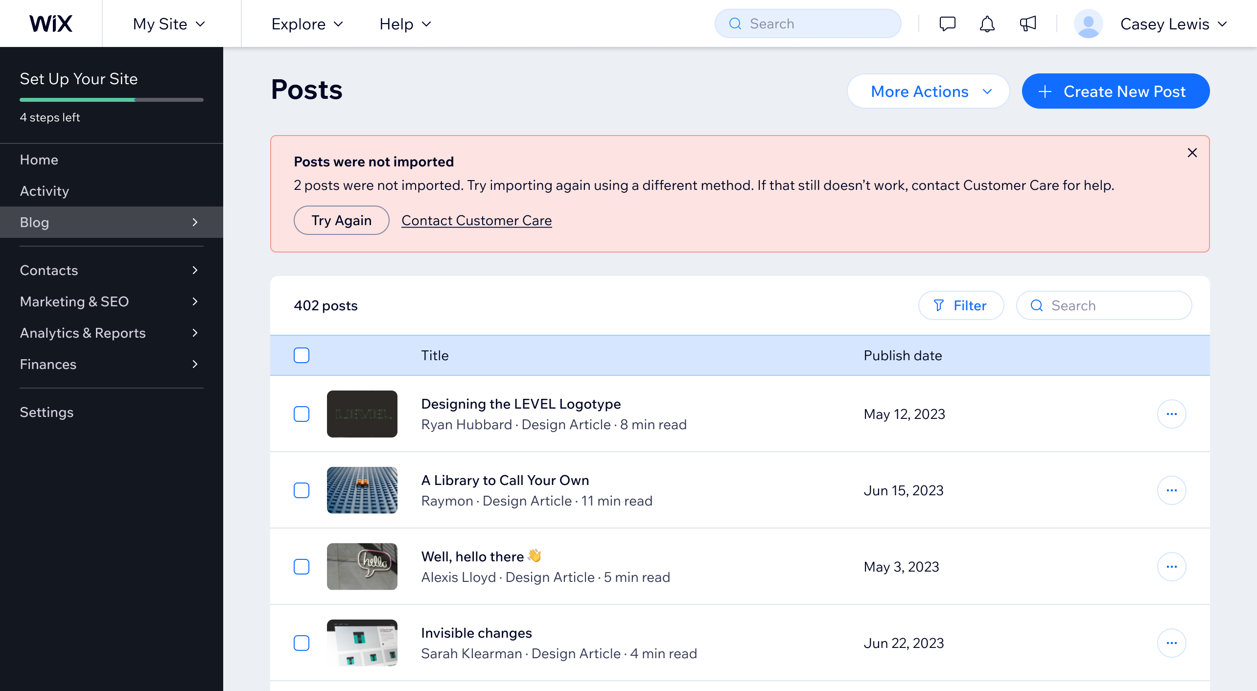
Do
For lengthy background tasks, use error section helpers.
4.5. Loading errors
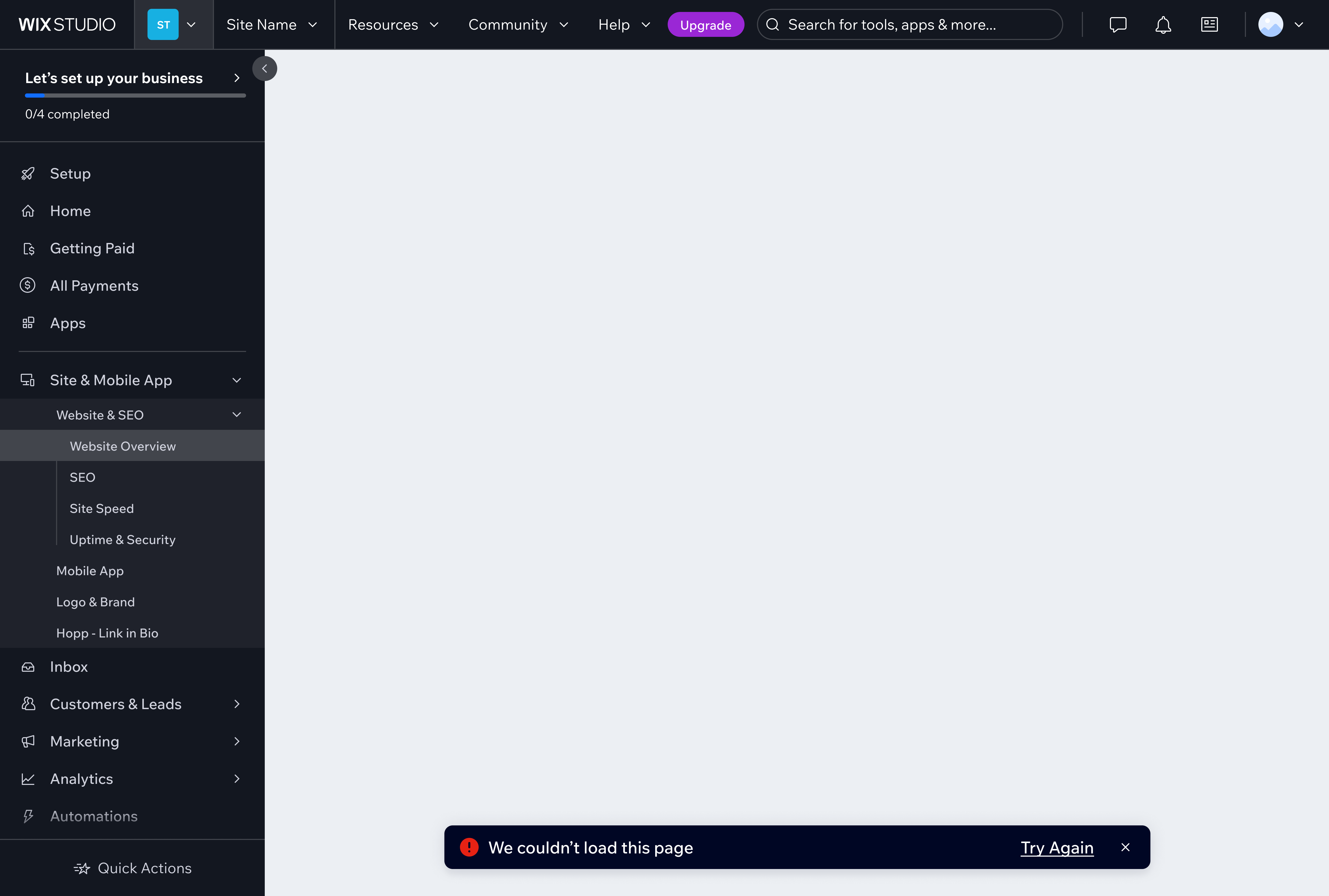
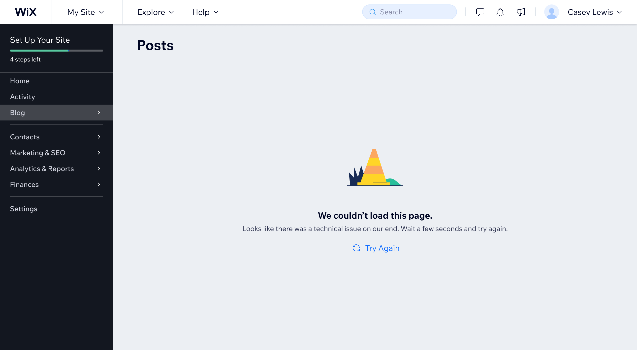
When a page or modal fails to load, tell users what happened and offer a way forward. Show CTAs to "Try Again," "Refresh," or reach out for support.
Don't leave the page or modal content area completely empty. Instead, use an empty state layout with an optional illustration, short title, description, and actions.
Don't
Don't leave the page or modal content area completely empty.
Do
Use an empty state layout in pages and modals that have failed to load.
4.6. System error
System errors happen because of technical issues and may be out of application scope, such as server overload. They are also identified by 4** and 5** HTTP status codes.
Wix system errors may include:
- 400 Bad Request: server doesn't process the request due to a client error.
- 403 Forbidden: user doesn't have permissions to access a page.
- 404 Not Found: page or resource has been moved, deleted, or never existed.
- 500 Internal Server Error: generic error message.
- 503 Service Unavailable: server is overloaded or down for maintenance.
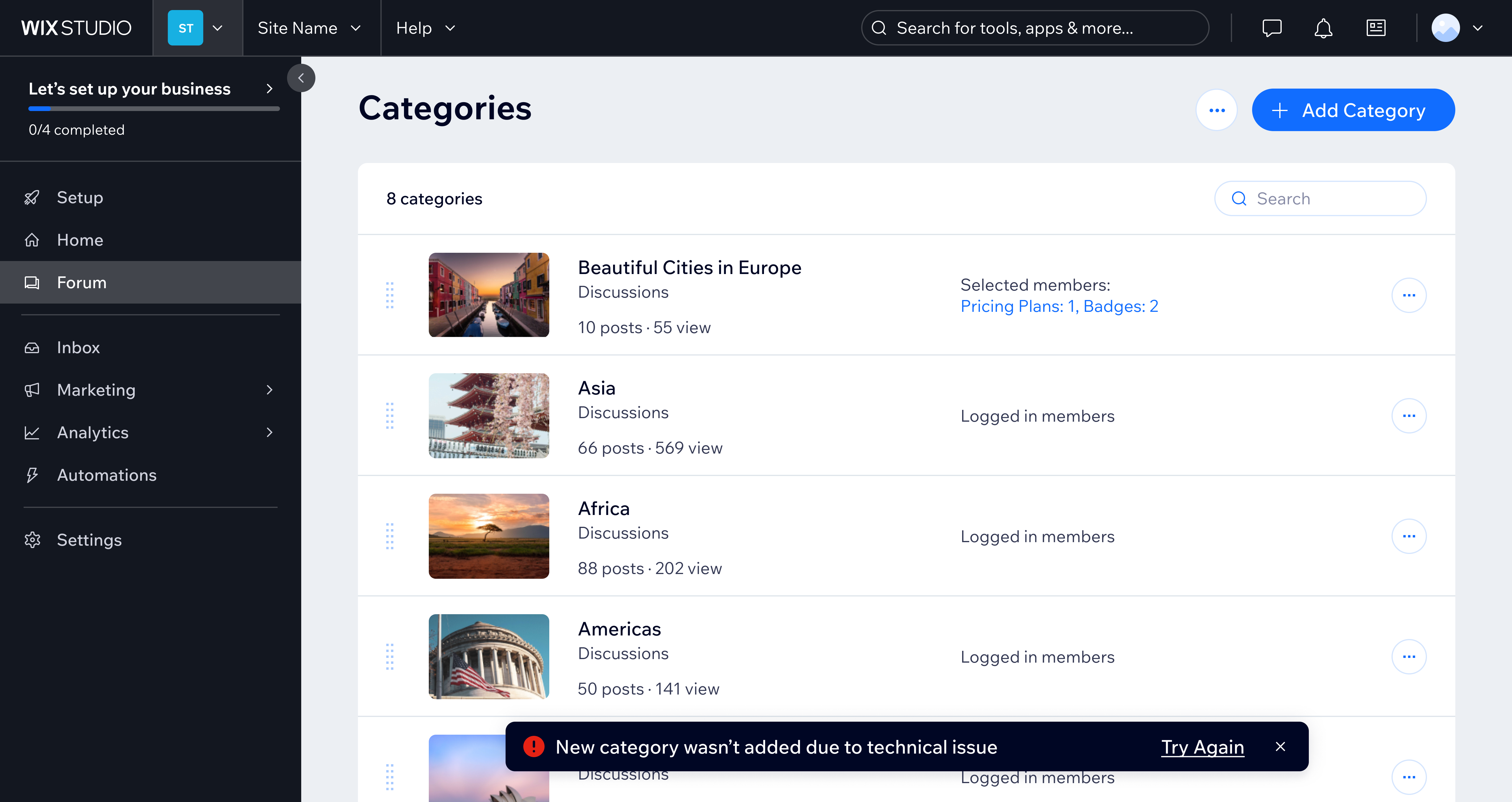
Depending on context, use an error status toast or an empty state layout to inform users about the issue. Be as specific as possible and provide a way out, such as a link to troubleshooting or support, or a "Refresh" or "Try again" button. An error toast has no timeout: it stays on screen until the user dismisses it or the error is resolved.
Do
Use error status toast to inform users about a system error.
Accessibility
A huge part of accessible UI state communication is clear and helpful copy. Use plain language, be as specific as possible, and always aim to provide a way forward, in case there's an issue.
To communicate a component's status, show messages directly below the fields. Avoid placing status messages inside tooltips, which are less accessible for screen magnifier, keyboard, screen reader users, and people with cognitive disabilities.
Audit your design for sighted-only status changes and ensure an equivalent experience for screen reader users with a live region component. For example, add a status update "Saving changes" when a loading spinner is given to sighted users.
Related components
- Empty state
- Skeleton group
- Loader
- Linear progress bar
- Circular progress bar
- Status toast
- Composer header
- Section helper
- Form field
- Live region
Last updated: 21 October 2026