Grid
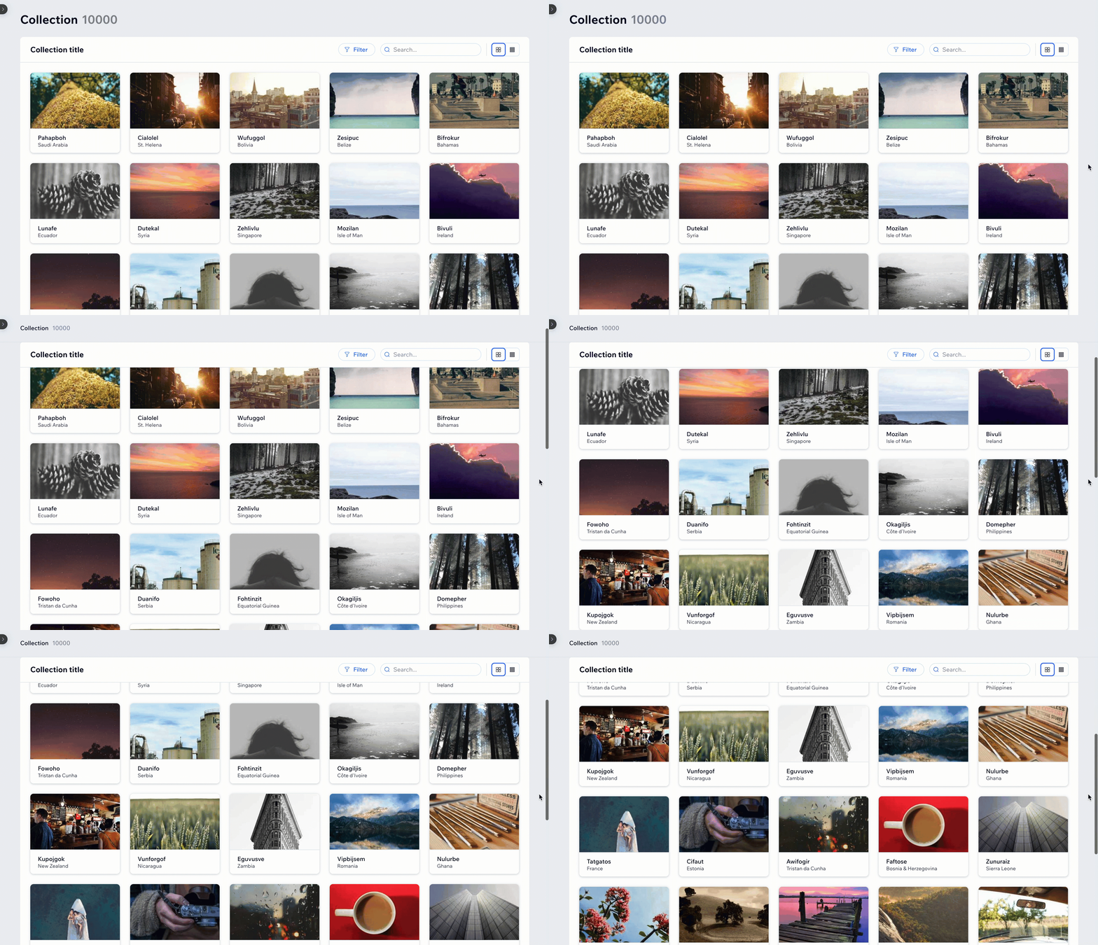
A Grid component for displaying data in a card format in a grid-like layout, allowing you to quickly identify and retrieve relevant information. Grids are an alternative to Tables as a way to display items. Grids are responsive, so the number of cards in a row is managed automatically based on the viewport width.
The Grid component includes essential design and functional features for querying, displaying, and filtering the collection data.
Features you can add to the Grid component include:
- Infinite scroll
- Date range filter
- Autocomplete filter
- Drag and drop
- Multi bulk action toolbar
- Sortable columns
Last updated: 15 October 2026
Did this help?