Modals and Overlays
Modals and overlays are essential UI patterns that temporarily take control of the user's attention to communicate important information or collect input. When used well, they streamline workflows. When overused they frustrate users and break flows.
This article provides clear, actionable guidelines for choosing and implementing the right modal component for any given use case - both across desktop and mobile devices.
1. Key principles
1. Minimize disruption.
Use the least intrusive overlay that still accomplishes the goal. Not every task needs a full-screen takeover.
2. Preserve context when needed.
If the user's action relates to content on the page behind, use an overlay that keeps that content visible
3. Always provide a clear exit.
Every modal must have an obvious way to dismiss it - close, cancel buttons, or tap/swipe-outside.
4. Match the component to the content.
Content length, complexity, and user expectations should determine which modal type you select.
5. Respect platform conventions.
Desktop and mobile have interaction expectations. A pattern that works well on desktop may need a different component on mobile.
1.1 User-triggered vs. system-triggered
- User-triggered overlay is triggered by the user themselves. For example, when the user clicks 'Delete Item', they can trigger the modal 'Are you sure?'. In other words, the modal or overlay doesn't open until the user triggers it by performing an action.
- System-triggered - is triggered without the action of the user. Think of promotions or onboarding, when the system pushes an overlay upon entering the site. The user doesn't perform any action that triggers the overlay, but the system still shows it.
2. Component overview
An overview of what's available. For detailed rules and usage patterns, see each component's story page.
2.1 Desktop modals
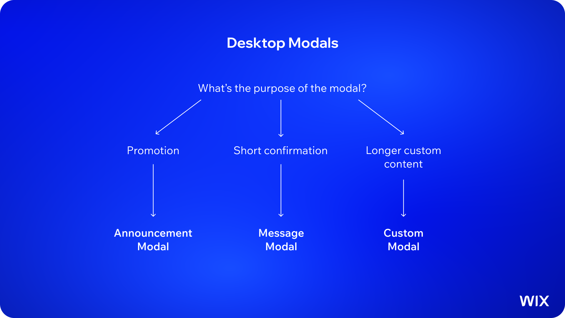
Desktop modals in WDS follow a centered overlay pattern with a backdrop. The three primary components serve distinct purposes and shouldn't be used interchangeably.
1. Announcement Modal
Feature promotions, upsells, and optional entry points. Non-blocking, can include illustration, headline, and CTA. The user can dismiss and continue.

2. Message Modal
Short, focused confirmations and alerts. Small, compact, always user-initiated. Used for destructive actions and simple binary decisions.

3. Custom Modal
Flexible container for forms, multi-step flows, and rich content. User-initiated only.

2.2 Mobile modals
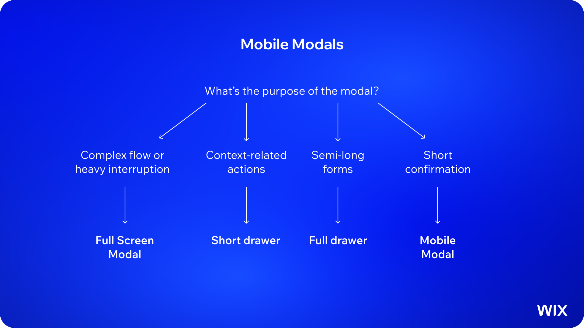
Mobile modals and overlays offer a variation of layouts for different scenarios. They are more flexible compared to desktop options and can be used interchangeably depending on the use case.
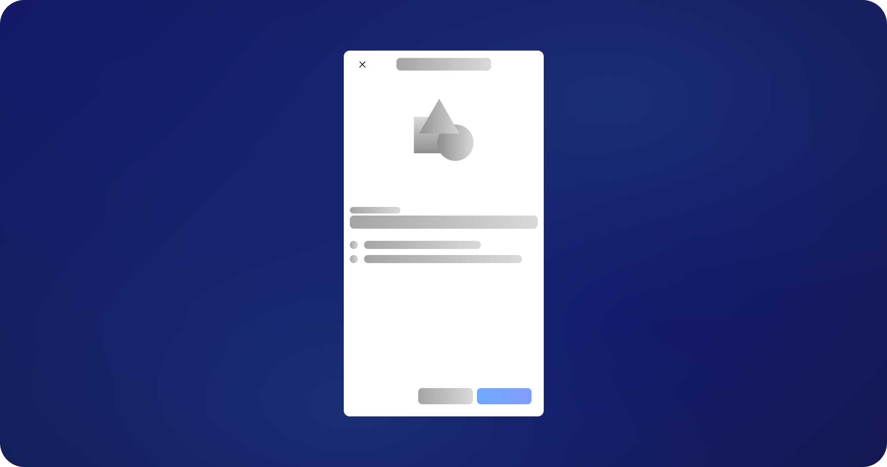
1. Full Screen Modal
Full-screen takeover for heavy interruptions: promotions, multi-step flows, long forms. Highly customizable. Can be system-triggered.
2. Drawer
Slides up from the bottom. Adapts height to content. Ideal for contextual actions, short forms, action sheets, and anything where page context matters. Replaces desktop popovers and dropdowns.

3. Mobile Modal
Centered overlay for summaries, end-of-journey confirmations, and short content where the user doesn't need the page behind.

3. Desktop-mobile mapping
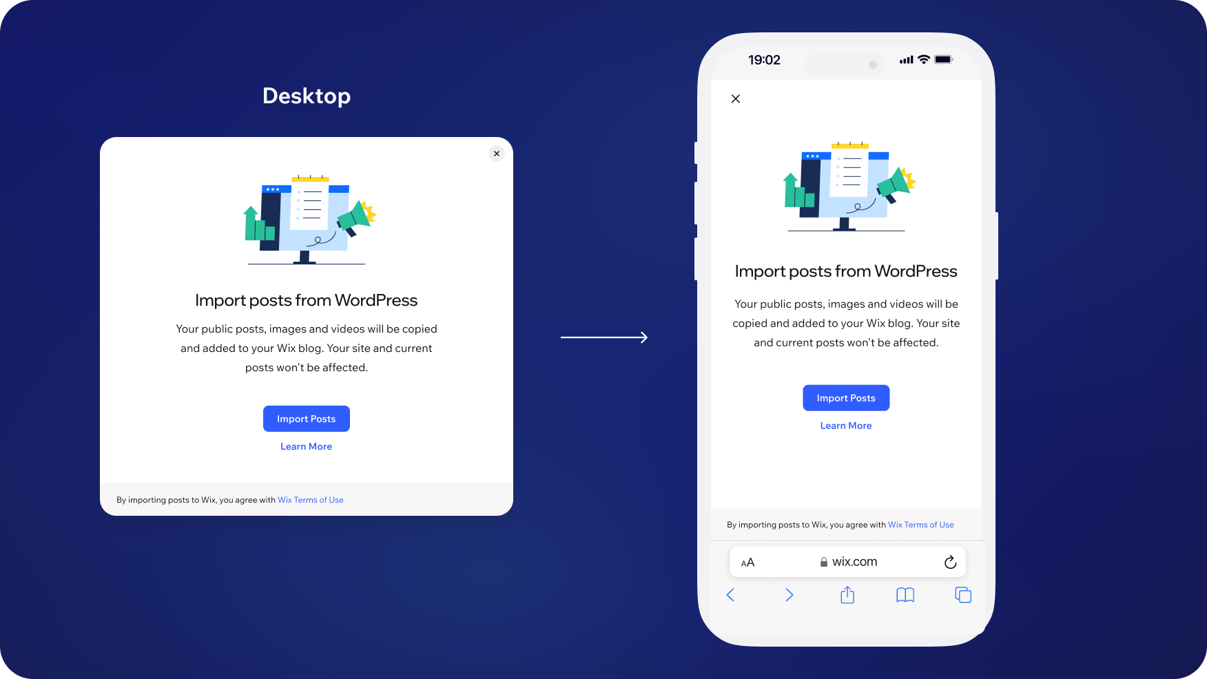
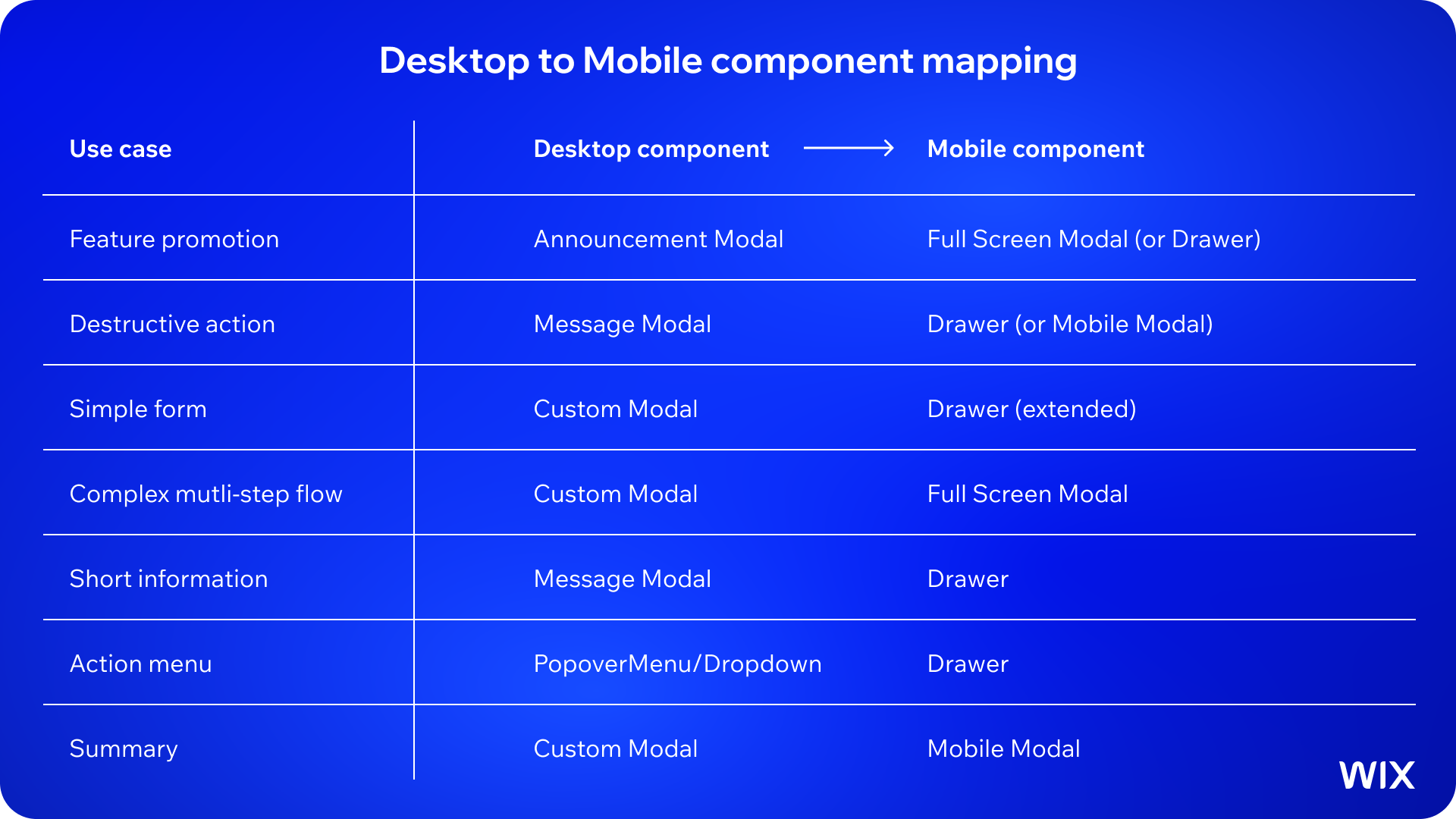
As Wix is increasing the number of mobile products, it's become critical for desktop and mobile components to work responsively between each other. The same user need often requires a fundamentally different component on each platform.
Promotions
Announcement Modal (desktop) -> Full Screen Modal (mobile). For smaller promotions, Drawer works on mobile.
Confirmation
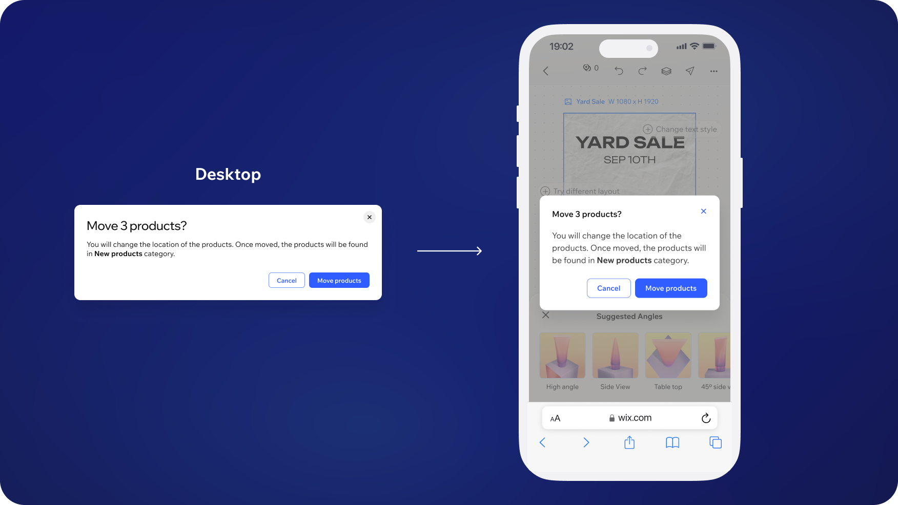
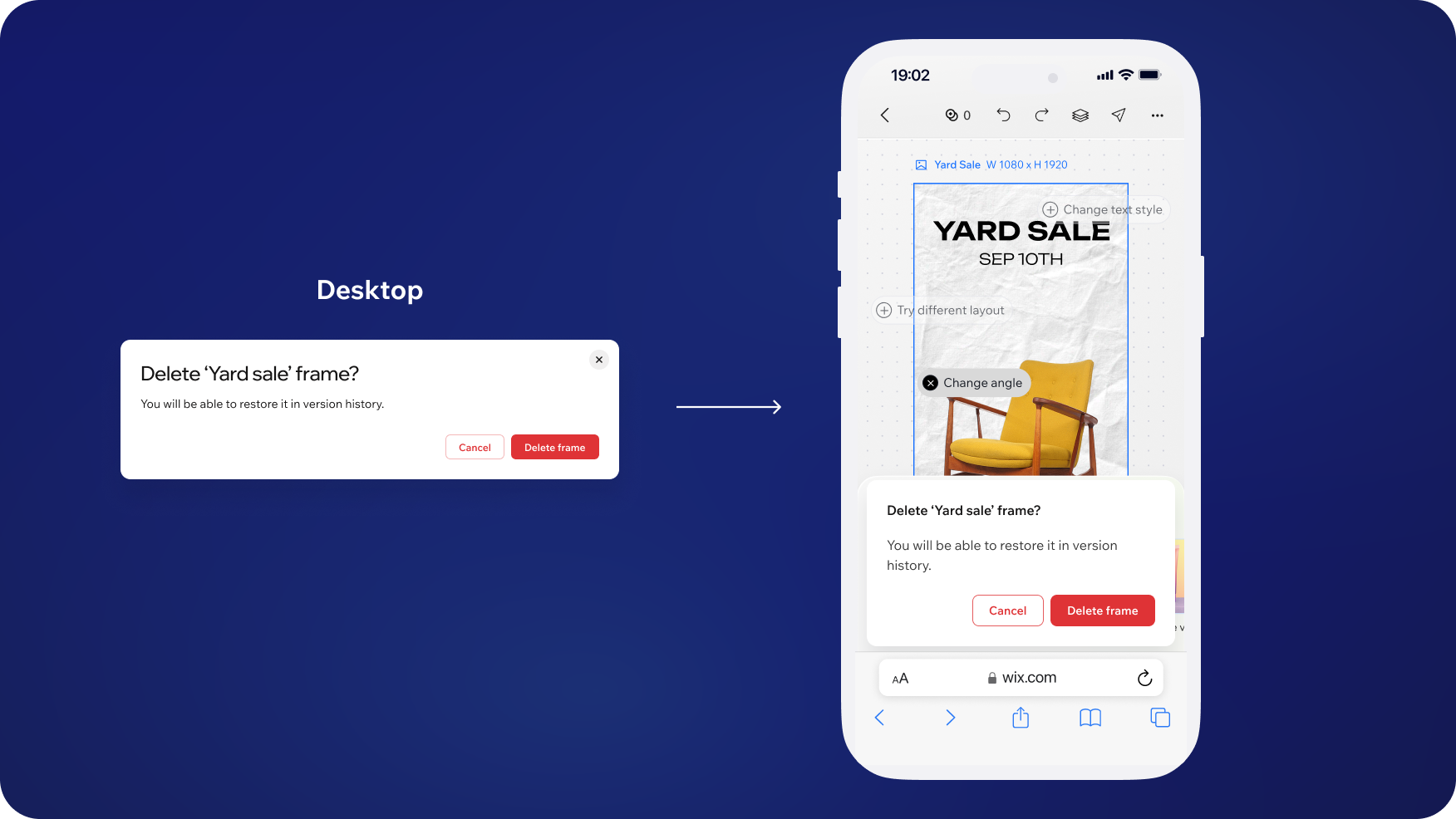
Message Modal (desktop) -> Drawer (mobile, if context matters) or Mobile Modal (if context doesn't matter)
Forms
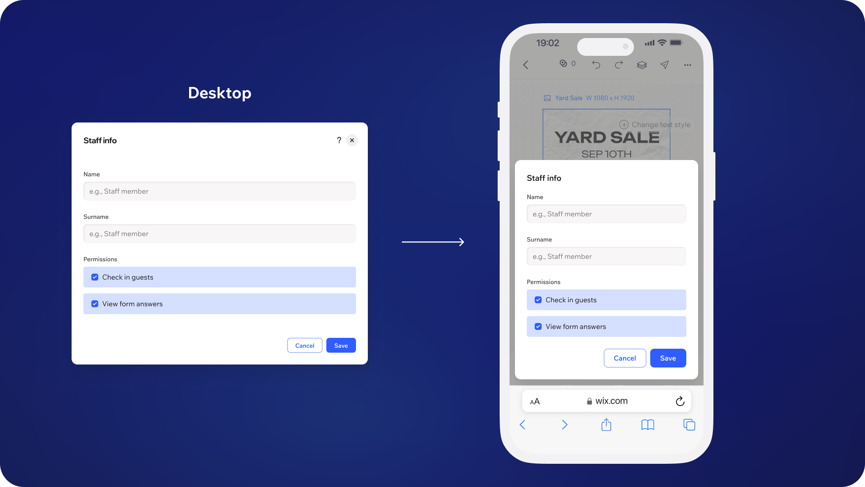
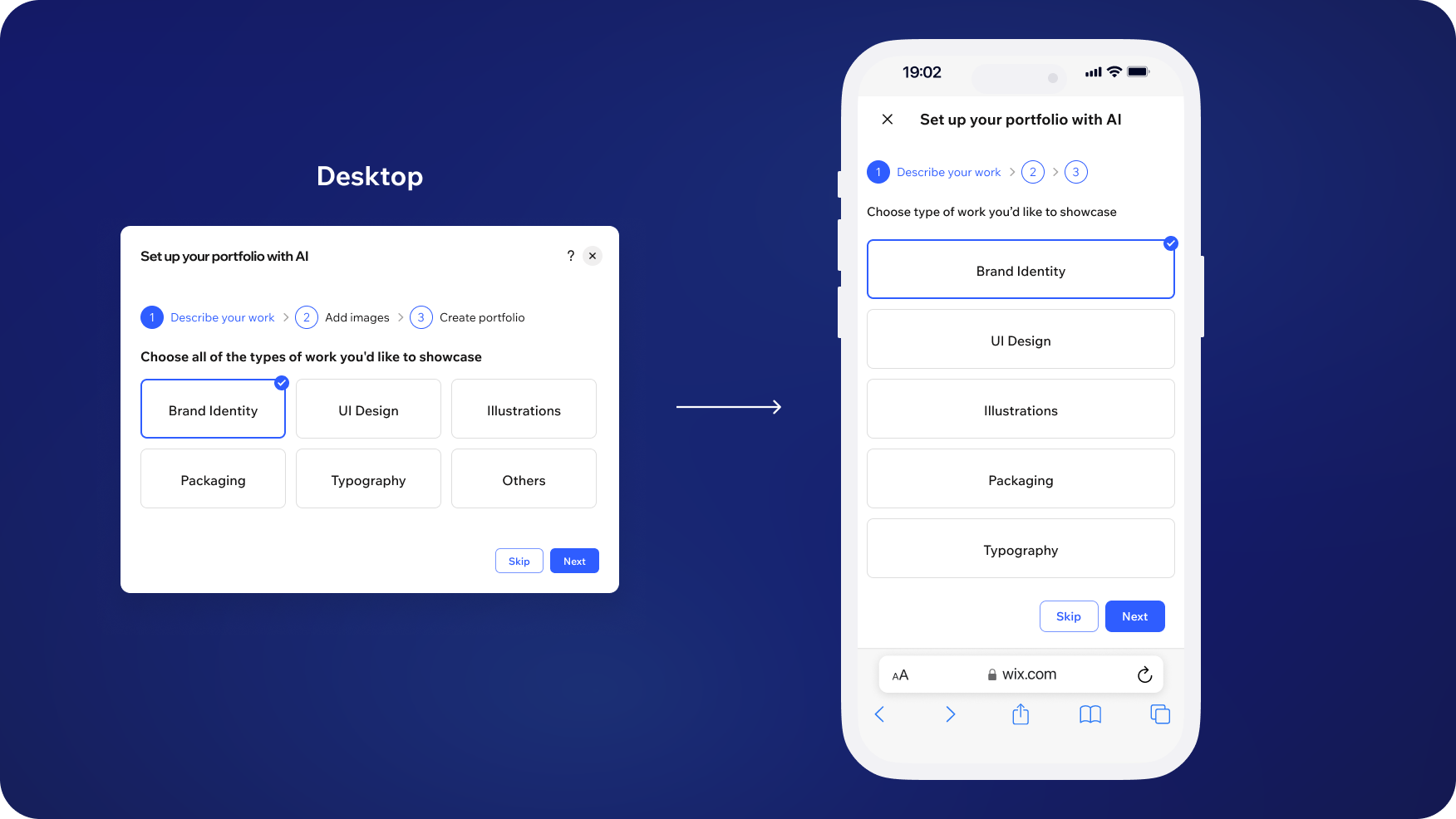
Custom Modal (desktop) -> Drawer extended (mobile, shorter forms) or Full Screen Modal (mobile, complex forms).
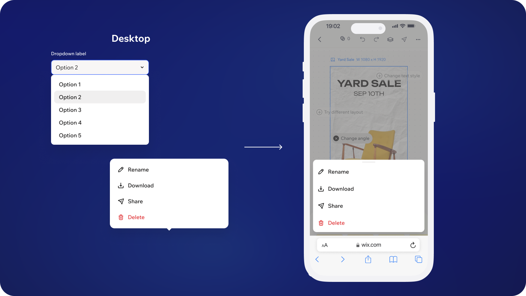
Action menus
PopoverMenu / Dropdown (desktop) -> Drawer (mobile)
Use this table as a quick reference guide when deciding which type of overlay or modal to use:
4. Best practices and anti-patterns
4.1 Content guidelines
For more extensive and detailed guidelines reference UX Writing page
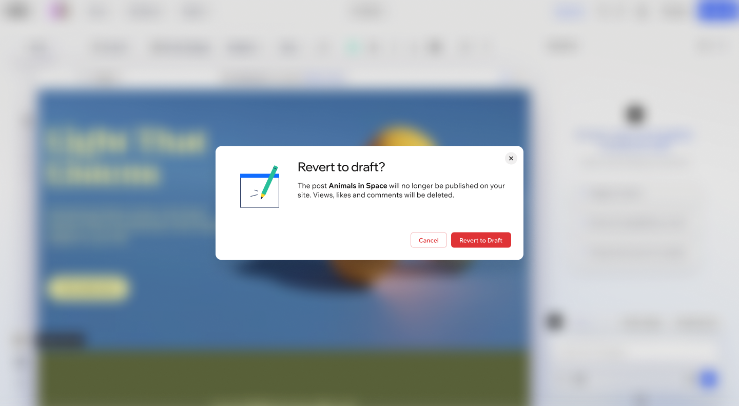
Do
Titles should clearly state the purpose - never use generic titles like "Confirm" or "Alert"
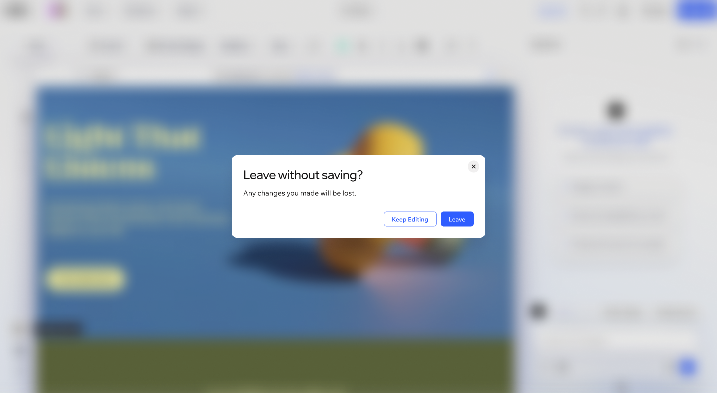
Do
Body text should be concise. More than 3-4 sentences suggests a modal may not be the right pattern.
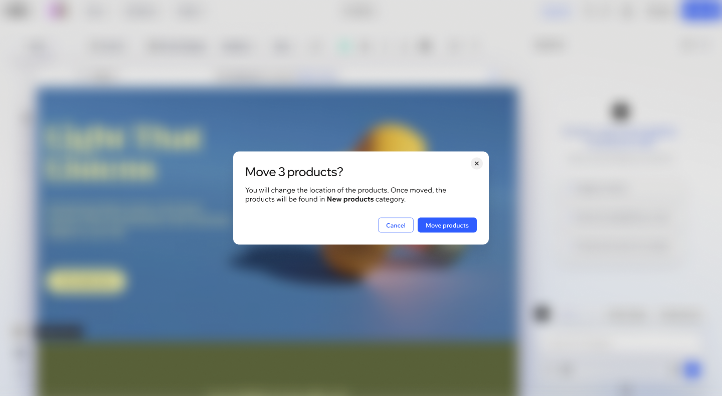
Do
Primary action buttons should use specific verbs ("Delete program", "Start import") rather than vague labels ("OK", "Yes")
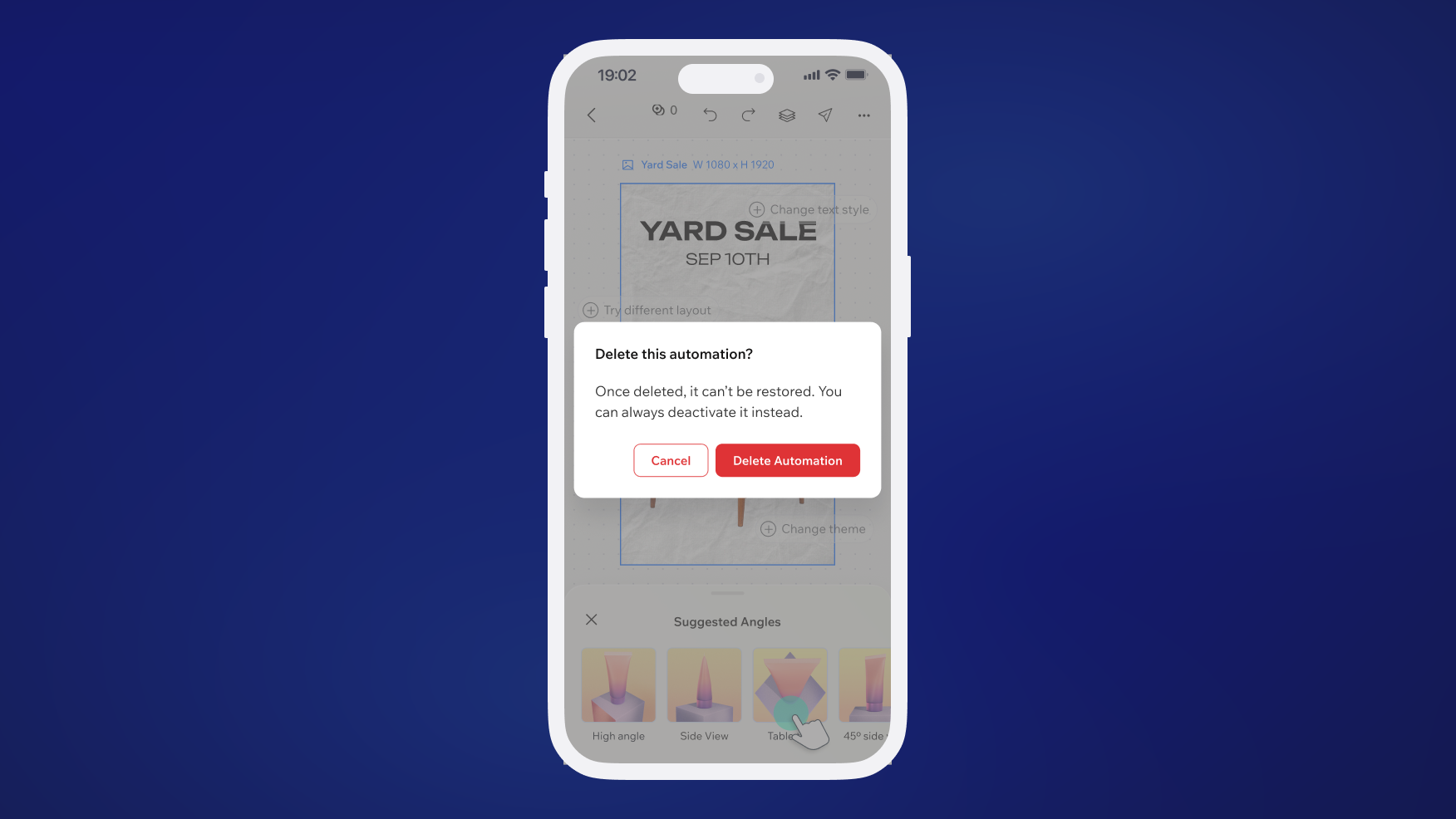
Do
For destructive actions, make consequences clear in body text and use a visually distinct primary button.
4.2 Accessibility guidelines
Getting accessibility correctly with modals and overlays is critical. Getting this wrong means some users can't use or escape the overlay. Wix Design System team made so that modals and overlays are accessible out-of-the box, but every team is responsible for any overrides to be accessible as well.
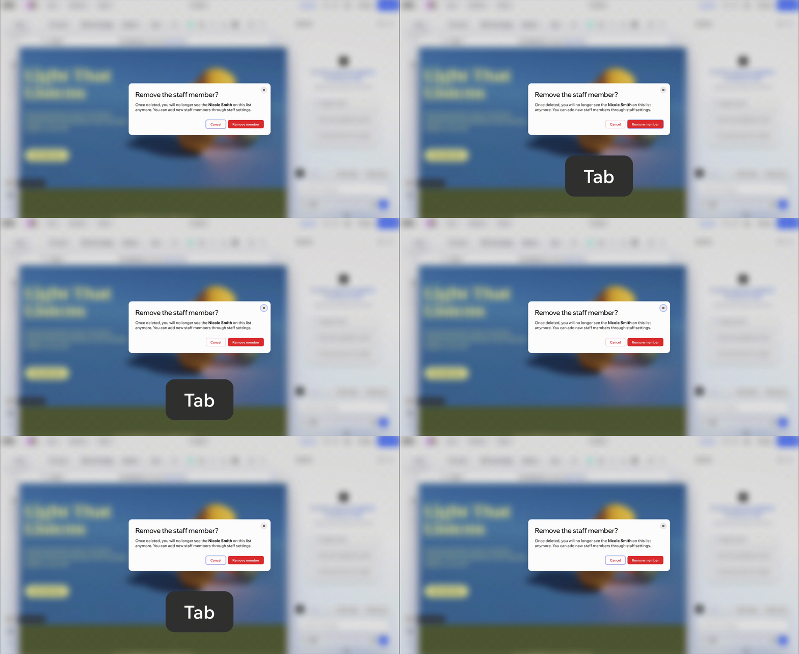
1. All modals must trap focus while open.
Focus must be trapped inside the modal while it's open. Tabbing past the last focusable element should cycle back to the first. After dismissal, return focus to the triggering element.
Never auto-focus a destructive action button. In a "Delete this item?" modal, focus should land on "Cancel", not "Delete".
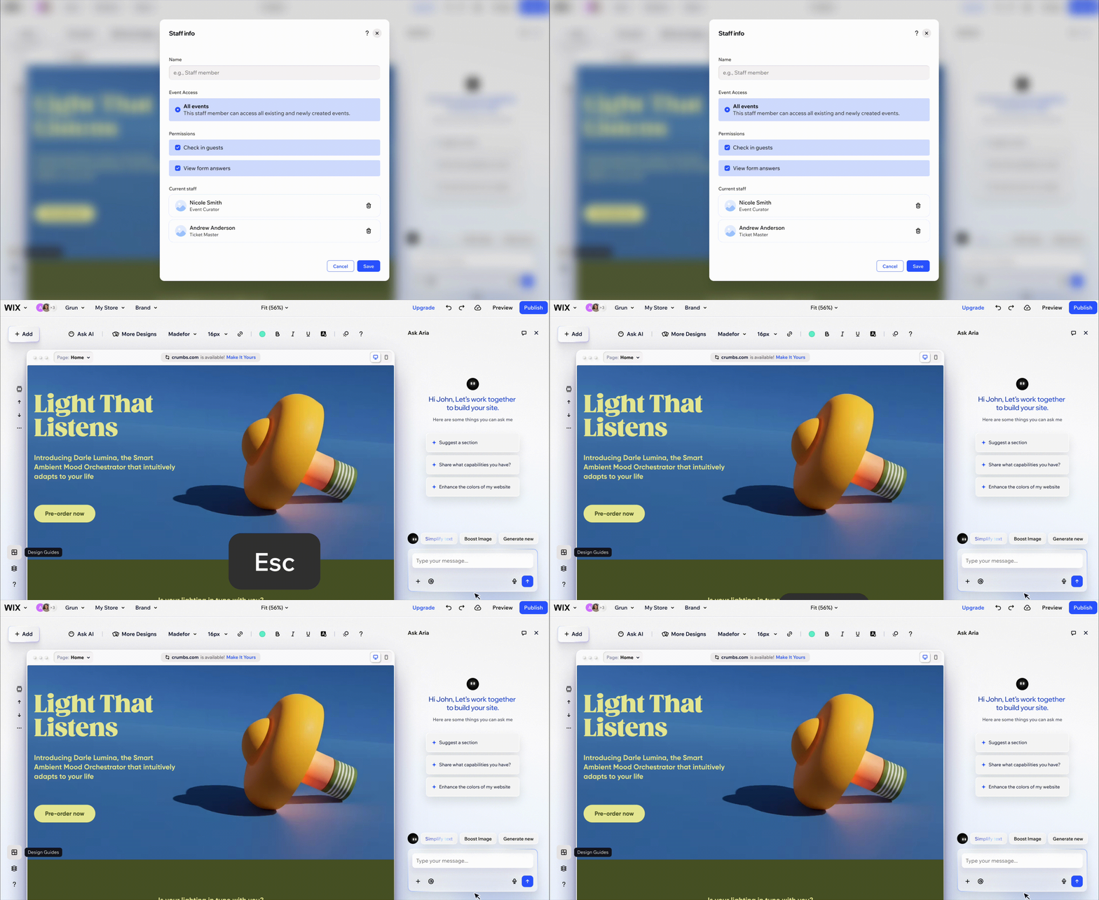
2. Escape key should dismiss on desktop.
These are the expected behaviour patterns on overlays and modals:
- Escape -> dismisses the modal
- Tab -> moves focus to the next focusable element in the modal
- Shift+Tab -> moves focus to the previous focusable element
- Enter -> activates the focused element
3. Screen readers must announce the modal title on open.
4. Ensure sufficient color contrast for all modal text.
5. Mobile touch target must be at least 24x24 pixels
4.3 Anti-patterns
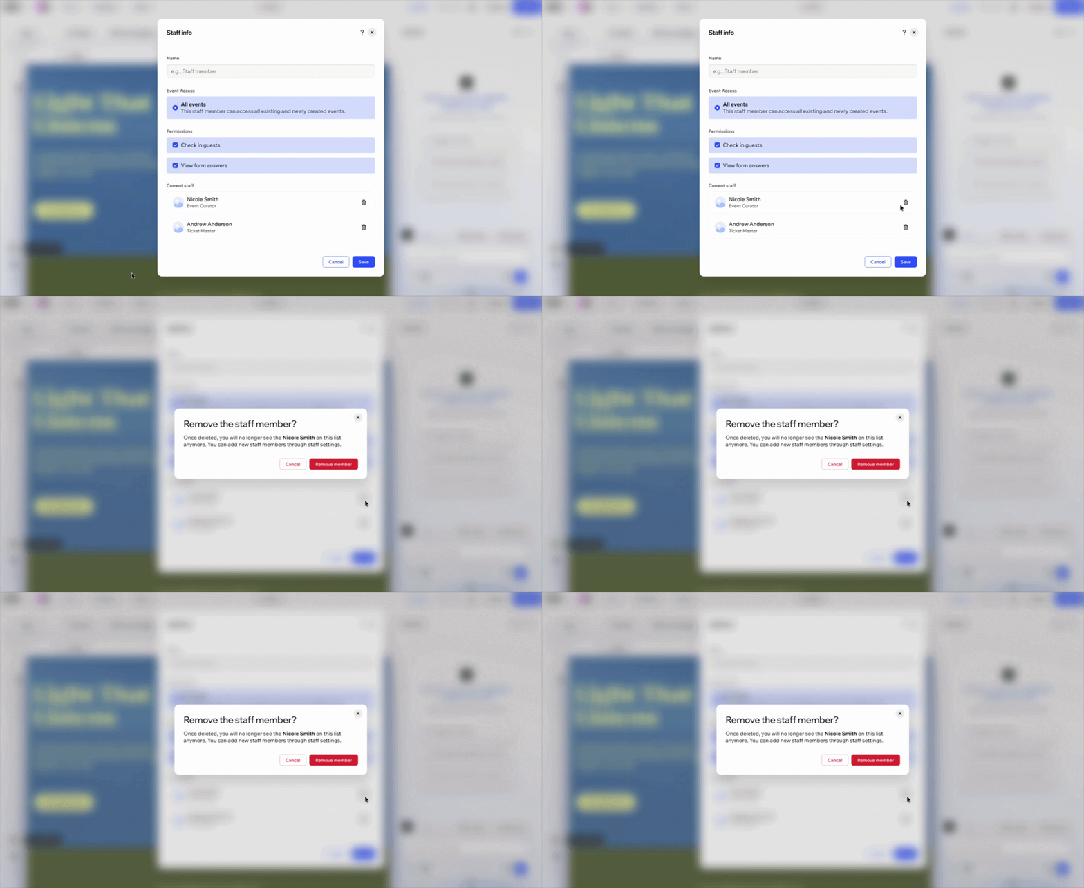
Don't
Avoid opening a modal on top of another modal. Consider alternative solutions like content replacement or in-line alerts for non-blocking feedback. If the stacking is unavoidable, ensure you don't stack a lot of layers, and the top layer doesn't introduce complex new decisions.
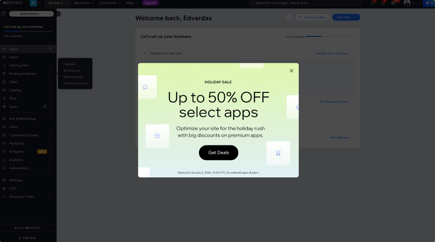
Don't
Never use system-triggered modals. It should be limited to promotions or critical alerts. Unexpected modals frustrate users.
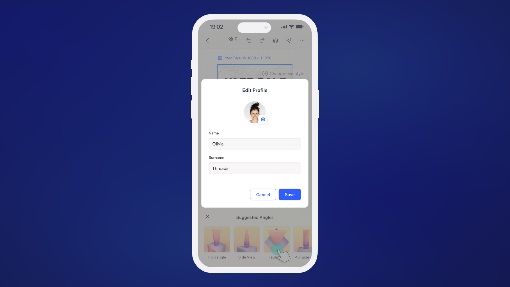
Don't
Use the wrong component for content. Don't use MessageModal for long content, don't use FullScreenModalLayout for a simple yes/no. Check with the decision tree or with the Wix Design System team member.
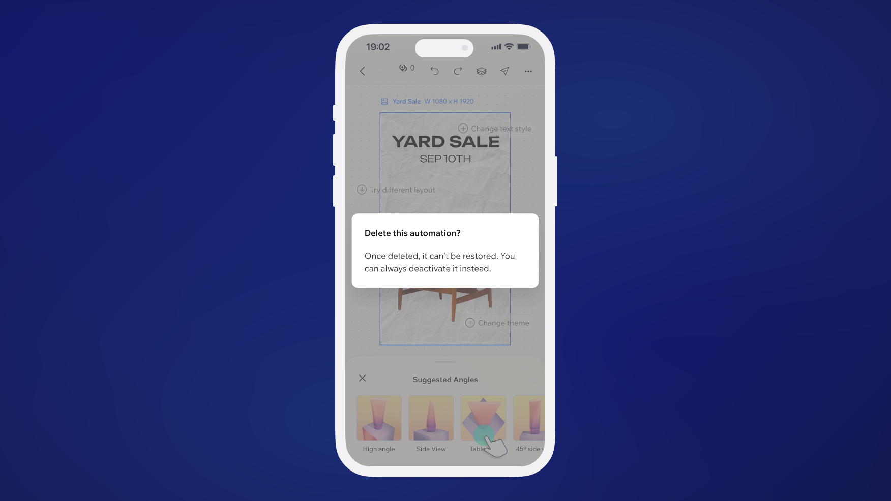
Don't
Miss the dismiss path. Every modal must have at least one way to close without completing the action.
Related components
Last updated: 21 October 2026