Disabled States
A disabled state makes a component visible but non-interactive. It's helpful for preventing errors and guiding users, but improper use can negatively impact the user experience, cause frustration, and accessibility issues.
1. Key principles
1. Informative
Users should always understand why something is disabled. Clear or easy-to-find explanations help avoid confusion and give users a better sense of control over what they can do.
2. Avoid hiding functionality
It's often better to let users attempt an action and receive real-time feedback than to hide functionality behind disabled states. Disabling elements without a clear reason can confuse and frustrate users, leaving them unsure of what to do next or where to find more information.
When used according to the guidelines, disabled states help prevent improper use of Wix products without compromising the user experience or accessibility.
2. Alternatives for disabled states
This section outlines common solutions you can use instead of disabled states to keep the experience intuitive, accessible, and informative.
2.1 Form validation
When users need to edit or input data before continuing, avoid disabling form actions like submit buttons. A disabled button doesn't tell users what's missing or how to fix it. It can feel like hitting a wall. Instead, keep the button active and show helpful messages after users try to submit. It's clearer, more accessible, and creates a smoother experience.
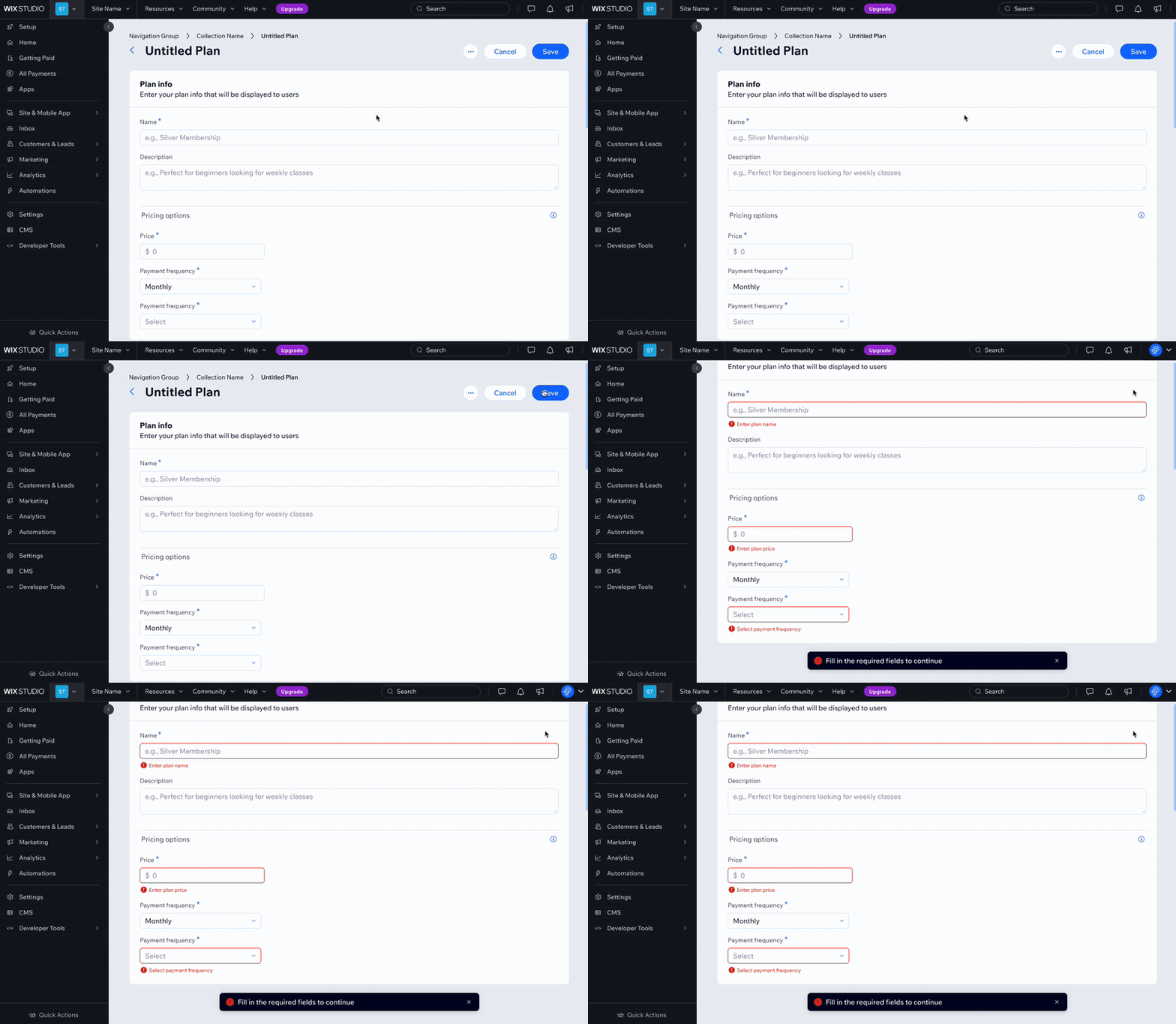
Do
Keep buttons active and show validation messages after user interaction.
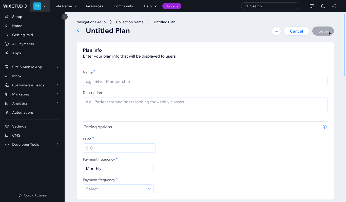
Don't
Disable buttons, especially main actions.
2.2 Conditional relevancy
Choose X, then show Y
Only show options after the relevant trigger is selected. For example, don't show "Checked by default" unless "Add a checkbox" is selected. This keeps the interface clean, avoids confusing disabled elements, and helps users focus on what matters.
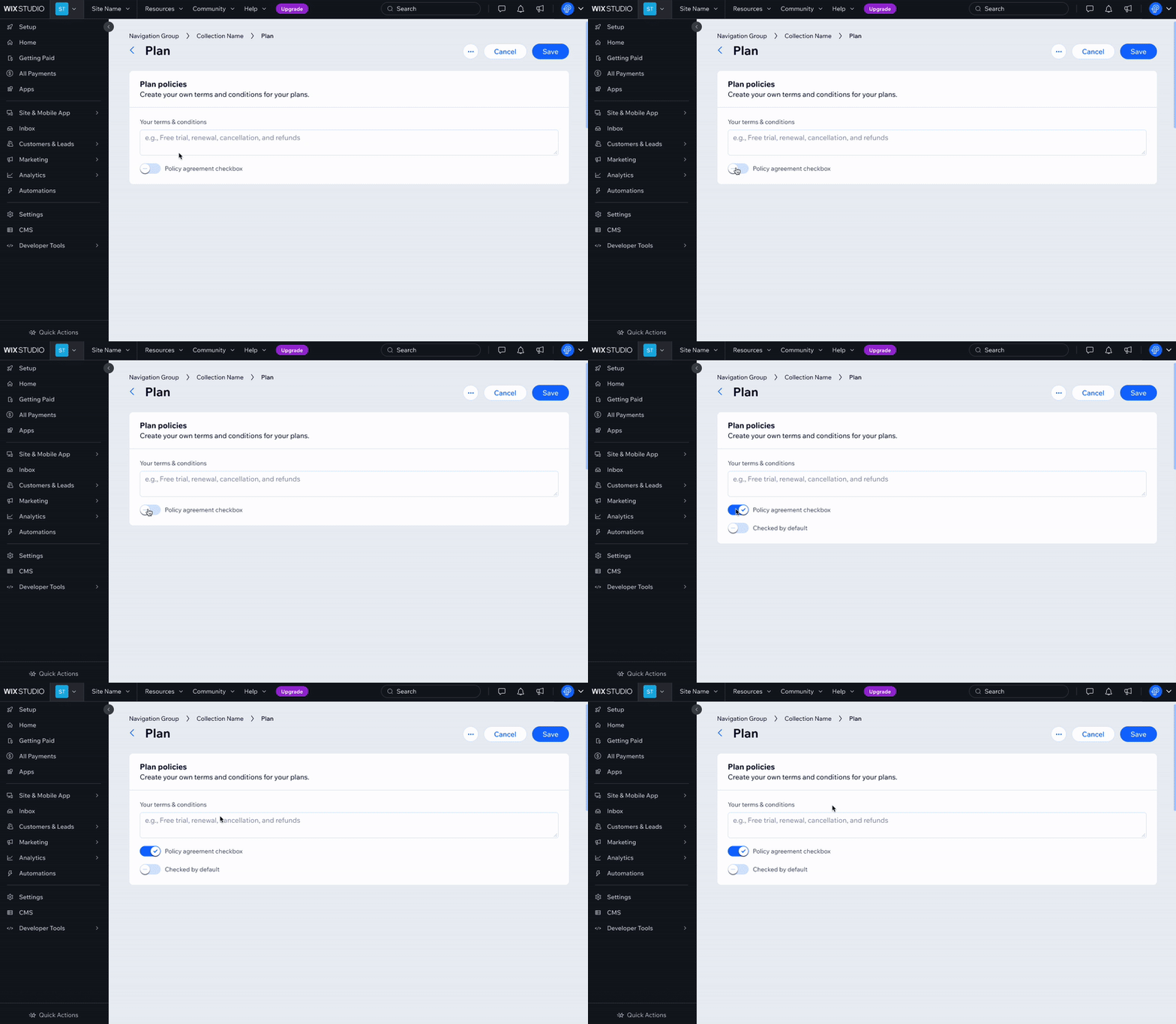
Do
Consider hiding actions that are only relevant when another action is taken.
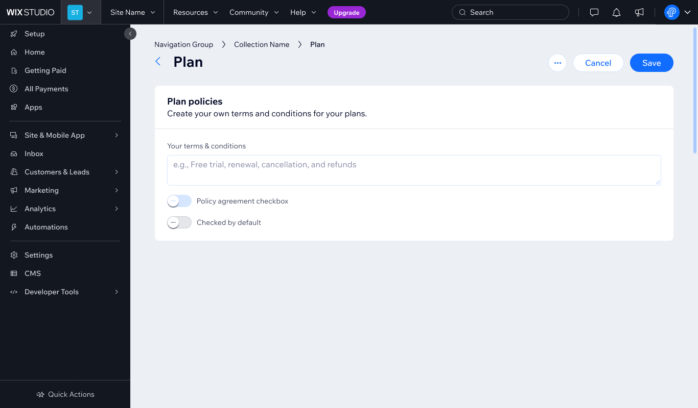
Don't
Disable actions that depend on other conditions.
2.3 Pre-filled fields
When a value is set elsewhere (like by the system or in another setting), don't disable the input field. Disabled fields can't be focused, copied, or read by screen readers, which can be frustrating for users. Instead, use a read-only field or plain text. This keeps the content visible and accessible, while still making it clear that the user can't edit it.
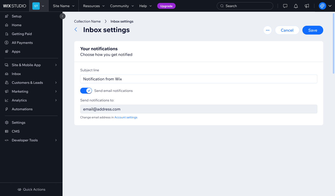
Do
Use read-only fields to display values that can't be changed, while keeping them selectable and accessible.
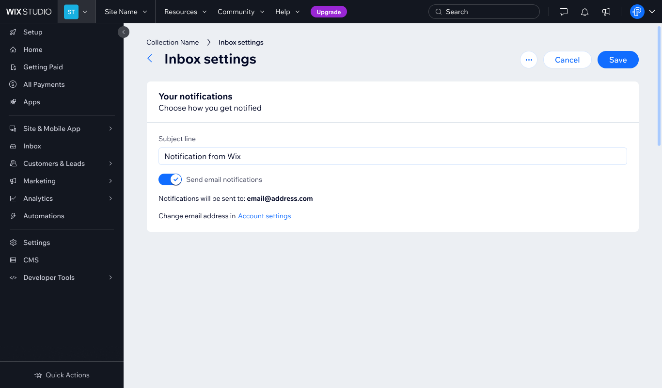
Do
Use static text instead of inputs. If necessary, explain where the value can be changed.
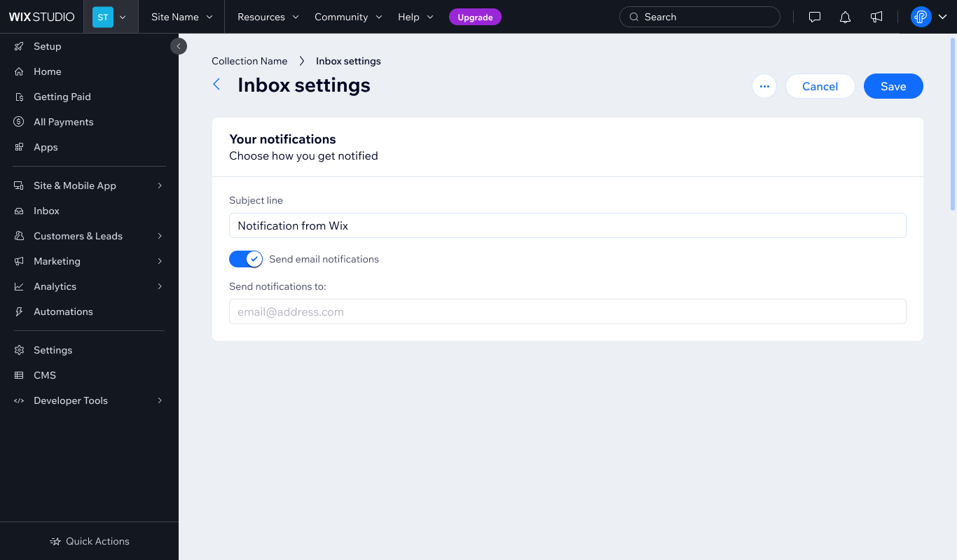
Don't
Disable inputs when read-only or static content is clearer.
2.4 Loading
When content is loading, use loading indicators to show progress and prevent repeated clicks.

Do
Show a loader or message like "Saving...".

Don't
Disable the element, but don't let users click on actions while content is still processing.
For more about loading states you can read the Notification and states guidelines
3. How to use disabled states
This section provides solutions for when disabled states can be used. The primary goal is to ensure our users understand why it is disabled and what they can do to make the element active.
3.1 Section helpers
This solution is flexible and can be used for page sections, like a whole card, or sections in that card. The primary goal is to tell the user how to activate the section (for example, To do __, do __).
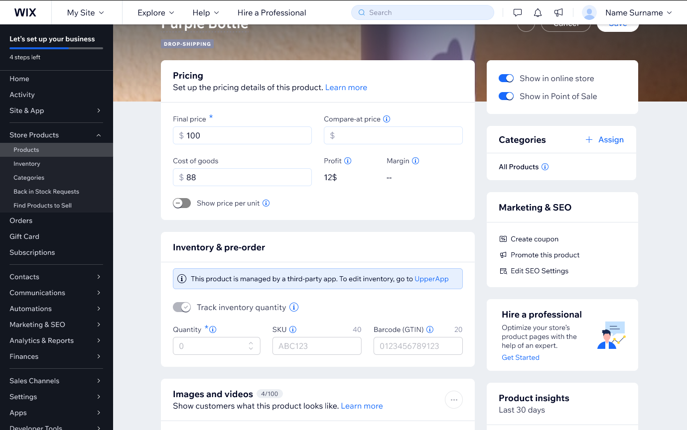
Do
Use section helpers to explain why content is disabled and how users can update it. In this example, the "Inventory & pre-order" section is disabled and the helper section explains that the inventory can be edited in the third party app, UpperApp.
Do
Use section helpers to explain why a smaller group of elements inside a larger section is disabled.
Don't
Position a section helper in a way that makes it seem like the whole card is disabled when only one element is disabled. Instead, position the helper section close to the specific element it addresses.
3.2 Status messages
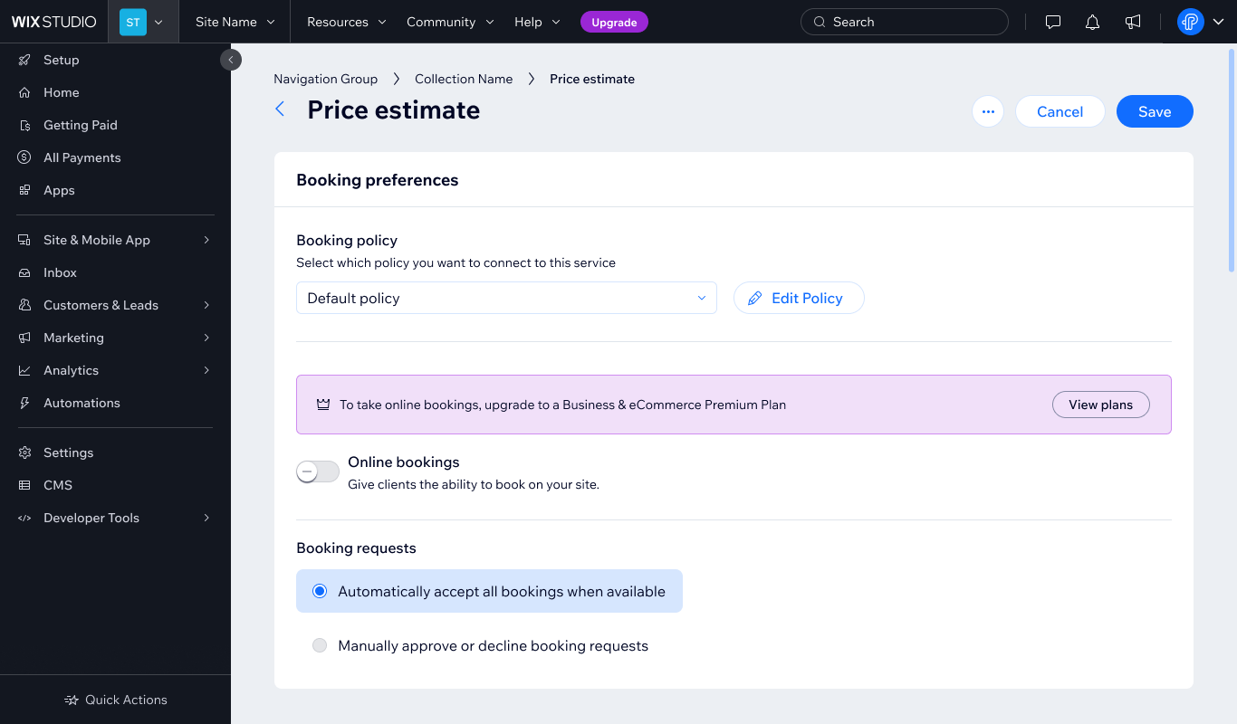
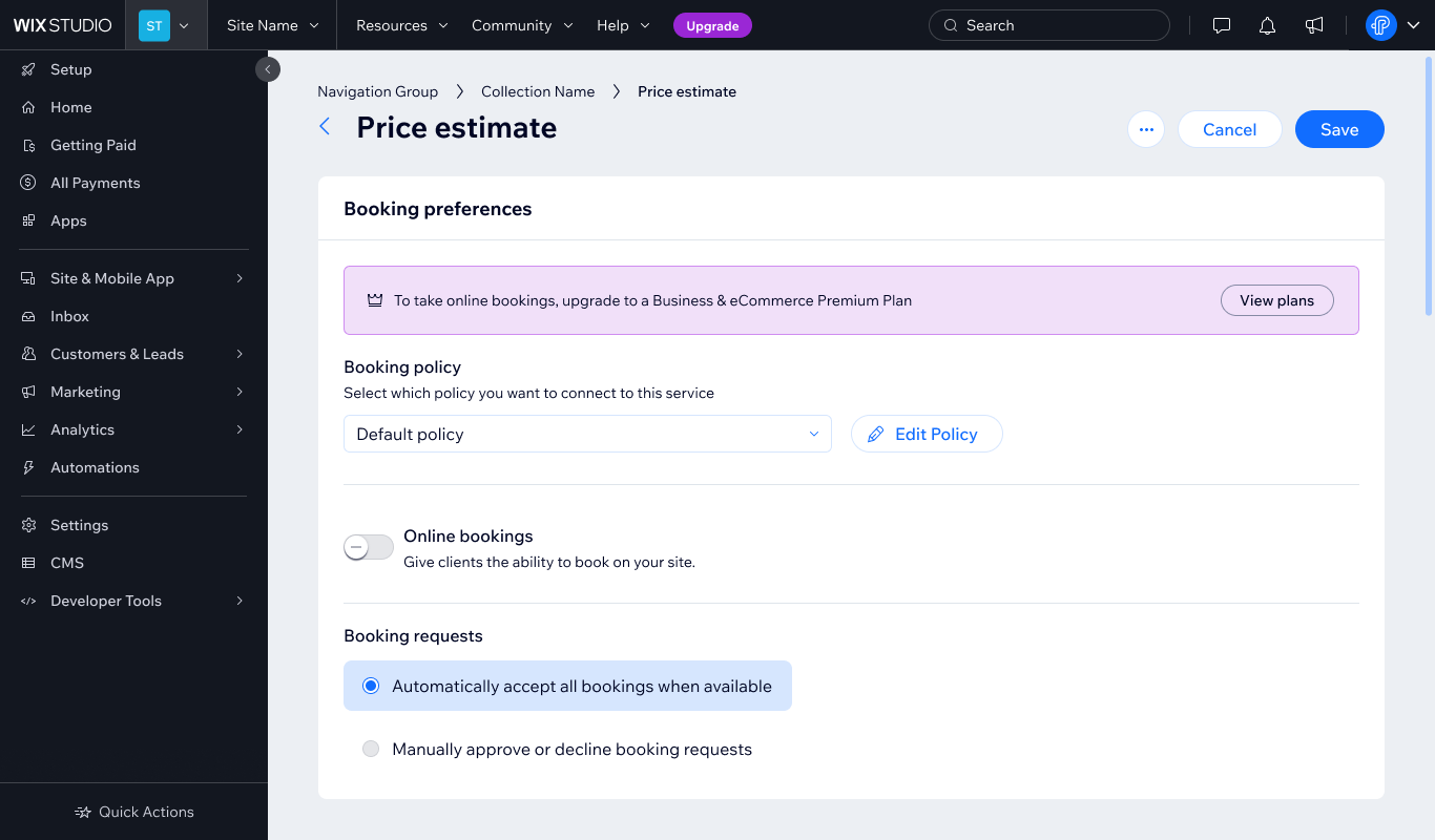
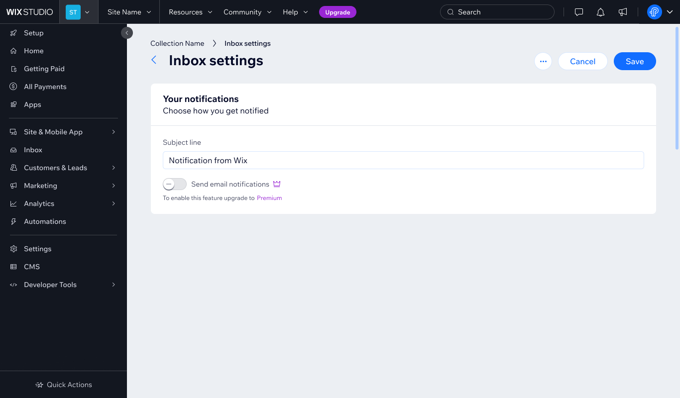
This solution can be used when space allows for more text on screen. It is useful when explaining why smaller elements that are disabled (for example, toggles, checkboxes, input fields).
Do
Use status messages to identify Premium features and provide an upgrade path.
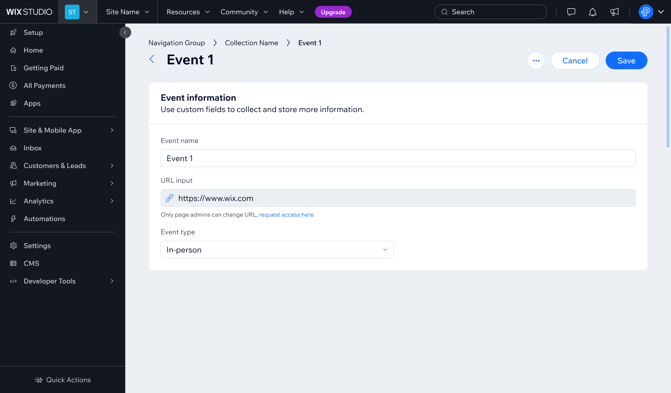
Do
Use status messages to explain why elements are restricted and explain how users can access them.
3.3 Info icons
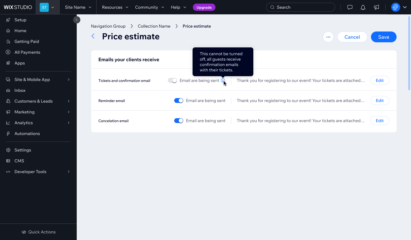
Info icons can be used to explain a disabled state to users (for example, tables, lists).
Do
Info icons next to disabled elements can help clarify the state to users.
3.4 Tooltips
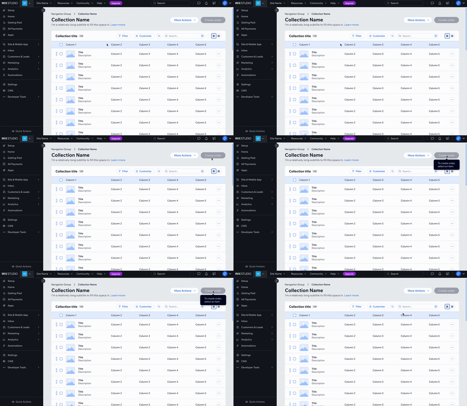
When there is no other optimal way to explain the disabled state to users, provide tooltips on hover and focus. However, be mindful that this approach has accessibility limitations and may not work well for all users.
Do
Indicate why an element is disabled in a tooltip on hover and focus.
Don't
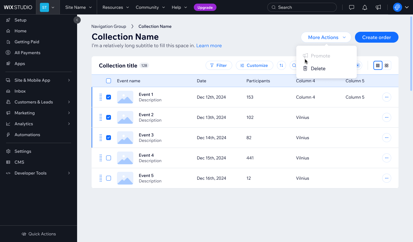
Leave the user without explaining how they can activate the element.
Don't
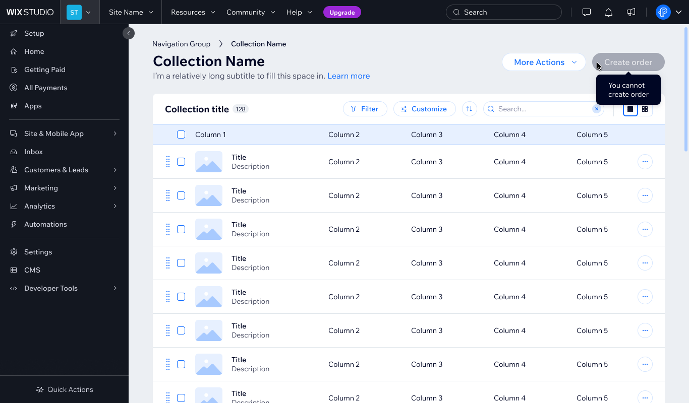
Use tooltips that fail to guide users on how to activate the element.
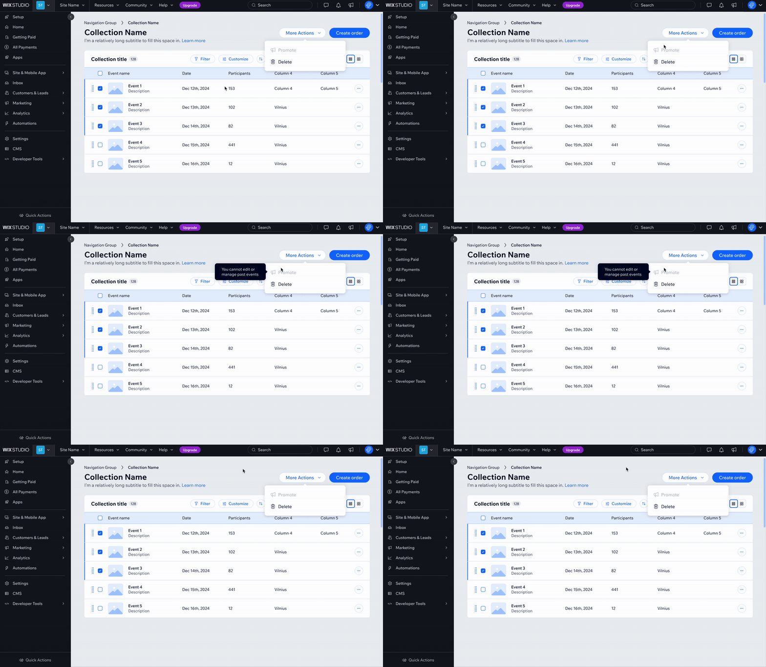
When tooltips are used on multiple items that are close together, apply a delay to avoid overwhelming the user. Use the enterDelay token to control when the tooltip appears, so it doesn't pop up too quickly or block nearby content.
Do
When using a tooltip to explain a disabled state, consider applying a delay to it.
3.5 Step-by-step flows
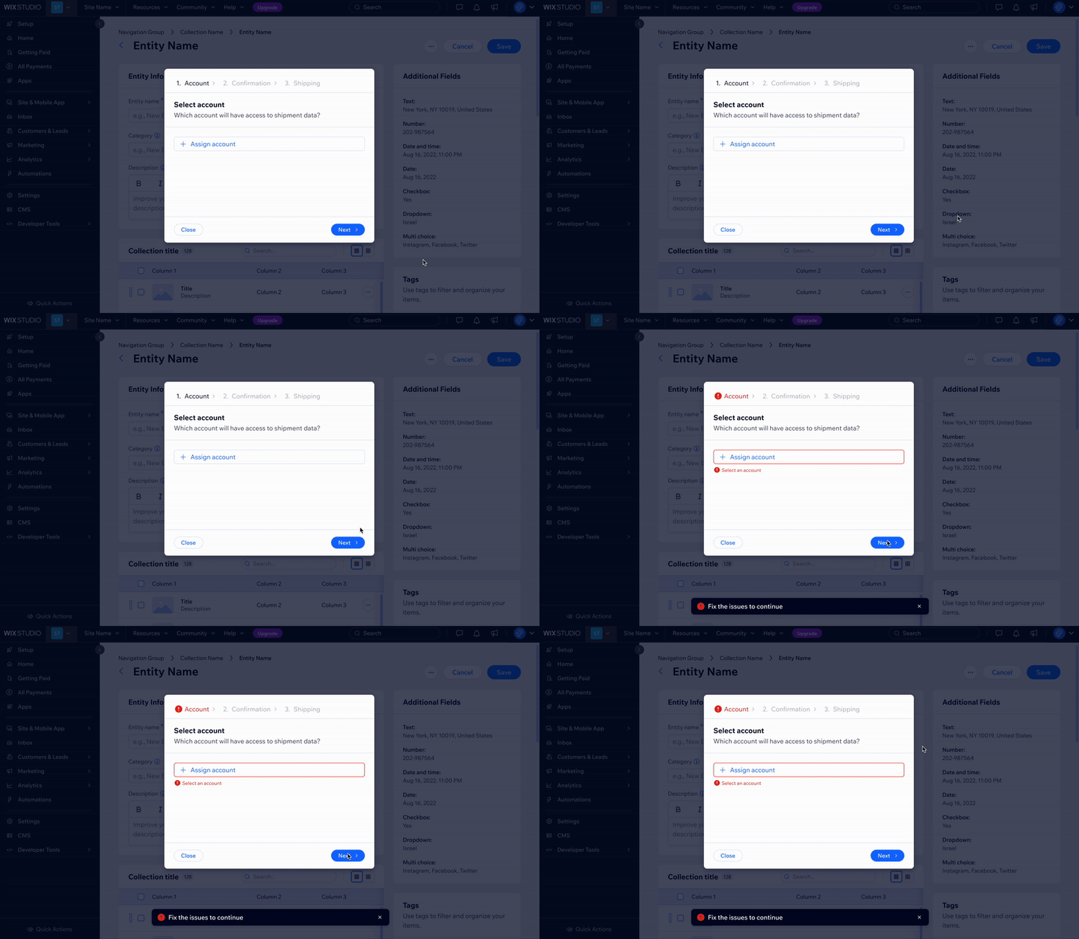
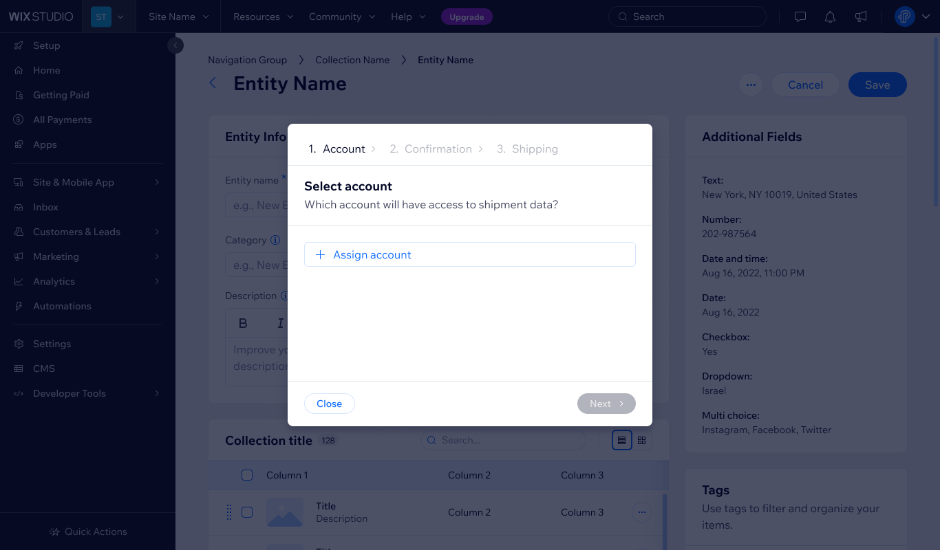
In a step-by-step flow, use disabled states to block steps (for example, Step 2, 3), but allow navigation and provide feedback when necessary.
Do
Allow users to go to the next steps and provide feedback when errors occur. When suitable, indicate fields that contain errors.
Don't
Disable navigation without clearly showing what must be done, this blocks the user.
3.6 Contextual utilities
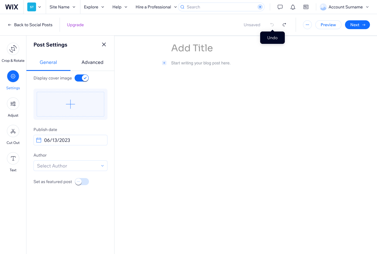
For actions like "Revert" or "Clear," we recommend using disabled states as they indicate that such actions are available, but currently it's disabled.
Do
Show disabled elements, but also show tooltips to explain them.
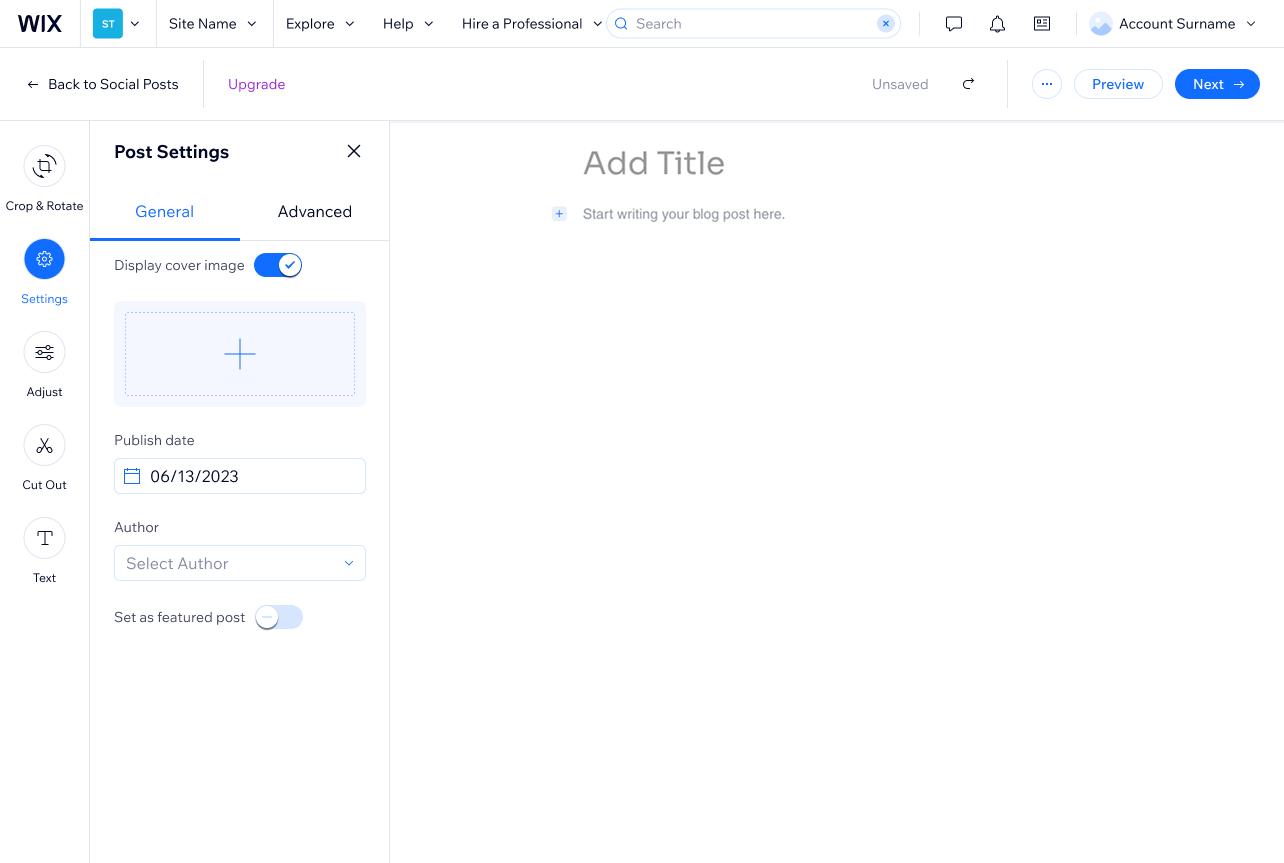
Don't
Remove elements from the page, while also shifting the layout of the page.
4. Accessibility
Disabled states present several accessibility challenges, and care must be taken to ensure all users understand what's happening.
1. aria-disabled
Make sure screen readers are aware of disabled elements. Use aria-disabled=true, and ensure elements can still be focused or announced.
2. aria-describedby
Point to a visible explanation when context isn't next to the component.
3. Use read-only when appropriate If users still need the information (for example, to copy it), use read-only or static display instead.
4. Don't rely on color alone
Color alone isn't enough to signal disabled status. Use text cues, iconography, and cursor: not-allowed for added clarity.
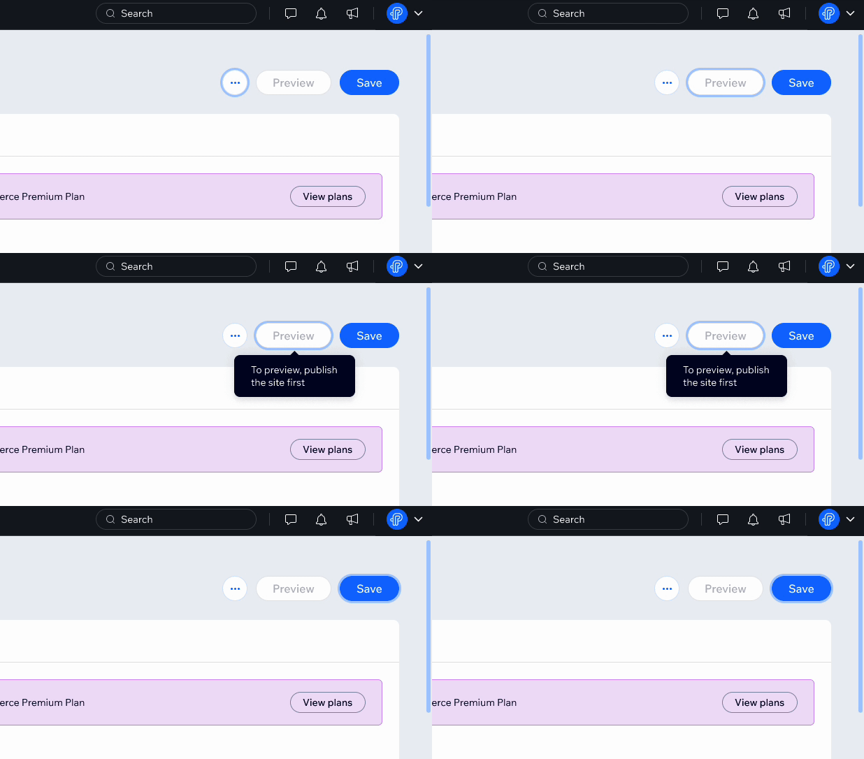
Do
Apply aria-disabled to important elements. This allows keyboard navigation.
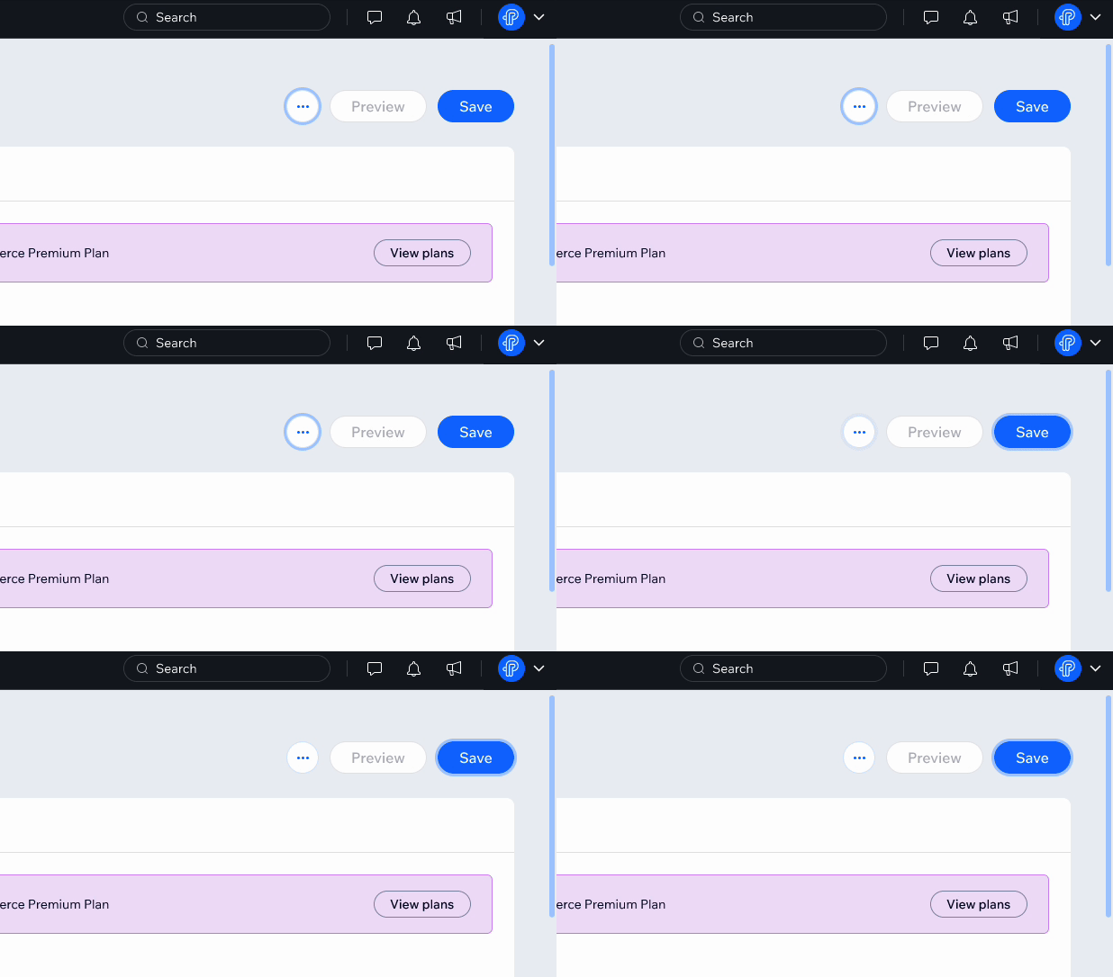
Don't
Leave important elements non-interactive. Keyboard navigation often skips disabled elements.
Related components
Last updated: 21 October 2026