Localization
What is localization
Localization is the process of adapting a product to a specific country or region, in terms of both language and culture. In other words, our goal is to have every interface, flow, and feature translated and adapted to the user's needs. Essentially, each area of the product should be customized for users in their specific locations.
Localization-friendly design
- Accommodates different text lengths in all product components.
- Supports various grammatical structures.
- Includes comments for front-end developers regarding formats pulled from libraries to ensure localization is supported.
- Avoids images containing text, as well as culture- or region-specific design elements.
Localization cheatsheet
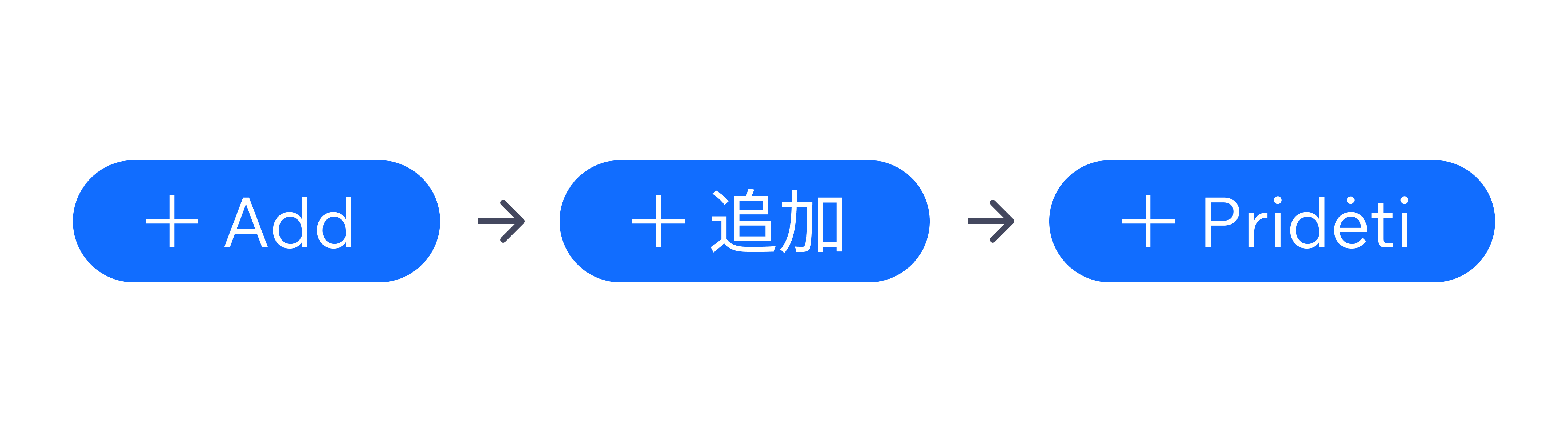
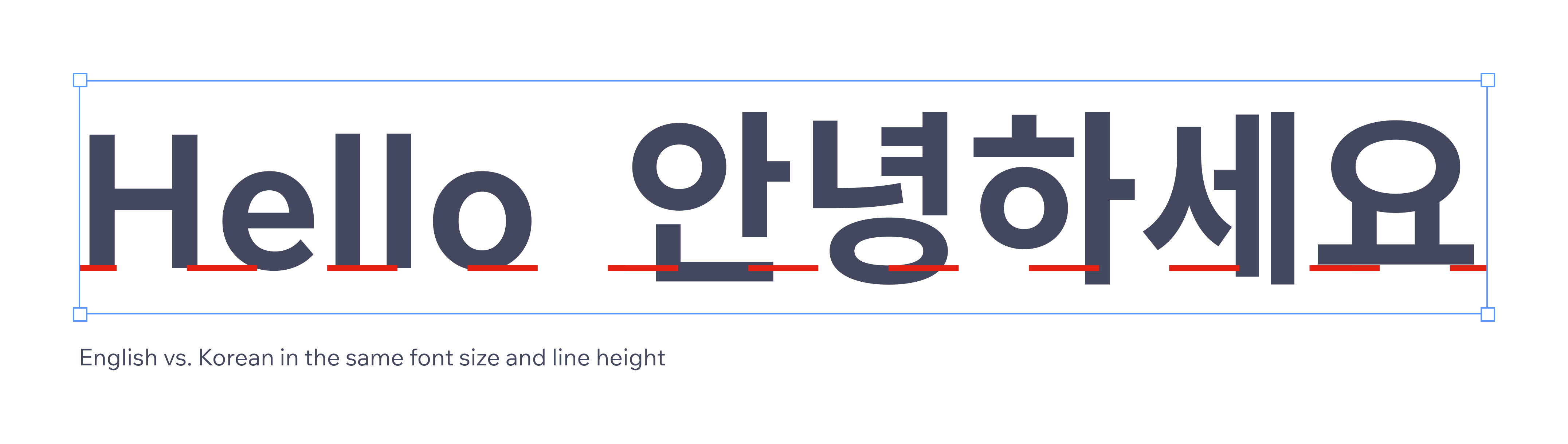
Each language has a unique structure, rules, special symbols, and alphabet. The word order and text length change according to each language. Additionally, the height of letters varies across alphabets (for example, Japanese, Chinese, Korean). Therefore, our designs shouldn't be based solely on English but should consider all Wix-supported languages and their requirements.
Text expansion guides
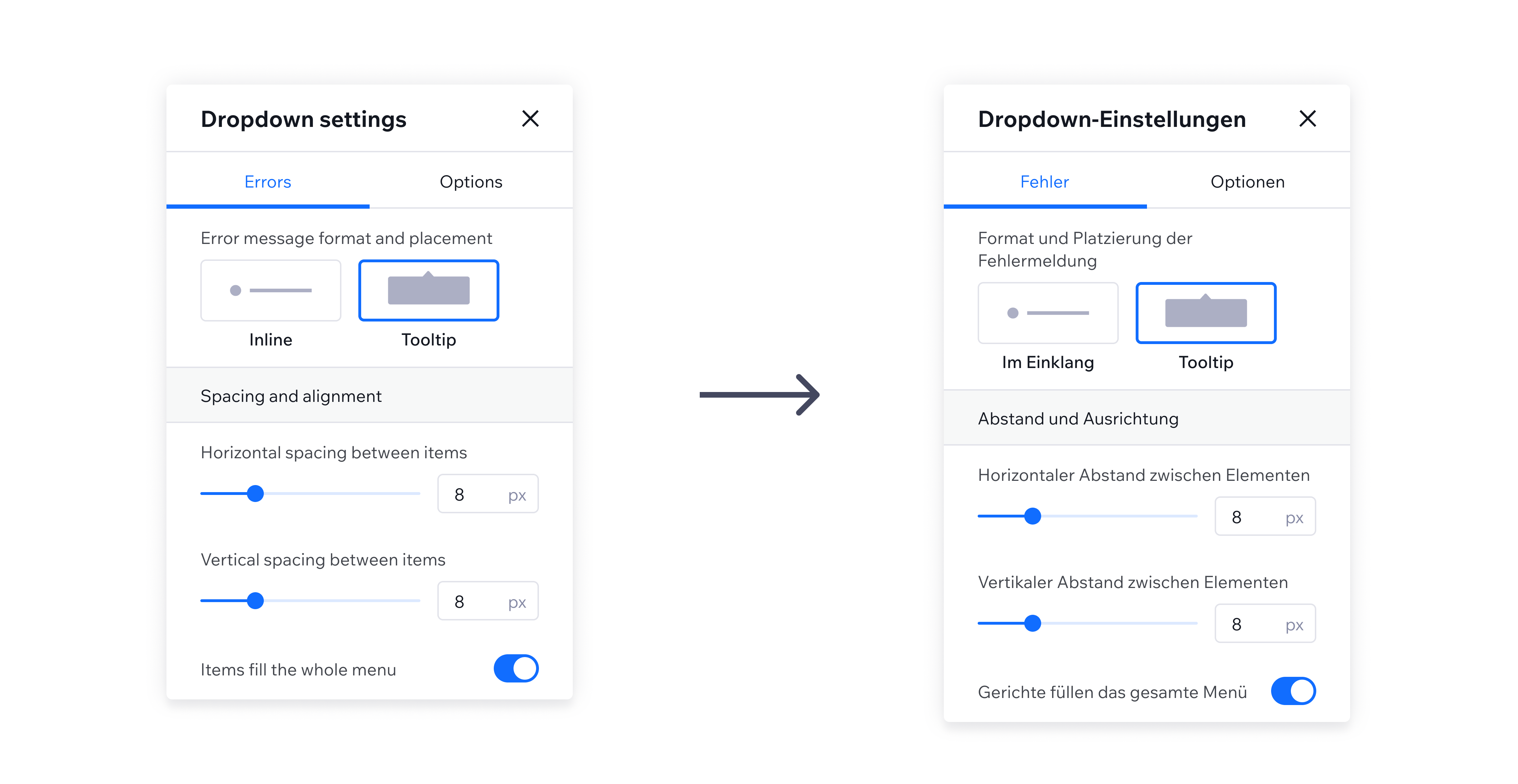
Localized content often expands. Text in most languages is on average 50% longer than English. Non-Latin languages, such as Japanese, tend to take up more vertical space. The design must be flexible enough to accommodate these changes without altering the context of use. We recommend testing designs with different languages before the development phase.
Always account for worst-case scenarios in text length. Most languages are longer than English, potentially expanding components significantly.
Examples:
- "Upgrade" (English) vs. "Fazer upgrade" (Portuguese)
- "Add" (English) vs. "Toevoegen" (Dutch)
- "Edit" (English) vs. "Bearbeiten" (German) or "Редагувати" (Ukrainian)
Avoid truncating text by design
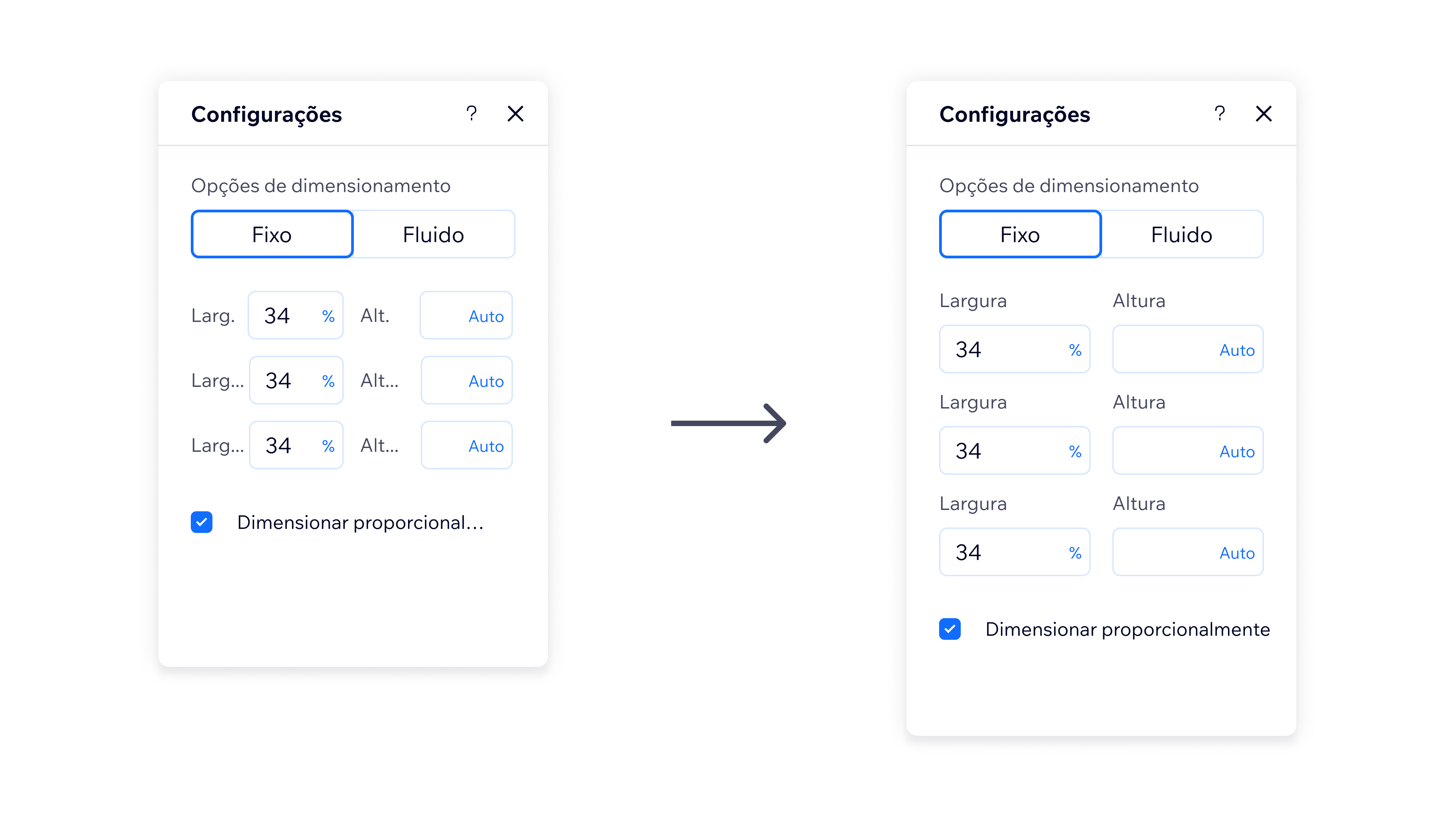
While all components are equipped to handle edge cases by truncating text and displaying the full content on hover, this should only serve as a fallback rather than a primary solution. Relying on ellipses decreases discoverability and may lead to user frustration, especially in longer languages, where truncation can occur in multiple places on the same screen.
Break text into several lines
Allow component labels, text links, bullet points and other text elements to overflow onto the next line. Use line breaks or consider using icons instead of words when applicable, but keep in mind that text buttons have a much better discoverability.
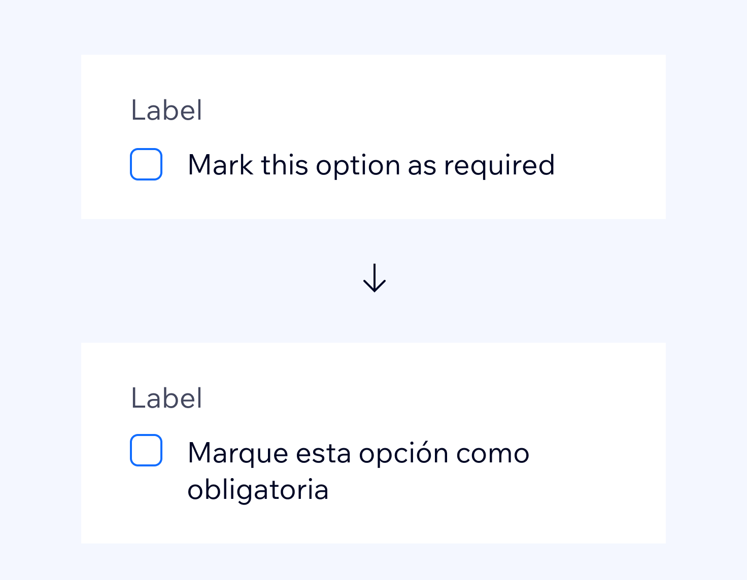
Do
When possible, use line breaks for labels. In most cases, text in English that fills one row expands to two or three rows in other languages.
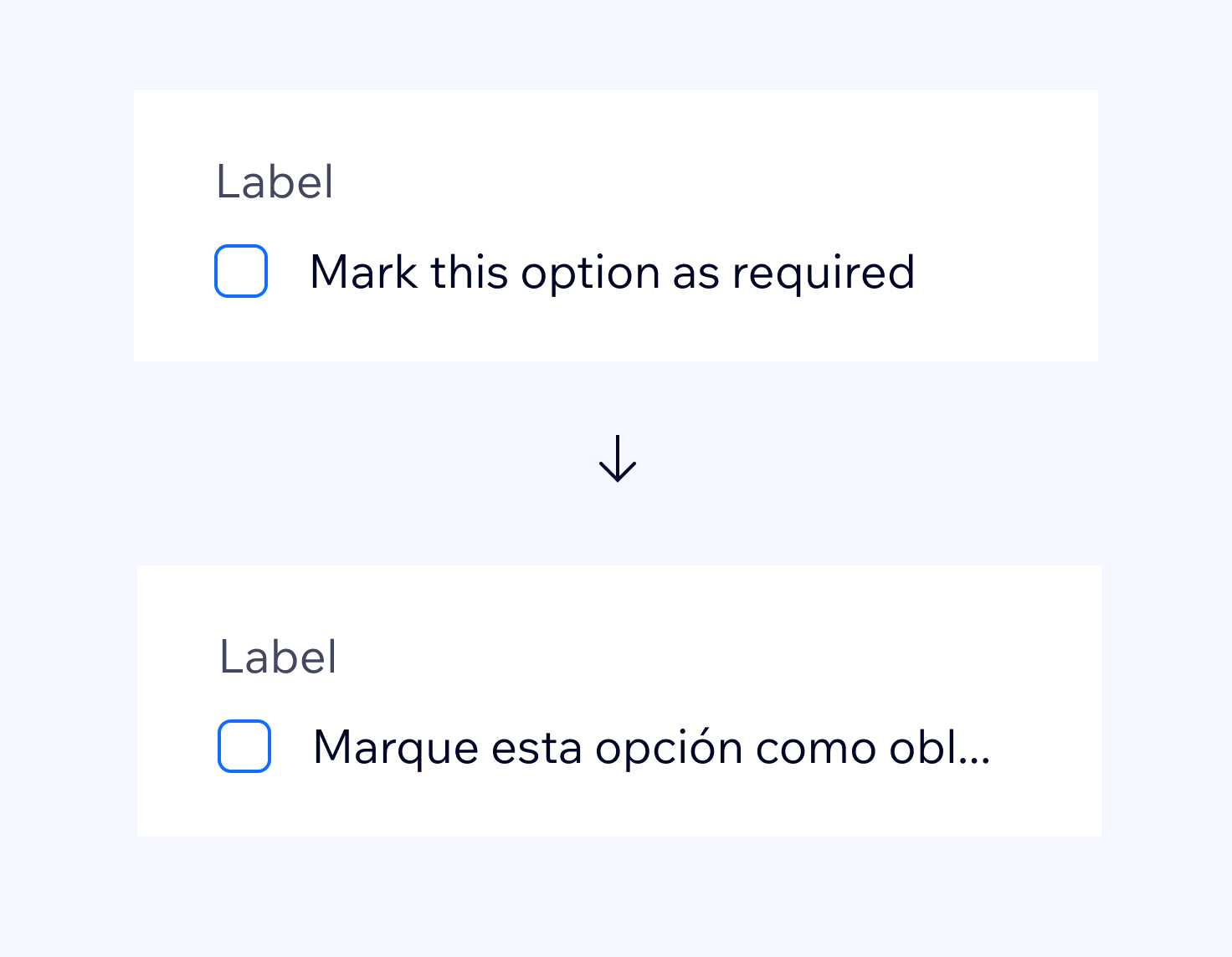
Don't
Don't rely on tooltips on ellipsis. Always assume the text takes more than one row.
Allow text to break into a second line, regardless of which component wrapper they are in, if it's a tooltip or a card, the component should grow with the content.
Layout in panels
Panels have a fixed width of 288px, so it is important to make sure that all of the elements are stacked correctly to support content in different languages.
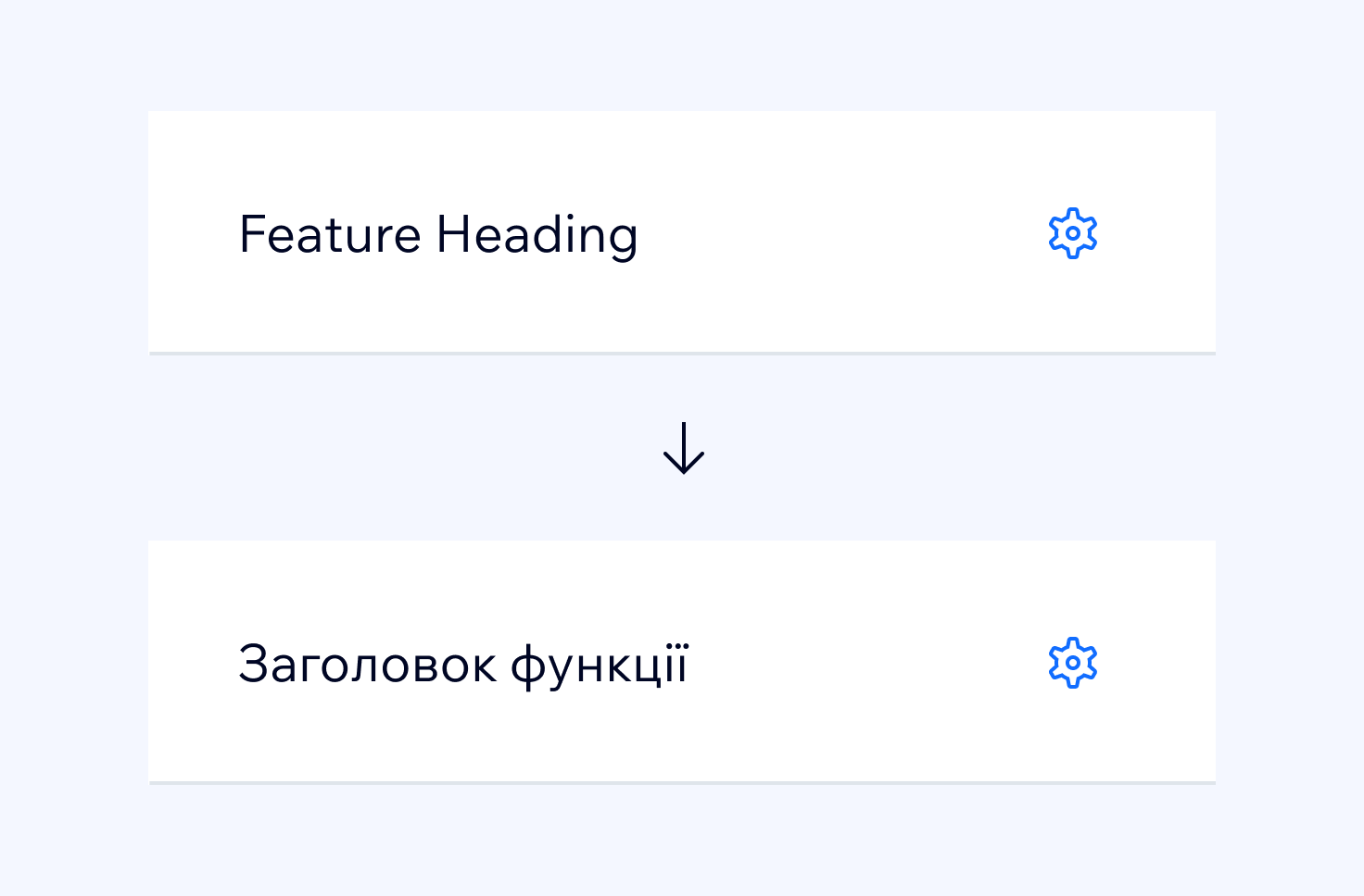
Do
You can use a text element and an <IconButton/> side-by-side.
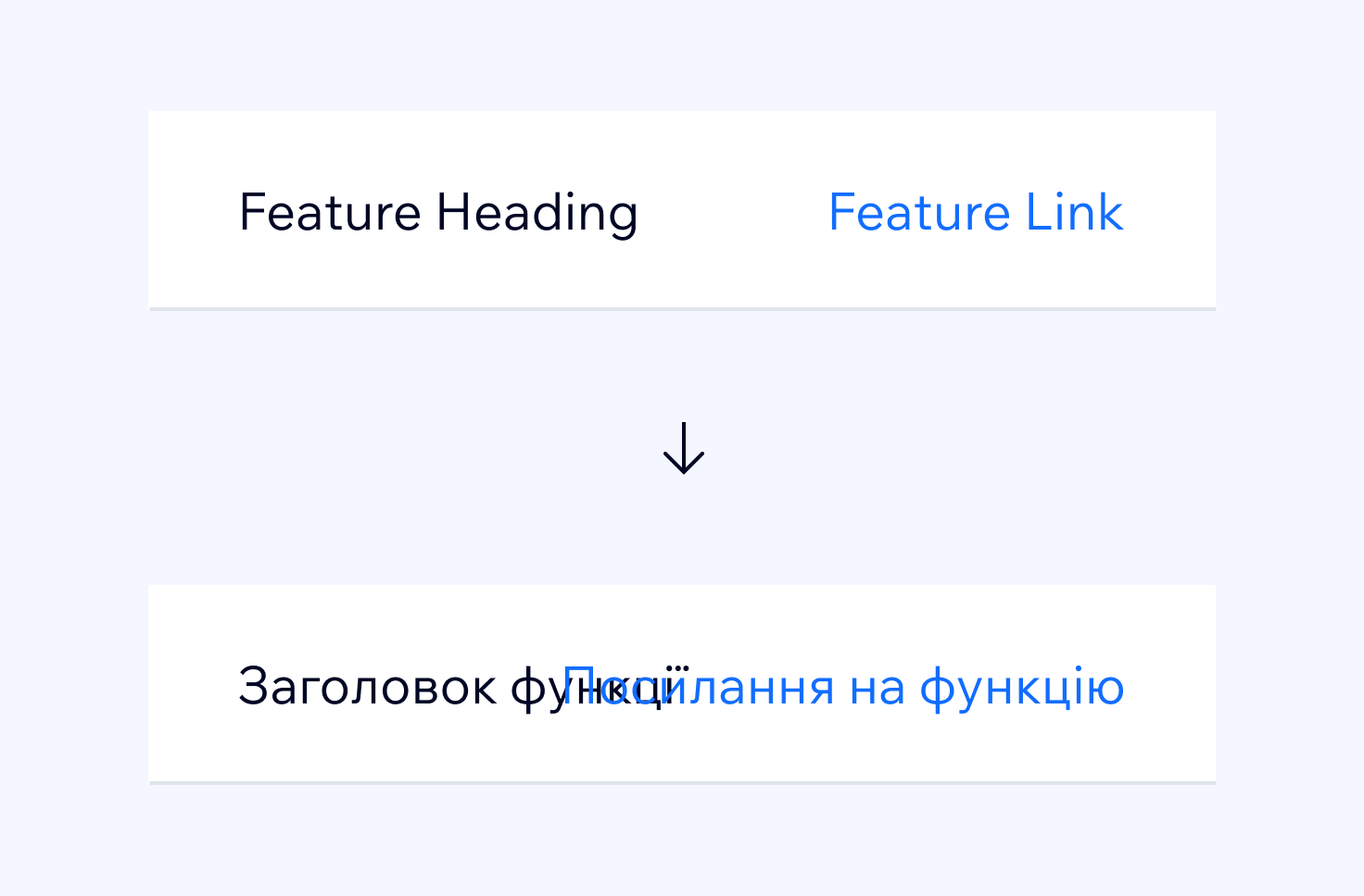
Don't
Avoid positioning two text elements next to each other, side-by-side.
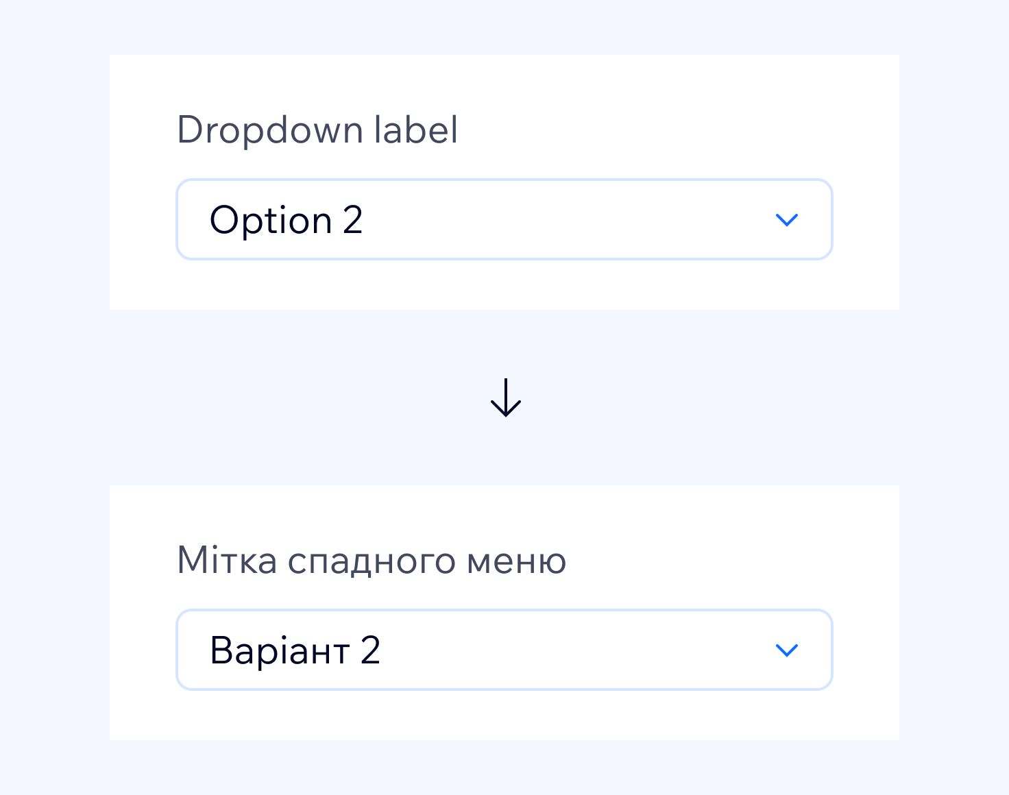
Do
Position text labels above other elements. Use
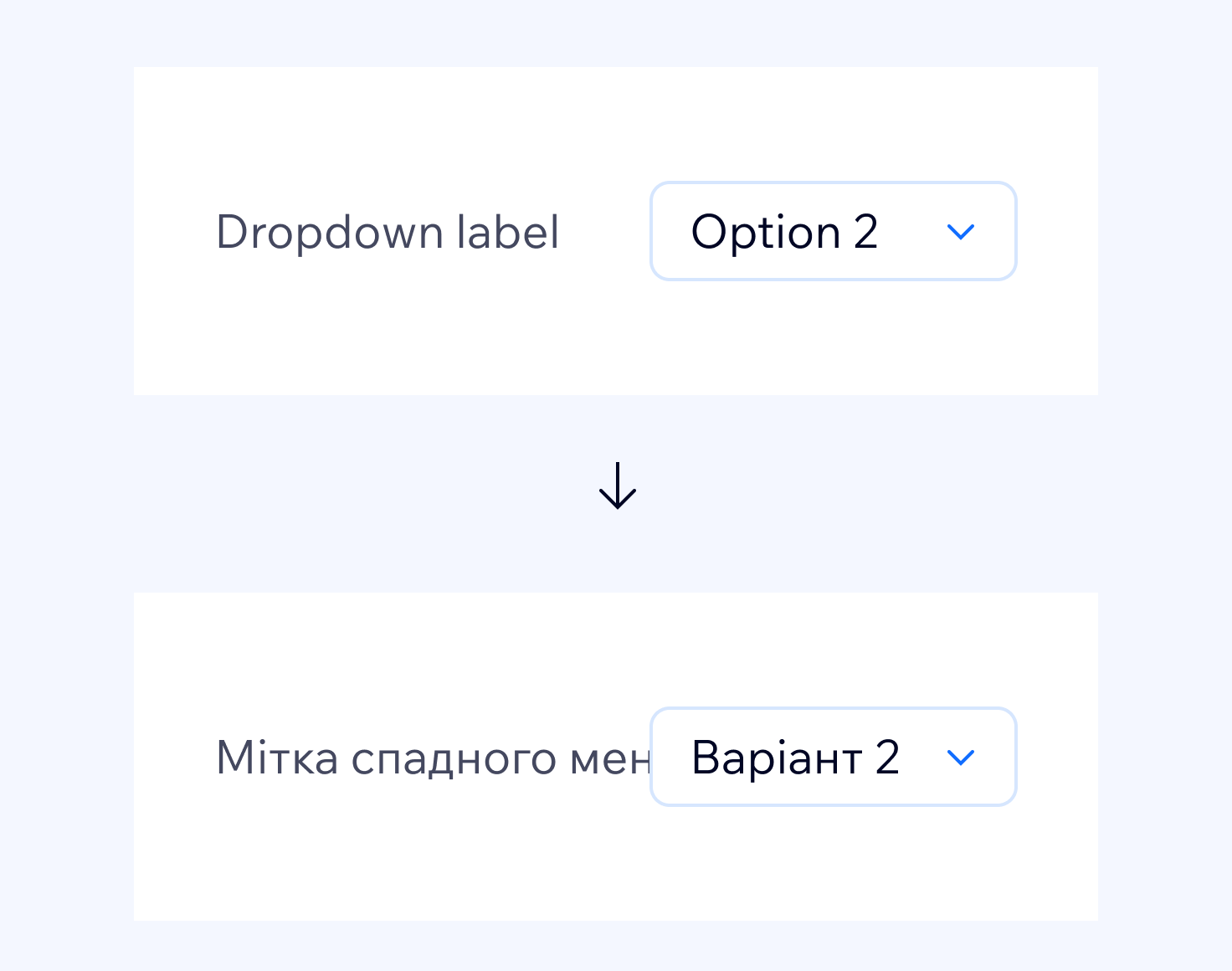
Don't
Avoid having text labels on the side of other elements. They overlap the element beside them, or cut off with an ellipsis in longer languages.
Thumbnails in panels
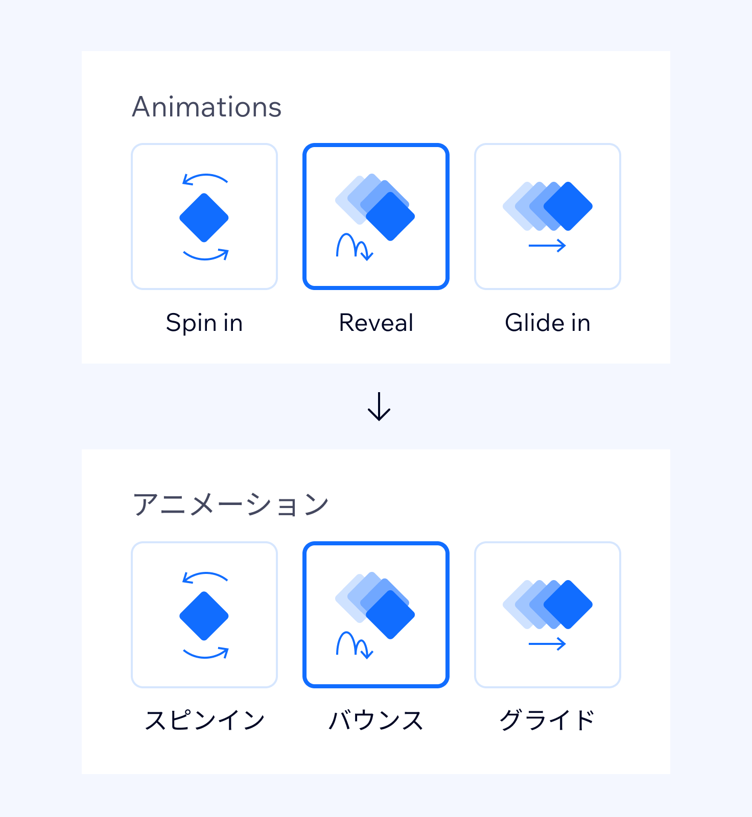
Do
Use up to 3 thumbnails in a row. Be sure the labels on the thumbnails wrap into multiline.
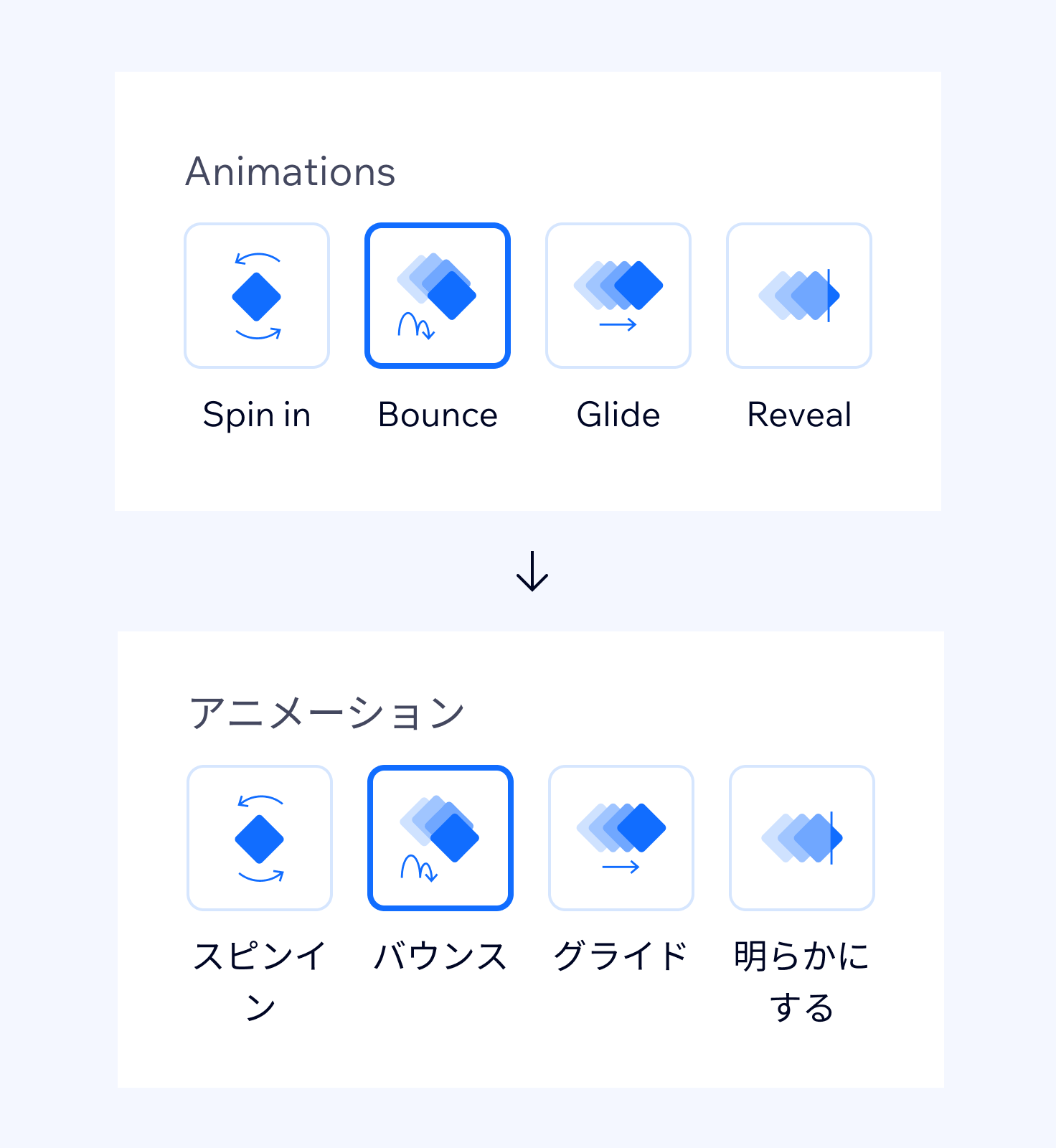
Don't
Avoid using more than 3 thumbnails in a row. If there are more, the labels tend expand and overlap. Don't rely on ellipses and tooltips to show a full label.
Avoid UI components to build sentences
As every language has a different grammatical structure, the order of words in a sentence can vary.
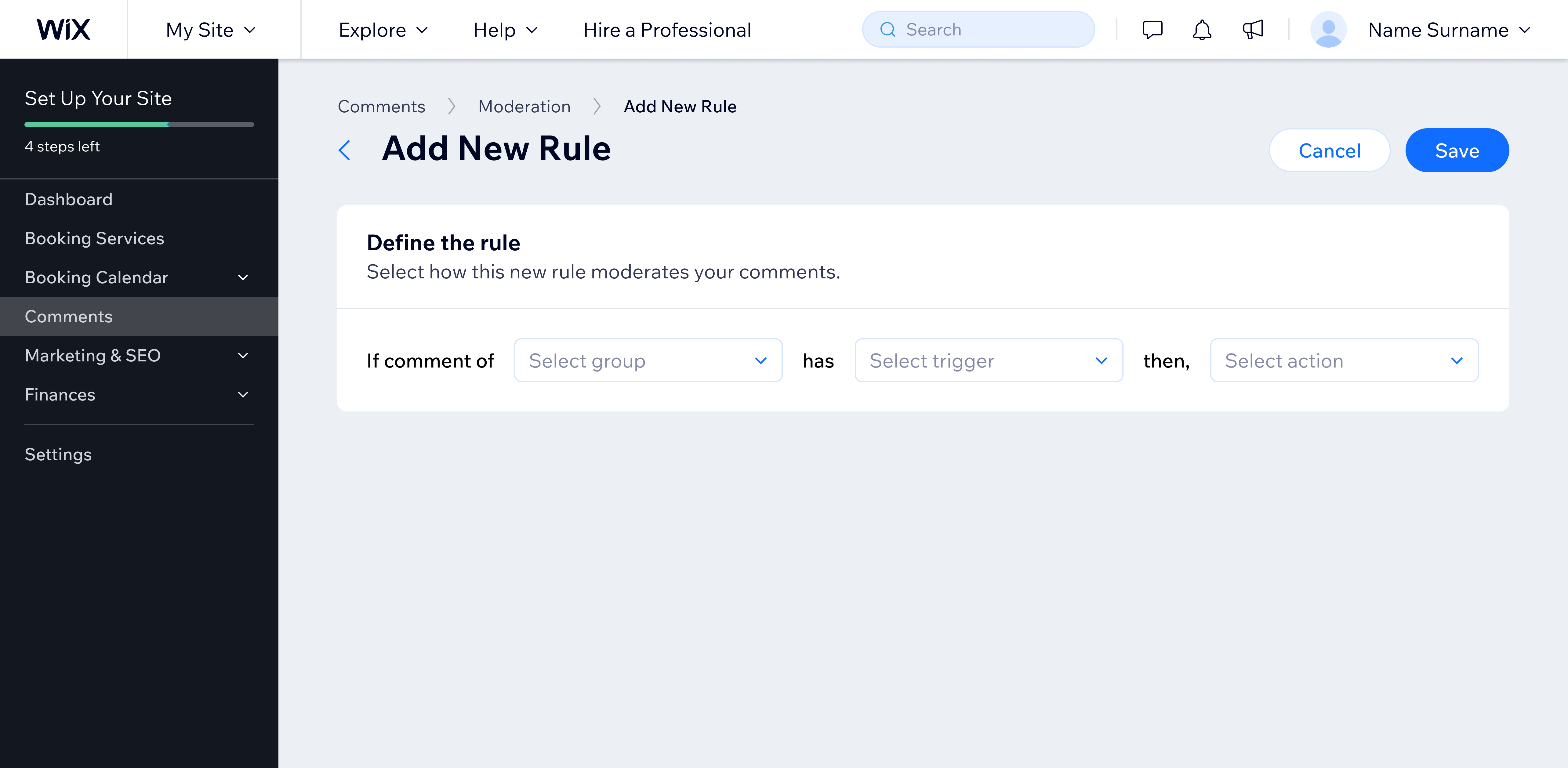
Don't
Don't build sentences from UI components that have a hardcoded structure.
In most cases layout can be redesigned to work in all languages, without having to develop different versions of the same product for different languages.
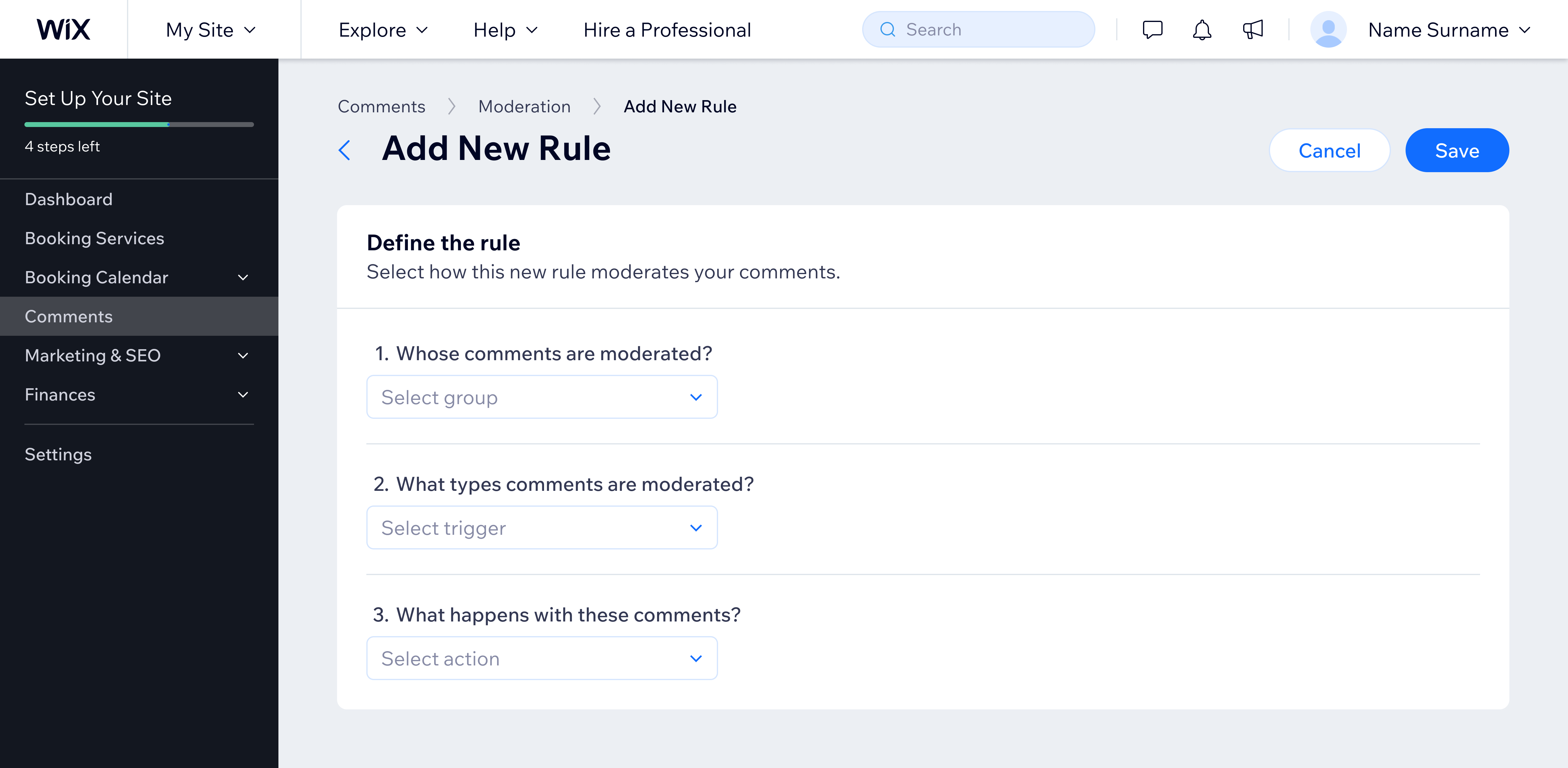
Do
Adjust layouts and copy to work in every language and region.
Dates and numbers
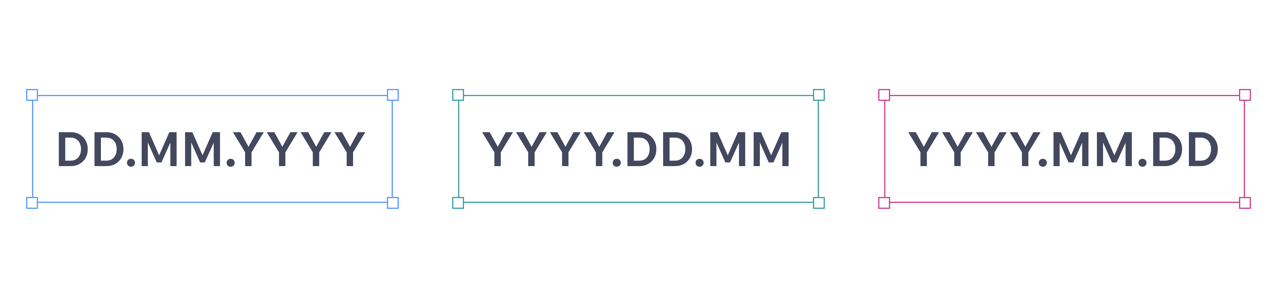
When dates and time are used in design, consider that there are different formats for each language and country. These values should never be hardcoded. For example, in <DatePicker/> component a property called "locale" is available to help handle different formats.
Text on images and illustrations
In general, it's not recommended to have any text in images or illustrations. Visuals should'nt include text. However if it must, text should be blurred or there should be different versions for each language (that means over 20 versions). This is valid for marketing pages and other promotional materials.

Do
Blur text or use shapes instead.
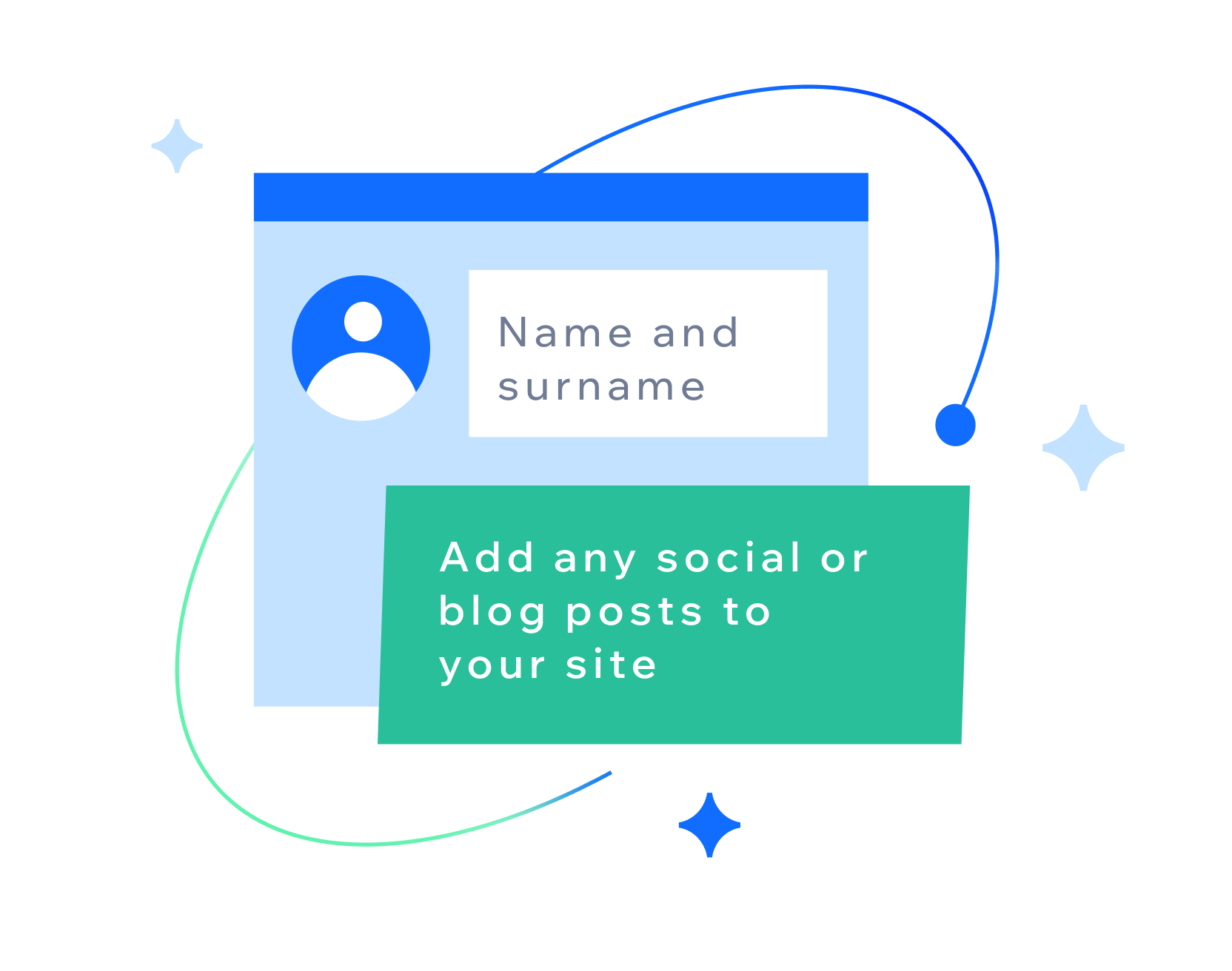
Don't
Don't add any text to images or illustrations
QA your product
Always make sure your design and product is localized correctly starting from the design phase and in development. Any later layout changes can affect localization as well. For any additional requests, reach out to your localization manager and arrange a review.
Reviewing your designs with a localization manager early saves a lot of time later. If needed, reach out to the localization team on #localization Slack channel.
Last updated: 21 October 2026