Studio 2.0 Theme
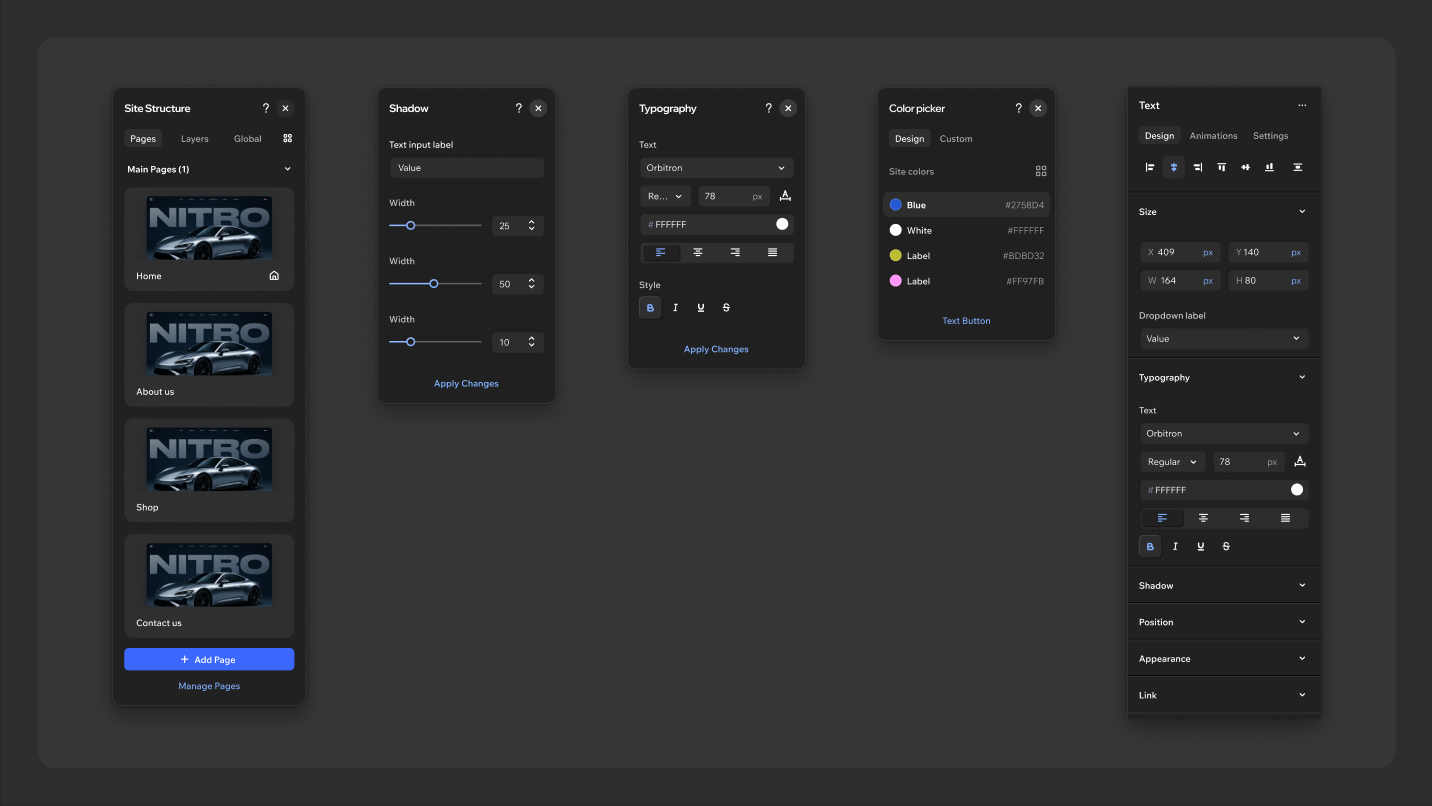
Studio 2.0 is the dark skin of the Wix Studio editor. It builds on the foundation of the Harmony theme and turns it into a refined dark-mode experience, so the same visual language runs across the company's products. Here it is crafted for a more professional audience.
The scale is deliberately tighter than Harmony's. A more compact scale of components and typography increases precision, and subtle transparency across overlay surfaces adds depth. The material sensibility of shadows, elevation and layering keeps the feel cohesive and tactile.
In code, Studio 2.0 is the odeditor-dark theme, the dark counterpart of Harmony's odeditor. It isn't the older studio theme. Everything on this page is expressed through odeditor-dark tokens. Use tokens rather than hard-coded values so the same markup renders correctly in every theme.
There is also a studio2-light theme: Studio 2.0's proportions carrying Harmony's colours. This page describes the dark skin only, so its colour guidance doesn't apply there; it's being reviewed component by component and isn't ready for use yet.
1. Foundations
1.1 Typography
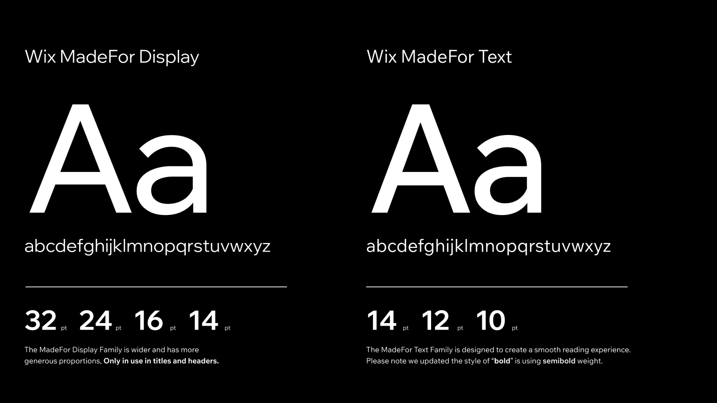
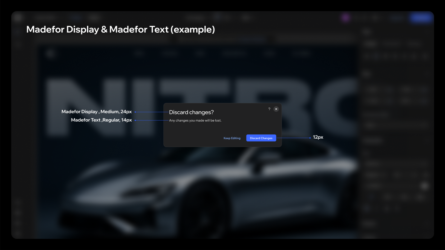
Studio 2.0 uses the same two Madefor families as Harmony, one scale step smaller.
Wix Madefor Display: wider, with more generous proportions. Used only in titles and headers, mostly panel headers and modal titles. Sizes: 32 / 24 / 16 / 14pt.
Wix Madefor Text: designed for a smooth reading experience. Sizes: 14 / 12 / 10pt. Note that "bold" renders with the semibold weight.
Rules
- The primary text size is 12pt. Don't use 14pt anywhere other than panel headers and modal body text.
- Use semibold mostly for section headers, accordions and buttons, so text aligns optically with the 1.5px icons used as prefix/suffix.
Type scale
| Style | In use | Font | Weight | Size | Line height | Letter spacing |
|---|---|---|---|---|---|---|
| H1 | XL modal | Madefor Display | Regular | 32pt | 40 | -0.5 |
| H2 | L modal | Madefor Display | Medium | 24pt | 30 | -0.5 |
| H3 | M panel header | Madefor Display | Bold | 16pt | 24 | -0.5 |
| H4 | S panel titles | Madefor Text | Medium | 14pt | 18 | 0 |
| H5 | Labels | Madefor Text | Semibold | 12pt | 18 | 0 |
| Body (Small) | Madefor Text | Semibold / Medium / Regular | 14pt | 18 | 0 | |
| Buttons (Tiny) | Madefor Text | Semibold | 12pt | 16 | 0 | |
| Body (Tiny) | Madefor Text | Medium / Regular | 12pt | 16 | 0 |
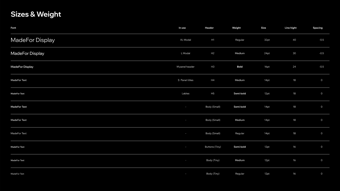
Text in panels
| Role | Size / weight |
|---|---|
| Panel header | 14px Display / Bold |
| Section header | 12px Semibold |
| Field label | 12px Medium |
| Control value | 12px Regular |
1.2 Colour
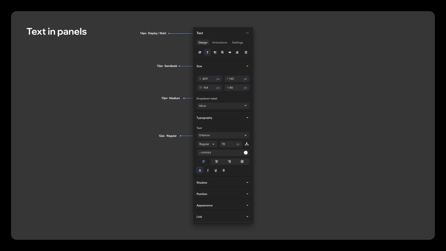
Studio 2.0 has the same two primary ramps as Harmony, Blue and Dark / greyscale, plus the system ramps, all re-cut for a dark surface. They are the odeditor-dark values of the usual --wds-color-* tokens, so the ramp names are unchanged and only the values differ.
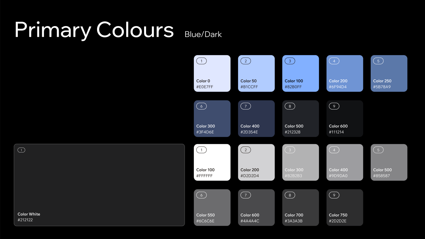
Blue: --wds-color-blue-*
| Step | Hex |
|---|---|
| Color 0 | #E0E7FF |
| Color 50 | #B1CCFF |
| Color 100 | #82B0FF |
| Color 200 | #6F94D4 |
| Color 250 | #5B78A9 |
| Color 300 | #3F4D6E |
| Color 400 | #2D354E |
| Color 500 | #212328 |
| Color 600 | #111214 |
Dark / greyscale: --wds-color-black-*
| Step | Hex |
|---|---|
| Color 100 | #FFFFFF |
| Color 200 | #D2D2D4 |
| Color 300 | #B2B2B3 |
| Color 400 | #9D9DA0 |
| Color 500 | #858587 |
| Color 550 | #6C6C6E |
| Color 600 | #4A4A4C |
| Color 700 | #3A3A3B |
| Color 750 | #2D2D2E |
The ramp is inverted relative to Harmony: black-100 is white and the high steps are the dark surfaces. --wds-color-white is #212122. In a dark theme, the "white" surface token is the near-black panel base.
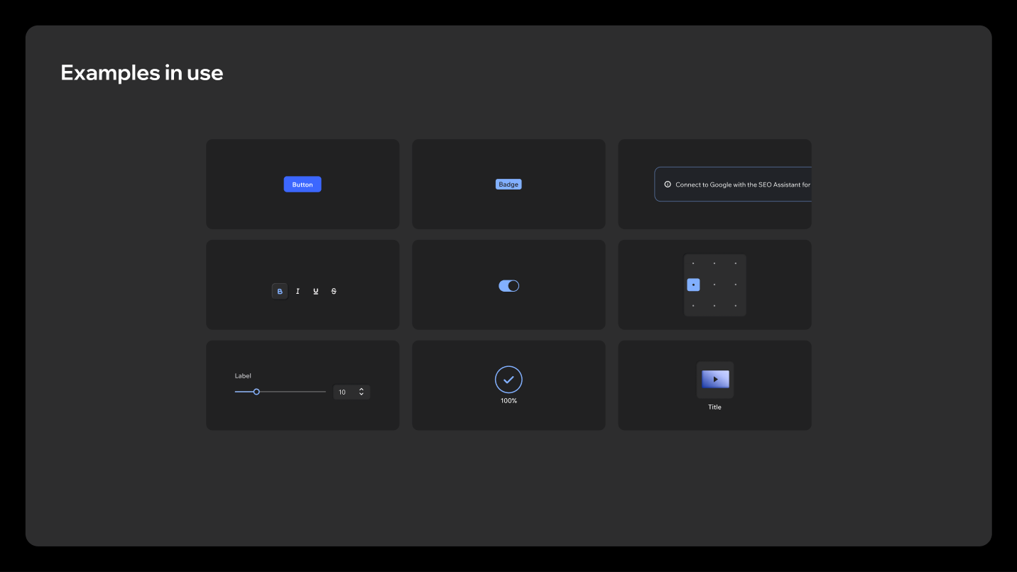
Where blue is used
Blue stays the primary action colour. Primary buttons, selected toggle and segmented states, sliders, checkboxes, progress indicators and inline links all use it, which keeps interactive affordances recognisable against the dark surfaces.
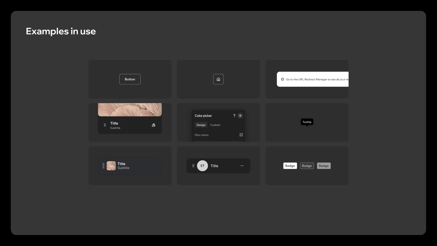
Where white is used
White is the supporting action colour, and it takes the role black plays in Harmony: secondary buttons, tertiary icon buttons, white notifications, tooltips, badges and list items. Use it consistently for these patterns to keep a clear hierarchy against blue.
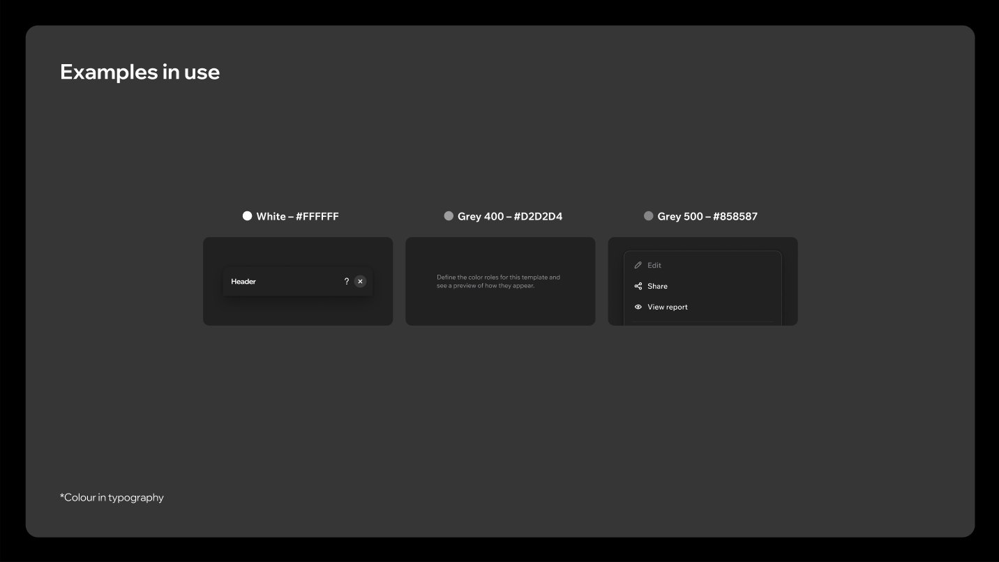
Greyscale in typography
| Role | Value |
|---|---|
| Primary text | White, #FFFFFF |
| Secondary text | Grey 400, #D2D2D4 |
| Disabled / tertiary text | Grey 500, #858587 |
System colours
Red, orange, yellow and green ramps for status and feedback, each running from a light Color 0 down to a deep Color 600 that reads as a surface on dark backgrounds.
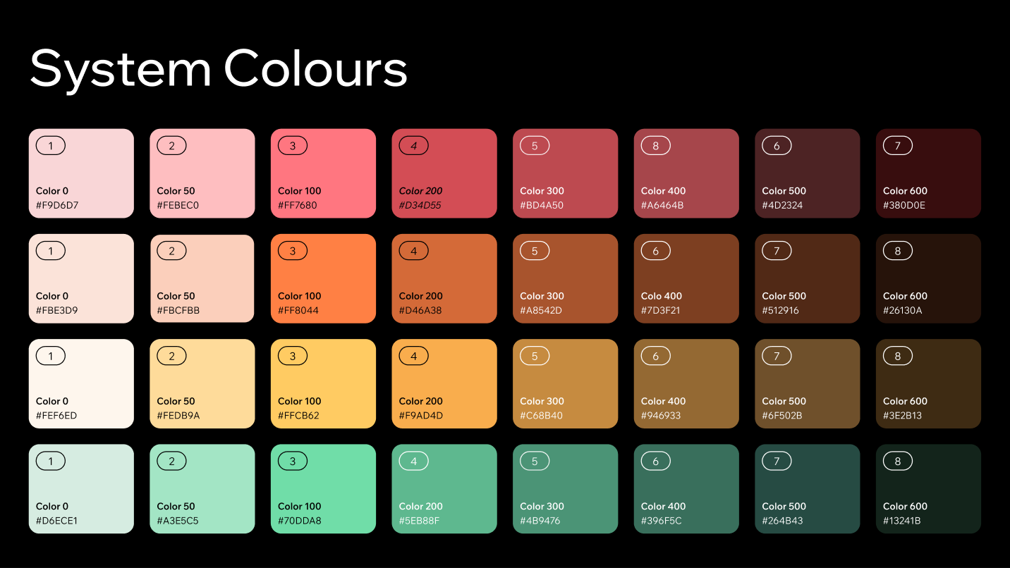
| Ramp | Steps 0 → 600 |
|---|---|
| Red | #F9D6D7, #FEBEC0, #FF7680, #D34D55, #BD4A50, #A6464B, #4D2324, #380D0E |
| Orange | #FBE3D9, #FBCFBB, #FF8044, #D46A38, #A8542D, #7D3F21, #512916, #26130A |
| Yellow | #FEF6ED, #FEDB9A, #FFCB62, #F9AD4D, #C68B40, #946933, #6F502B, #3E2B13 |
| Green | #D6ECE1, #A3E5C5, #70DDA8, #5EB88F, #4B9476, #396F5C, #264B43, #13241B |
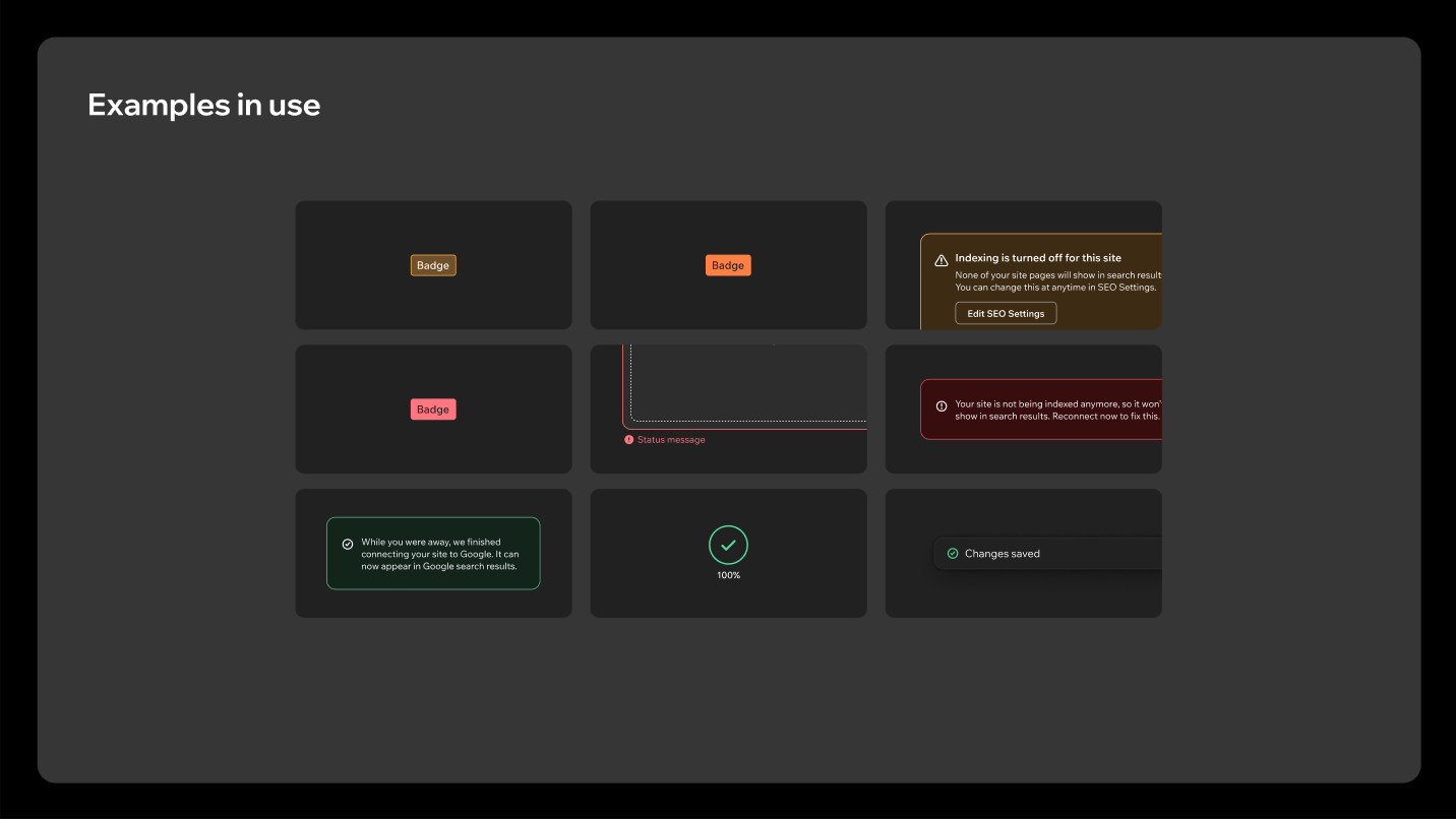
Implementation note. Reference --wds-color-* tokens, never the hex values above. The specification and the shipped odeditor-dark theme have drifted in a few places. The greyscale steps 200 to 600 are slightly cooler in the deck than in the tokens (spec #D2D2D4 / #B2B2B3 / #9D9DA0 / #858587 / #6C6C6E / #4A4A4C against token #D4D3D2 / #A8A6A5 / #A09E9D / #878685 / #666565 / #454544), Red 300 is #BD4A50 in the deck and #A6464B in the tokens. Green 100 is #70DDA8 in the deck and #53DA98 in the tokens. The deck's typography swatches also label #D2D2D4 as "Grey 400" and #858587 as "Grey 500", which are steps 200 and 500 of its own ramp. Confirm with the Design System team before relying on a specific step.
1.3 Shadows
Four elevation levels, mapped to the same semantic tokens as Harmony.
| Level | Token | Applies to |
|---|---|---|
| Raised | --wds-shadow-surface-raised | Cards |
| Overlay | --wds-shadow-surface-overlay | Panels, dropdown lists, popover menus, white tooltips |
| Overlay dark | --wds-shadow-surface-overlay-dark | Dark tooltips, dark popovers |
| Modal | --wds-shadow-surface-modal | Modals |
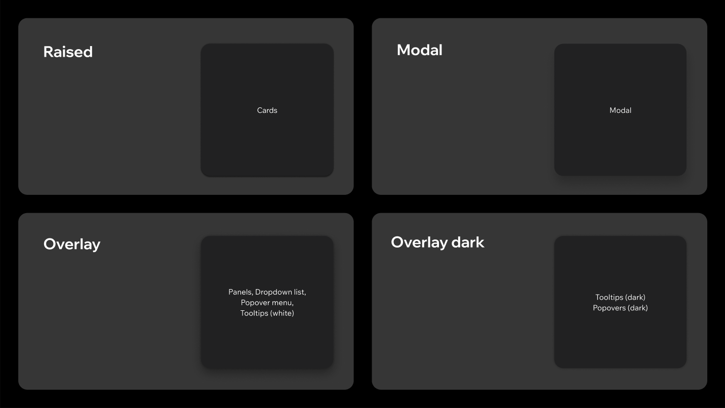
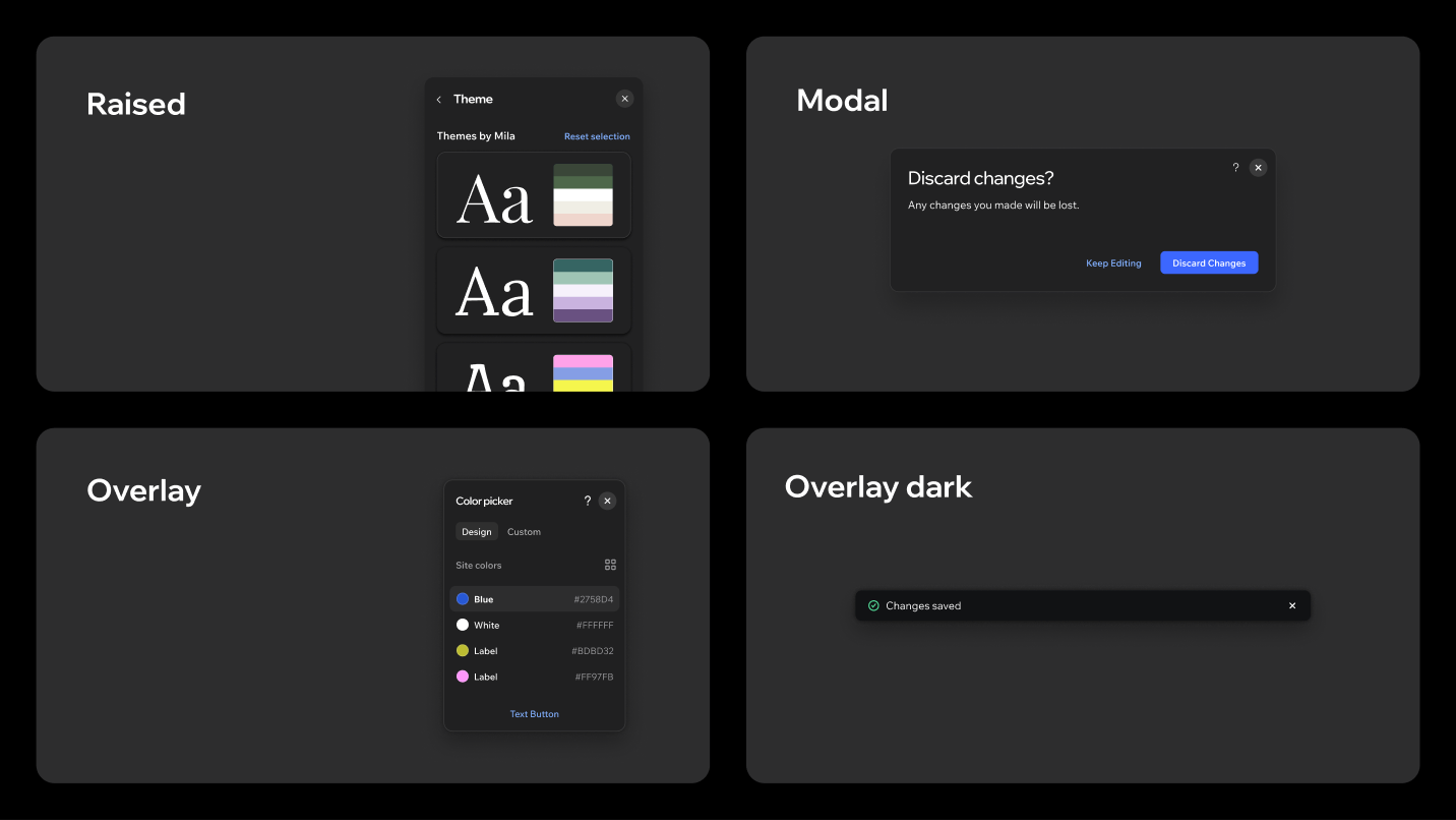
On a dark surface elevation reads mostly through the surface colour and its transparency. The shadow only reinforces it, so don't add extra shadows by hand to fake depth.
1.4 Corner radius
| Radius | Token | Applies to |
|---|---|---|
| 24px | --wds-border-radius-1200 | Announcement modals |
| 12px | --wds-border-radius-600 | Modals, panels, large images, clickable cards |
| 8px | --wds-border-radius-400 | Large and medium buttons and inputs |
| 6px | --wds-border-radius-300 | Small and tiny buttons and inputs, for optical alignment |
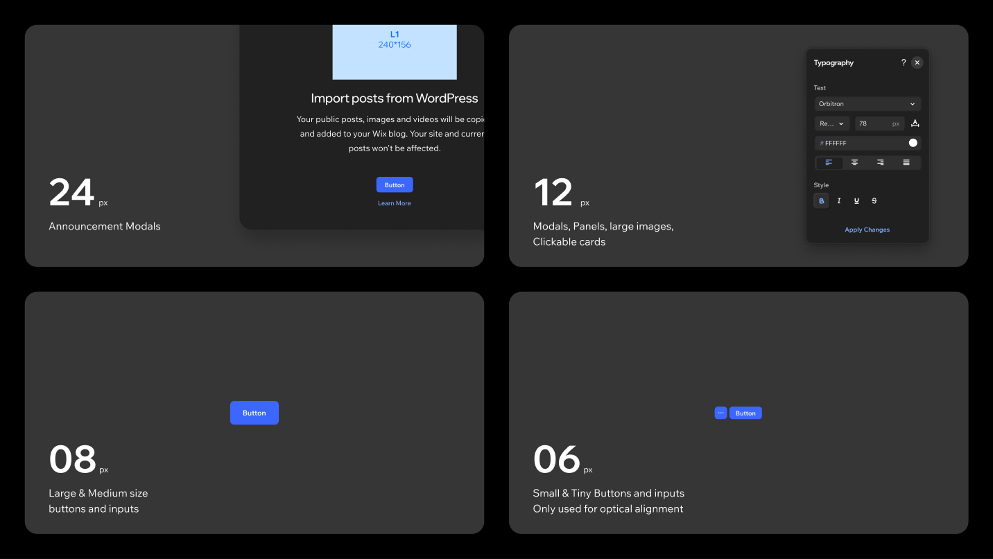
Button already maps these radii per size in odeditor-dark (--wds-button-border-radius-*), so don't set a radius on a button by hand.
1.5 Icons
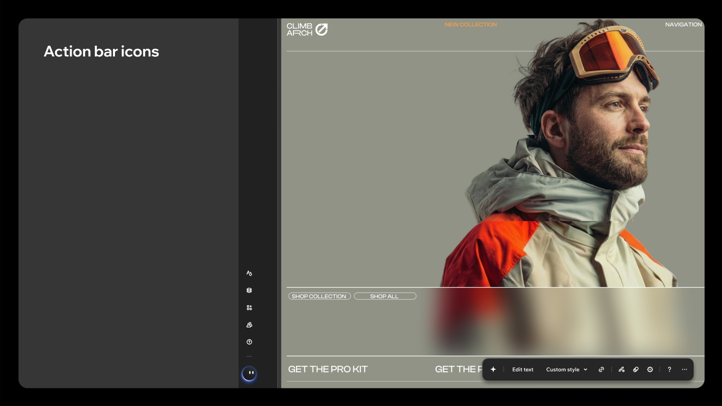
Icons are drawn with 1.5px strokes, in 18px and 24px sizes. The heavier stroke is what lets an icon sit optically level with semibold text when used as a prefix or suffix.
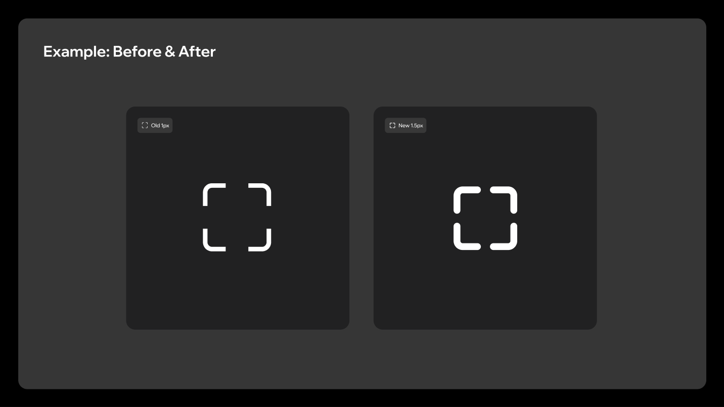
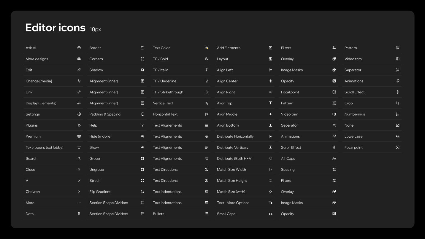
Don't
Mix icons from other libraries. Use icons exclusively from the dedicated Editor icons library, otherwise stroke weights and optical sizes stop matching across the product.
2. Buttons
2.1 Sizes
Four heights, matching the Button size prop in the odeditor-dark theme.
| Height | size |
|---|---|
| 46px | large |
| 38px | medium |
| 30px | small |
| 24px | tiny |
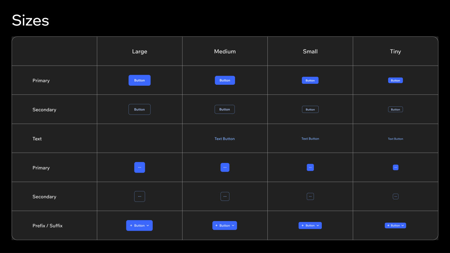
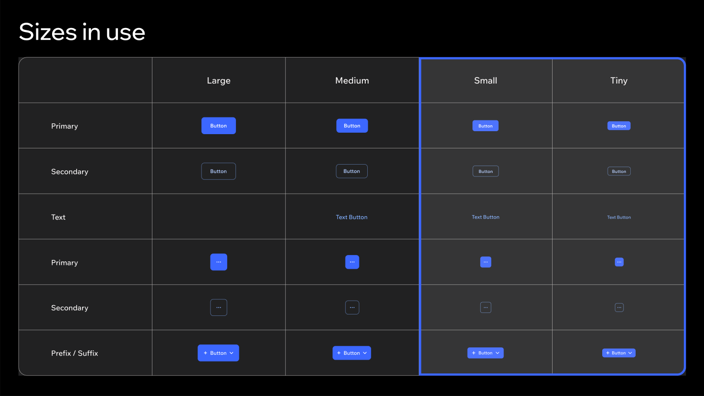
Small (30px) and Tiny (24px) are the sizes in use in Studio 2.0. This is the clearest difference from Harmony, where M is the default inside panels. The compact scale is what makes the dark editor read as precise rather than roomy. Large and Medium stay available for surfaces that need them, such as modals.
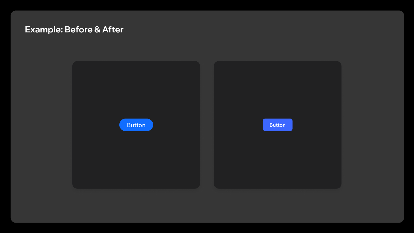
2.2 Shape
Buttons are no longer pill-shaped: they use the corner radius scale above: 8px at large and medium, 6px at small and tiny.
2.3 States
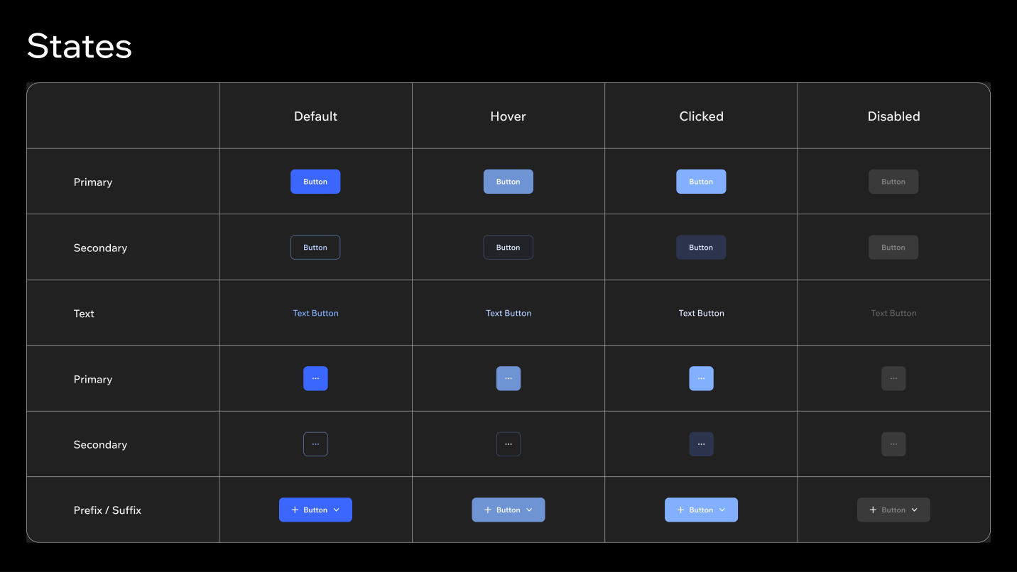
2.4 Skins
Beyond the standard blue, three additional skins are available: Dark, Alert and Premium.
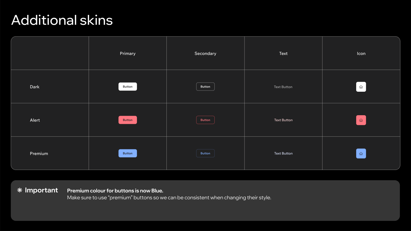
- The premium colour for buttons is blue. Always use the
premiumskin rather than restyling a standard button, so the whole product changes together when the premium style changes. - Dark renders as a light-on-dark button here. It is the inverted skin, not a darker blue.
2.5 Toggle buttons
There are three ToggleButton skins.
| Skin | Where to use |
|---|---|
| Standard (Main) | General use, all panels |
| Dark (Stage) | Stage environment only: top bar, action bar, and side bar |
| Inverted (Stage) | Stage environment only: top bar, action bar, and side bar |
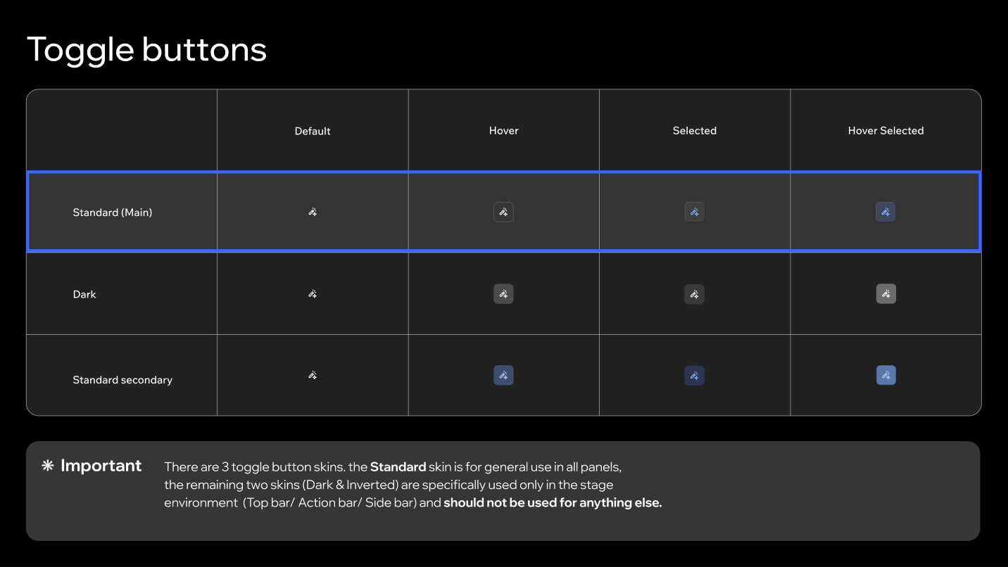
The Dark and Inverted skins are reserved for the stage environment and shouldn't be used for anything else.
3. Panels
3.1 Inputs & controllers
The default input and controller size in panels is S: small inputs, small accordions and small toggle buttons, with tiny segmented toggles.
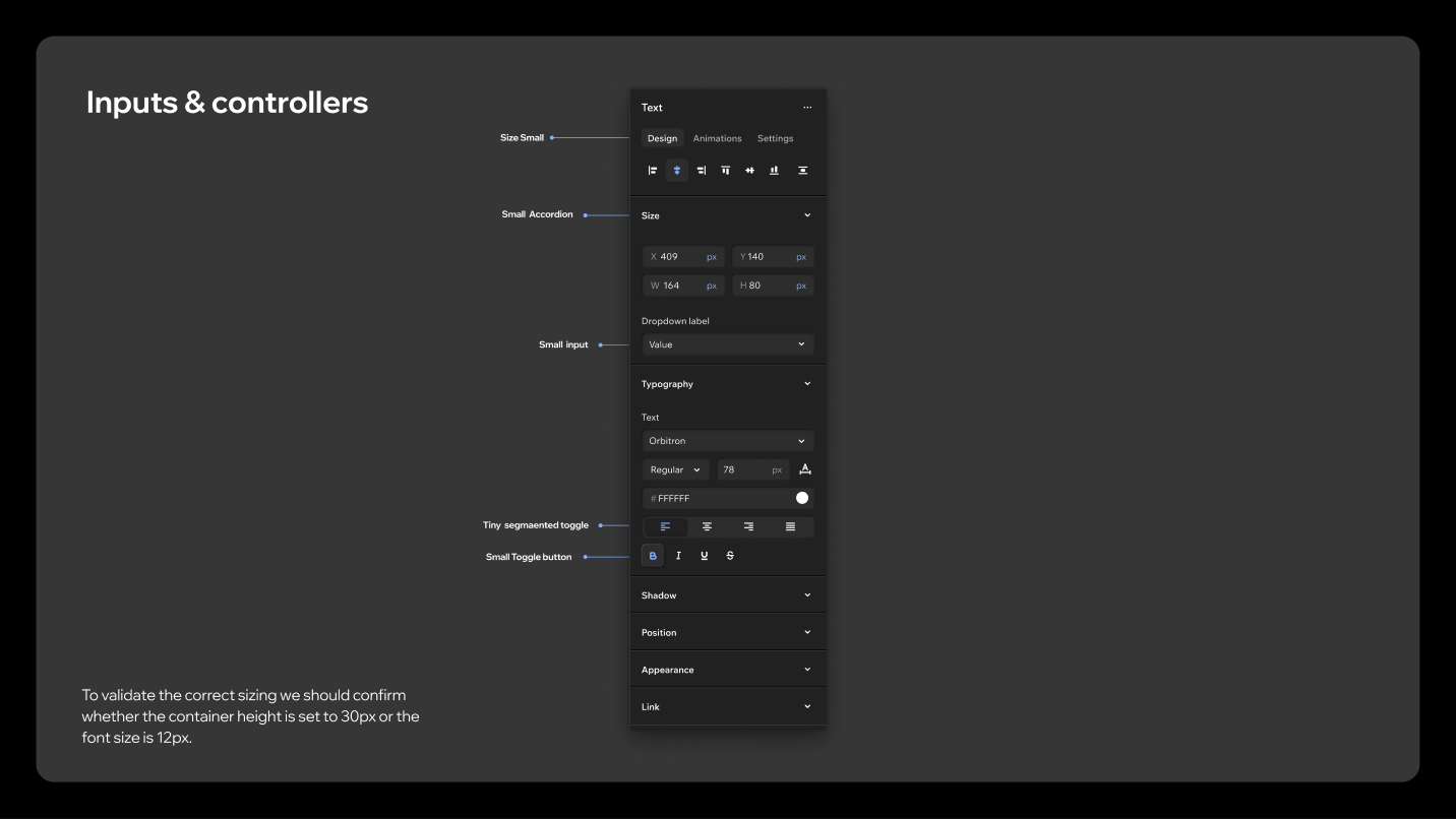
To check that a control is on the right size, confirm the container height is 30px and the font size is 12px.
3.2 Spacing
Some panel spacing is given by the components and can't be changed; the rest has to be set manually.
| Spacing | Where | Source |
|---|---|---|
| 8px | Below the panel header, before the first item | Manual |
| 4px | Between tightly grouped controls | Manual |
| 24px | Between panel sections | Given |
| 12px | Panel content padding, top and bottom | Given |
| 16px | Panel content padding, sides | Given |
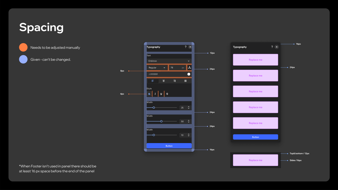
When a footer isn't used in a panel, leave at least 16px of space before the end of the panel.
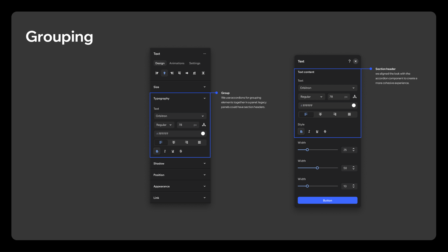
3.3 Grouping
Use accordions to group elements together in a panel. Legacy panels may still use section headers; the section header look has been aligned with the accordion component to create a more cohesive experience.
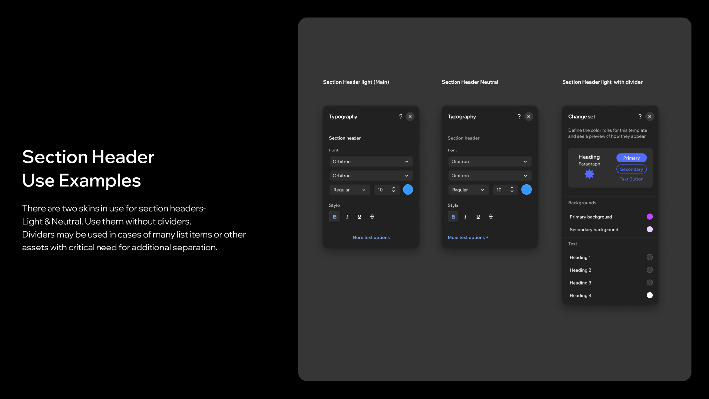
Two SectionHeader skins are in use, Light (main) and Neutral. Use them without dividers. Dividers may be used only where many list items or other assets create a critical need for extra separation.
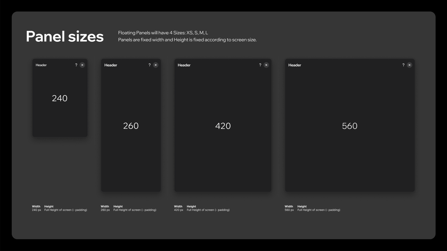
3.4 Panel sizes
Floating panels come in four fixed widths. Height is fixed to the screen size, minus padding.
| Size | Width |
|---|---|
| XS | 240px |
| S | 260px |
| M | 420px |
| L | 560px |
3.5 Header & footer
Headers and footers come in variants per panel width. There is a regular header and a mini header for the 240px panel. Footers hold two buttons side by side, a single full-width button, or a lone text button in the mini panel.
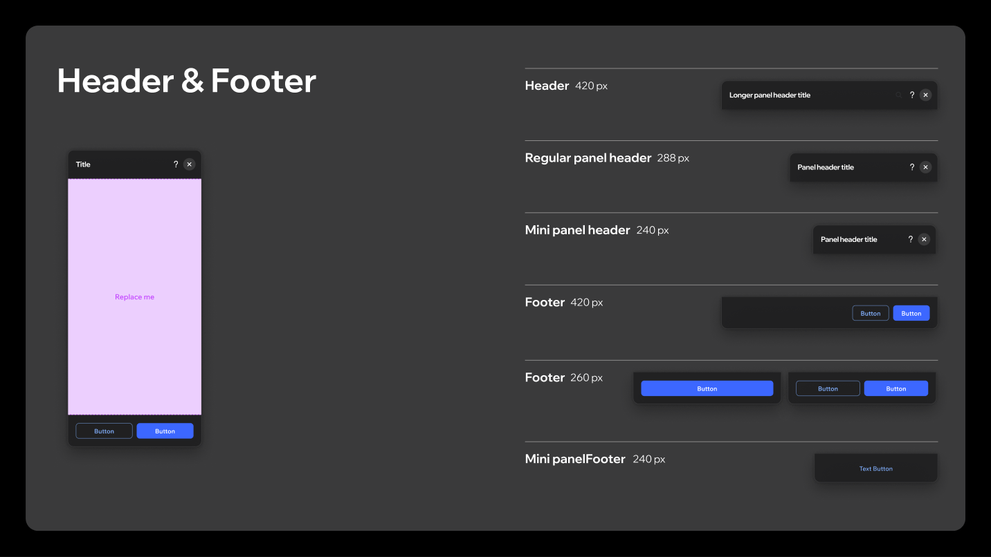
In small panels adjust the buttons to fill the container width, and stack them only when long labels leave no other option. A stacked footer gets very thick.
The deck labels these variants by panel width: 420px, 288px and 240px for headers, 420px, 260px and 240px for footers. The 288px header is the odd one out: the panel size scale above has no 288px step (S is 260px), so treat it as the regular header rather than a fifth panel width.
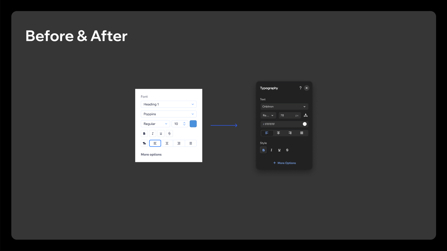
3.6 Text under the header
If text is needed under the header, put it in the panel body and remove the top spacing from a side panel field. Use 12pt regular in Grey 400. A short paragraph with its own 12pt semibold title is possible but not advised.
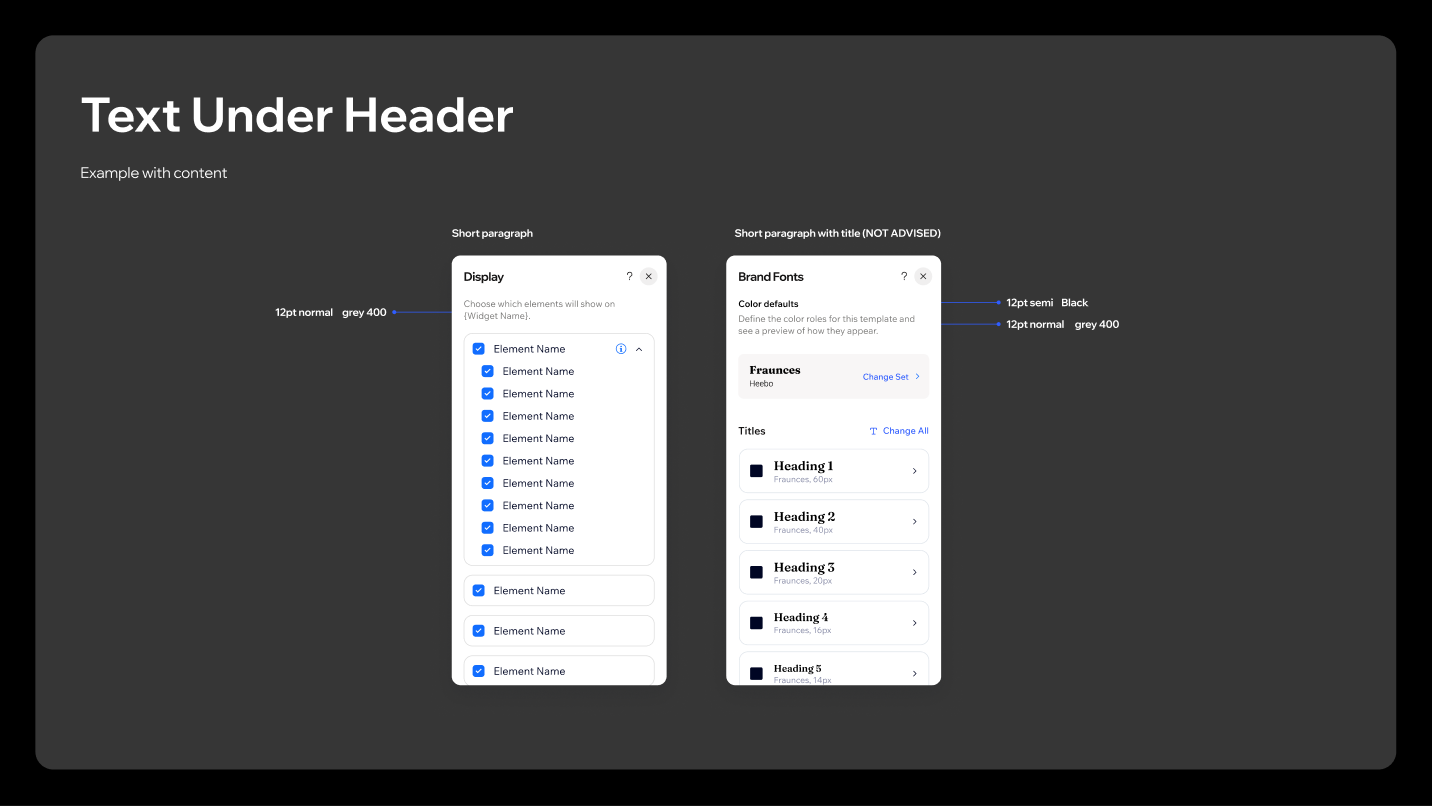
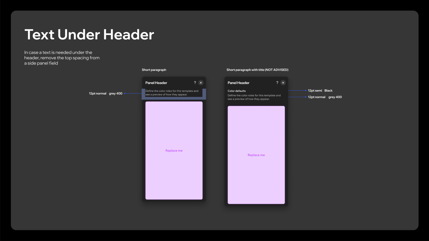
Don't
Use the header subtitle for additional text. Put the text in the panel body instead. This also applies to modals.
4. Modals & popovers
4.1 Modal shape and type
Modals use the 12px corner radius, and announcement modals the 24px one. Titles are Madefor Display, 32pt at XL and 24pt at L, with 14pt Madefor Text body copy, the one place besides panel headers where 14pt is allowed.
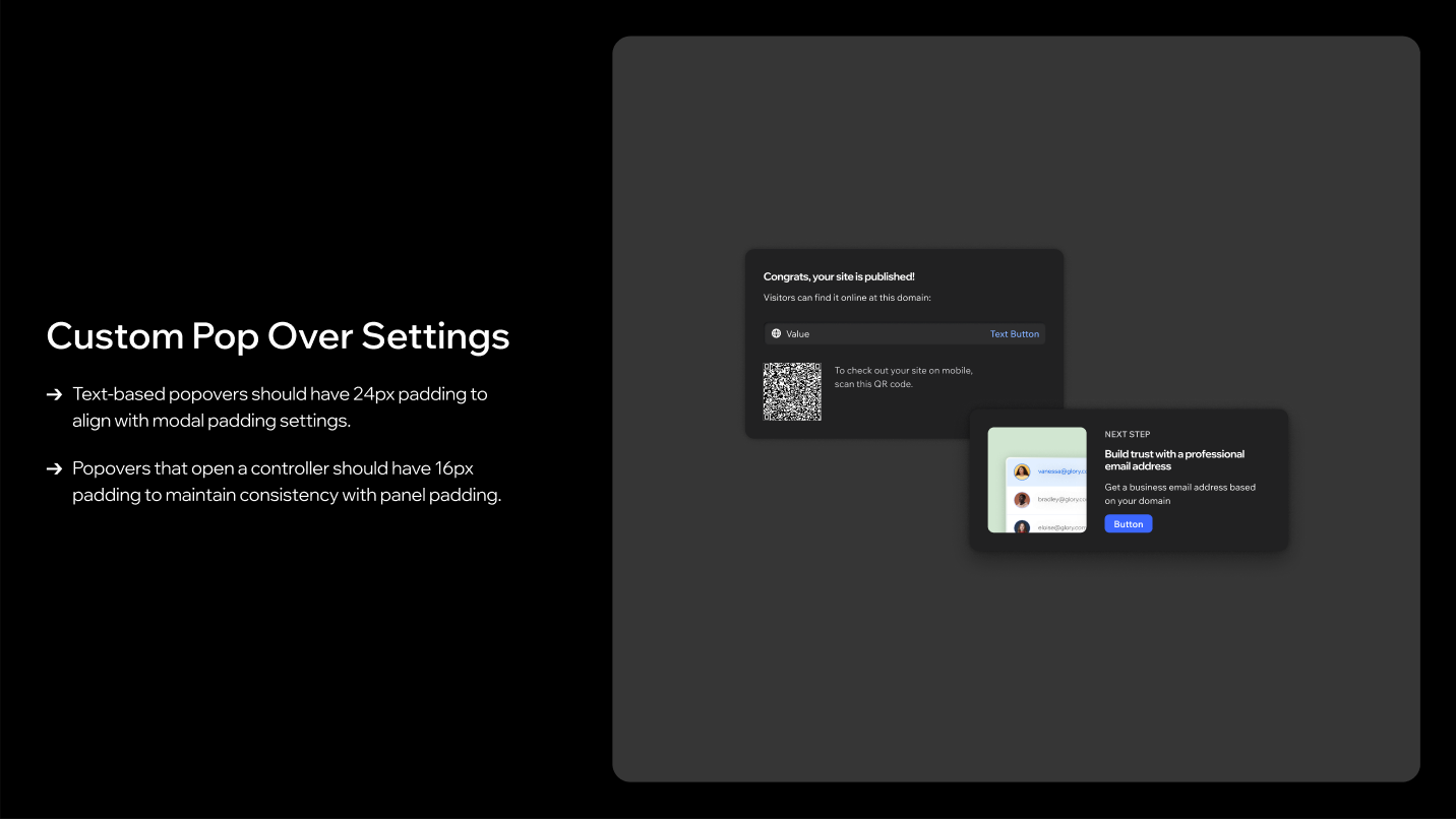
4.2 Popover padding
| Popover type | Padding |
|---|---|
| Text-based | 24px, aligned with modal padding |
| Opens a controller | 16px, aligned with panel padding |
5. Manual adjustments checklist
Several components don't yet default to their Studio 2.0 styling. These have to be adjusted by hand.
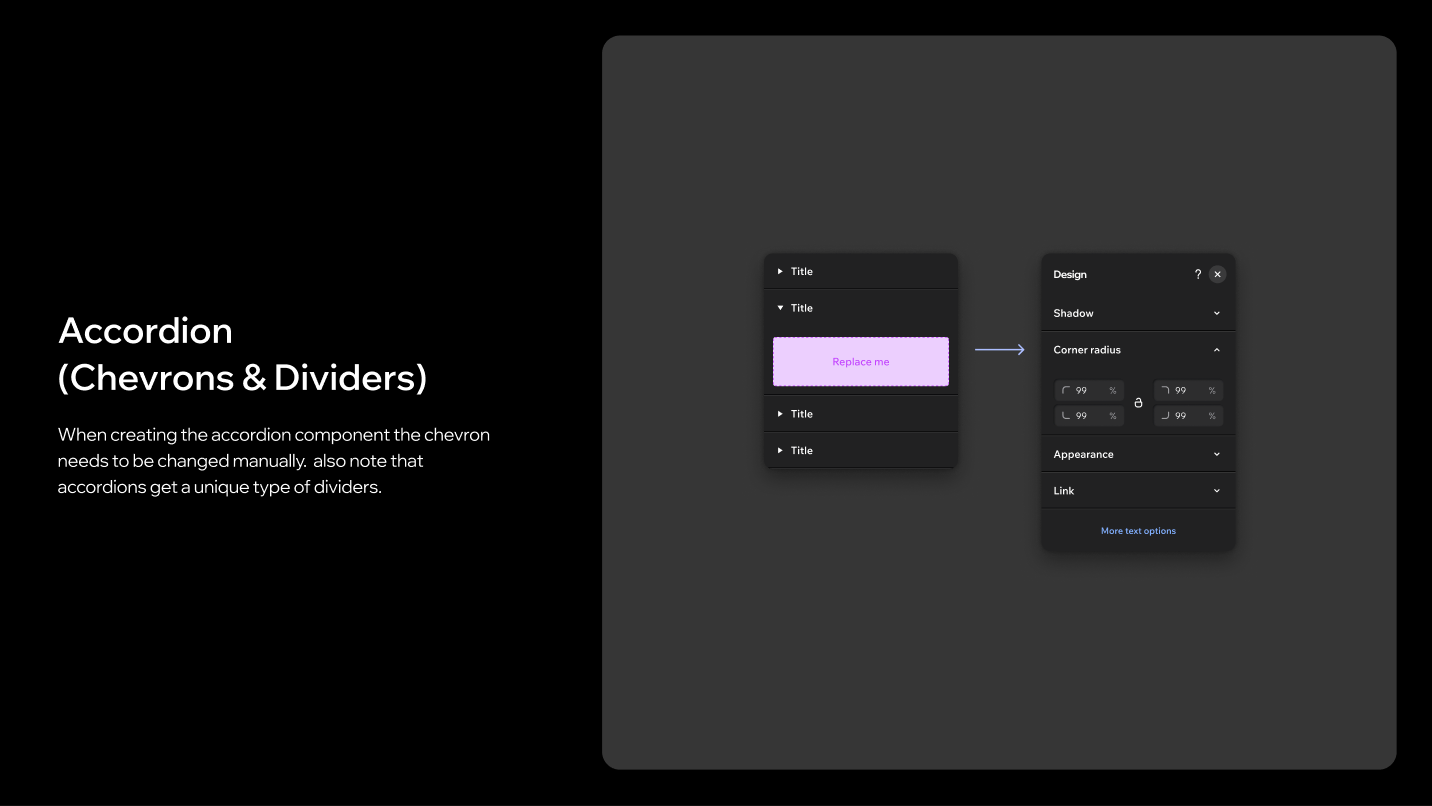
Accordion: the chevron needs to be changed manually, and accordions get their own divider type.
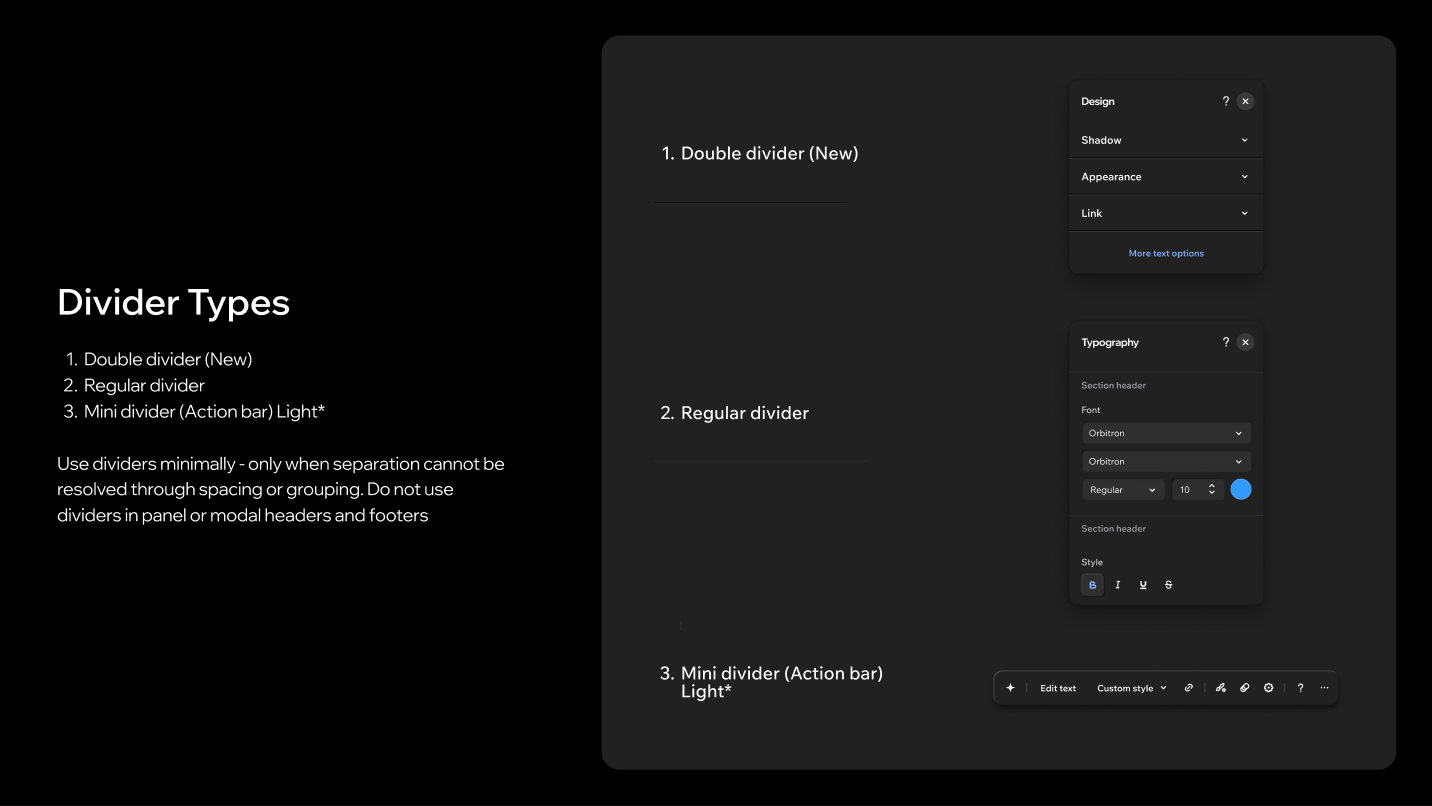
Dividers: three types are in use: the new double divider, the regular divider, and the mini divider (action bar, light). Use dividers minimally, only when separation can't be resolved through spacing or grouping, and never in panel or modal headers and footers.
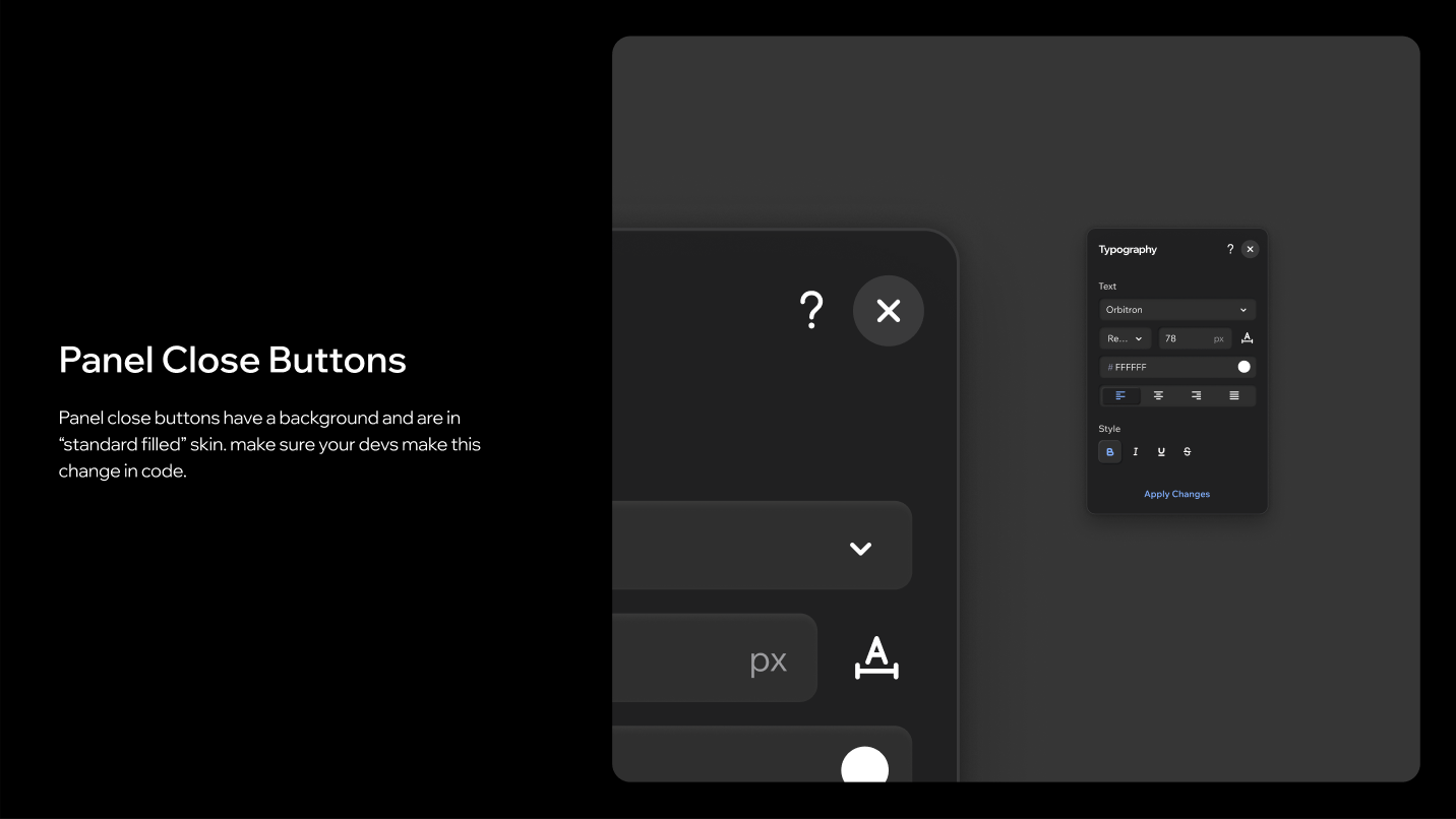
Panel and modal close buttons: close buttons have a background and use the standard filled skin. This has to be changed in code for every panel and modal header.
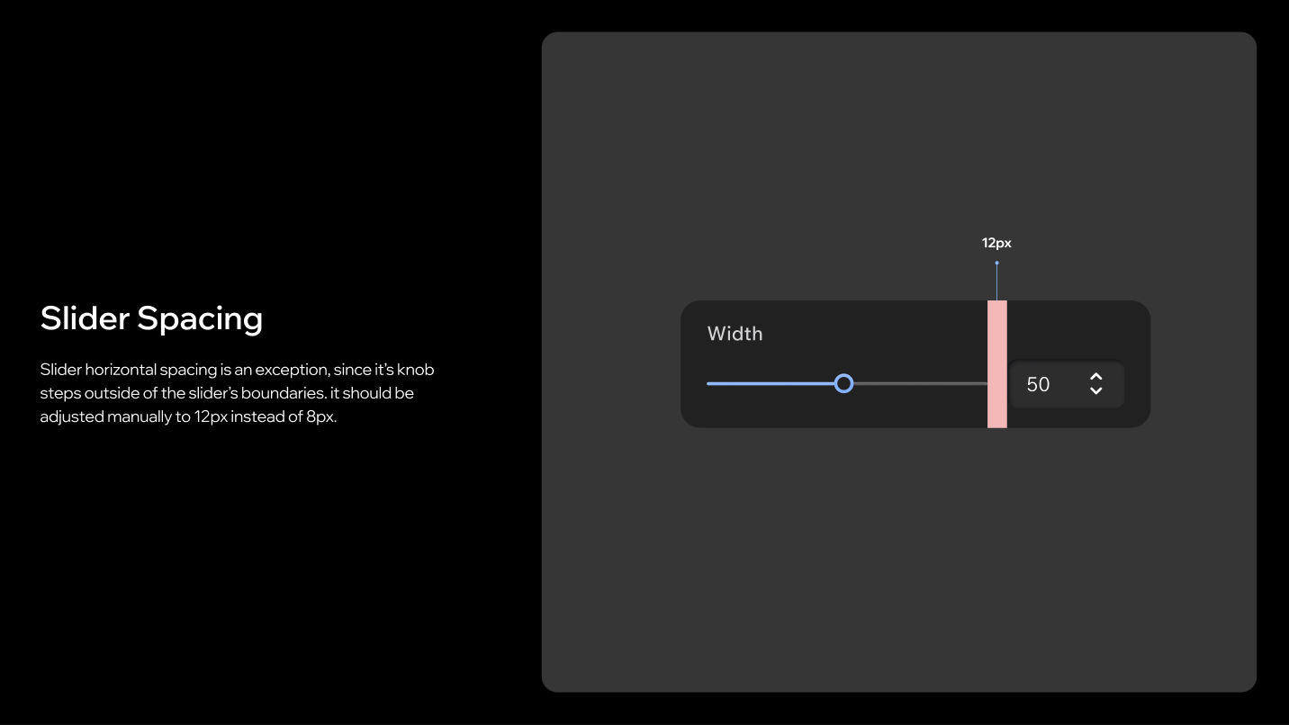
Slider: horizontal spacing is an exception, because the knob steps outside the slider's boundaries. Set it manually to 12px instead of 8px.
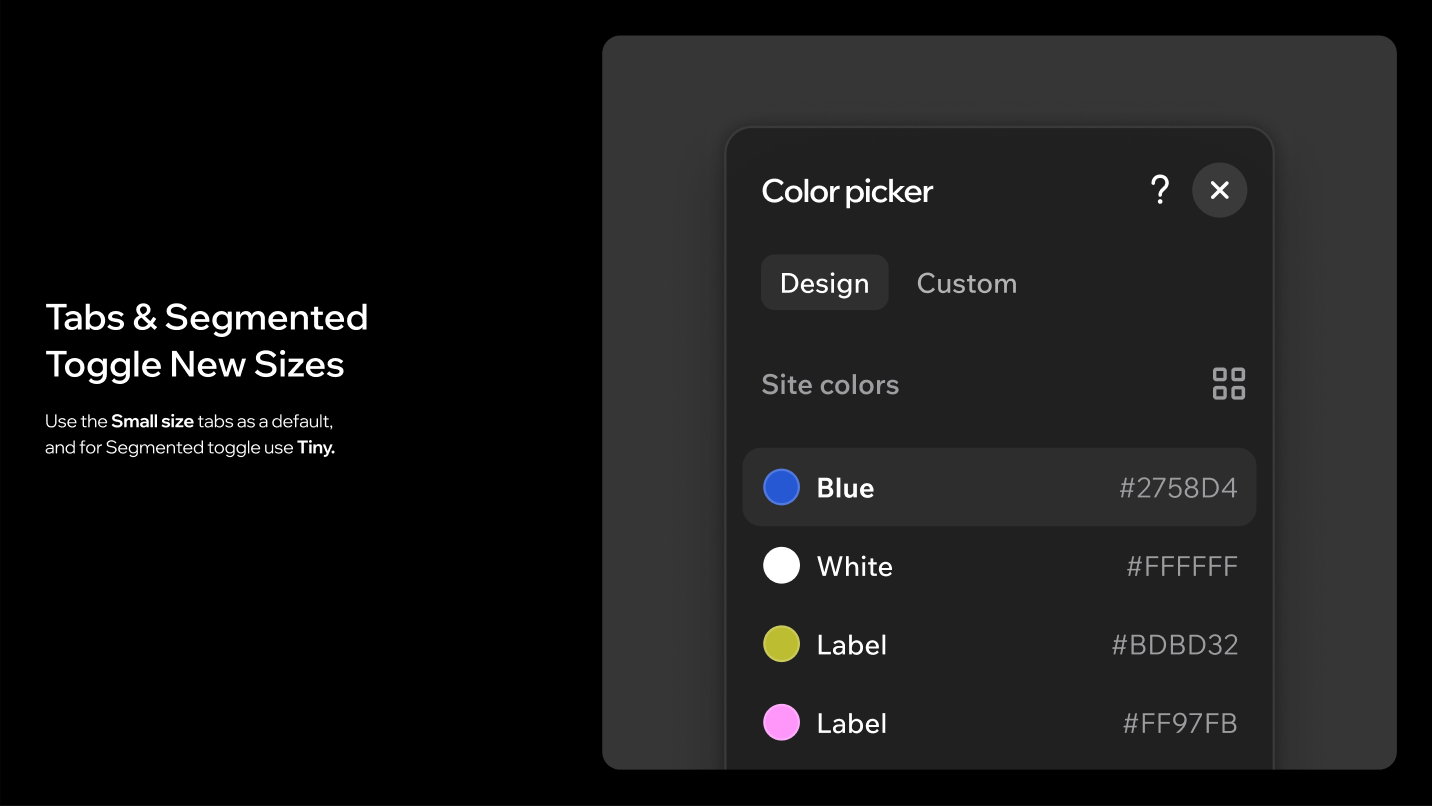
Tabs and segmented toggle: use the small size for Tabs as the default, and tiny for SegmentedToggle.
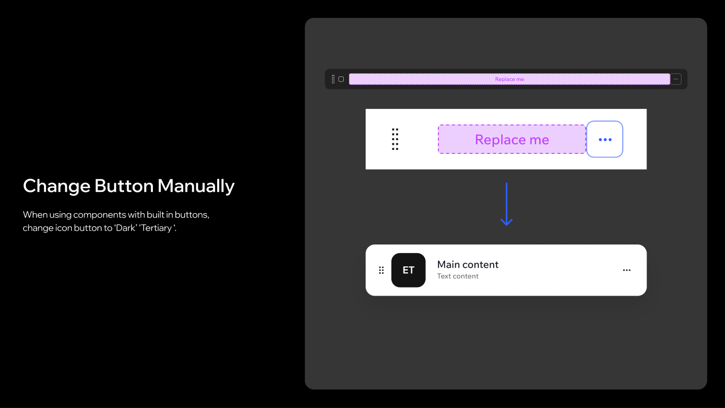
Components with built-in buttons: change the icon button to Dark / Tertiary.
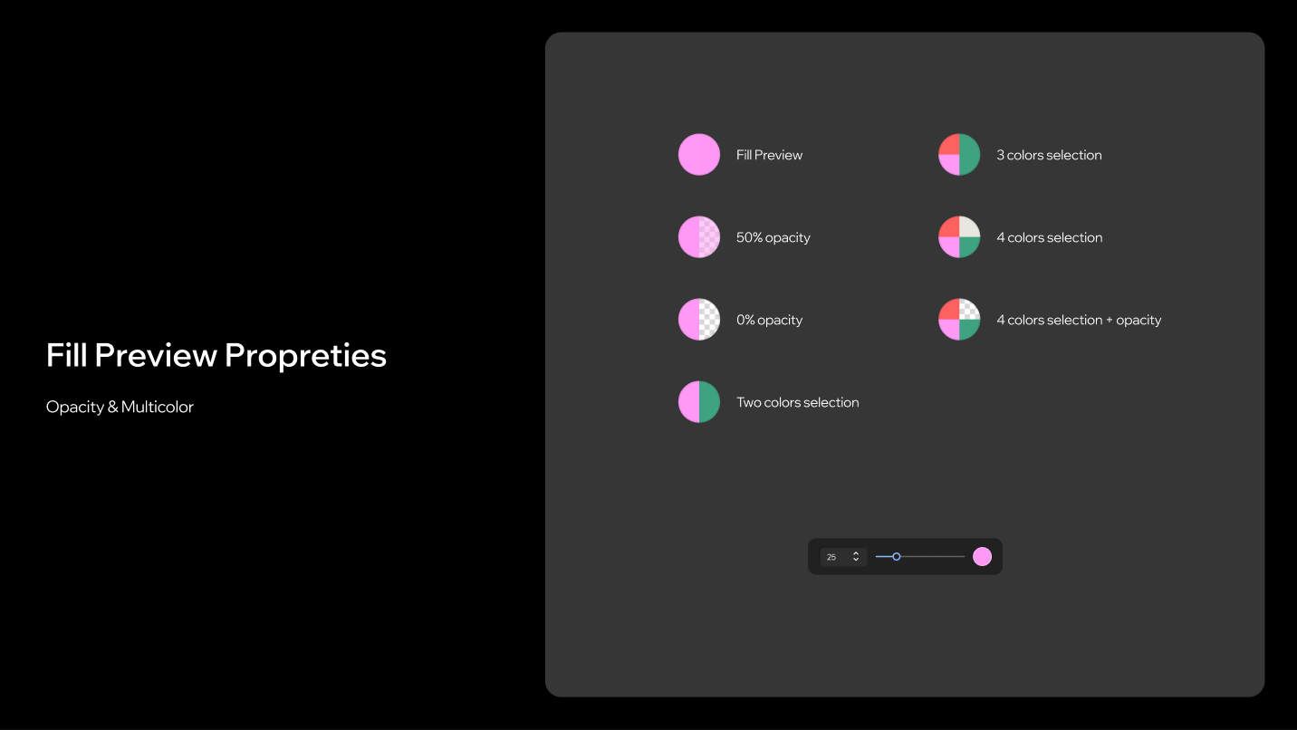
Fill preview: FillPreview supports opacity and multicolour selections: two, three and four colour selections, with or without opacity.
Related components
- Button
- IconButton
- TextButton
- ToggleButton
- Card
- SectionHeader
- Divider
- Accordion
- Tabs
- SegmentedToggle
- SidePanel
- Popover
- CustomModalLayout
- AnnouncementModalLayout
- Slider
- FillPreview
Related guidelines
Last updated: 21 October 2026