Settings Panel Layout Guidelines
What is a panel?
A panel is a defined section in the user interface dedicated to specific functionalities or content management. Panels enable users to customize elements and widgets directly on-stage.
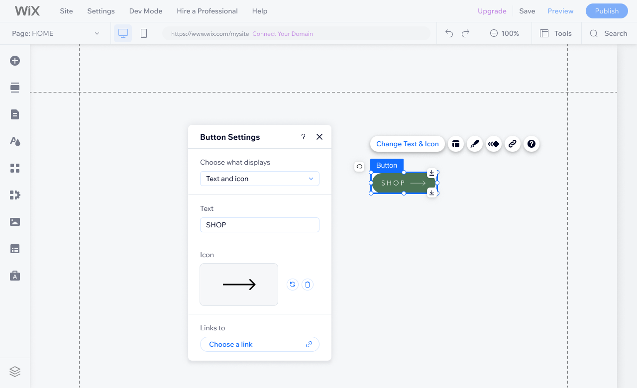
Accessed through the component's GFPP (Graphic Floating Properties Panels), panels are presented as draggable floating layers over the editor, typically positioned beside the component. Panels are designed to expose the stage and provide immediate feedback on changes users make in the panel.
Structure and constraints
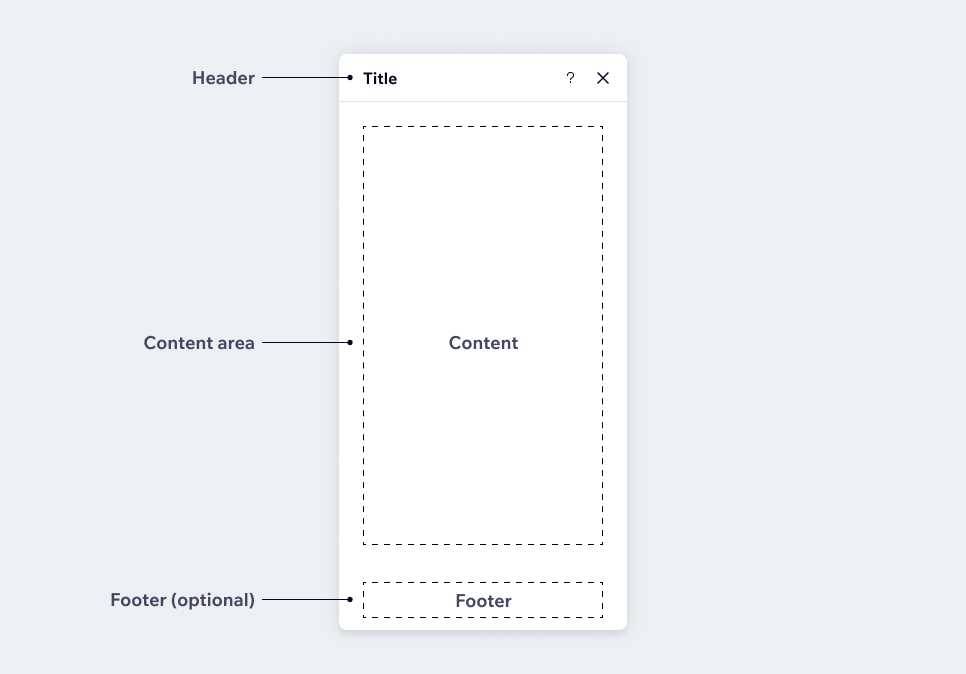
Every panel has three main sections:
1. Header
2. Content Area
3. Footer
Header
The panel header describes the purpose of the panel and provides users with a context about what they're interacting with. Additionally, it can include actions to key functions, such as closing the modal or help navigation.
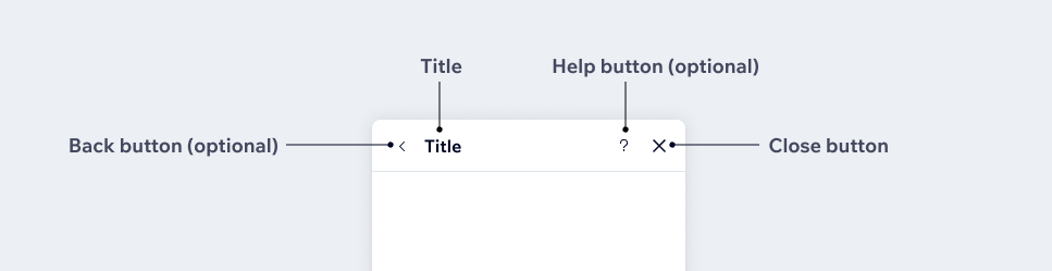
1. Title (mandatory)
The title follows the format of stating the name of your widget or element first, followed by the name of the action. For example, if your element is "Menu" and the action is "Settings," the panel should be named "Menu Settings."
The title shouldn't include call-to-action.
Title is mandatory.
2. Back button
The back button allows users to go back to the previous state and is used in drill-in mode only.
3. Help button
The help button opens a link to the help center panel which contains a short article relevant to the widget or element, and a search bar for more help.
4. Close button (mandatory)
The close button allows users to exit the panel. Users can also exit the panel using ESC, or by clicking outside of the panel on any other element.
Close button is mandatory.
Content area
The content area is the space to display controls, input fields, customisation options, media, and any other information related to the chosen element or widget.
Sticky footer (optional)
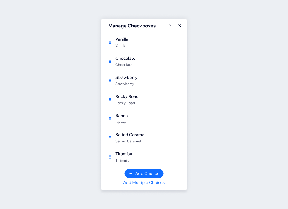
Sticky footer is optional and can be used for actions that you want to remain visible at all times, such as a list of items.
Constraints
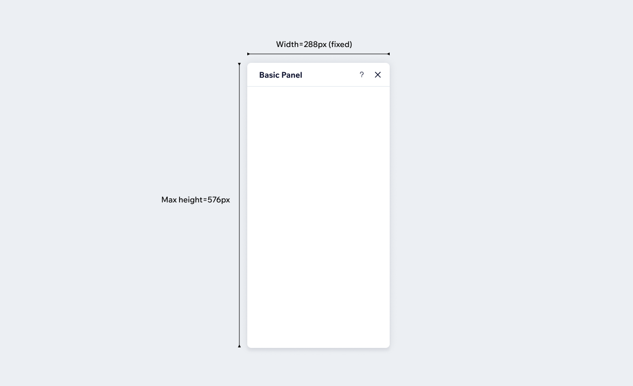
- Basic panel width should always be fixed at 288px.
- Panel height is set as auto by default with a max height of 576px.
Panel behaviors
Dividers
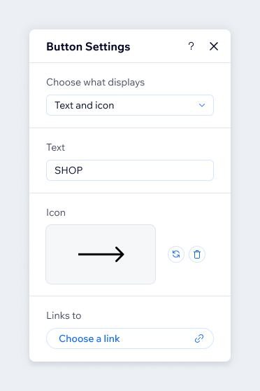
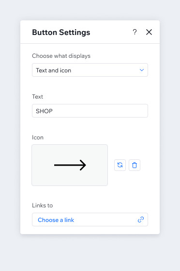
A divider is a thin line that groups content in the panel. Dividers are displayed by default in Classic, but not in Studio. You can enforce show/hide by using the divider prop or adding a divider manually.
Classic
Dividers enabled automatically after every control
Studio
By default dividers are disabled
Disabled content
Don't display disabled controls as they can frustrate users who may attempt to edit them. Instead, hide these controls until the relevant feature is triggered by the user.
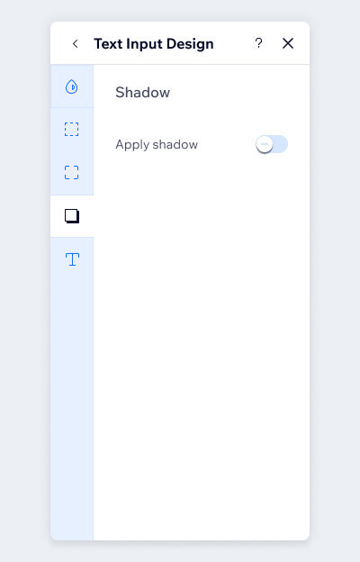
Do
Hide controls that can't be edited
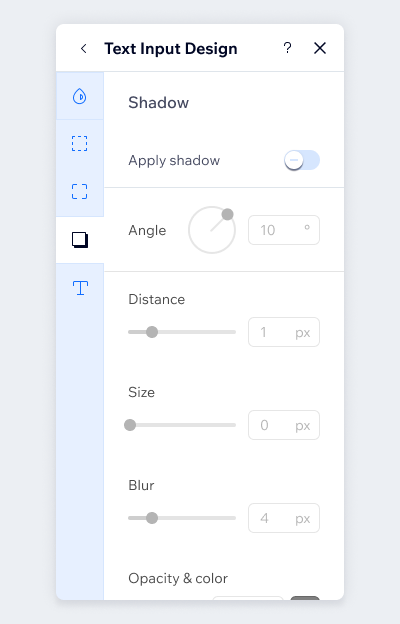
Don't
Disable content that can't be edited
Panel types
There are 10 types of panels that can be created for your app:
- Settings
- Manage
- Layout
- Behaviors
- Design (platform API)
- Connect to data (platform API)
- Animations (platform API)
- Link (platform API)
- Stretch content (platform API - Classic only)
- Custom
Settings
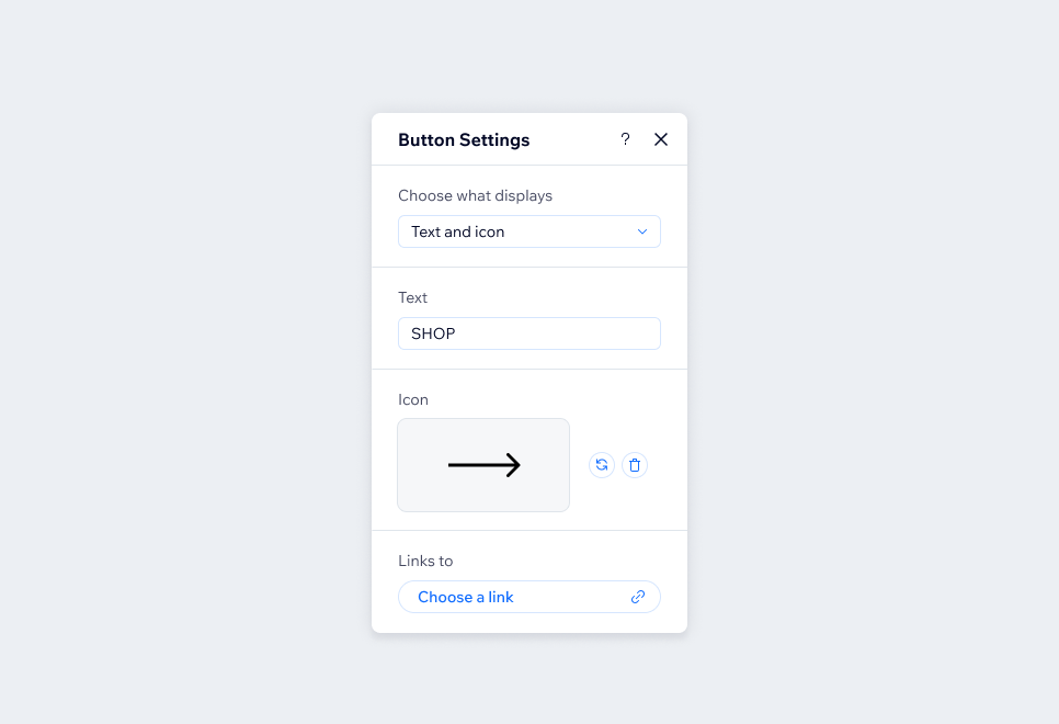
Settings panel is used to control the content of the element or an app or where they can start up the app and define its general functionality.
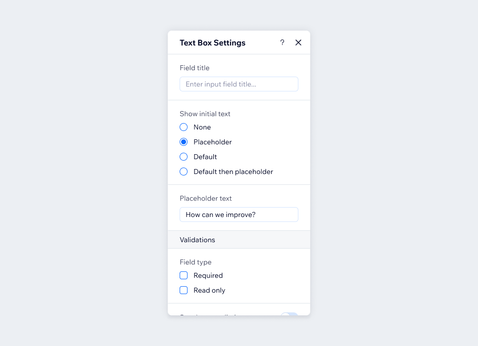
What should go inside the Settings panel?
- Content editing (text, icon, image)
- SEO settings
- Links (for example, when there is only URL)
- Validations (for example, if this is required)
- Account activation
- Enable/disable features
- Privacy and sharing
- Regional settings (like the app's language on the live site, measurement units, currency)
Manage
Manage panel is responsible for editing components with multiple items (for example, tabs, radio buttons, dropdown, menus etc.).
The Manage items panel should have a fixed height: 576px ( which is the panel max height), it's also common to use the footer with one or two CTAs like "Add Items".
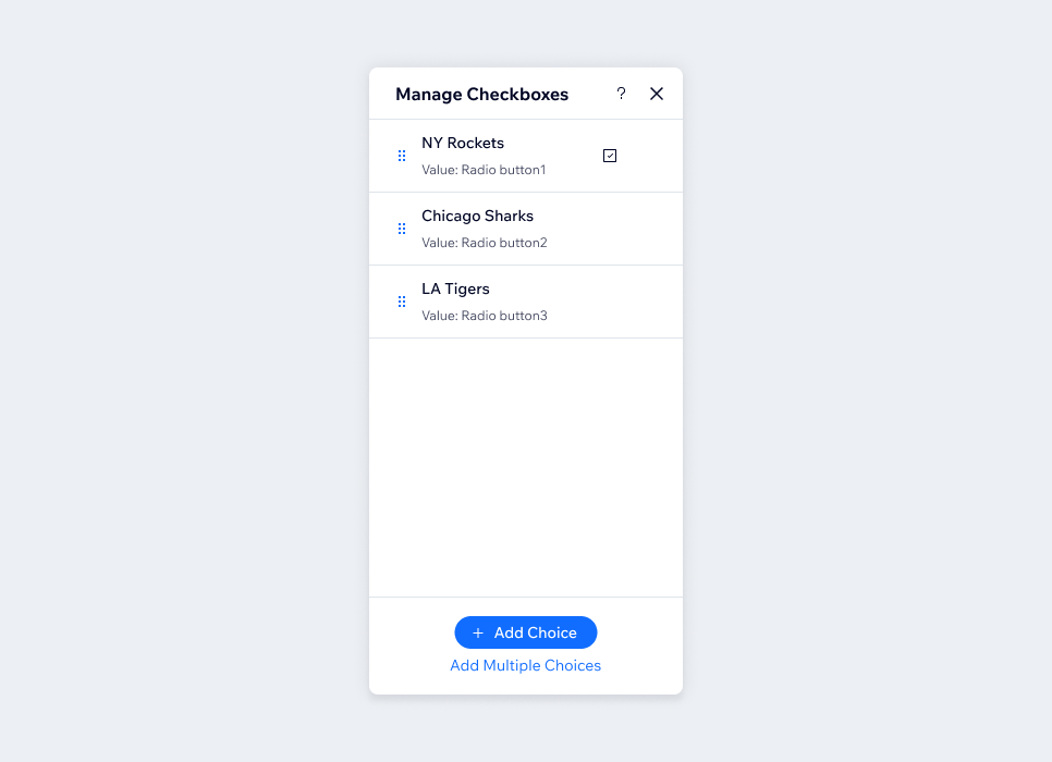
What should go inside the Manage panel?
- List items
- Actions related to list items, for example, add new, settings.
Layout
Layout settings are responsible for changing the composition, spacing between elements, overflow and other resize behaviors of the element that can't be controlled from stage.
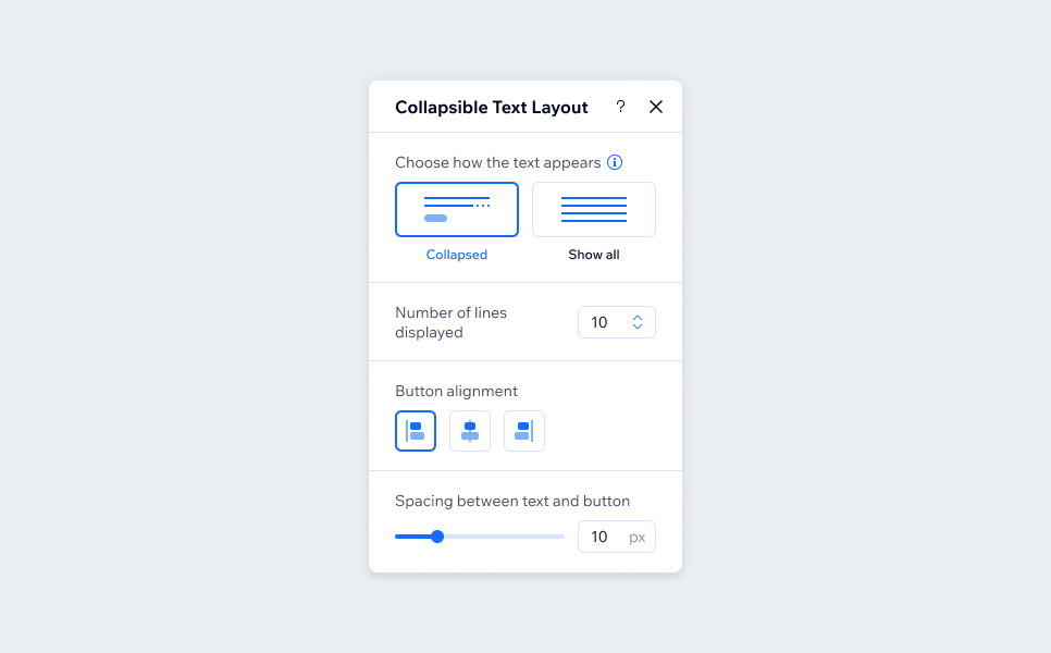
What should go inside the Layout panel?
- Direction (horizontal / vertical)
- Items alignment
- Sizing (only if its not from stage)
- Spacing between elements
- Fluidity (stretch / condensed)
- Overflow (scroll / overlap / ellipsis)
- Items directionality (RTL / LTR)
Design
Design panel is an Editor platform API, it is used for all the design properties of the stage element.
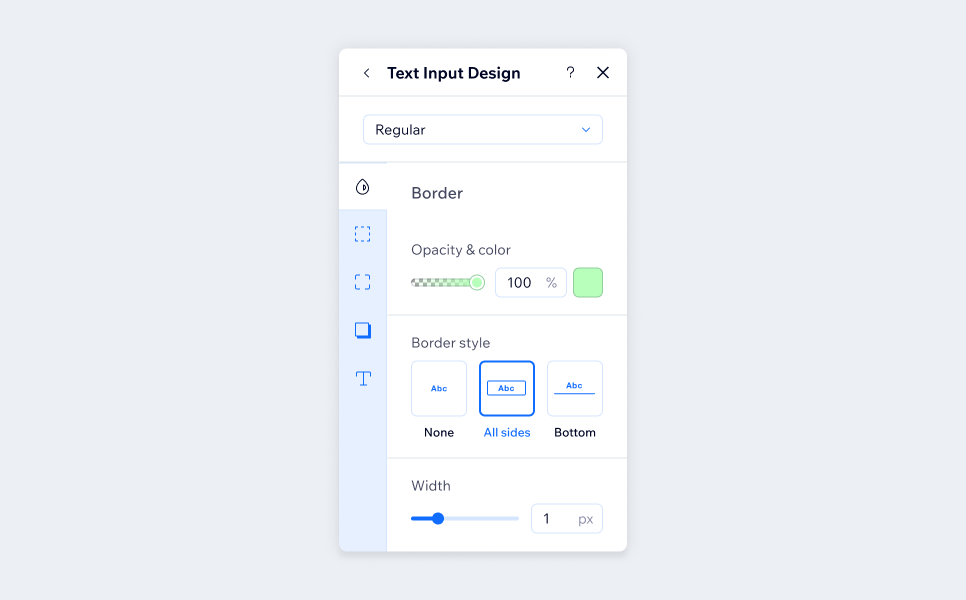
What should go inside the Layout panel?
- Fill and color
- Border
- Corner radius
- Shadow
- Text
- Spacings
- Custom
Behaviors
The behaviors panel contains hover and click interactions to the component.
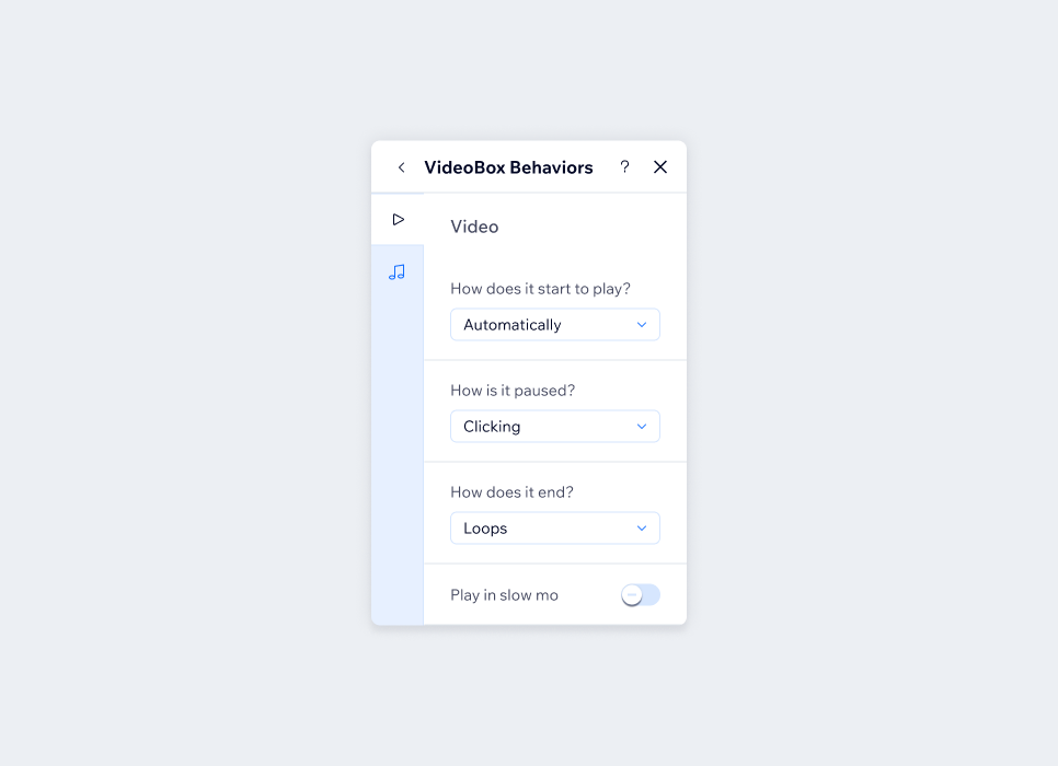
What should go inside the Layout panel?
- Preview video / animation
- Video effects (for example, how the video starts playing / how it stops)
- Sounds effects (for example, with/without sound effects)
- Design effects (for example, opacity, rotate, scale, etc.)
Connect to data
Data panel is used to connect elements to data by adding a dataset and linking values to a database.
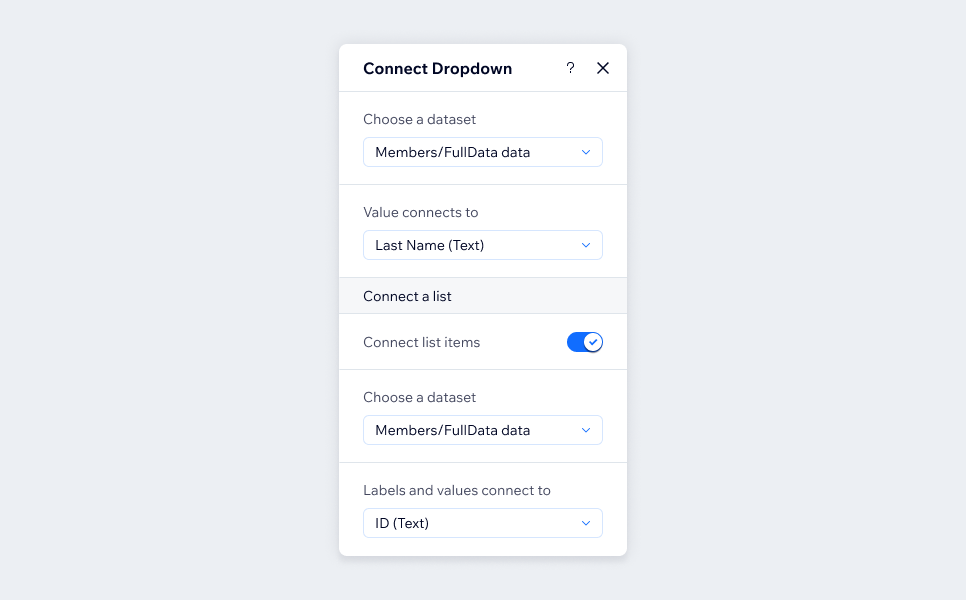
What should go inside the Connect to Data panel?
- Connecting dataset
- Fields values configurations
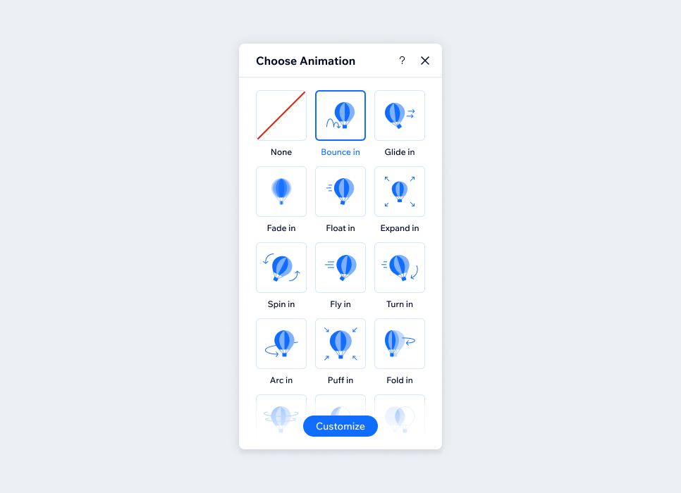
Animations
The Animations panel lets you customize an animation and apply it to a selected element. Every element gets this panel when it is created, so you only decide whether animations suit your element or app.
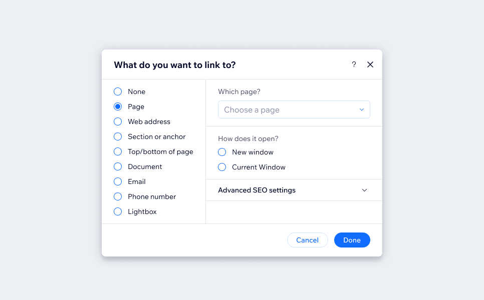
Link
Link panel is an Editor platform API, it can be used through GFPP or from controls that require a link. The API can be modified to use only specific link options or all link options, depending on your product requirements.
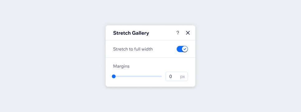
Stretch content
Stretch content is a platform panel which is used to make relevant components stretch to screen size. This panel exists only in Classic editor since Studio has a different responsive mechanism.
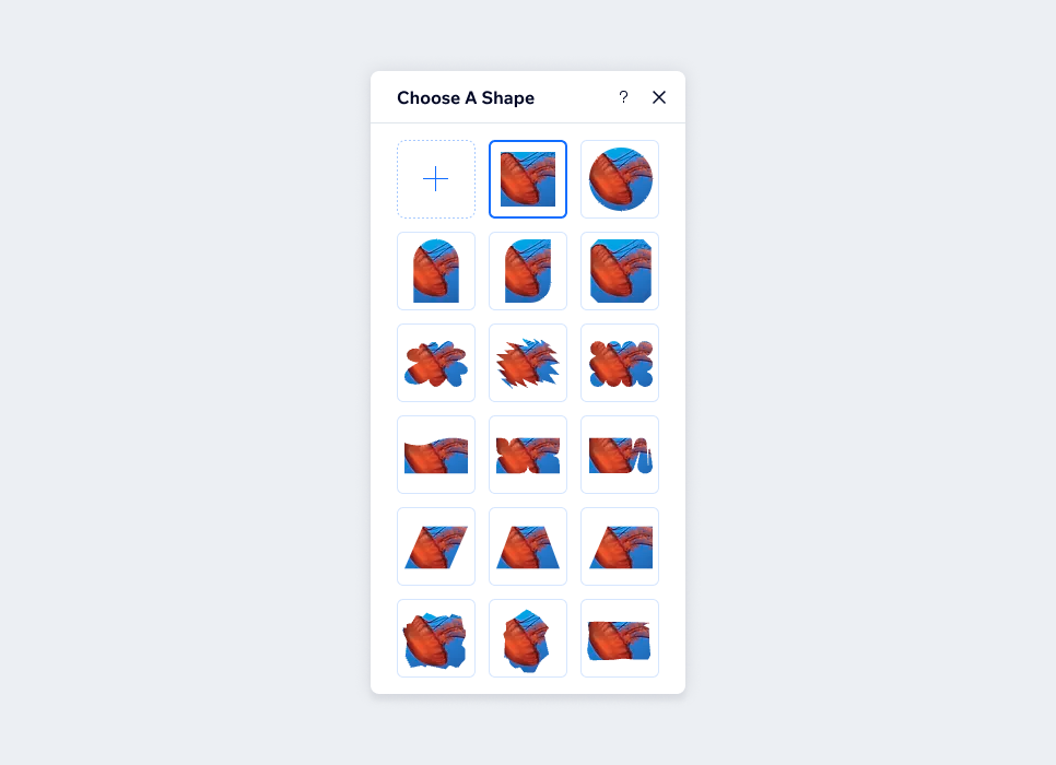
Custom
Some components/apps require a unique setting panel that's doesn't fit the default types, for example: filters, masks, interactions, shape dividers.
Content guidelines
When we write, we're designing consistent experiences. Many similar experiences are designed across Wix products which is why it can be helpful to refer back to this guide to follow best practices.
Note: For consultation, contact the UX writers. The decision is theirs.
Panel title
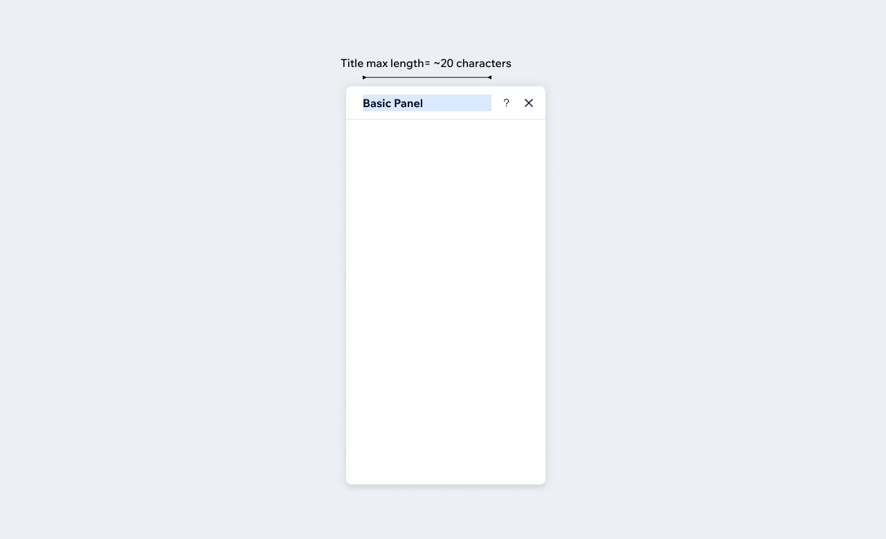
The panel title is the heading of the entire panel. Panel titles are used to explain what the panel is about.
- Use title case.
- First state the name of your widget or element and then the name of the type of panel. For example, if your element is Menu and the type is Settings, name your panel: Menu Settings.
- Make sure that your panel title fits into the space provided and doesn't get cut off. Basic panels fit up to approximately 20 characters.
Field labels
A field label is the label (or title) of an input field. Field labels are used to explain what type of information users need to add to an input field.
- Use sentence case.
- Keep labels easy to understand without being overly complicated.
- Use short 1 - 4 word phrases, unless questions are a better choice for clarity or empathy.
- Pay attention to the order of your labels with the information hierarchy of the component. Eg: when you have a color slider - it should always be "Opacity & Color" (since the slider is before the color).
- Use a tooltip to give the user more information about the section. Only include information that isn't critical to completing a task, but will help guide users in the right direction.
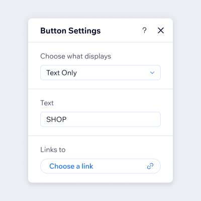
Do
Write labels as guiding questions according to the situation.
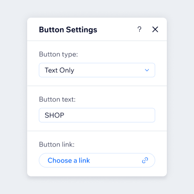
Don't
Write generic description to the control function.
Side panel sections
Sections are used to divide between different property groups of the element.
- Use sentence case.
- Don't make section dividers questions.
- If there is only one section in the panel, there is no need for a divider.
- Only use a section divider if you have content to go underneath it.
- Use a tooltip to give the user more information about the section. Only include information that isn't critical to completing a task, but will help guide users in the right direction.
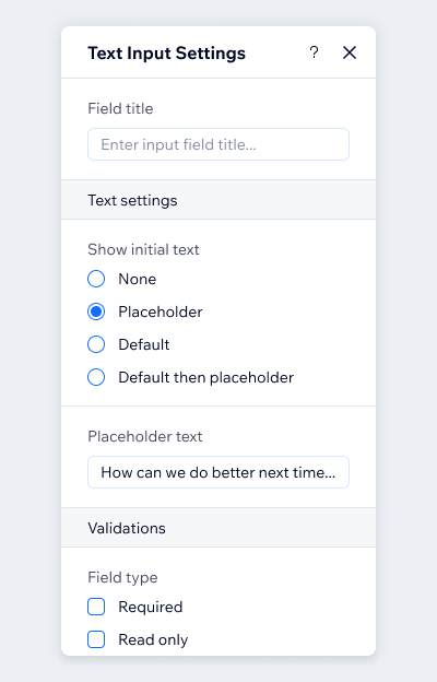
Do
- Use the most important settings on top and split the rest into sections
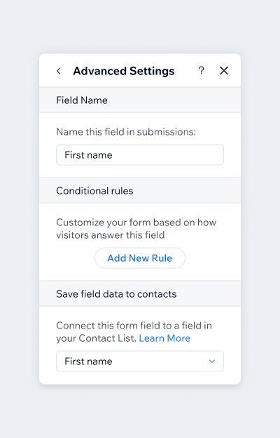
Don't
- Don't use section as panel title
Back button
Back buttons should say only "Back". For example, in a design tab the back button should say "Back" and not "Back to Design" since we are already in the Design Tab.
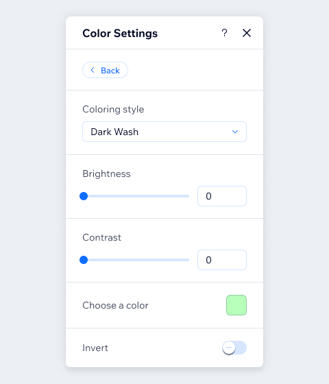
Do
Use only "Back".
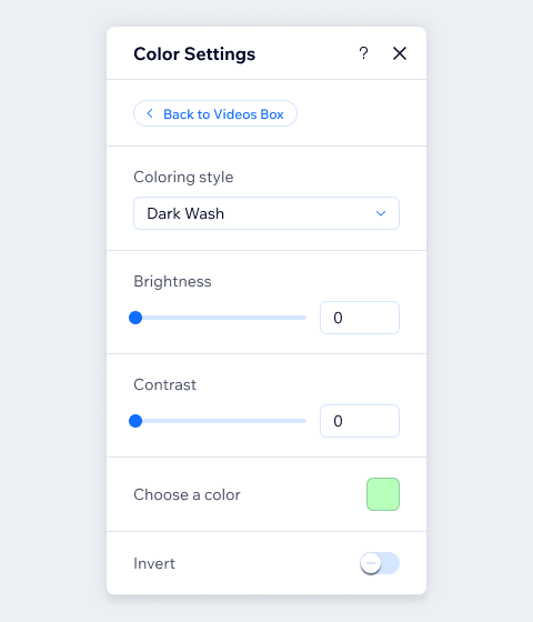
Don't
Don't use "Back to Page Name".
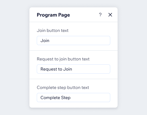
Repetative text
For example, in the text section, there's no need to mention text in every label.
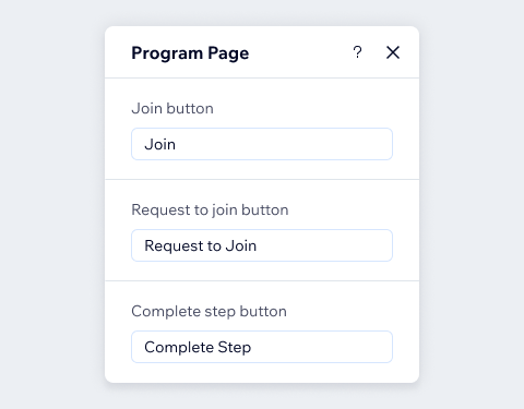
Do
Be clear and concise.
Don't
Don't repeat the name of the tab in field labels.
Brackets or parentheses
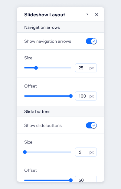
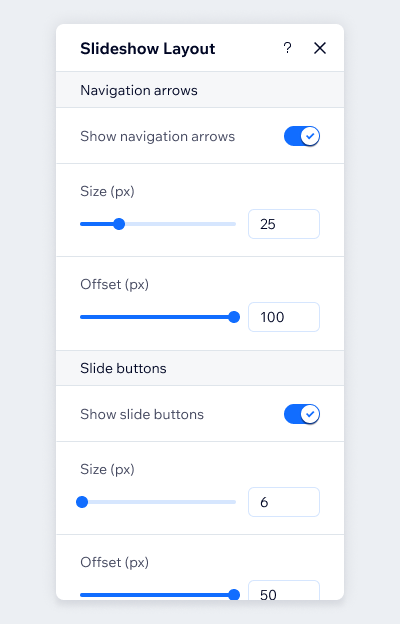
Avoid using brackets parentheses unless absolutely necessary.
Do
Use input suffix to show unit value.
Don't
Don't Use brackets or parentheses unless absolutely necessary.
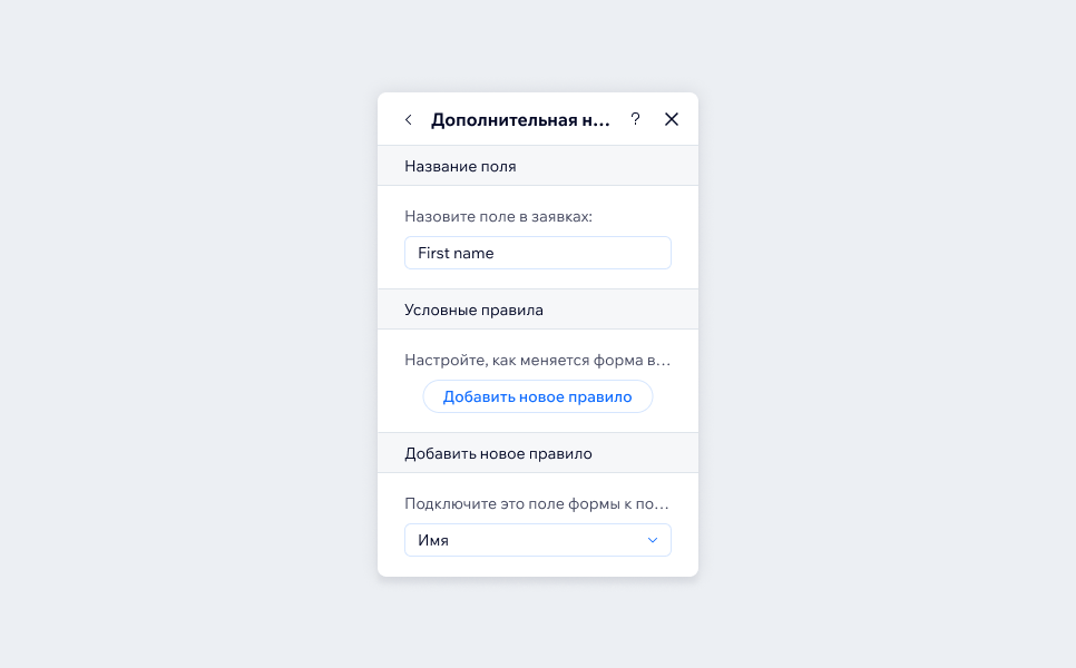
Text length
Keep in mind that text tends to be longer when translated into other languages, and panels have a fixed width.
Related components
Last updated: 21 October 2026