Icon Guidelines
Usage
The Wix Design System offers an extensive icons library to enhance its usability and features.
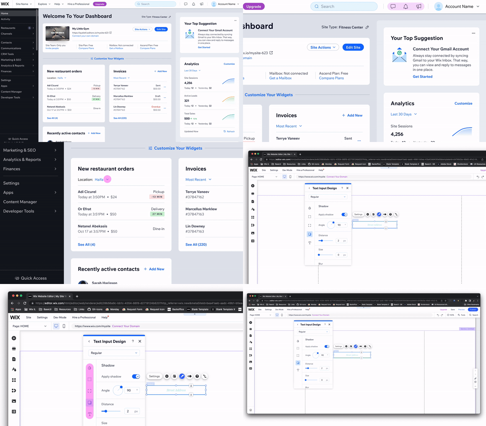
These icons can only be implemented in design system components, such as buttons, inputs, and selections.
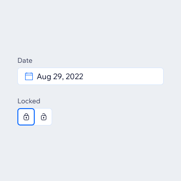
Do
Use icons in design system components.
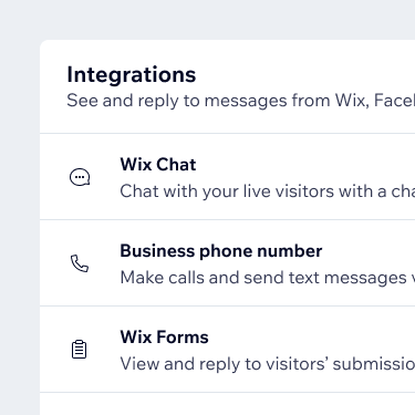
Don't
Don't use icons as standalone objects to emphasize content.
Icons can't be used as standalone components or decorative assets. As an alternative, you can add dedicated illustrations to complement and expand upon your content.

Do
Use illustrations to give a broader explanation for the content.

Don't
Don't use general icons or their combinations as illustrations.
We recommend using icons only for their defined purpose, and avoiding them for other meanings or functions.
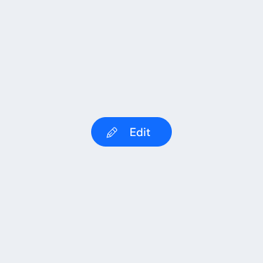
Do
Use icons only according to a defined purpose of use.

Don't
Don't use icon graphics as granted meaning.
Size
There are two sizes of general icons available. You should choose the size based on the size of the relevant parent component.
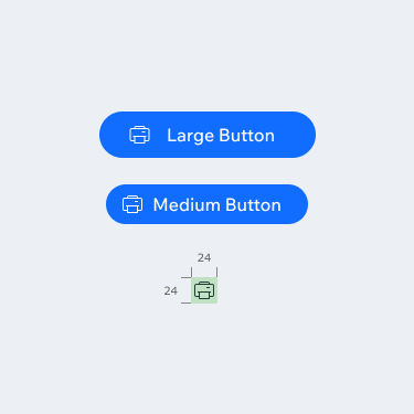
Medium
These icons are 24px by 24px. Use them in medium and larger components.
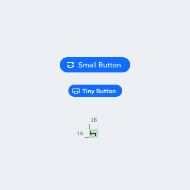
Small
These icons are 18px by 18px. Use these in small and tiny components.
Color
Depending on intention and background, you can set icons to the following colors:
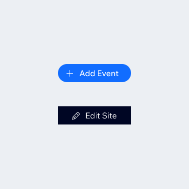
Light, D80
Use this color on primary buttons and on dark backgrounds.
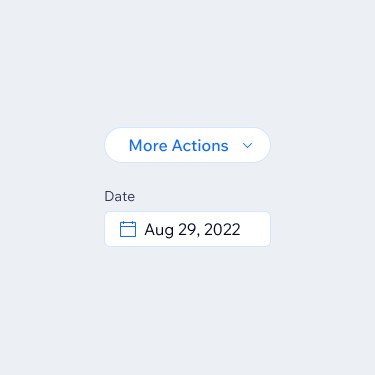
Standard, B10
Use this color on text buttons, secondary buttons, and inputs.
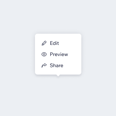
Dark, D10
Apply this color as the default color for list items.
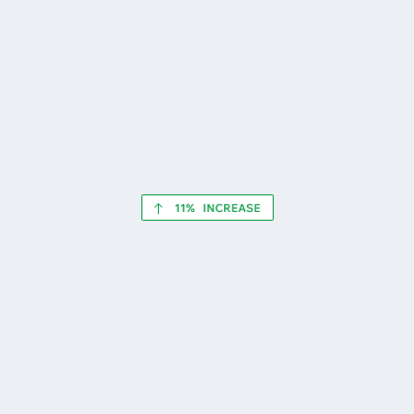
Success, G10
Use this color in success messages.
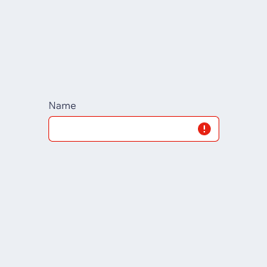
Destructive, R10
Apply this color to error messages regarding destructive actions.

Premium, P10
Use this color on components that contain a premium color theme.

Disabled, D10-30
Apply this color to display components that are currently disabled.
Repository
All icons can be found in the icons library.
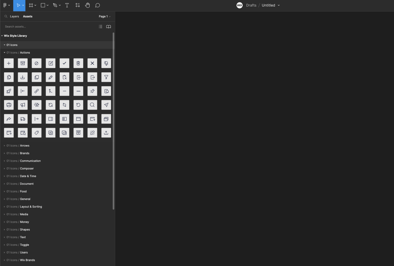
Icons are mirrored in Figma library as well. They can be found in the 01. Icons section:
Last updated: 21 October 2026