About Pricing Page Best Practices
A well-designed pricing page can significantly increase the number of Wix users who purchase your app. This guide provides best practices for designing an effective Wix pricing page that helps Wix users make informed decisions and drives upgrades.
Highlight plan benefits
Use bullet points to describe each plan's benefits. Paragraphs are harder to scan and compare across plans.
You can display up to 4 benefits per plan. Make each benefit clear and concise. You can explain additional details in the comparison table below. Keep feature names and benefits consistent across plans to make it easier to identify the differences.
Focus on what Wix users achieve:
- Avoid: "API access."
- Write: "Connect your app to external tools with API access."

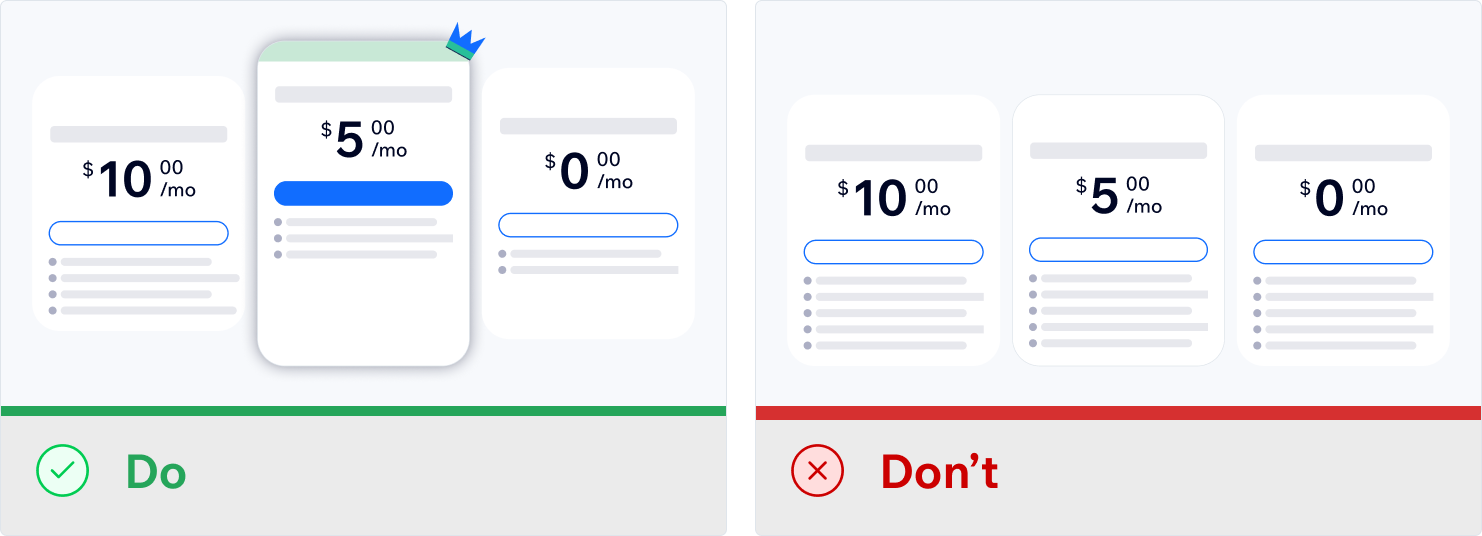
Position your most popular plan in the center
When you customize your Wix pricing page, choose which plan is your recommended plan. This plan gets marked as "Recommended."
Position your recommended plan in the center. This creates a visual hierarchy that guides Wix users to your best option while letting them compare alternatives.

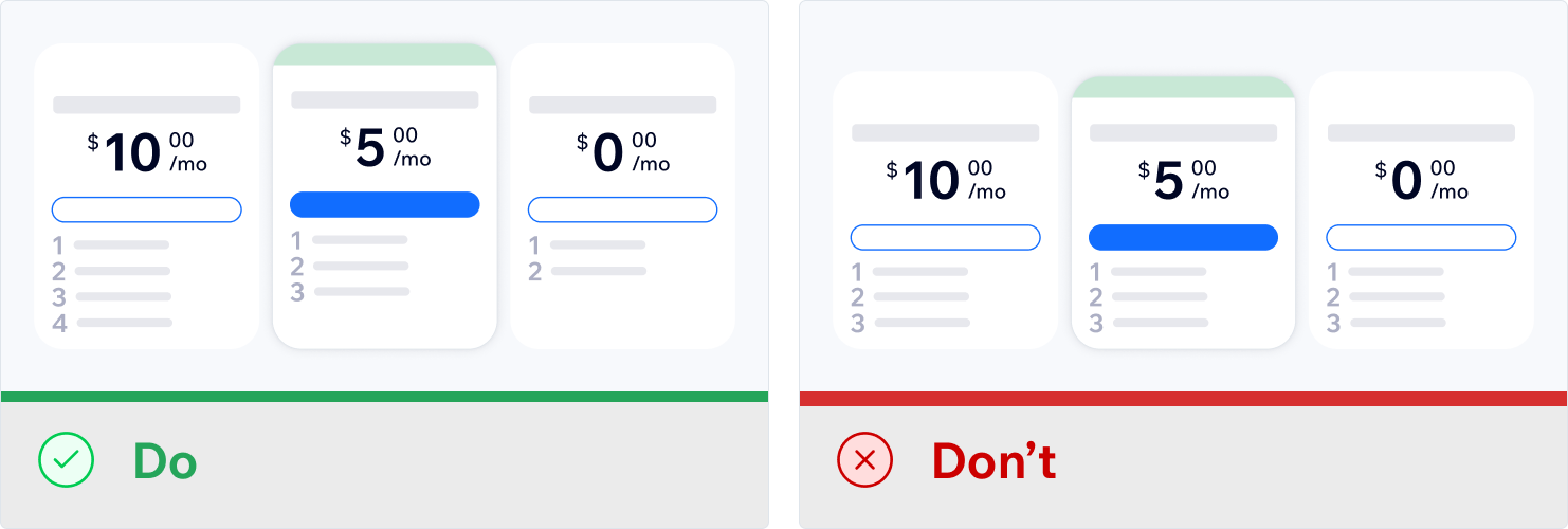
Show clear value progression across plans
Show clear value progression across your plans. Higher-priced plans should offer more benefits than lower-priced ones.
Example progression:
- Premium: Offers 4 advanced capabilities and higher limits.
- Mid-tier: Offers 3-4 enhanced features.
- Basic: Offers 2-3 core features.
This progression helps Wix users understand why they should upgrade and makes the value difference clear.

Optimize pricing strategy and upgrade flow
Yearly plan discounts
The Wix pricing page automatically shows users how much they save with a yearly plan. Take advantage of this feature by offering yearly plans at a discounted rate, and encourage longer commitments.
For example, if your monthly plan costs $29/month, set the yearly plan to $24/month. Wix shows users that they can save $60 annually when they choose the yearly option.
Upgrade entry points
Add Upgrade entry points throughout your app:
- Top right navigation: Add a consistent Upgrade button.
- Feature restrictions: Show CTAs when Wix users hit premium features.
- Contextual prompts: Show prompts at moments when upgrading makes sense.
Testing your flow
Before launch:
- Click Upgrade in your app.
- Complete purchases for each plan.
- Verify that features unlock correctly.
- Test monthly and yearly billing.
After launch, track which plans and features drive upgrades.