When creating a settings panel for a self-hosted site widget or a site widget built with the CLI, you can integrate Wix's native color and font pickers. These tools also allow users to select from their site's theme colors and fonts, ensuring seamless alignment with the site's design. If a user selects a theme color or font, your widget's style will automatically update whenever users modify their site's theme settings.
Wix's native color picker allows users to easily select colors from their site's theme colors or pick a custom color. This can be especially useful for widgets that need to maintain design consistency with the rest of the site.
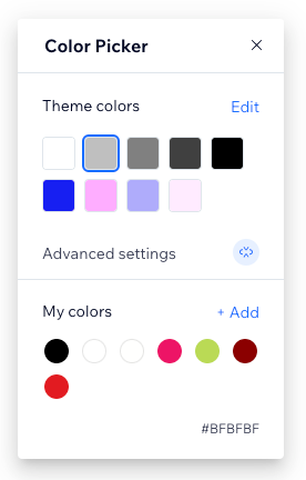
Use the Inputs API's selectColor()
function to open the color picker panel in the editor, prompting the user to select a color.
Note: If a user selects a theme color, the returned value contains a CSS variable function. This function dynamically retrieves the value of the corresponding site theme CSS variable. For example, it might return a value like 'var(--wst-color-line, #000000)'
.
The following example shows how to create a settings panel that allows users to select and update a background color using the Wix color picker, with the selected color being saved and retrieved using widget.getProp
and widget.setProp
.
import React, { useState, useEffect, FC } from 'react';
import { FormField, FillPreview, SidePanel, Box, WixDesignSystemProvider } from '@wix/design-system';
import { widget, inputs } from '@wix/editor';
const Panel: FC = () => {
const [backgroundColor, setBackgroundColor] = useState<string>(''); // Initialize state for background color
// Use useEffect to retrieve the background color when the component mounts
useEffect(() => {
const fetchBackgroundColor = async () => {
const color = await widget.getProp('background-color'); // Retrieve the custom element's background-color attribute
setBackgroundColor(color || ''); // Set the background color if available
};
fetchBackgroundColor();
}, []); // Only run once when the component mounts
// Handle color change after selecting a new color from the picker
const handleColorChange = (newColor: string) => {
setBackgroundColor(newColor); // Update local state for backgroundColor
widget.setProp('background-color', newColor); // Set the new backgroundColor in the widget
};
return (
<WixDesignSystemProvider>
<SidePanel.Section title="Background Color">
<SidePanel.Field>
<FormField label="Background Color" labelPlacement="left" labelWidth="1fr">
<Box width="30px" height="30px">
{/* Color preview that opens a color picker */}
<FillPreview
fill={backgroundColor} // Display the current background color
onClick={() =>
inputs.selectColor(backgroundColor, {
onChange: (value: string) => {
handleColorChange(value ?? ''); // Handle color change
},
})
}
/>
</Box>
</FormField>
</SidePanel.Field>
</SidePanel.Section>
</WixDesignSystemProvider>
);
};
export default Panel;
Wix's native font picker allows users to select fonts directly from their site's theme styles or choose custom fonts. This ensures that your widget's typography remains consistent with the rest of the site.
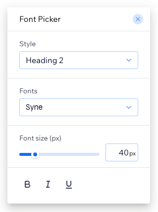
Use the Inputs API's selectFont()
function to open the font picker panel in the editor, prompting the user to select a font.
The font picker returns an object containing the user's selected font details, including the font
and optionally the textDecoration
property.
The value of the font
property is a font
CSS shorthand property, which can include the following:
italic
only)Note: If a user selects a theme font style, the returned font
property contains a CSS variable function. This function dynamically retrieves the value of the corresponding site theme CSS variable. For example, it might return a value like 'var(--wst-font-style-h2)'
.
The value of the textDecoration
property is a text-decoration
CSS shorthand property. It can also be set to undefined
.
The following example shows how to create a settings panel that allows users to select and update a title font using the Wix font picker, with the selected font being saved and retrieved using widget.getProp
and widget.setProp
.
import React, { useState, useEffect, FC } from 'react';
import { FormField, SidePanel, Button, WixDesignSystemProvider } from '@wix/design-system';
import { widget, inputs } from '@wix/editor';
const Panel: FC = () => {
const [selectedFont, setSelectedFont] = useState<string>(''); // Initialize state for selected font string
// Use useEffect to retrieve the selected font when the component mounts
useEffect(() => {
const fetchFont = async () => {
const font = await widget.getProp('title-font'); // Retrieve the custom element's title-font property
setSelectedFont(font || '');
};
fetchFont();
}, []);
// Handle font change after selecting a new font from the picker
const handleFontChange = (newFont: any) => {
const fontString = newFont?.font || ''; // Extract the font string
setSelectedFont(fontString);
widget.setProp('title-font', fontString);
};
return (
<WixDesignSystemProvider>
<SidePanel.Section title="Font Selection">
<SidePanel.Field>
<FormField label="Font" labelPlacement="left" labelWidth="1fr">
<Button
onClick={() =>
inputs.selectFont({ font: selectedFont }, { // Pass the selectedFont as part of the object
onChange: (value: any) => {
handleFontChange(value); // Handle font change by passing the font string
},
})
}
>
Select Font
</Button>
</FormField>
</SidePanel.Field>
</SidePanel.Section>
</WixDesignSystemProvider>
);
};
export default Panel;
When developing custom elements, the page's stylesheet is not aware of the fonts used within the custom element. To ensure that the custom element has access to the required font styles, call setPreloadFonts()
from your settings panel. This function sets the list of fonts that are preloaded when the custom element is displayed on a site.
Note: Calling setPreloadFonts()
overwrites any fonts that were previously set to be preloaded. This means that any fonts not included in the current call will no longer be preloaded. Make sure to pass all the fonts that need to be preloaded every time you call the function.
When working with custom elements that use a shadow DOM or an internal iframe, the page's stylesheet may be inaccessible. To ensure your custom element has access to the required font styles, call getFontsHtml()
to retrieve the necessary CSS and load the fonts.
The following example shows how to create a custom element with a shadow DOM that dynamically reads font configuration attributes and applies the specified styles to its content, using getFontsHtml()
to load the necessary font CSS:
import { site } from "@wix/site-site"; // Import the site module for font handling
// Define the custom element
class FontsCustomElement extends HTMLElement {
constructor() {
super();
// Attach a shadow root to the element
this.attachShadow({ mode: "open" });
}
connectedCallback() {
// When the custom element is added to the DOM, it will read the initial attributes
this.updateFonts();
}
attributeChangedCallback(name, oldValue, newValue) {
// This will be triggered when any attribute changes
if (name === "title-font" || name === "body-font") {
this.updateFonts();
}
}
static get observedAttributes() {
// Define which attributes to watch for changes
return ["title-font", "body-font"];
}
async updateFonts() {
// Dynamically read the attributes
const titleFont = this.getAttribute("title-font");
const bodyFont = this.getAttribute("body-font");
// Fetch the HTML for the provided fonts dynamically
const fontHtml = await site.getFontsHtml(
[titleFont, bodyFont].filter(Boolean), // Only include non-empty fonts
);
// Set the shadow DOM's innerHTML with the font content
this.shadowRoot.innerHTML = `
<div>${fontHtml}</div>
<div style="font: ${titleFont}">This is the Title</div>
<div style="font: ${bodyFont}">This is the body text</div>
`;
}
}
// Register the custom element with the browser
customElements.define("fonts-custom-element", FontsCustomElement);