Add Your Media
To list your app on the market, you need to add some media that show what your app does. This includes:
To add your media, go to the App Profile > Media page of your app's dashboard.
Step 1 | Add Images
Stunning images really help to encourage users to install your app. We've got Sketch, Figma, and PSD files to get you started. If you're using the Figma file you need to create a duplicate before you can edit.
- How many: Try to add 5-6 images
- Minimum size: 1,200 x 900 px. Ratio 4
- File types: JPG or PNG
If you add text to your images, we recommend these specifications:
- Font: Roboto
- Size: 20
- Color: Black or white
Main Image
A promotional image that shows your app's brand. It should include:
- Your app's name.
- A tagline showing off your app's core benefit.
- An image that grabs a user's attention.

Additional Images
You can add extra images to show screenshots of how your app looks on the Wix platform.
- For dashboard apps: Show 3-4 images highlighting top features.
- For website apps: Show 2 images as it appears on a Wix template, and 1-2 of the app's settings and customization options.
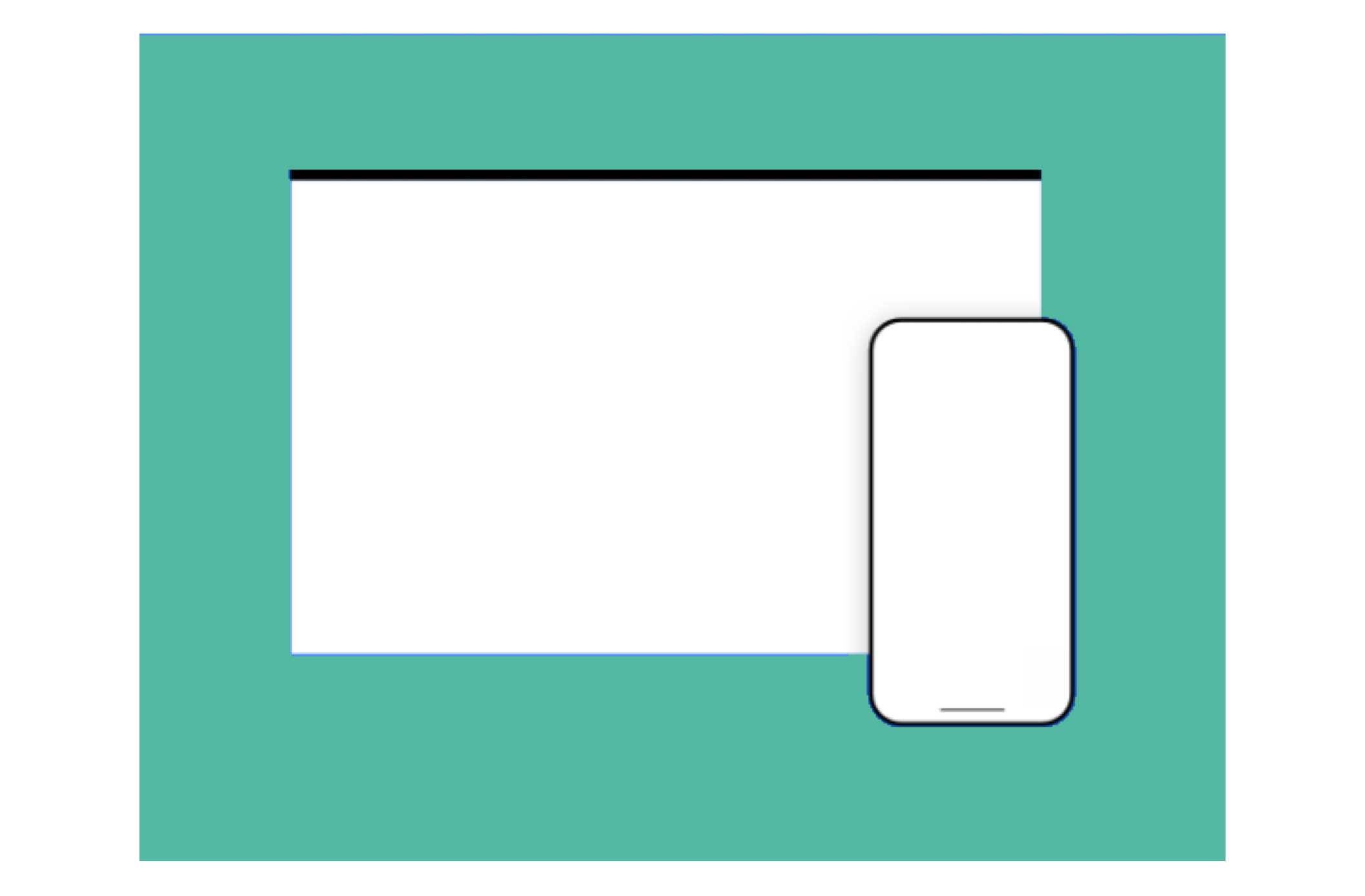
- For mobile-optimized apps: Show 1 image of your app's mobile view.
Best practice for images
- Use high-quality images.
- They should follow the same general design theme.
- Use one solid background color for all your images (try to match this to your logo's dominant color).
- Screenshots should show the app in use (not just the title art, login page, or splash screen).
- Avoid images that contain only plain text or use large amounts of descriptive text.
- Avoid graphics or text that relate to sales, promotions or discounts.
- Don't copy existing official App Market sale or promotional graphics.
- Use images to tell your app's story (they should flow progressively from one to the next).
Step 2 | Add a Video
High quality videos are a great way to tell your app's story, so we highly recommend adding one using a YouTube URL. This should be a quick, promotional overview of what your app's about and shouldn't be a demo tutorial of how it works.
Step 3 | Add a Promotional Banner
From time to time we feature the very best apps in dedicated App Market collections. A promotional banner is completely optional, but we do use these to promote our favourite apps in campaigns. Here's how they look in the App Market:

Often the image you've already uploaded as your first market listing image works well as a promotional banner. If not, follow this specification:
- Recommended size: 540 x 360 px
- File type: JPG
Best practice for promotional banners
- Use a colorful background, preferably your logo's dominant color (not white, which will fade into the white background of the App Market).
- Don't include text or your app name. Your app name and teaser will appear directly below the banner.
- Don't include your logo. It appears directly below the banner.