Blocks Widget Design Guidelines
Editor compatibility
Wix Blocks apps aren't supported in the Wix Harmony editor. Existing Blocks apps remain available for purchase on the Wix App Market for Wix Editor and Wix Studio sites. To learn more, see About Wix Harmony and Blocks.
Wix Blocks allows you to design stunning apps with simple drag-and-drop abilities, with little code, in a similar way to how you build Wix websites. This article explains how to make your app widgets behave responsively and adapt to any screen size, blend beautifully with Wix sites, and offer as many design styles and layouts as you want.
See our Figma kit
The Blocks Elements Figma kit gives you full access to Blocks widget, dashboard & panel elements, text styles and icons. If you want to start in Figma before designing in Blocks, make sure to use the kit to align with our visual standards.
Create responsive apps
Blocks allows you to build responsive apps and install them on all Wix editors. Designers can build fully fluid and functional widgets that support viewport/widget size change and customized content. This is why, before you begin to work on Blocks, it’s important to know the basics of responsive and fluid design.
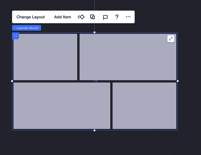
Building with layout elements such as flexbox, grid, stack and repeater will help you create responsive behaviors.
The 6 layout elements for creating responsive behaviors.
- Grid: Every container and section comes with a built-in grid. You can choose the number of rows and columns your composition requires, and adjust their size in many different measurements.
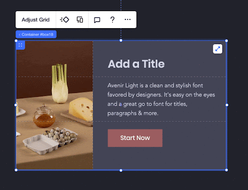
- Box: This is the simplest of the layout tools. Every other layout tool, apart from the grid, is built on a box. Stack, repeater, flexbox, and multi-state box are all built using boxes. Note that every widget comes with a default box, containing the entire widget.
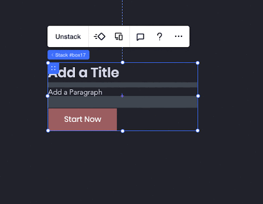
- Stack: Group several components together in a vertical arrangement, and apply collapse and expand functionality. Because it is built as a container, you can select background color and other customizations.
- Repeater: Create a list of items with the same design and layout, but different content in each. Repeaters are arranged in a flex layout that automatically reorganizes content when it’s resized.
- Flexbox: Add your content to a flex layout of your choice. The items inside a flexbox are containers. This allows you to drag and attach any element to an item, and it will move with the item when the flexbox is resized.
- Multi-State Box: You can show different content for different situations in the same container box, displaying one state at a time.For example, you can create a loading state, or a "thank you: state. Choose the amount of states your box should have, design them, and give them IDs that you will later use in your code.
Tip: plan ahead! Defining your responsive behaviors and desired customizations before you start to build. This will help you decide on the structure and layout tools that you should use. For example, it will help you determine in advance how many columns you need in your grid.
Support customizable content
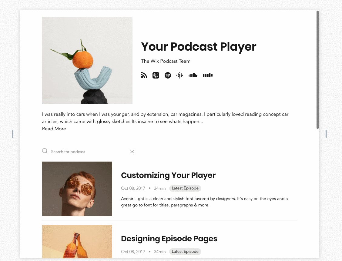
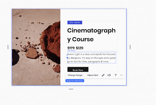
When you build an application in Blocks, you should take into consideration that it can be customized in the Wix editors and should support this customizable content. For example, a user who installs your app in the editor can delete some of the elements. Therefore, it’s important to adjust the design of your app to different kinds of edge-cases scenarios, such as how it will look when one of the sections is deleted. For example, look at this widget:
Here you can see the same widget after the user chose to delete the image:
To make sure that your content stays customizable:
- Use elements such as grid (on min-content) and stack in order to make sure that different content lengths, and showing/hiding content will not break the layout.
- Test your app with different contents (text lengths, different images, languages etc.).
- Show and hide elements in order to make sure the behavior is as you expected.
Use presets for design and layout
Design presets allow you to create a variety of designs for one app. Design across breakpoints and reorganize the same elements to create multiple layouts for your widget (e.g. desktop and mobile). Note that all presets contain the same elements - reordered, but not re-parented. Everything is connected with the same logic. For example, grids in all presets must have the same number of cells.
Learn more about creating and managing design presets.
Advantages of Presets
- Variety of content: Presets allow you to offer your user different designs and layouts. Presets use the same code and panels. User overrides can be saved when changing a preset.
- Fluid & Responsive: Presets can be created to fit smaller screens in case your main preset is not responsive enough.
- Hidden elements: You can choose which elements to hide on a specific preset, by clicking Don’t display. Elements we add/delete will be added/deleted across presets.
Limitations of Presets
- No reparenting between presets: Reparenting is attaching an item to another container or dragging it out of its container. This is not available between presets, meaning this change will be applied on all presets.
- No content change between presets: Just like in breakpoints - images, text, and videos cannot change from one preset to another.
- Several elements cannot change between presets: For example -
- An SVG’s shape and color.
- Layout of a native gallery.
- Layouts of all inputs.
- Overrides between presets (in the Wix Editors): When adding the widget to your Editor and making overrides (editing the design), those customizations will follow to the next preset or will be reset (according to desired behavior). We can’t select certain overrides to follow, (such as font-family) and other overrides to reset (font color), it’s all or nothing.
Changes per preset versus global changes
You can make some changes in a preset that only impact the current preset. Other changes impact all of them. Read more about changes that impact your current preset, versus changes that affect all of them.
Stay as fluid as possible
Keep your widget as fluid as possible in all presets, even if using different presets for different breakpoints. Fluidity will allow the user who installs your application on a site to get a better behavior when they resize their app on a specific breakpoint. This is because different websites might have different breakpoints and you cannot predict the breakpoint of every website.

Use widget in widget
Use the Blocks option to insert one widget into another widget when you build a complex composition. This gives you the ability to suggest inner-widget presets. This allows more customization combinations for your user. It also simplifies the structure and the work on stage. Learn more about Nested Widgets in Blocks.
Connect elements to site themes
Since your widget does not stand alone but will be installed in a site, it is important to make sure when you build it, that it connects to the site theme.
Points on connecting elements to themes:
Connect your colors to a theme:
Make sure to connect your elements to the site's color palette in order to:
- Keep your app consistent and aligned with any Wix-site color scheme.
- Make sure your app is visually accessible.
Connecting Text themes:
Make sure your text elements are connected to the text theme in order to:
- Keep your app consistent and aligned with any Wix site text theme.
- Make sure your app is visually accessible.
Note: You can disconnect the font size from the theme. This maintains the look of the typography when the user changes their theme from the Theme Panel.
Tip: Test your theme in Preview When you finish connecting all the elements to site themes, go to Preview in Blocks and click Test Theme. This will help you make sure that you didn't miss any element in your widget and that everything is connected perfectly.
Make sure that:
- Your design works with different color schemes, and it is properly connected.
- Your design works properly with different font families.
After you finish designing your widget, we recommend that you install your app to make sure it works properly.