UX Guidelines for Dashboard Pages in Blocks
UX Guidelines for Designing Dashboard Pages in Blocks
Editor compatibility
Wix Blocks apps aren't supported in the Wix Harmony editor. Existing Blocks apps remain available for purchase on the Wix App Market for Wix Editor and Wix Studio sites. To learn more, see About Wix Harmony and Blocks.
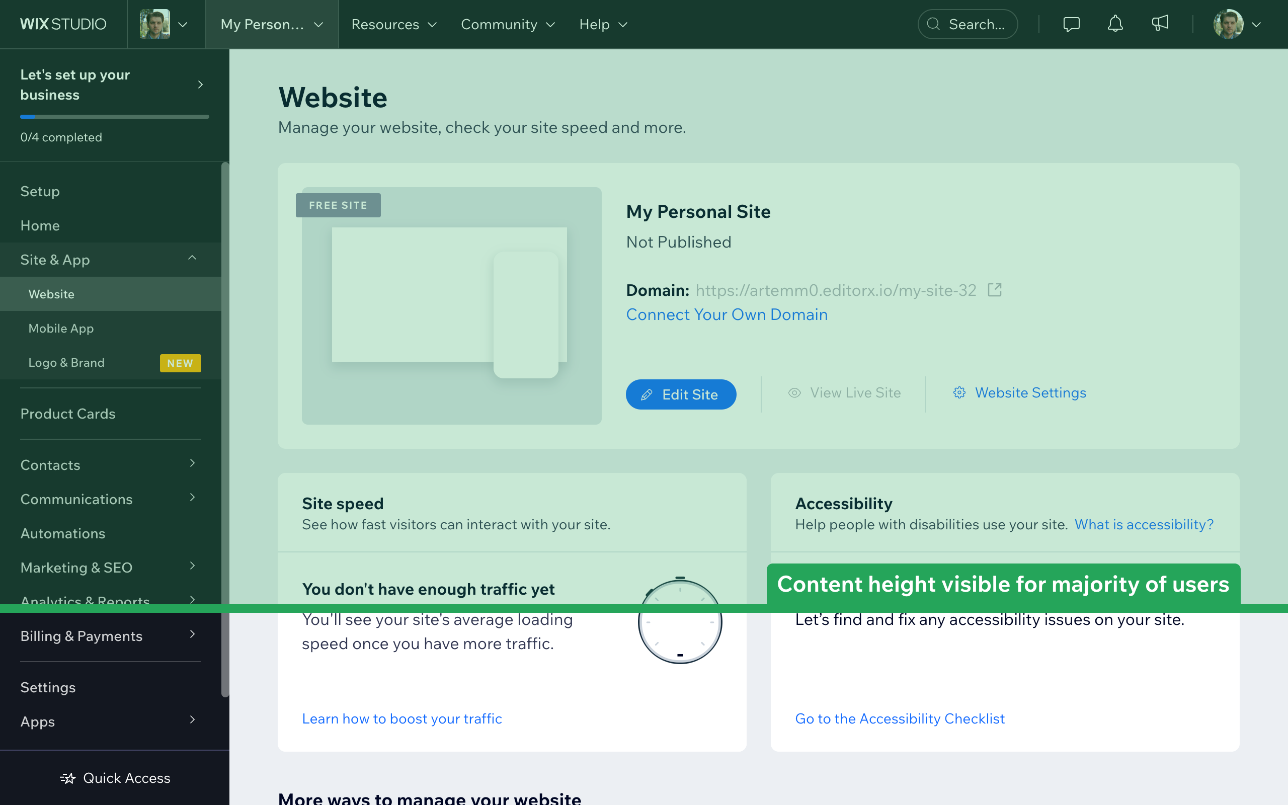
Dashboard pages are the backoffice of your app, allowing site builders to manage the app's data and settings.
When your app is installed on a site, the Dashboard page for your app will be part of the site Dashboard, alongside other apps from Wix. To make it easier for people to use your app, we recommend that you follow our suggested patterns when designing Dashboard pages.
Screen sizes
Dashboard pages in the Business Manager are viewed on a variety of desktop screen sizes, so aim to design layouts and content that work well on various screen sizes. Users should understand the purpose of a Dashboard page right away. The primary content should be revealed at the top area of the page, without asking users to scroll down. Content displayed in the top 600 pixels of the page will be visible for the majority of our users.
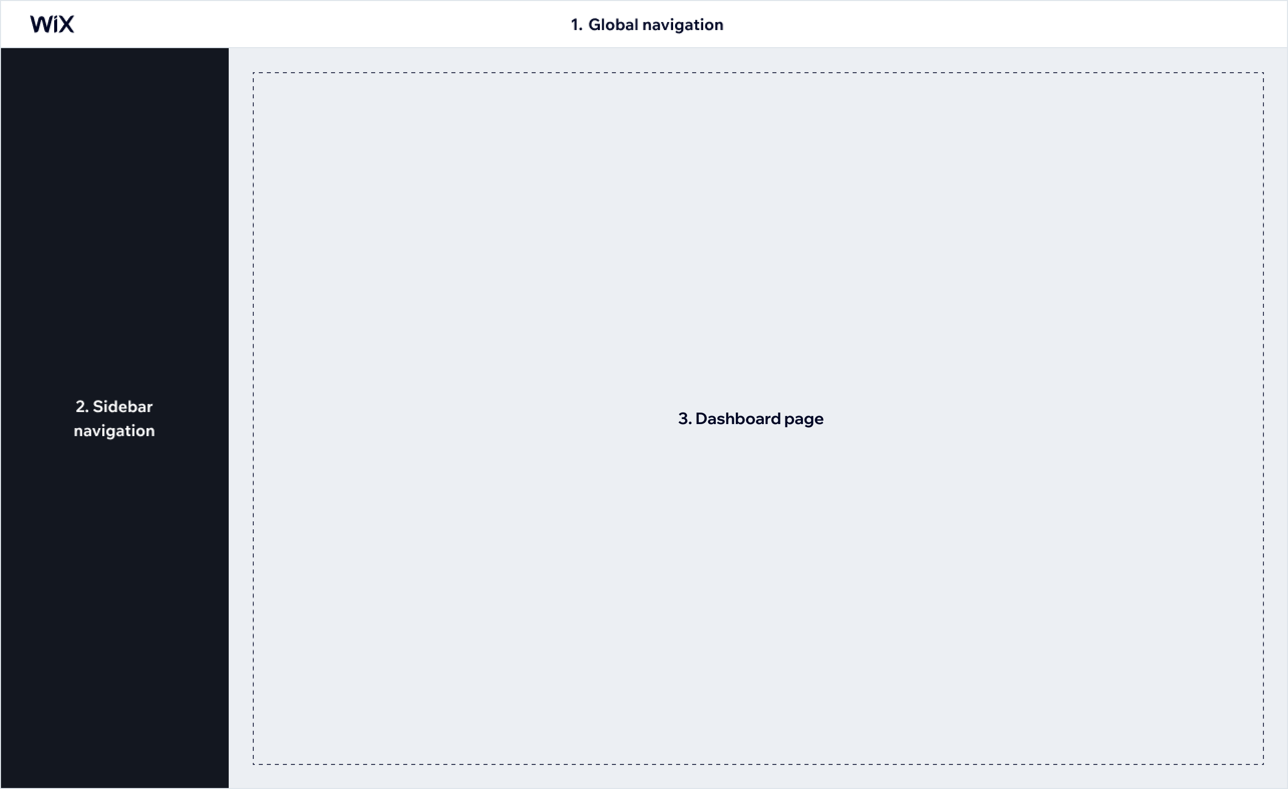
The dashboard page takes up the whole content area, with a width that's adaptable to screen size.
Elements
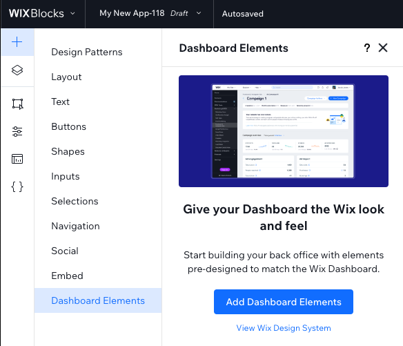
Dashboard pages are designed with their own visual language and a dedicated design system.
When designing your app’s Dashboard page, use elements from the Dashboard Elements section of the Add Elements panel, which contains a set of recommended elements.
Note that Dashboard pages can’t contain widgets, so you will not see them in the Add Elements panel.
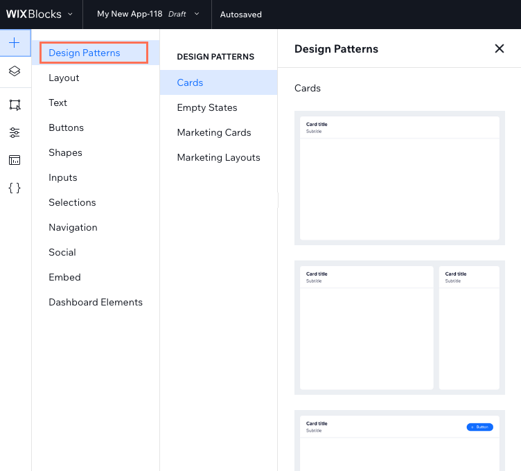
The Design Patterns section of the Add Elements + panel contains several basic recommended layouts for you to start designing your app’s Dashboard page.
Layout
The page layout defines the page structure, hierarchy, and rhythm. Choose a layout that decreases the amount of time a user needs to invest in a complex task.
In order to design a page with a great layout, it’s important to understand what the page content will be, how it will be segmented on the page, and how each segment will use the grid.
Layout grids
When designing your Dashboard page content, we recommend using a fluid grid layout with a fixed maximum width of 1248px. Such a grid should use columns that scale and resize the content that's placed on the grid accordingly. This means that content placement on a screen is always consistent.
Columns
For maximum flexibility, use a 12-column grid as a base when planning your page layout. Each column width is fluid and changes according to the page width.
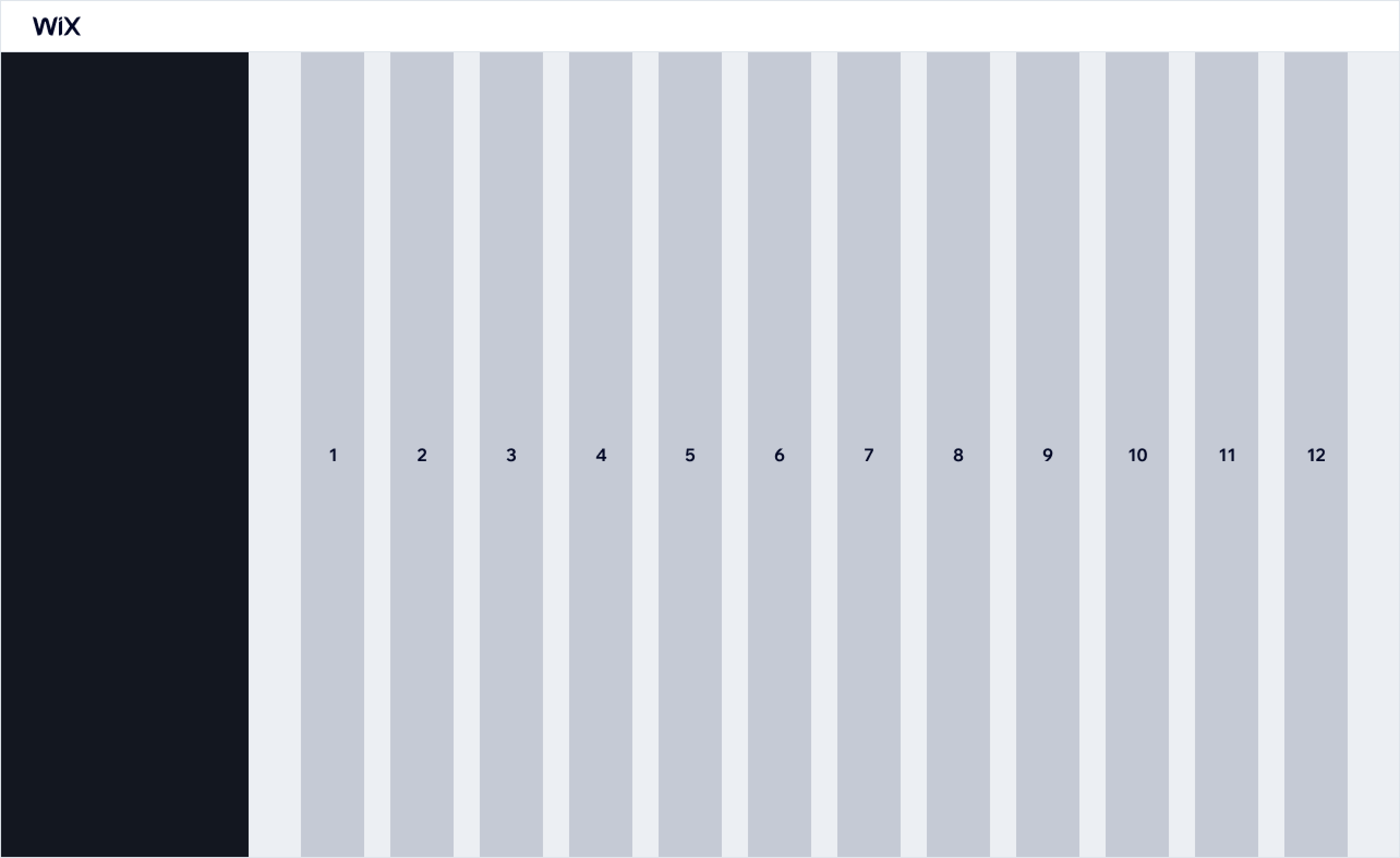
Such a 12-column grid will allow you to use column spans to construct layout regions of your page. Regions will be separated by a grid gutter.
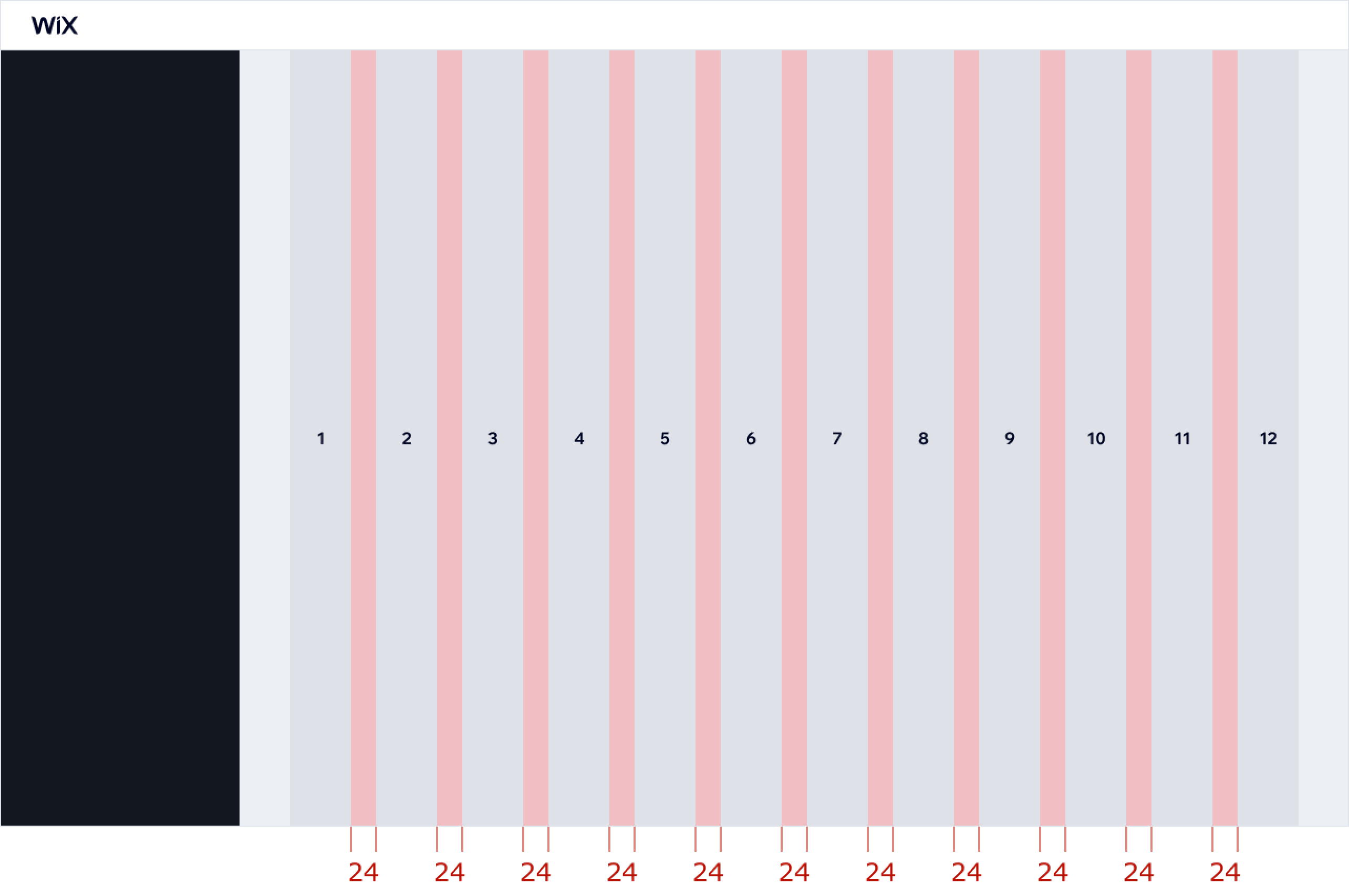
Gutters
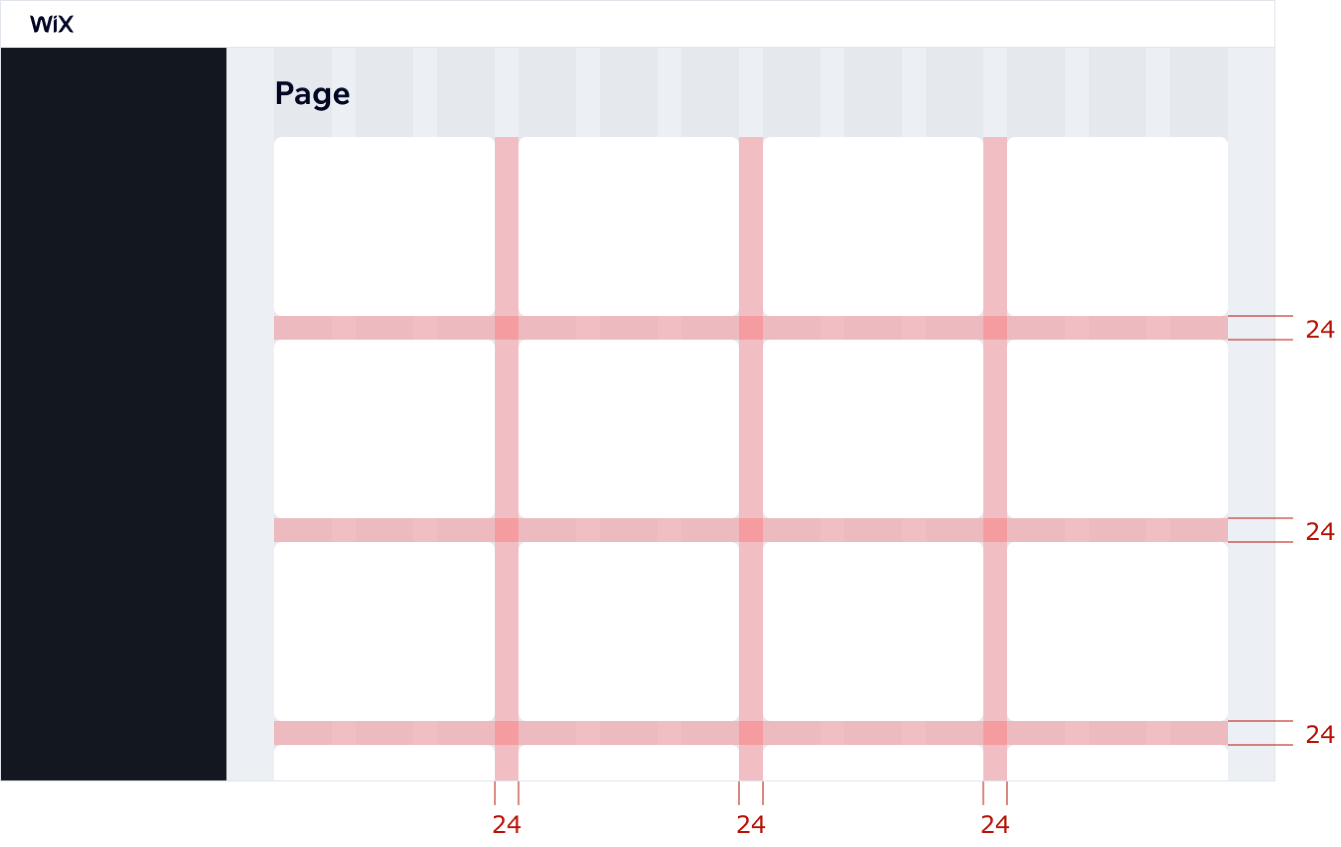
Gutters are the gaps between the columns. Gutter width should have a fixed value of 24 px.
Using the grid on a page
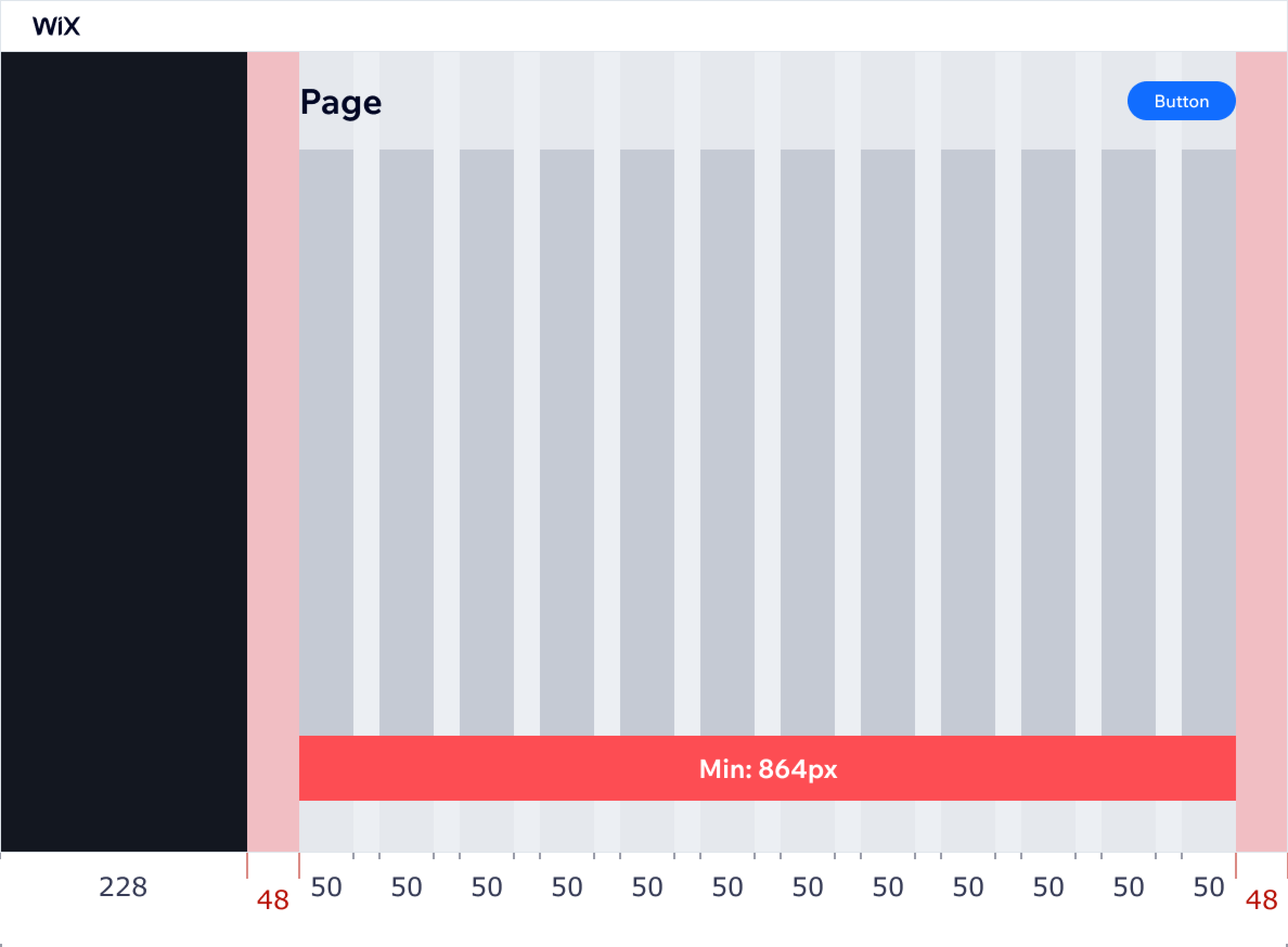
The page's content area should have 48px side margins and a 48px bottom margin. To arrange content inside of a page, use a 12-column grid.
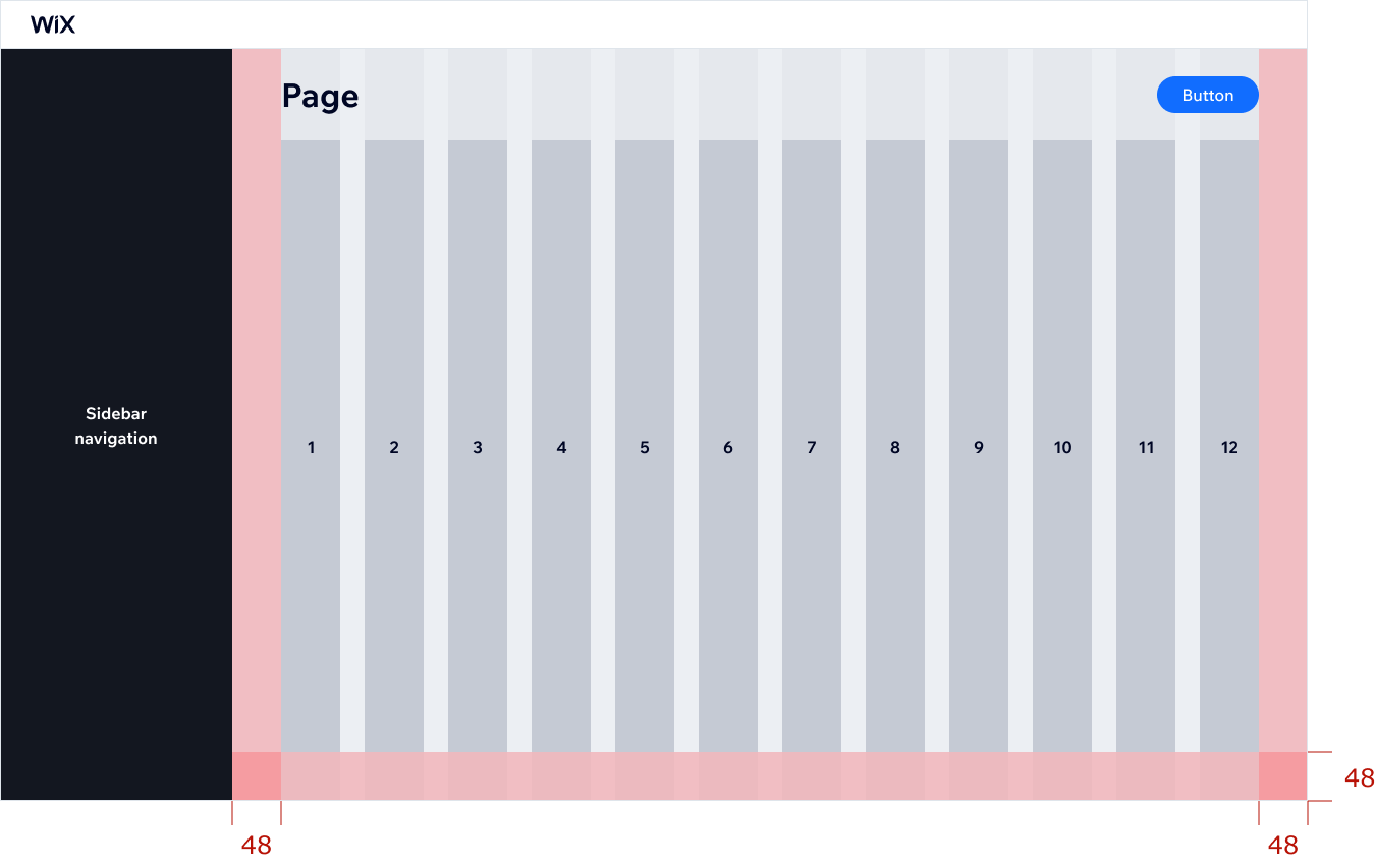
A page's content area has a minimum width of 864 pixels (each grid column should be 50px wide).
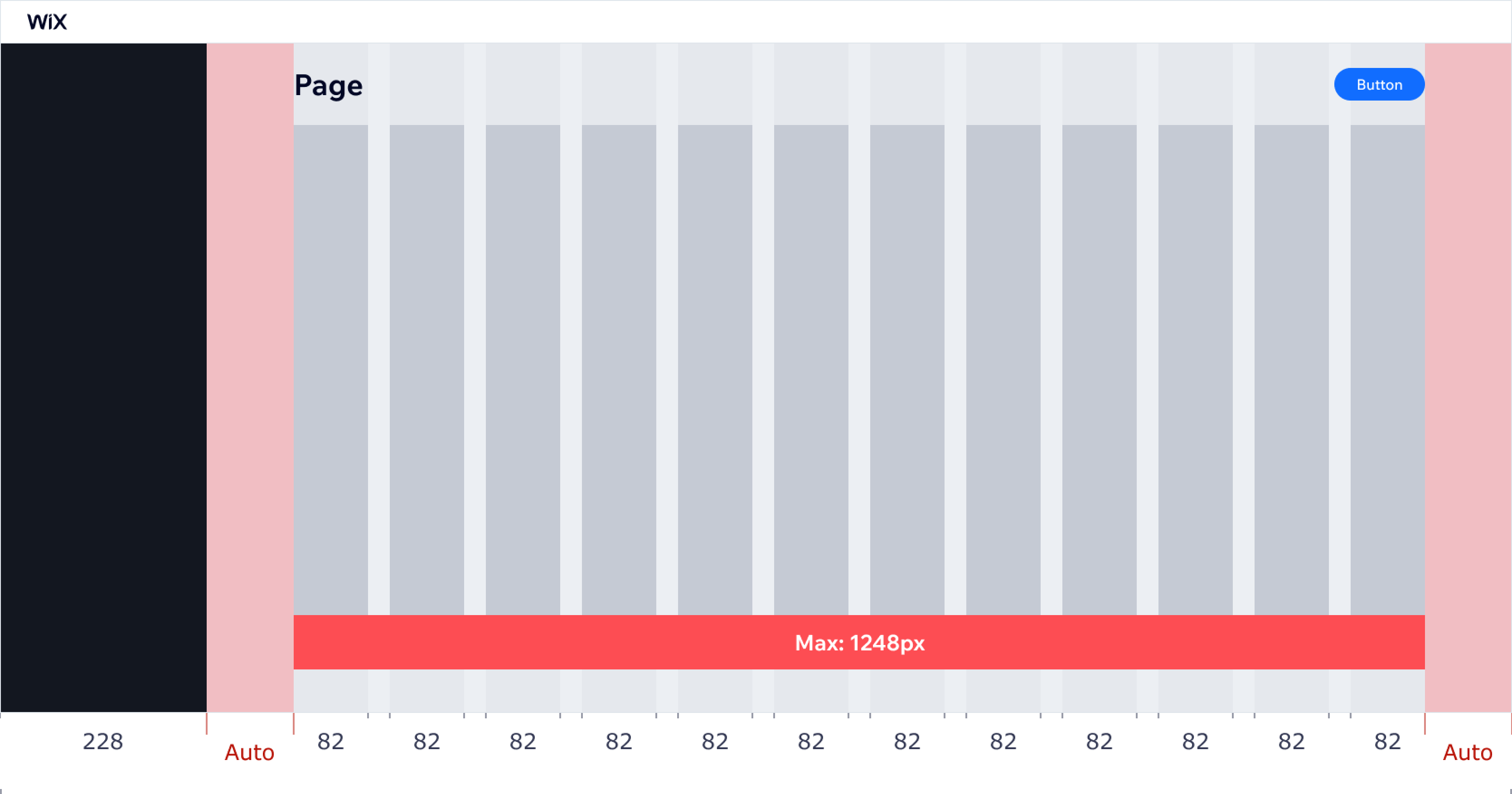
The maximum width of a page's content area should be 1248px (each column is 82px wide). Wider screen sizes should maintain a 1248px content area width. Side margins should automatically stretch to maintain content in a centered position.
A page can contain multiple layout regions of content (cards). Use a 24px gap between such cards both vertically and horizontally:
Layout intents
Page layouts can be divided by intention into the following types:
- Form
- Display
- Marketing
- Wizard
Let's describe these layouts.
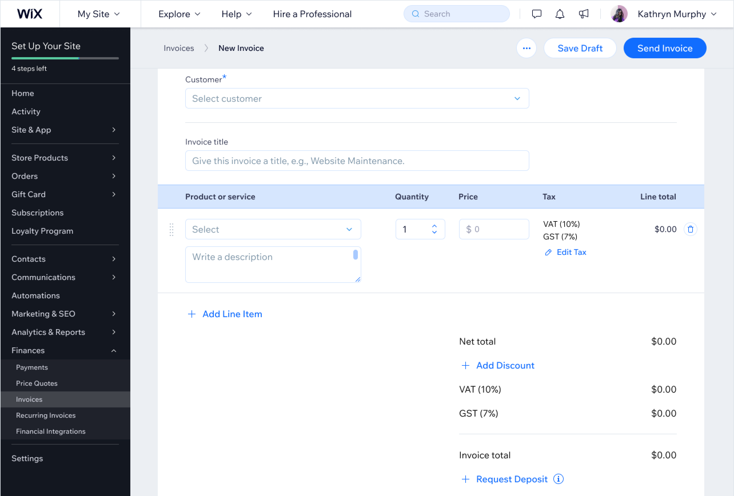
Form layout
Forms allow users to fill-in data or edit existing data. Depending on the content, the form layout type can appear in two different ways:
- 2/3 layout with an optional sidebar (8/4 column split)
- Full width (12 columns)
Both form page layouts include Save and Cancel actions in the header and footer areas.
The 2/3 form layout
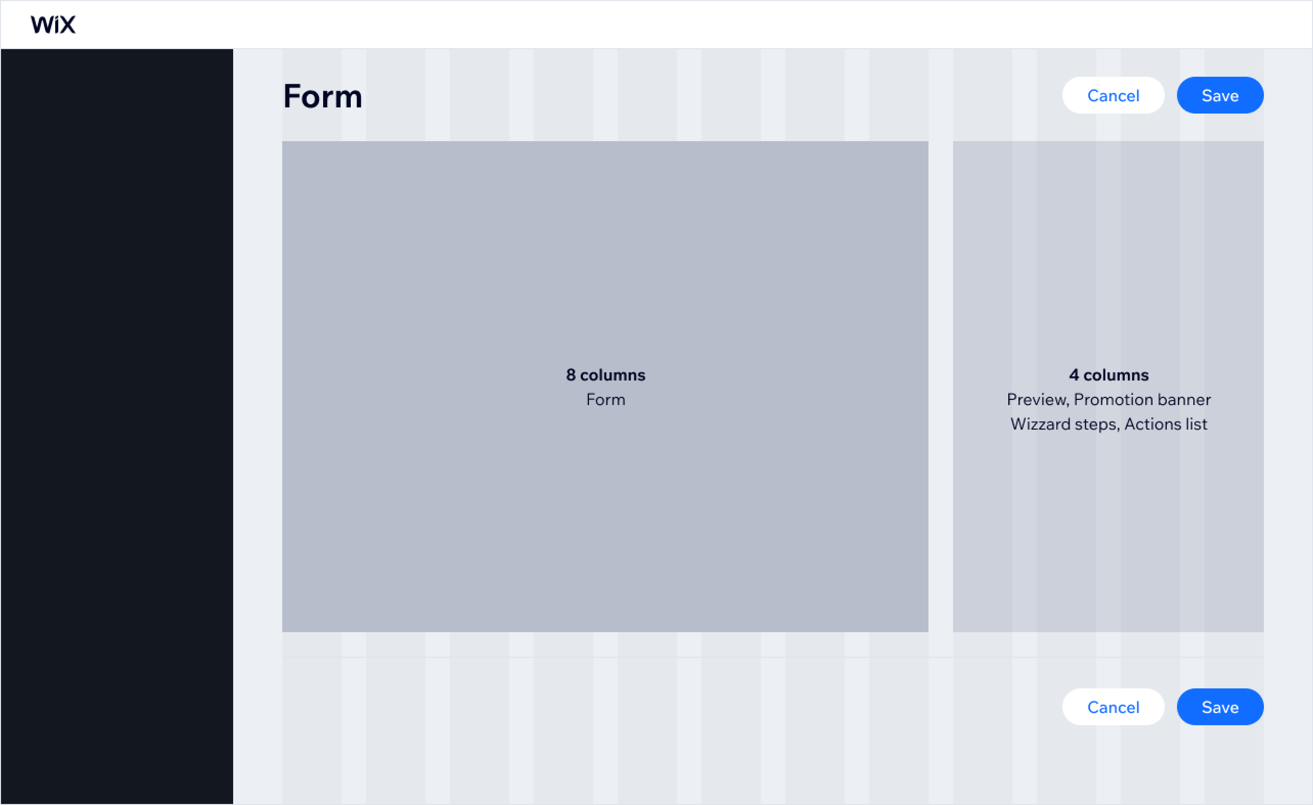 The 2/3 layout provides the flexibility to expose a variety of content at the same time.
Use this layout to:
- Expose primary and secondary content at the same time
- Keep the form easy to scan and understand
The page content is easier to scan when text and data inputs have a set maximum width. Shorter lines are more pleasant to read and allow users to understand the content faster.
When working on a form design, be thoughtful of the white space you use. Just like content, white space should have a purpose and intention.
Use white space to:
- Emphasize content
- Highlight hierarchy
- Group related content together
The full width form layout
The full width form layout supports advanced needs. Use it when a form includes complex structures, such as a data table with inline editing.
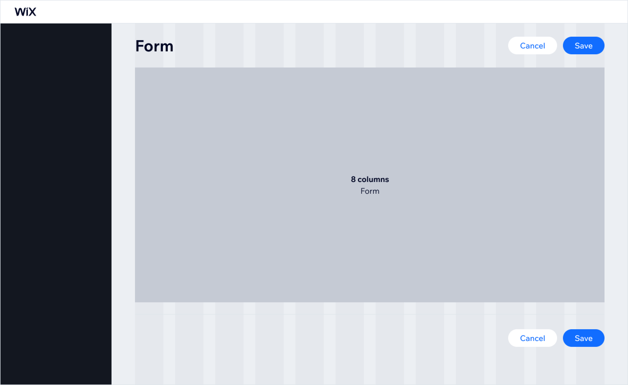
Use the full width layout for forms that include complex structures such as tables:
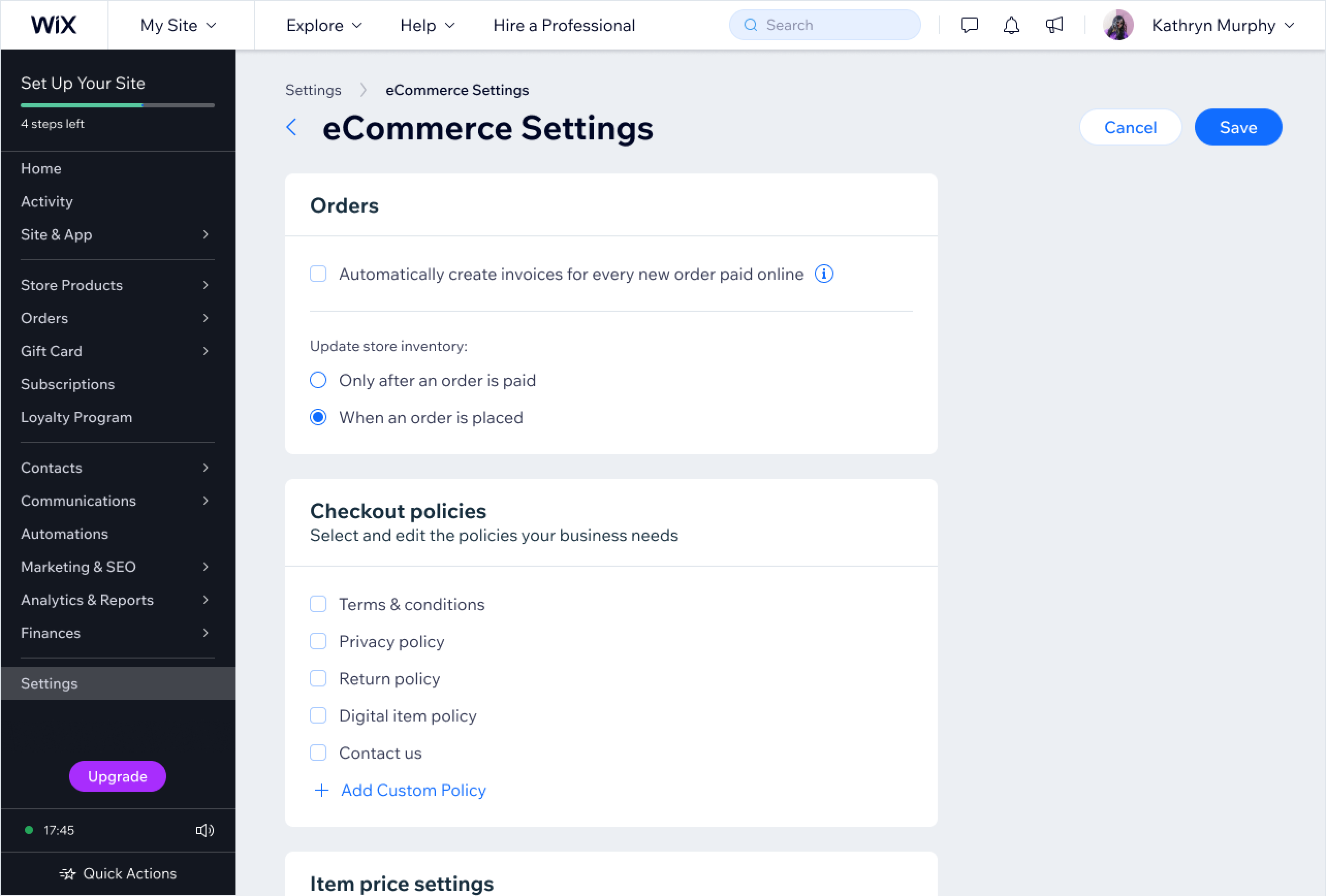
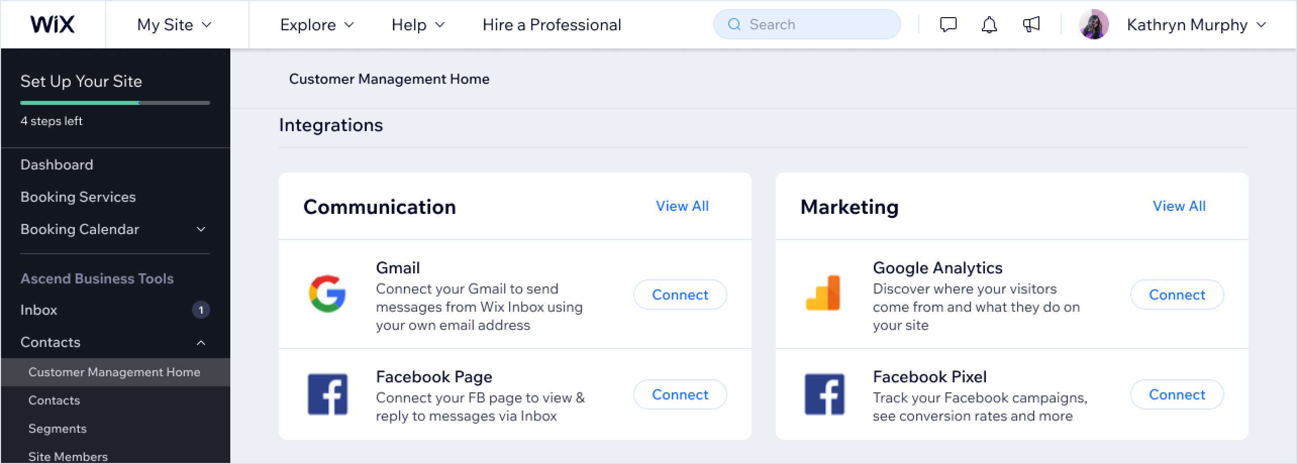
The display layout
Display pages showcase data or content in a corresponding layout. These pages do not accept input from the user side. They can contain minor actions such as data filtering.
Here are some of use cases for display layout:
- List or table
- Grid
- Dashboard
- Empty state
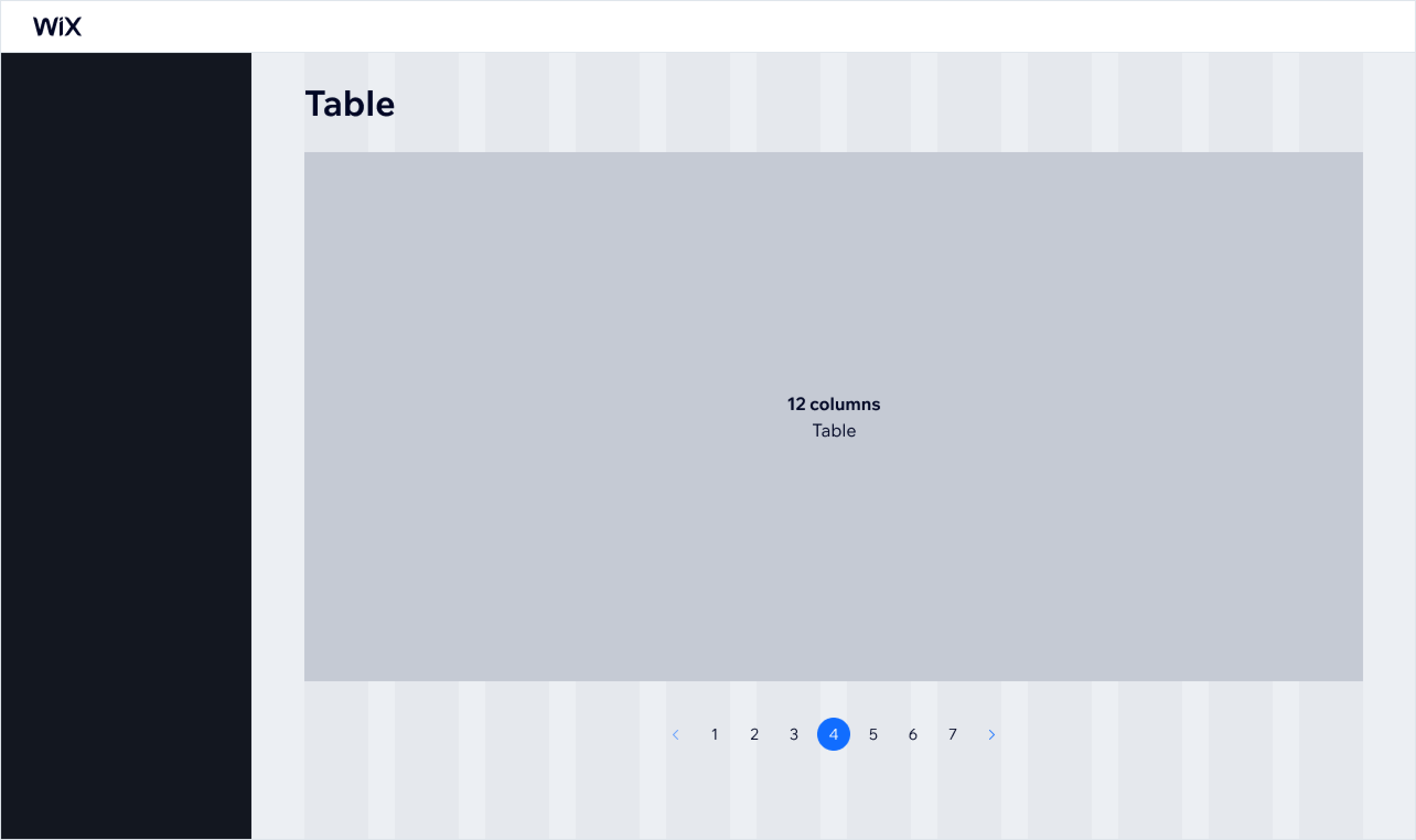
List or table display
Lists or tables, display large databases and provide users with a quick overview. They allow users to manipulate and act on a database. Use a 12-column layout for lists and tables.
Depending on the loading type, pagination may or may not be displayed at the end of the list.
Grid display
Grids can display lists of different items: features, tools, photos, audio files, etc. There are multiple variations of grids available to use:
- 2 columns
- 3 columns
- 4 columns
- Custom
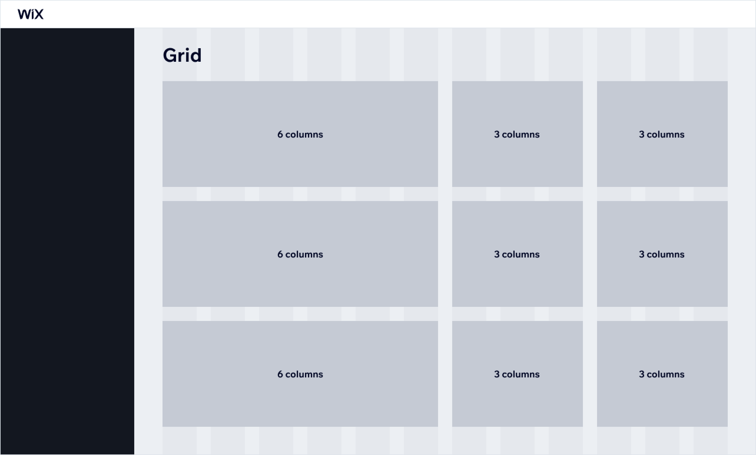
Selecting the right grid depends on the content you want to display. Before picking a type, you should think about:
- The total amount of items that you want to show
- The content that you need to display in each list item
- What objects the list of items reflect. Sometimes lists reflect physical objects, such as photo albums. Photo albums tend to have a square shape most of the time in the physical world. You should stick to that shape in digital space as well to make it easily recognisable.
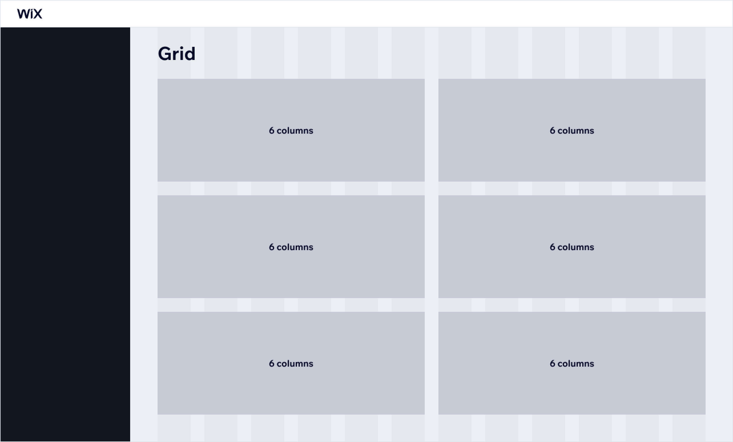
Use a 6/6 column split to list features or tools with lengthy descriptions:
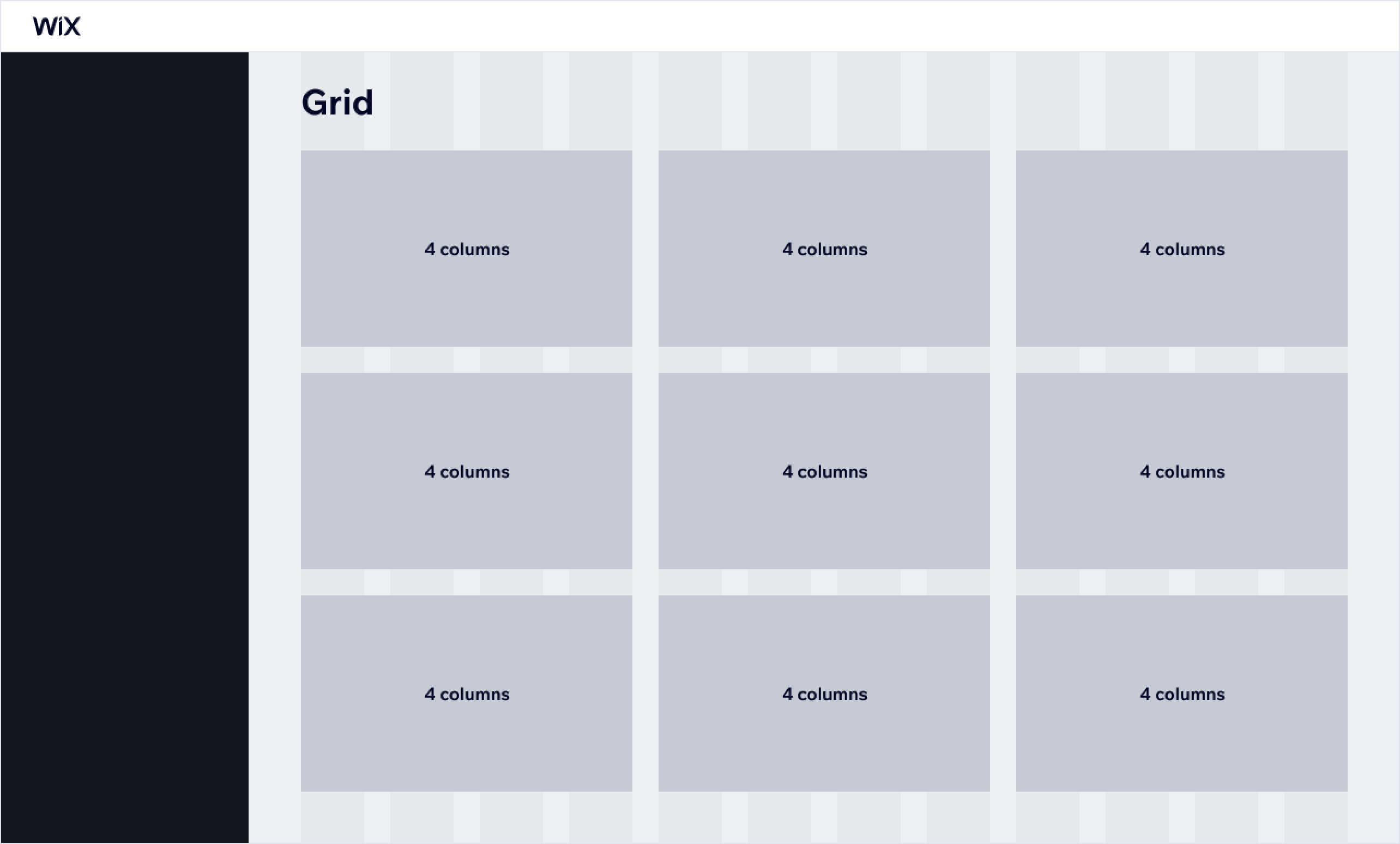
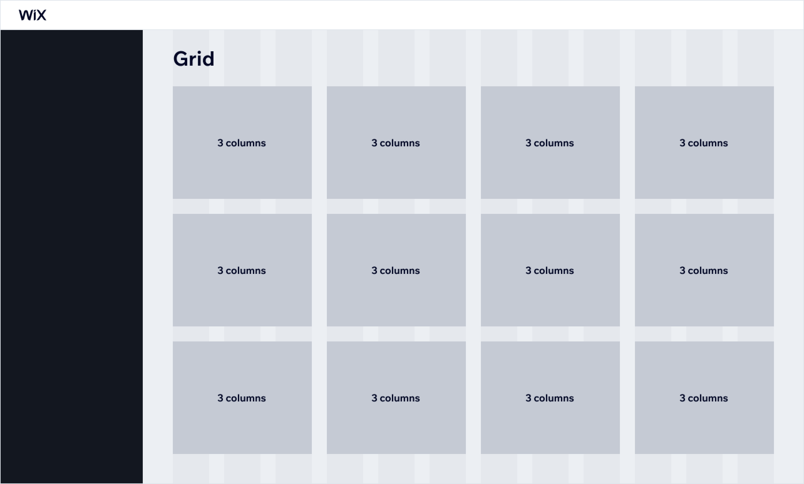
Keep in mind that a layout that works in one case might not be the best option in another. If the list item has a number of text lines of different types, a 3/3/3/3 column split reveals more items above the fold than a 6/6 layout:
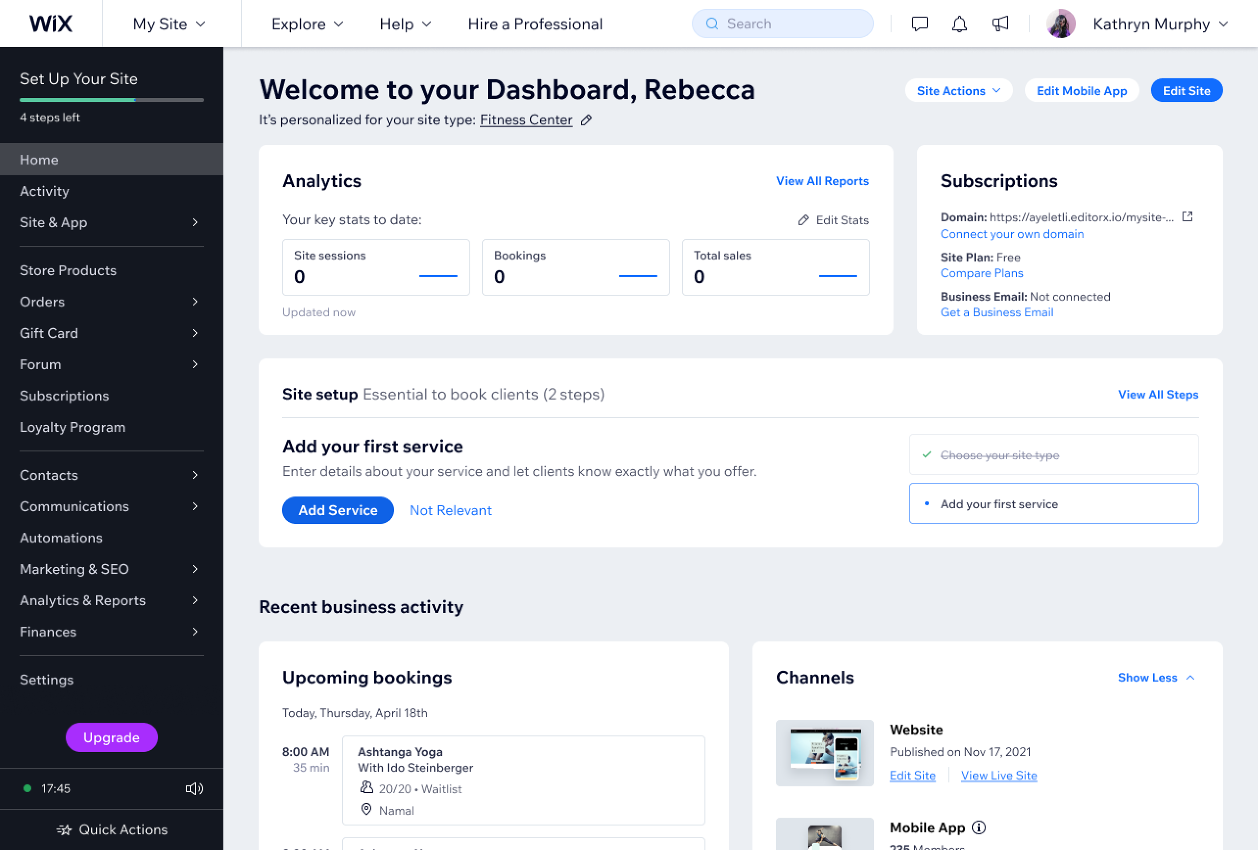
Dashboard
Dashboards display different types of data on a specific topic. Feel free to use a combination of grid segments to display all the different types of information.
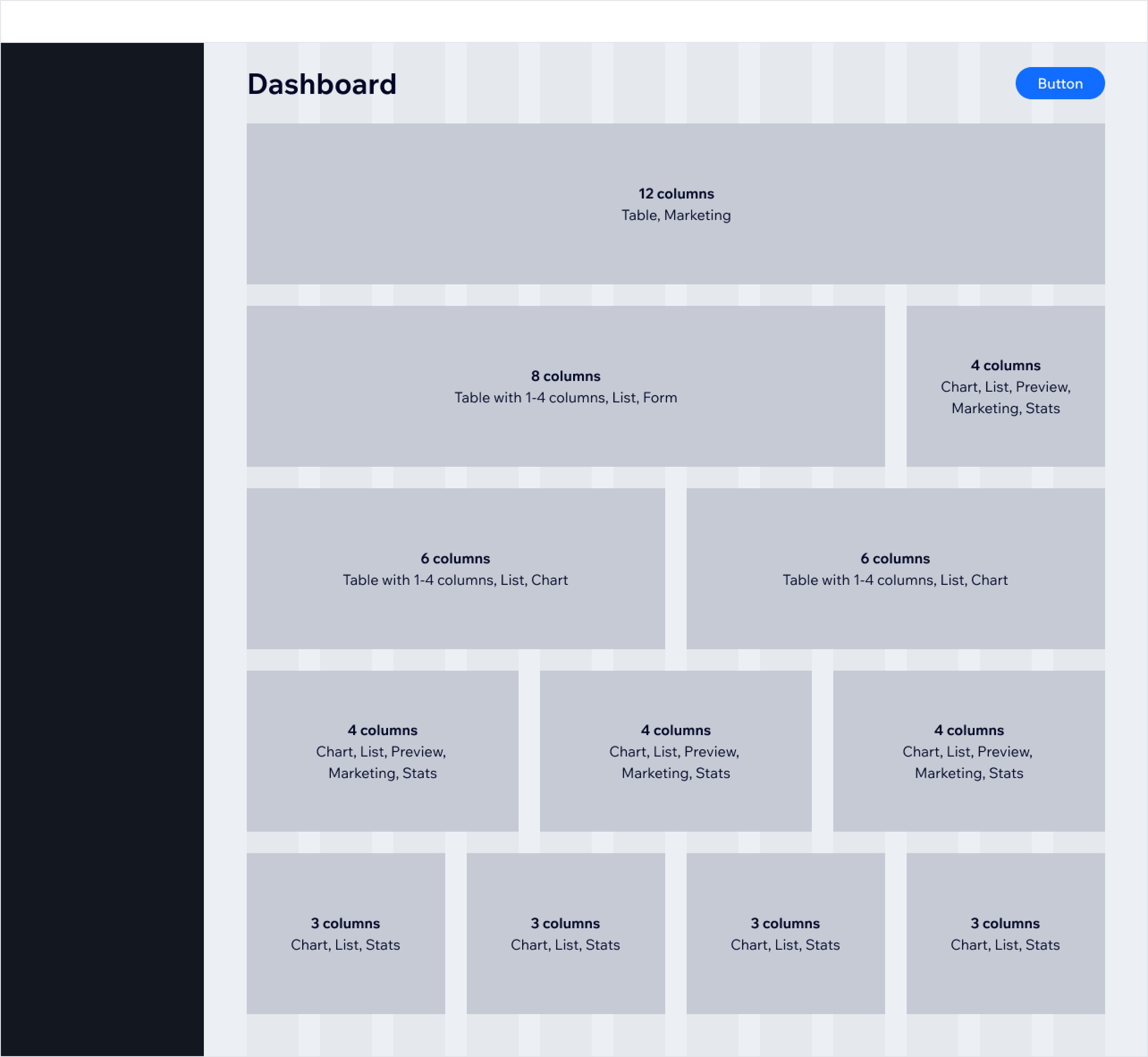
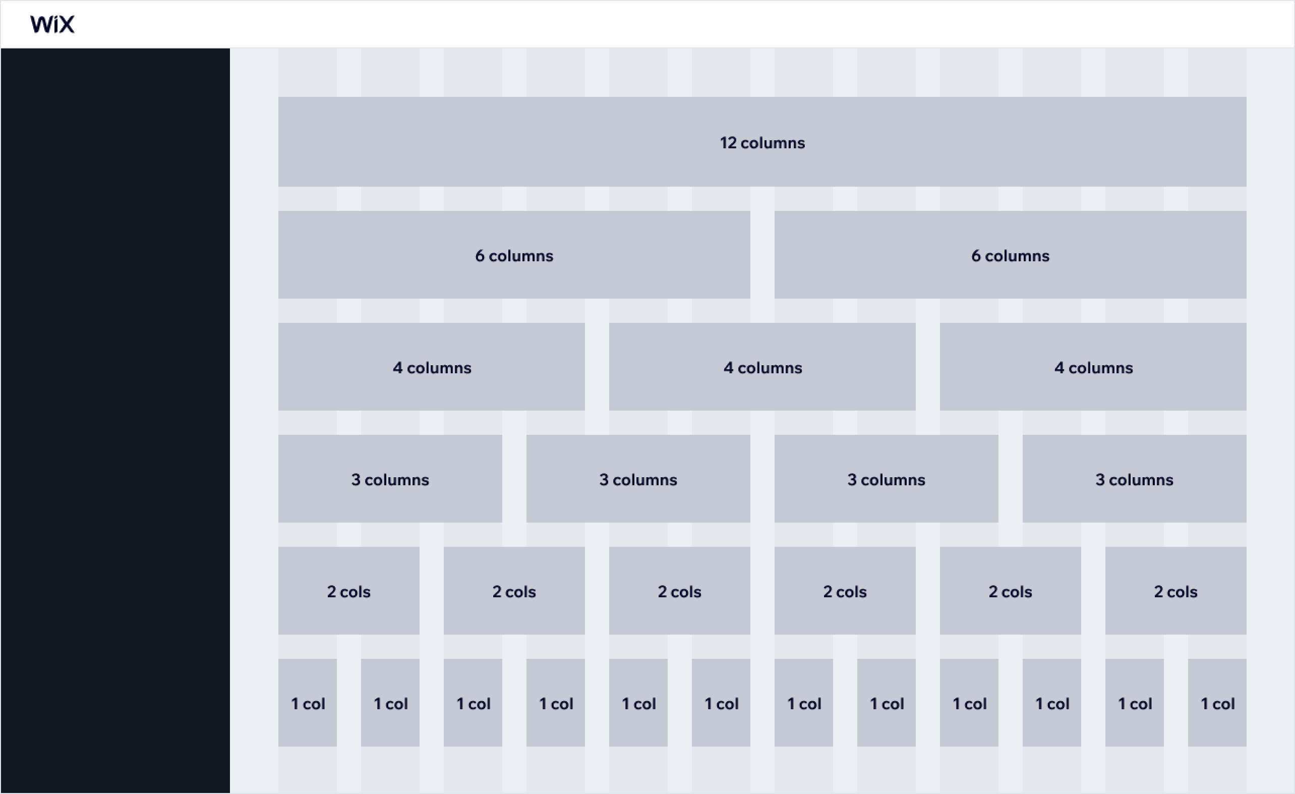
The number of columns to span the layout region across depends on the content. Use:
- 3 or 4 columns: for lists of items, previews, marketing, statistics, and charts
- 12 columns (full width): for tables and marketing content
- 8 columns: for lists, tables with a few data columns, setup wizards, and charts
- 6 columns: for lists, tables with a few data columns, and statistics
Use 12 columns for marketing content to draw attention to it:
Use a 6/6 column split to categorize features under the same section:
Use a 3/3/3/3 layout to list the options of a feature that user can choose from:
Feel free to combine different grid for mixed data displays:
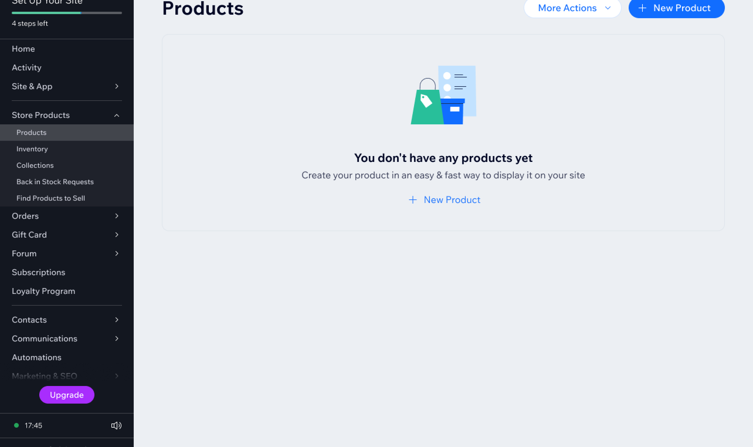
Empty state
Use the full width layout for the empty state of a page to indicate that a feature or product:
- Has no data yet
- Has all data cleared
- Is not set up yet (first time experience)
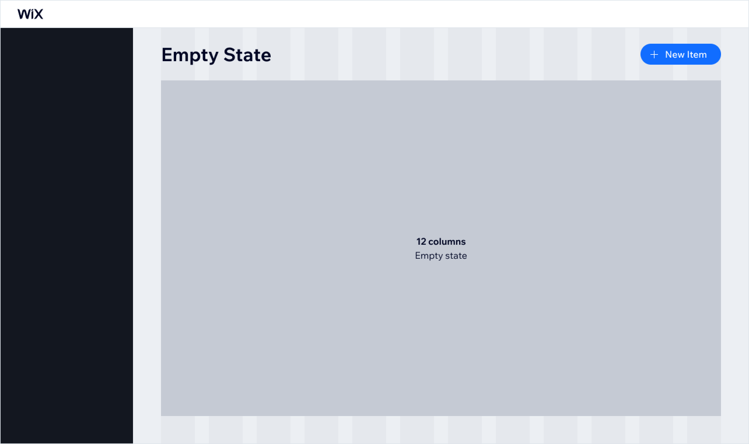
Use the full width layout to clearly communicate that a page is empty, and add a clear CTA indicating what to do to fill the page with relevant content:
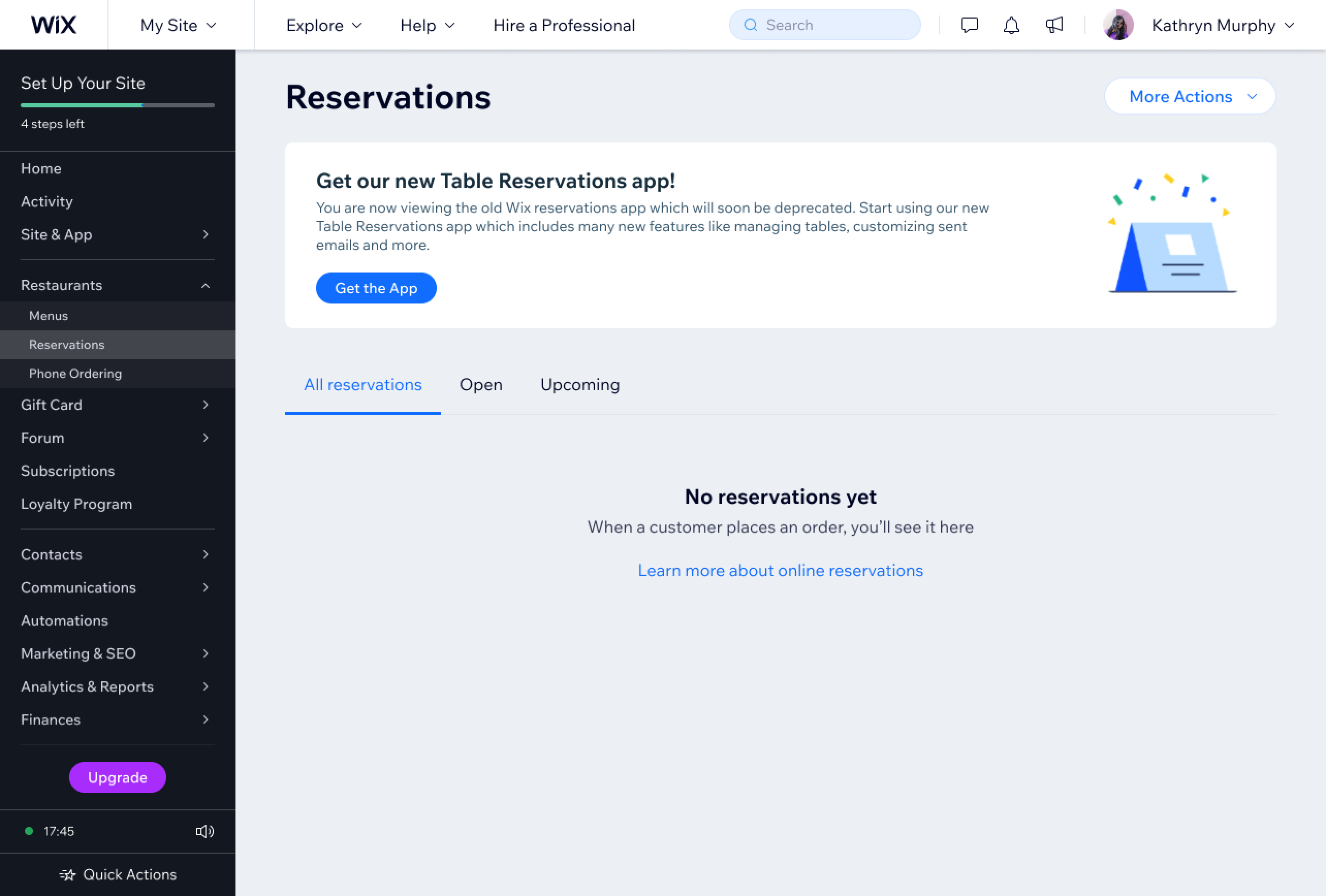
It's OK to combine the empty state with other layout elements such as marketing widgets or navigation elements:
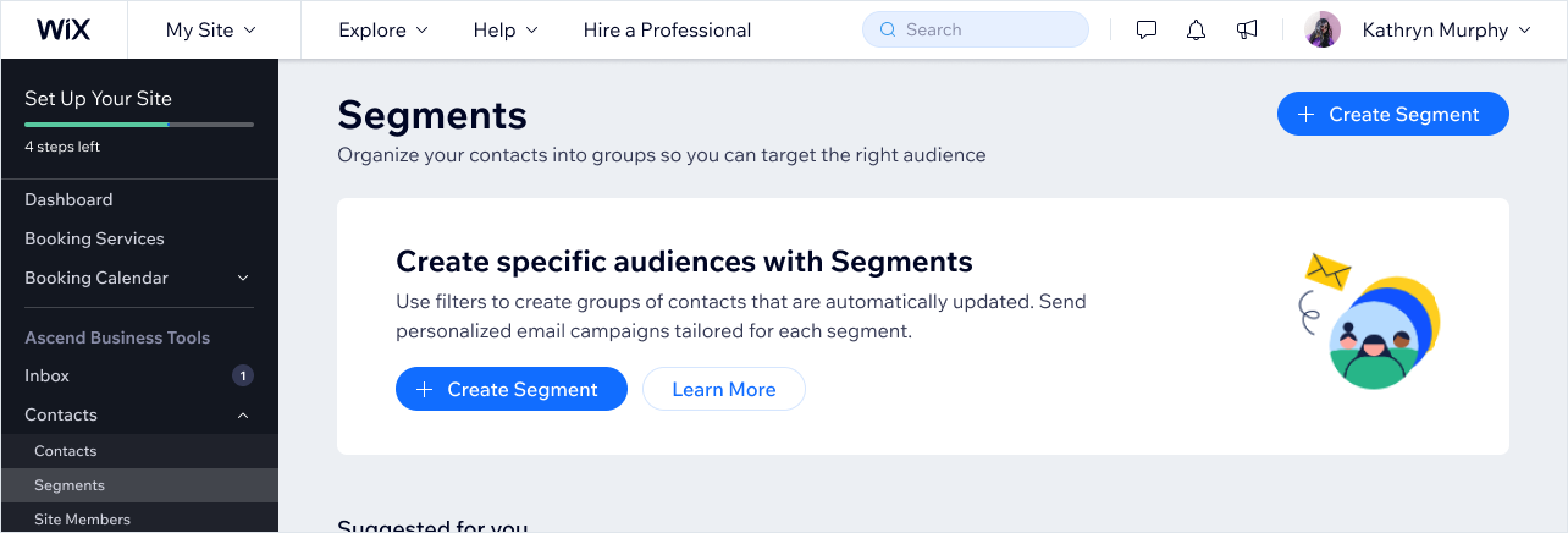
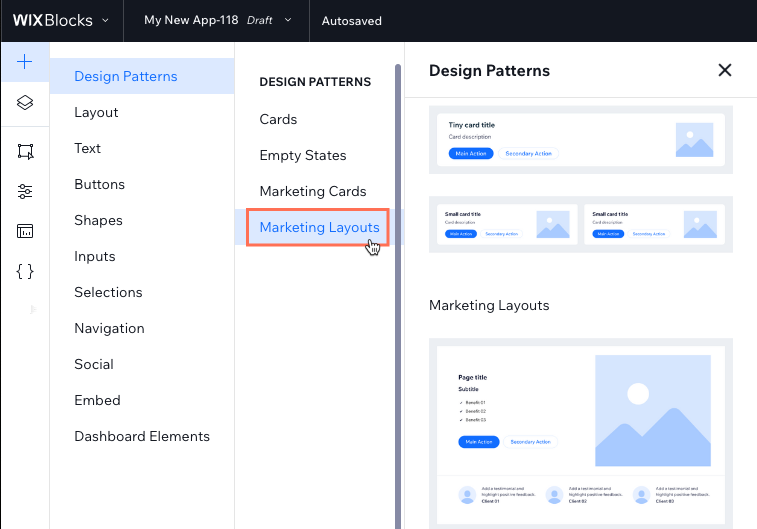
Marketing
A marketing layout can promote your app or products that site owners are not aware of yet.
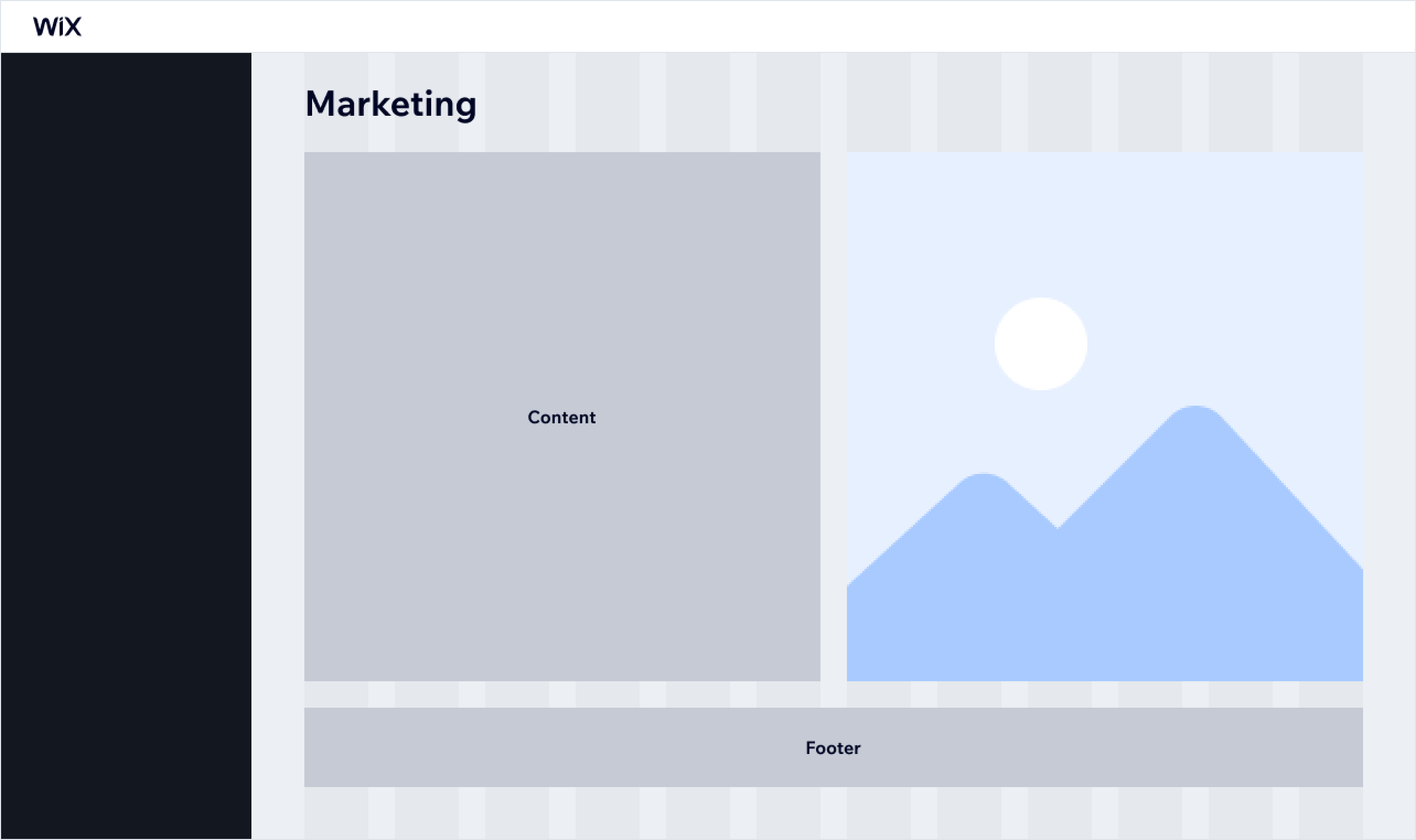
Marketing pages should be built using the dedicated Marketing Layouts compositions which you can find in the Add Elements panel.
Wizard
Wizard pages guide users through setting up a product or feature. They also split complex forms into steps so that they're easier for users to complete.
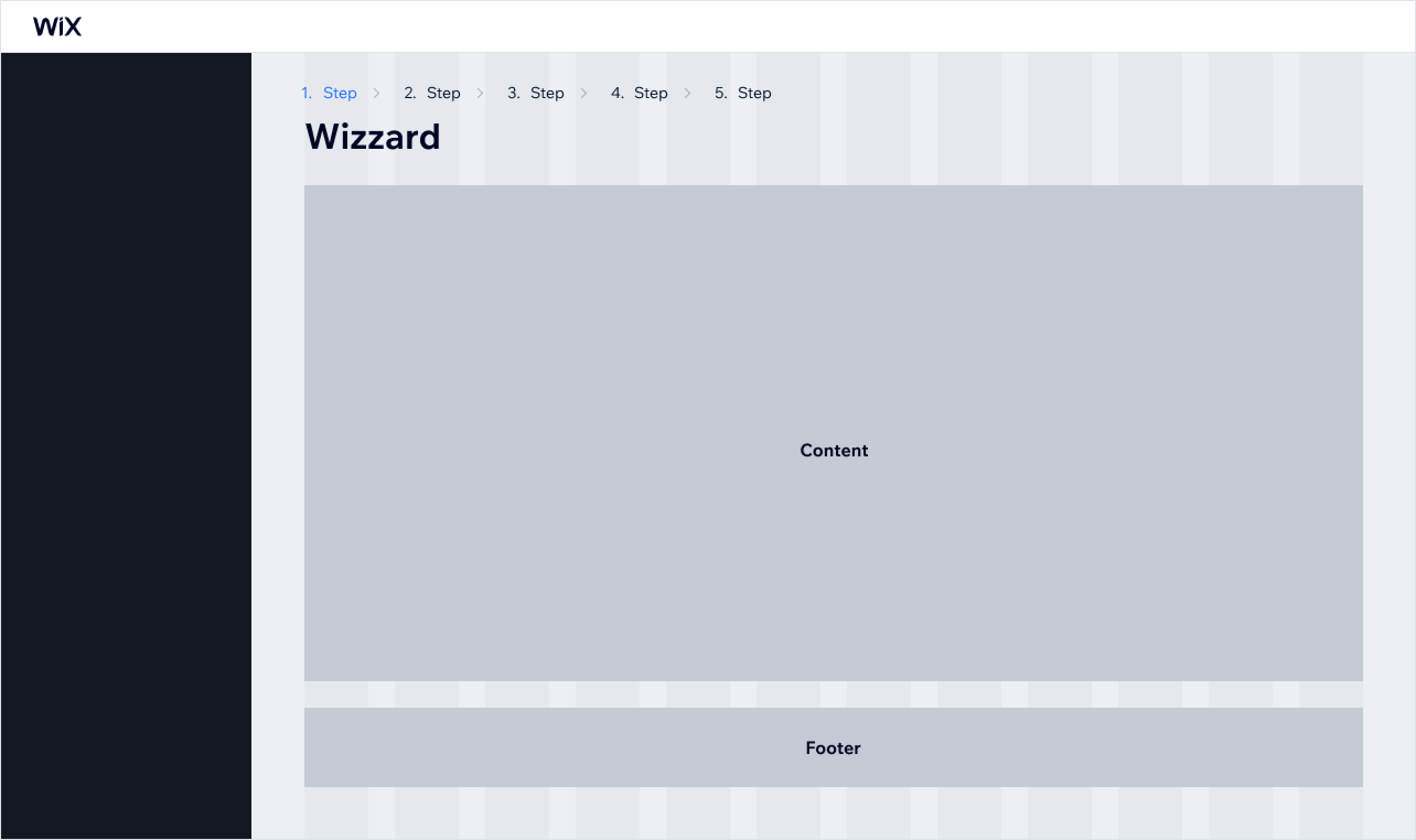
Create multiple Dashboard pages or use a Multi-State Box to split up complex forms or product setup into smaller steps of a wizard:
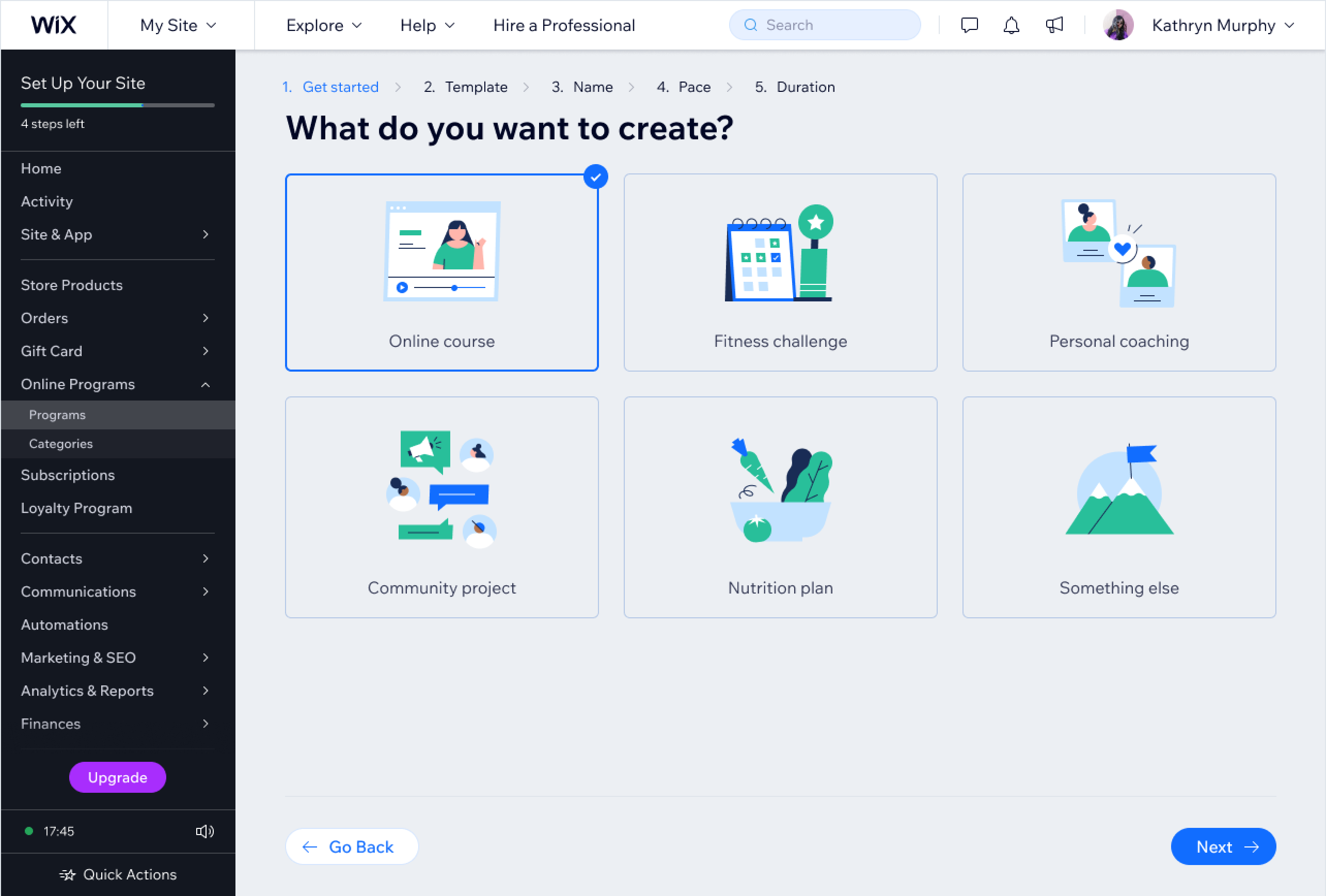
Remember that wizards need to have an explicit entry point and a final destination. After a user completes all the steps, they should end up on a relevant page: a dashboard, a details page, or any other relevant location.
Last updated: 19 January 2026