Custom Element Extension Files and Code
Deprecation notice:
installation.autoAdd is deprecated. If your code still uses this property, update it to installation.staticContainer.
Learn more about custom element installation in the CLI.
Add a new custom element extension to your CLI project with the generate command, select Custom Element as the framework.
The CLI generates a folder with the name you choose, containing the following files:
- An
element.extension.tsfile that defines a builder containing the configuration settings for your custom element. - An
element.tsxfile that contains the main code for the custom element. - A
element.panel.tsxfile that contains the code for your widget's settings panel. - A
element.module.cssfile that configures CSS styling to customize your widget's appearance. It's generated with some initial styles to help you get started. - A default
thumbnail.pngfile that contains the thumbnail displayed in the Add Elements panel and the Manage Apps page for your widget. This file is optional, but without a thumbnail, your widget won't appear in the Add Elements panel or the Manage Apps page.
It's possible to create each of these files yourself, but we don't recommend it for a couple of reasons:
- You're more likely to make errors in the filepath if you add the files and folders yourself. If the filepath is incorrect, the CLI can't detect the custom element and it won't work.
- The auto-generated files offer React template code that helps you get started developing.
element.extension.ts
The element.extension.ts file configures the settings for how your custom element appears on a user's site. This file is required, so don't delete it after the extension is generated. If you add your own files, you must include element.extension.ts.
When you generate a new custom element in your project, you'll see the following code in element.extension.ts:
You can edit the configuration object and add properties as follows:
| Key | Type | Description |
|---|---|---|
id | string | A unique identifier for your custom element. The CLI generates this GUID for you. If you add the JSON file yourself, you must generate your own GUID. |
name | string | The name of the custom element as it appears in the app dashboard. The CLI prompts you for the name when you create the extension. |
height.defaultHeight | number | The widget's height in pixels when it is first installed on a site. |
width.defaultWidth | number | The widget's width in pixels when it is first installed on a site. |
width.stretchByDefault | boolean | Whether to stretch the widget to full width on installation. |
width.allowStretch | boolean | Whether to allow users to toggle the widget between full-width and default width. |
installation.staticContainer | string | Determines where the widget is automatically added when your app is installed. Set to "HOMEPAGE" to automatically add the widget to the site home page upon installation. If you omit the field, the widget isn't added upon install. |
presets[0].id | string | A unique GUID identifier for the preset object containing your thumbnail. |
presets[0].name | string | The display name for the preset. This can be any descriptive name. |
presets[0].thumbnailUrl | string | The URL path to your thumbnail image. Use the format {{BASE_URL}}/public/your-image-name.png where your-image-name.png is the filename of your image in the public folder. |
Set installation.staticContainer to "HOMEPAGE" to automatically add the widget to the site home page when the app is installed. Wix users can move the widget to any location after installation. If the field is omitted, the widget isn't added on installation and Wix users can add the widget manually from the editor's Add panel. In the CLI, automatic installation applies only to the home page. For details, configuration examples, and best practices, see About custom element installation with the CLI.
element.tsx
The element.tsx file is where you write the code for the custom element. You can write code in other files and include it here, but you must return your main component in this file. This is where the CLI will look for the custom element definition.
This file is required for the custom element to work, so don't delete it. If you add the files on your own, you must include element.tsx.
When the element.tsx file is generated, it looks like this:
The file sets up a React component called CustomElement, where you write the custom element code. It also calls reactToWebComponent to convert your React component to a custom element, and exports the custom element so Wix can work with it.
We recommend writing your code in React, since the rest of the CLI also works with React. However, you can also write code directly in element.tsx with JavaScript. If you do so, make sure to export the custom element, like in the example below:
Note that you don't need to call define() even here; Wix still takes care of that for you even if you haven't defined the custom element in React.
element.panel.tsx
The element.panel.tsx file contains the code defining your custom element's settings panel. The settings panel lets site users customize the widget after they install your app.
In the panel's code, use Wix's JavaScript SDK to access widget properties and retrieve environmental data from the editor, as well as access and manage Wix business solutions.
To apply changes made in the settings panel to the widget, use the Widget API's setProp() function. Widget properties are bound to your custom element's attributes, so any change in the properties automatically updates the corresponding attribute. To handle attribute updates so they're reflected in your widget in the editor, use the attributeChangedCallback() in your custom element's code.
After the custom element is generated, you'll see code like this in element.panel.tsx file:
The file contains a React component called Panel that defines the custom element's settings panel with the following key features:
- State Management: Uses React hooks (
useState,useEffect,useCallback) to manage the display name property. - Widget Integration: Uses the
widgetAPI from@wix/editorto get and set widget properties. - UI Components: Utilizes Wix Design System components like
SidePanel,Input, andFormFieldfor a consistent user interface.
As with element.tsx, you can write code in other files and include it here, but you must return your main component in this file. The panel code must be written in React to work with the rest of the CLI.
Learn more about creating a settings panel for a custom element. You can also integrate Wix's native color and font pickers in your panel.
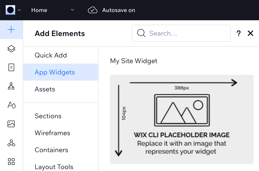
Custom element thumbnail
To display a thumbnail for your custom element in the Add Elements panel, you need to add a presets configuration to your element.extension.ts file and create a public folder with your thumbnail image.
Add the presets configuration to your element.extension.ts file after the settings property:
Create a public folder at the root level of your project and add your thumbnail image file.
Important:
If you rename the thumbnail file, you must update the path in thumbnailUrl. Without a thumbnail, your widget won't appear in the Add Elements panel or the Manage Apps page.