About Editor React Component Extensions
Alpha: Editor React Components are currently in alpha. This feature is subject to change and may have bugs, issues, and limitations. We're actively improving it based on your feedback.
Editor React Component extensions let you build custom site widgets in React that fully integrate with the editor. You describe your component's customizable parts in a declarative manifest, and the editor builds matching auto panels for Wix users.
This gives Wix users the same editing experience they get with built-in Wix elements, without you having to build or maintain your own settings panels like you would with a custom element. To see auto panels appear one by one as you add manifest properties, follow the step-by-step tutorial.
Editor Compatibility
Editor React Component extensions are built for Wix Harmony, Wix's AI-powered editor. They're not supported on Wix Editor or Wix Studio sites, and there's no way to conditionally switch between extension types based on the editor.
For a walkthrough of Editor React Components, watch the video tutorial:
How it works
Your extension has 2 main parts:
- React component: Your UI code that renders in the editor and on the live site.
- Manifest: A configuration object that declares what's customizable about your component, so the editor knows which auto panels and controls to show to Wix users.
You build the React component first. The CLI then auto-generates the large part of the manifest for you. For more information, see Auto-generated manifest.
Your component code may also include additional assets like stylesheets, and you can provide separate bundles for the live site and the editor. For more details, see resources.
When a Wix user adds your component to their site:
- The editor reads the manifest to understand what customizations are available.
- The editor builds the matching auto panels and controls in the editor UI.
- As the Wix user makes changes, the editor stores those values. It passes data changes to your component as props and applies style changes as CSS directly to the DOM elements that match the selectors in the manifest. TypeScript types for all props are available from the
@wix/editor-react-typespackage.
Example
Here's a testimonial card built as an Editor React Component. The component code comes first, then the manifest that drives it.
React component:
Sample stylesheet (style.css)
Notice how the component applies className to the root element and uses CSS classes like .quote and .author-name on inner elements. These patterns are part of the component requirements that let the editor manage your component.
Manifest:
The selector (.testimonial-card) matches the CSS class on the component's root element. Everything else in the manifest drives an auto panel.
Each data property with dataType: "text" becomes an editable text field. When a Wix user clicks Edit Text on the component, the editor builds an Edit Text auto panel with inputs for every text property. The displayName value appears as the label for each input:
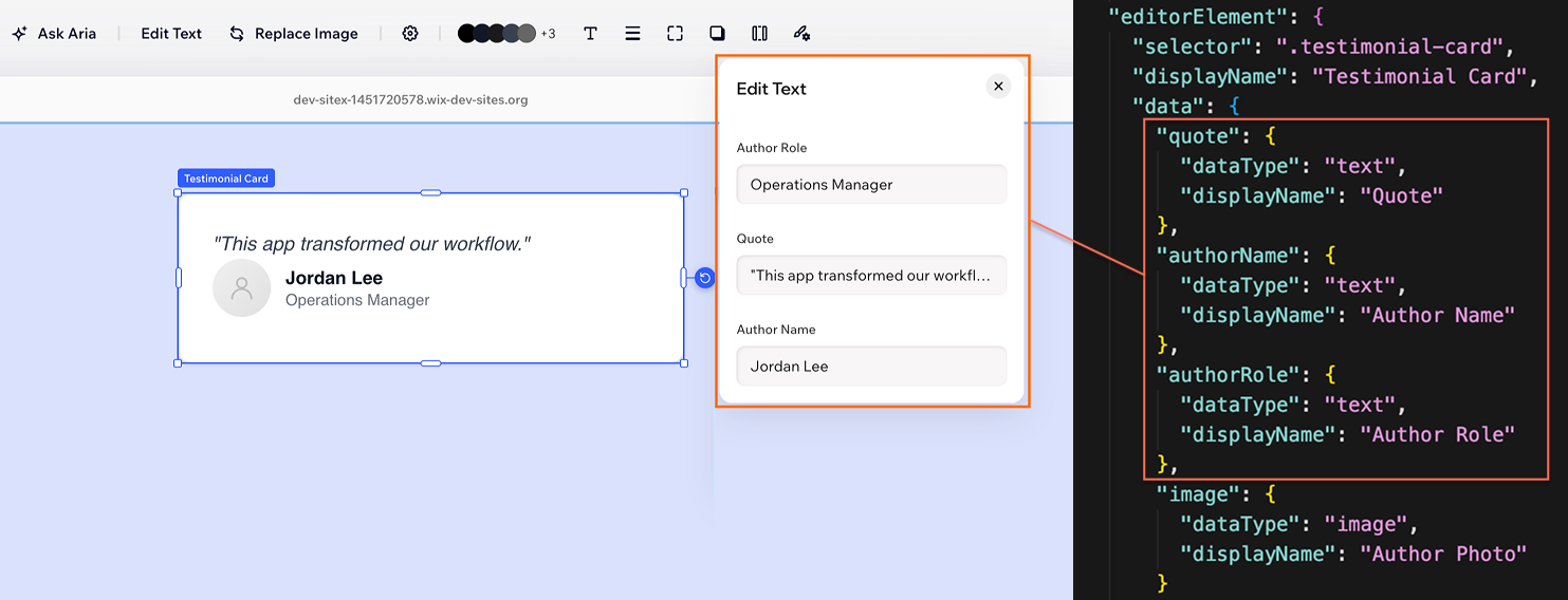
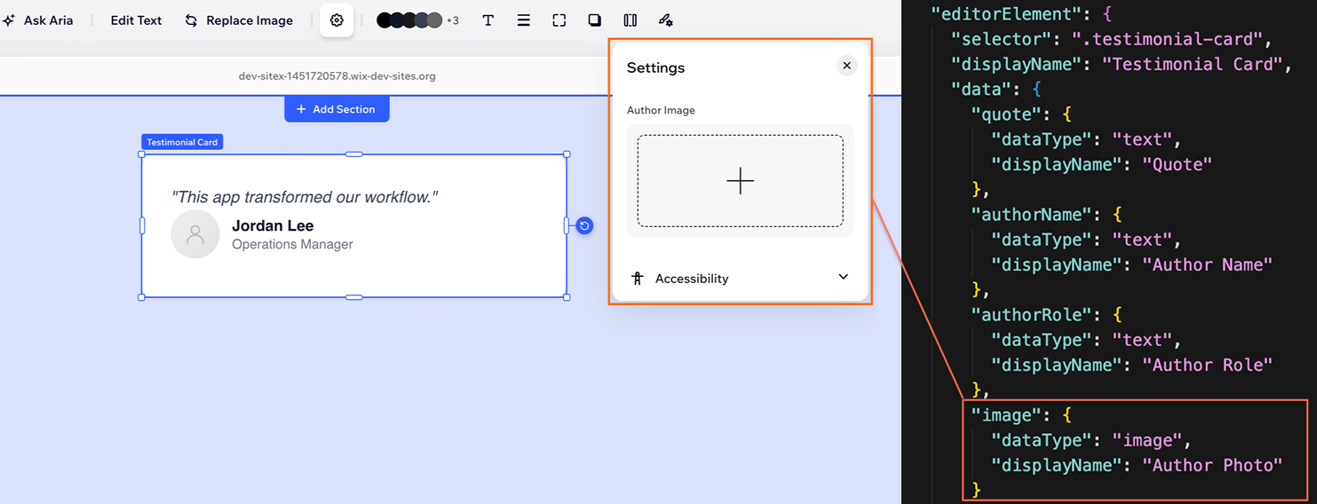
Properties with dataType: "image" surface in the Settings auto panel, where Wix users can upload or choose images from the Wix Media Manager:
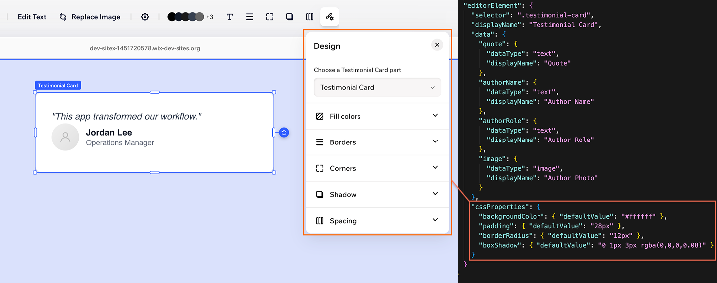
The cssProperties configure a full Design auto panel with controls for fill colors, borders, corners, shadows, and spacing. The editor maps each CSS property to the appropriate design control:
Note: These are a subset of the auto panels available. The full action bar is built from your manifest, and you never write panel UI code. For the full list, see About Auto Panels.
Component requirements
For the editor to style, select, and configure your component, it needs to follow these conventions:
- Export a default function component.
- Accept a
classNameprop and apply it to the root element. The editor uses this to manage styles and layout. - Add selectors to elements you want the manifest to target. The manifest accepts any valid DOM selector. CSS classes are the recommended approach.
- Name your data props to match the keys in the manifest's
datadefinition.
Some manifest features may require additional component-side setup, such as a wrapper element for presets and prop handling for interaction states. The tutorial on configuring auto panels covers these as they come up.
Runtime props
As Wix users edit your component, the editor passes updated values to it as React props. Data values like text and numbers arrive as top-level props, while style changes are applied directly to the DOM as inline CSS.
Some data types, like images and vector art, use complex object formats at runtime. The @wix/editor-react-types package provides TypeScript types for these values.
For the full breakdown of prop categories, see Runtime Props.
What you can configure
The testimonial card example covers a simple case: editable text, an image, and some design properties. Most components go further. A slideshow has navigation arrows, a menu has items with hover states, a card grid needs layout controls. Through the manifest, you can also configure inner elements with their own auto panels, interaction states, layout and resize behavior, presets, animations, and richer data types.
For the full set of auto panels and the manifest properties that drive each one, see About Auto Panels. For the per-property manifest reference, see About the Manifest.
Get started
You can add an Editor React Component extension using the CLI. The CLI scaffolds your component files, auto-generates the editorElement portion of the manifest from your React code, handles bundling, and manages deployment.
From there, you can develop your component:
- With an AI agent: Use Wix skills from a supported AI coding agent to build and update components. The skills regenerate the manifest as it works.
- Manually: Edit the component source directly. After manual changes, run
wix generate manifestto update the auto-generated manifest.
Limitations
The following limitations apply to Editor React Components. For manifest-specific rules and unsupported features, see About the Manifest.
- Custom panels aren't supported. Only auto panels are available. You can't ship your own React UI for an editor panel, so anything Wix users can configure has to map to a manifest property.
- Self-hosting: Self-hosting for Editor React Component extensions isn't supported. Deploy components using the CLI.
See also
Last updated: 1 July 2026