Tutorial | Configure Auto Panels for an Editor React Component
Alpha: Editor React Components are currently in alpha. This feature is subject to change and may have bugs, issues, and limitations. We're actively improving it based on your feedback.
When a Wix user adds your Editor React Component to a page, they customize it through auto panels that the editor builds automatically. You don't write any panel UI. You declare what's customizable in a manifest, and the matching native controls show up.
This tutorial walks through that declaration, step by step. You'll start with a minimal manifest that just renders the component in the editor with no controls, and then add one manifest field at a time. After each step, you'll see a new auto panel (or a new control inside one) appear in the editor.
Here's what we'll cover:
- Start with a minimal manifest that renders the component without panels.
- Add editable content for the Settings and Edit Text panels.
- Expose CSS properties for the Design panel.
- Define inner elements, each with its own action bar and auto panels.
- Configure layout and resize behavior in the editor.
- Set the initial size when the component is first added.
- Create visual presets for the Explore Designs panel.
- Add interaction states like hover for a state selector in the Design panel.
Each step builds on the previous. At the end, you'll have a fully configured manifest and a clear sense of which auto panel each manifest field drives.
Editor Compatibility
Editor React Component extensions are built for Wix Harmony, Wix's AI-powered editor. They're not supported on Wix Editor or Wix Studio sites, and there's no way to conditionally switch between extension types based on the editor.
Before you begin
Before you begin, make sure that you:
- Create an Editor React Component extension with the CLI.
- Install the
@wix/editor-react-typespackage for TypeScript types used by the editor.
The component
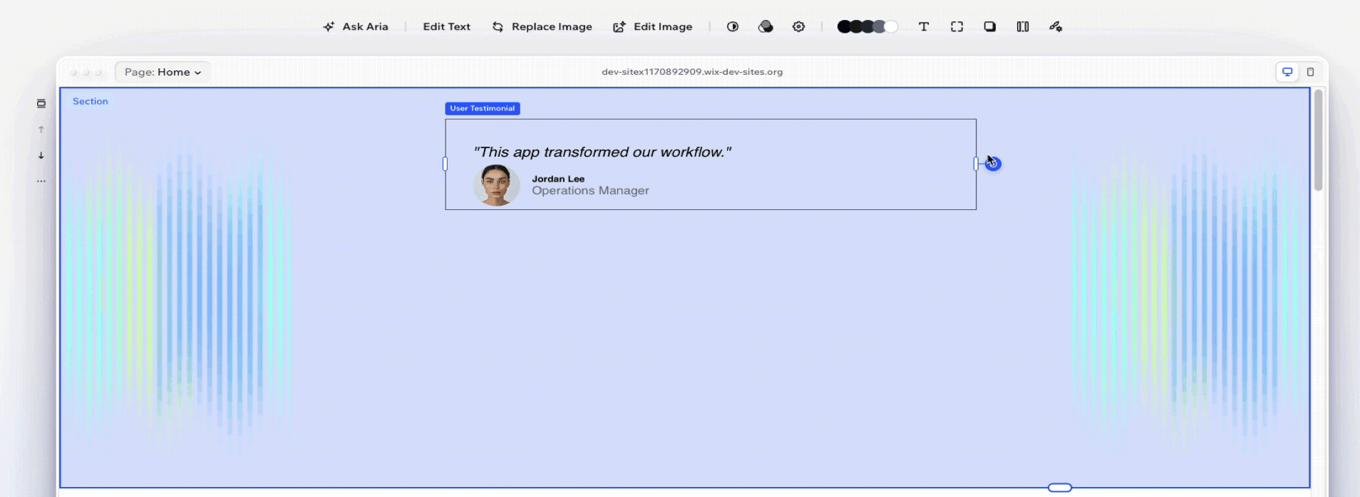
This guide uses a testimonial card that includes a quote, author info, and photo. Here's the React component:
Stylesheet (style.css)
For the editor to work with your component, it needs to follow the component requirements.
Later steps introduce additional component-side requirements for presets and states.
Step 1 | Minimal manifest
Every manifest needs 3 things:
typeto identify the component.resourcesto tell the editor where to find the code.editorElementwith at least aselectoranddisplayName.
Here's a minimal manifest for our example component:
Here's what each field does:
type: A unique identifier for your component.resources.client.componentUrl: Points to your React component file, relative to the project root. When you create your Editor React Component using the CLI command, this field is configured automatically.selector: Must match a CSS class on your component's root DOM element. For this component, that's.testimonial-card. The editor uses this selector to locate your component and apply styling.displayName: The label Wix users see when they select your component.
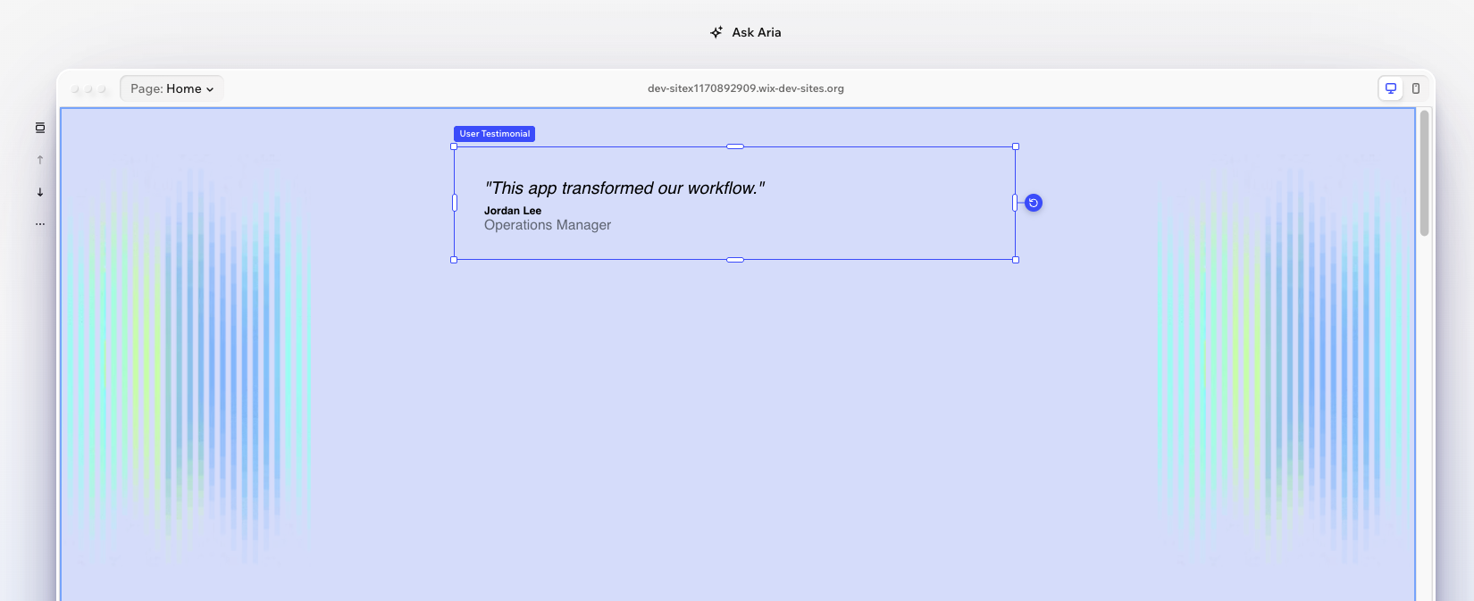
What changes in the editor
At this point, the component renders in the editor but has no editing controls. A Wix user can place it on a page, but they can't change any content or styling.
Step 2 | Add data
The data property defines what content Wix users can edit. Each key in the data object becomes a prop that your component receives at runtime. The dataType determines what kind of editor control appears: a text field, image picker, toggle, and so on.
Each data item has a few core fields:
dataType: Determines the editor control and the runtime value format.'text'gives a text input,'image'gives a media picker.displayName: The label Wix users see in the editor panel.defaultValue: The starting value shown in the editor panel. This value isn't passed to your component at runtime, so your component should handle its own fallback rendering.
Some data types support additional configuration in a field named after the type. Here, quote uses the text field to set maxLength: 500, which limits the text input to 500 characters.
The data keys quote, authorName, authorRole, and image must match the prop names in your component. The editor passes these as top-level props when it renders your component.
For the full list of data types, see Data Reference.
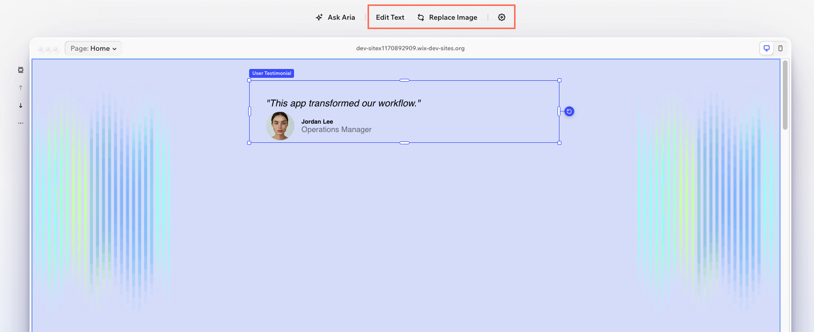
What changes in the editor
A Settings button appears in the action bar. Clicking it opens a panel with text inputs for the 3 text properties. A Media button also appears, opening the Wix Media Manager for the image property.
Step 3 | Add CSS properties
The cssProperties property defines which CSS styles Wix users can customize. The editor reads these definitions and configures the appropriate design panel controls. When a Wix user changes a value, the editor applies it as an inline style on the DOM element matching the selector. Your component doesn't need to read or handle these values.
Note: Not all CSS properties are supported. For more information, see Standard CSS Properties.
Each CSS property item can include:
defaultValue: The initial CSS value shown in the design panel. This should match the value already set in your component's CSS file. It tells the editor what the current default is so users can see it before making any changes.displayName: Optional label. If omitted, the editor derives a name from the property name.
If you don't need a custom default, you can pass an empty object (for example, backgroundColor: {}). The editor still shows the appropriate control and uses its own default value.
The editor maps each CSS property to the appropriate control automatically: backgroundColor gets a color picker, borderRadius gets a corner radius control, boxShadow gets a shadow editor, and padding gets spacing inputs.
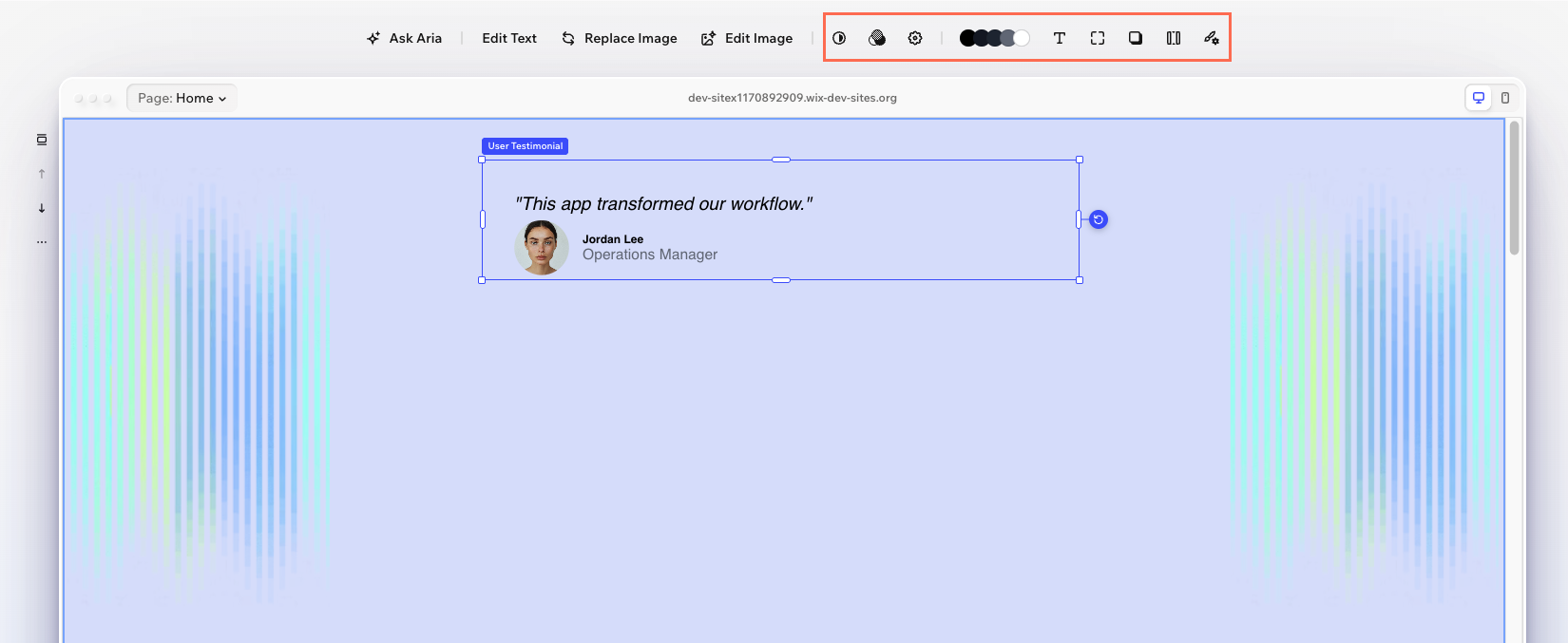
What changes in the editor
A Design button appears in the action bar. Clicking it opens a panel with color, spacing, corners, and shadow controls, all configured from the 4 CSS properties defined above.
Note: Your CSS file styles the component on initial render. The manifest's defaultValue tells the design panel what to display as the starting value, and it should match what's already in your CSS. When a Wix user customizes a value, the editor applies it as an inline style, which overrides both.
For the full reference, see CSS Properties Reference.
Step 4 | Add elements
So far, all customization targets the root element. But the testimonial card has distinct parts that Wix users might want to style independently, such as the quote text and the author section. The elements property lets you make inner parts of your component selectable and configurable.
Each element needs its own selector (matching a CSS class in your component), a displayName, and optionally its own data, cssProperties, and behaviors. For the full reference on what elements support, see Elements.
Each element is wrapped in an elementType and configuration object. The only supported type is 'inlineElement', an element inside your component code.
The behaviors field controls how elements respond to interactions in the editor:
selectable: Whether a Wix user can click on this part independently. Elements are not selectable by default, so you must set this totruefor any element you want users to select directly.removable: Whether Wix users can remove or restore this element in the editor. When removed, the element is hidden on the live site.
Note: Elements can also define their own data properties. When they do, the values aren't passed as top-level props. Instead, they arrive in an elementProps object, nested by element key. This example only uses cssProperties on elements, so elementProps doesn't apply here. For details, see Runtime Props.
Here, quoteText has selectable: true, so a Wix user can click the quote to see and edit its specific design controls. The author name and role are set to selectable: false, so their styling is accessible through the parent's design panel but they can't be clicked independently. This avoids cluttering the editing experience with too many selectable targets.
For the full reference, see Elements Reference.
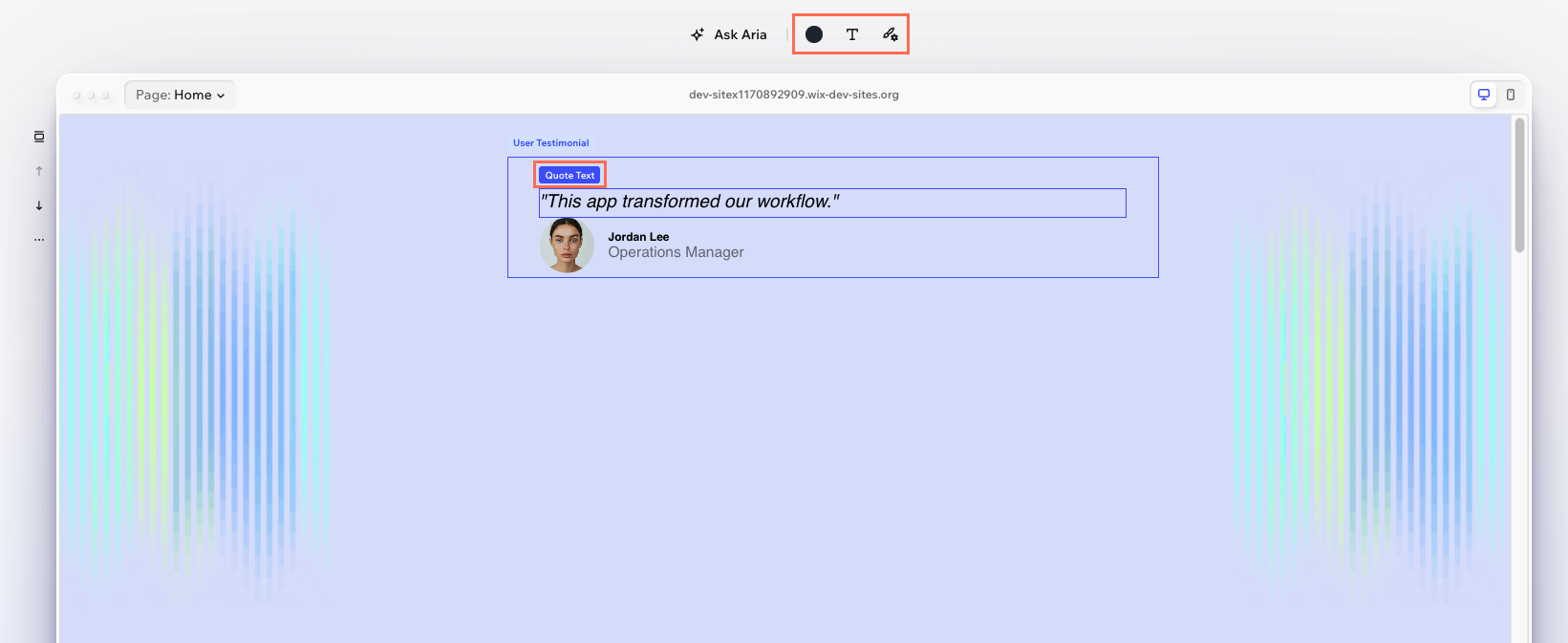
What changes in the editor
The quote text becomes independently selectable. When a Wix user clicks on it, the design panel shows controls specific to the quote (color, font size, and font style), separate from the card's overall design controls.
Step 5 | Add layout
The layout property controls how a Wix user can resize and position the component in the editor.
2 fields drive most layout behavior:
resizeDirection: Which directions the Wix user can drag to resize.'horizontal'means they can adjust the width but not the height.contentResizeDirection: Which directions the component automatically resizes to fit its content.'vertical'means the height adjusts as content grows or shrinks.
Together, these create a common pattern: the Wix user controls the width, and the height auto-adjusts to fit the content. This works well for text-heavy components like the testimonial card.
Setting disableStretching: false lets the Wix user stretch the component to fill the width of its container.
For the full reference and common patterns, see Layout Reference.
What changes in the editor
Resize handles appear on the left and right edges. Dragging them adjusts the width, and the height automatically follows the content.
Step 6 | Add installation
The installation property controls how the component appears when a Wix user first adds it to a page. The most important field is initialSize, which sets the starting dimensions.
Note: installation is a property on the same level as editorElement, not inside editorElement.
Each dimension uses a sizing type:
'pixels': A fixed pixel value. The component starts at exactly this size.'content': The dimension fits to the component's content.'stretched': The dimension fills its parent container.
Here, the card starts 400 pixels wide with the height driven by content. This works with the layout from the previous step: the width is a starting point that the Wix user can then resize horizontally, and the height always follows the content.
For the full reference, see Installation Reference.
What changes in the editor
Installation doesn't produce a visible change in the editor UI. The effect is only apparent when a Wix user first adds the component to a page and it appears at the configured size.
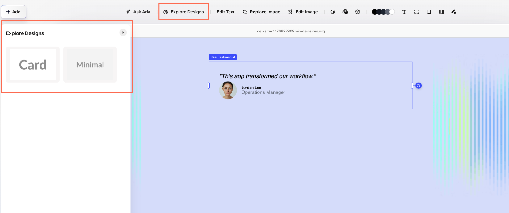
Step 7 | Add presets
Presets let you offer distinct visual variants of your component. Each preset can include a CSS file, layout overrides, and default values for CSS properties and elements. Use presets for significant differences between variants, like layout changes or major style shifts. For smaller customizations, CSS properties give users direct control without switching the entire preset.
For presets to work, your component needs a wrapper element with presetsWrapperProps. Add Wix from @wix/editor-react-types to your props interface and destructure it from props:
Note: When using presetsWrapperProps, place className on the inner element, not the wrapper. The wrapper renders with display: contents and is invisible to the editor. The inner element is what the editor tracks for selection and layout.
Then define presets in the manifest:
Each preset supports 2 optional fields:
presetCssUrl: Path to a CSS file scoped to this preset, relative to the project root. Use this for style rules that go beyond whatpresetDefaultscan express, such as layout changes, font declarations, or pseudo-element styling.thumbnailUrl: A valid web URL (http://orhttps://) to a preview image shown in the Explore Designs panel.
Each preset's presetDefaults replaces the base configuration when a Wix user switches to that preset. The 'card' preset shows the card with a white background and shadow. The 'minimal' preset strips those away for a clean, borderless look.
When using presets, you also need to map screen sizes to preset keys in installation. The large key applies to desktop and tablet, and small applies to mobile:
For the full reference, see Presets.
What changes in the editor
An Explore Designs panel appears where Wix users can switch between "Card" and "Minimal" preset variants.
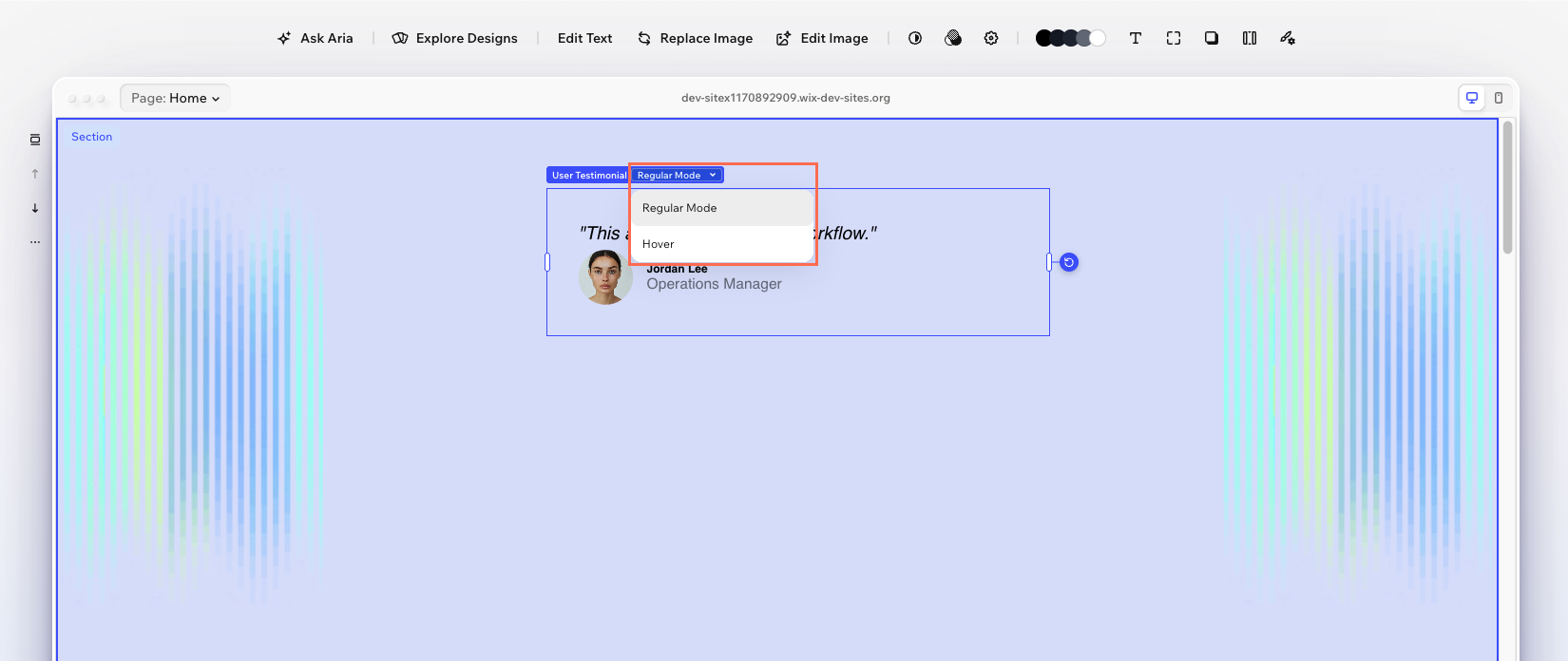
Step 8 | Add states
States let Wix users style your component differently based on conditions like hover. You define a state in the manifest using up to 3 mechanisms:
- A CSS pseudo-class (like
:hover) for the live site. - A CSS class for your stylesheet.
- Props that your component reads to preview the state in the editor.
Notice that backgroundColor and boxShadow now include statesDefaultValues. These set the initial design panel defaults for each state, so the editor knows what values to show when the Wix user switches to the hover state.
The hover state uses all 3 mechanisms:
pseudoClass: 'hover': Maps to CSS:hoveron the live site. The browser handles this automatically. Note that:hoverhas no effect on touch/mobile devices.className: 'is-hovered': Applies this CSS class when the state is active, so you can target it in your stylesheet.props: { hovered: true }: Passes this prop to your component when the state is selected in the editor, so you can show the hover appearance on stage.
Your component code uses the hovered prop to apply the class on the editor stage:
Your CSS needs to target both the class and the pseudo-class so hover styles apply both in the editor (via the class) and on the live site (via the pseudo-class):
Note: When a Wix user customizes hover values in the design panel, the editor applies them as inline styles on the element. You don't need matching CSS rules for statesDefaultValues properties to take effect.
For the full reference, see States.
What changes in the editor
A state selector appears in the design panel. Wix users can switch between "Regular" and "Hover" to style each state independently.
Complete manifest
Here's the full manifest with all the properties from the steps above:
See also
Last updated: 30 June 2026