About Auto Panels for Editor React Components
Alpha: Editor React Components are currently in alpha. This feature is subject to change and may have bugs, issues, and limitations. We're actively improving it based on your feedback.
Auto panels are how Wix users customize your Editor React Component in the editor. When a Wix user selects your component, Wix builds the panels automatically from the declarations in its manifest. You don't render any UI yourself.
The CLI auto-generates most of those declarations in the editorElement portion of the manifest by reading your React component source. For details, see auto-generated manifest.
To see auto panels built up from scratch, see Tutorial | Configure Auto Panels.
How Wix users open auto panels
When a Wix user selects your component in the editor, an action bar appears with buttons for the auto panels available on it. Each button opens a panel populated with the controls you declared.
Auto panels are available for the root component and, if you define them, for inner elements. Inner elements can be selected independently, each with its own action bar and auto panels.
Note: Auto panels appear only in the editor, while a Wix user is editing the site. They aren't shown on the live site.
Available auto panels and controls
The following panels and controls appear in the editor for your component, depending on which manifest properties you define.
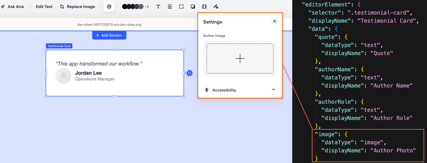
Settings
The Settings panel exposes editable content for your component. Each entry in your manifest's data becomes a labeled control, with the dataType determining the control type. For example, text becomes a text input, images open the Wix Media Manager, and dates show a date picker.
The values Wix users enter here are passed back to your component as React props at runtime.
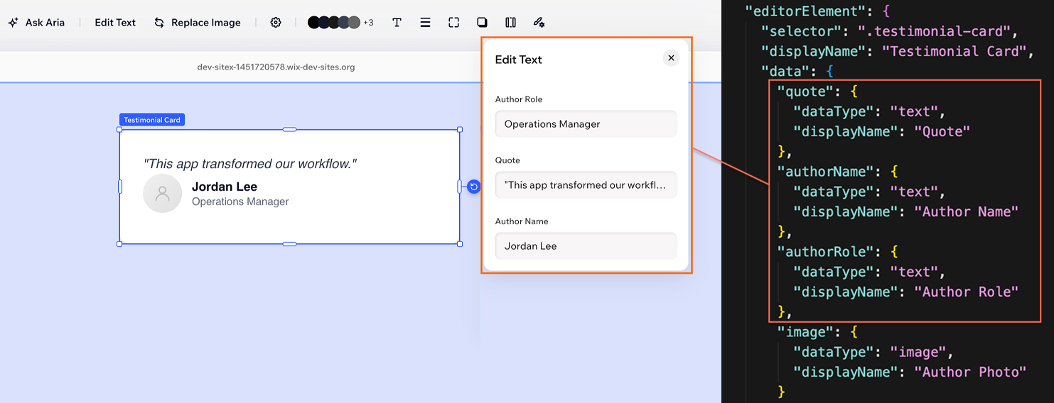
Edit Text
When your data includes one or more text-based items (text, richText, textEnum), an Edit Text panel is generated alongside Settings, exposing only the text inputs. This gives Wix users a focused way to update copy without scrolling through unrelated controls.
Design
The Design panel exposes style controls. Each entry in cssProperties and cssCustomProperties you declare becomes the appropriate control: backgroundColor gets a color picker, borderRadius gets a corner radius slider, boxShadow gets a shadow editor, and so on.
When a Wix user changes a value, the editor applies it as an inline style on the matching DOM element. Your component doesn't need to read or handle these values.
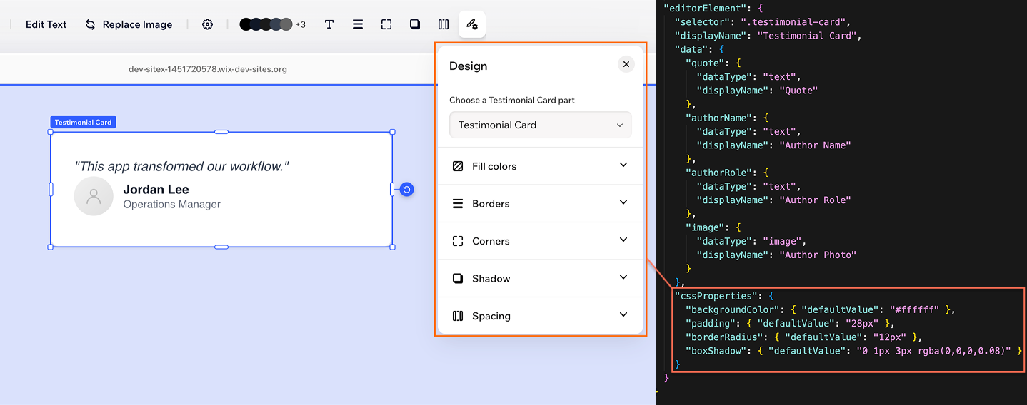
If your manifest also defines states, a state selector appears at the top of the Design panel so Wix users can style each state separately.
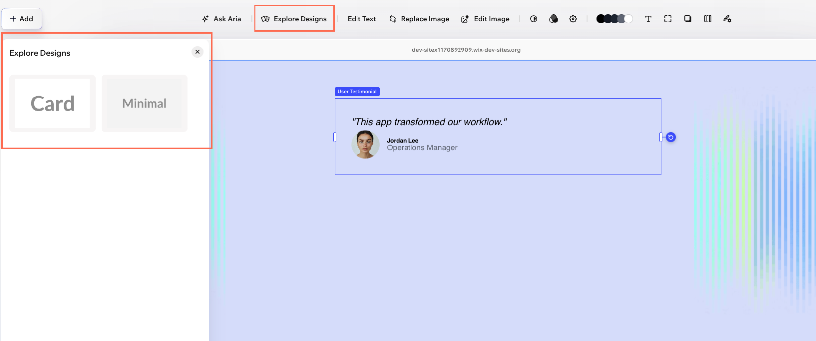
Explore Designs
If your manifest defines presets, an Explore Designs panel appears. Each preset is a named visual variation with its own thumbnail, default values, and optional preset-scoped CSS. Switching between presets is a one-click change for Wix users.
Animation
If your manifest defines interactions, an Animation panel appears with controls for declarative entrance effects, scroll triggers, and other interactions you opted into.
Action bar buttons
The action bar that opens your auto panels also hosts non-panel buttons, like duplicating the component or opening a Wix-managed picker. You can opt out of the defaults with actions, and you can add your own buttons with customActions that open URLs or trigger custom behavior.
Sizing behavior
The editor reads layout to enable resize handles, content sizing, and stretch behavior in the editor, and installation.initialSize to set the dimensions when the Wix user first drops the component on the page.
Control what's in a panel
You configure panel contents through manifest properties. The properties you define determine which controls appear and how they behave.
- Include or omit controls: Only properties you declare in the manifest appear in a panel. For example, skip a
cssPropertyand that control doesn't show up. - Set labels: Use
displayNameon data items, CSS properties, presets, and elements to control the text Wix users see. - Set default values: Use
defaultValueso controls show the same value the Wix user sees in the editor. - Constrain input: Each data type accepts type-specific options that the editor enforces in the control. For example,
text.minLength,text.maxLength, andnumber.minimum.
Organize controls within a panel
Use grouping and conditional visibility to keep each panel focused and easier to scan.
- Group related controls: Use
displayGroupsto organize properties into named sections inside a panel. - Show controls conditionally: Use
displayFiltersto hide controls based on the value of another data item, preset, or state.
Customize inner elements and states
You can expose advanced customization beyond the root component by configuring inner targets and state-based styling.
- Configure inner elements: Each entry in
elementsgets its own set of auto panels. Adddata,cssProperties,presets, orstatesinside an element to customize its panels independently of the root. - Expose state-specific styling: Define
states(like hover or disabled) for per-state styling.
Manifest cheatsheet
Use this as a quick lookup for which manifest property configures which part of the editor experience:
| Manifest property | Where it surfaces | What it controls |
|---|---|---|
data | Settings panel, Edit Text panel, and other native controls based on the dataType | Editable content like text, numbers, images, links, dates, and toggles. Each entry becomes a control and a runtime prop. |
cssProperties | Design panel | Standard CSS properties exposed as design controls (colors, spacing, corners, shadows, typography). Applied as inline styles. |
cssCustomProperties | Design panel | CSS variables for cases the standard properties don't cover. Applied as inline custom property values. |
elements | Independent action bar and auto panels on inner parts | Makes specific inner DOM elements selectable, each with its own data, CSS, presets, and states. |
presets | Explore Designs panel | Named visual variations with thumbnails, default values, and optional preset-scoped CSS. |
states | State selector in the Design panel | Conditions like hover or disabled, each stylable independently in the Design panel. |
interactions | Animation panel | Declarative animation triggers and effect groups. |
actions | Action bar | Opt out of, override, or rename default action bar buttons. |
customActions | Action bar | Add your own buttons to the action bar that open URLs or trigger custom behavior. |
displayGroups | Inside auto panels | Organize related controls into named sections. |
displayFilters | Inside auto panels | Show or hide controls based on the value of another data item, preset, or state. |
layout | Editor (resize handles and stretching) | Resize direction, content sizing, and stretch behavior. |
installation.initialSize | Editor (on insert) | The size the component takes when a Wix user first adds it to the page. |
See also
Last updated: 7 June 2026