Add Code to Custom Panels in Blocks
Editor compatibility
Wix Blocks apps aren't supported in the Wix Harmony editor. Existing Blocks apps remain available for purchase on the Wix App Market for Wix Editor and Wix Studio sites. To learn more, see About Wix Harmony and Blocks.
Create custom panels for action buttons in your widget and its elements. When a Wix user clicks an action button (for example, the Settings button), the custom panel opens.
You can create as many panels as you need, to provide users with various options to customize widgets.
First, design your panel and connect it to an action button. Then create your panel logic, to determine how it interacts with the widget or to control the behavior of the panel itself.
- You cannot test panels in the Blocks preview. To see your panel in action, test it on a site.
- You can connect panel elements to properties and set panel buttons to open pages with no code.
- See the panel elements $w reference.
To see examples of custom panels, open the following app templates and go to the Editor Experience  tab.
tab.
- Repeater app: Panel for changing the widget layout.
- Events Map app: Settings panel.
- Recipe List app: Settings panel that also links to a dashboard page.
- Banner app: Panel for adding and removing elements.
- Pie Chart app: Settings panel for custom element in Blocks.
To add code to your custom panel:
-
Go to Editor Experience
 in the left menu and select the Panels tab.
 -
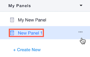
Make sure that your panel is selected in the Panels section on the left menu (or create a new panel, if you haven't created it yet).
-
Go to your panel's code section and write your code there.
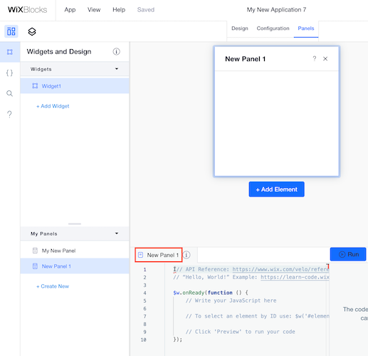
If you are working with the Blocks-CLI integration, write your panel code in the panel.ts file.
Panel elements
Custom panels are made of unique user interface (UI) elements, such as buttons, checkboxes, drop-down lists and more. See the list of elements and the $w reference for all panel elements.
SDK and Velo modules for Blocks custom panels
To enable panel elements to interact with your widget and perform actions in the editor, you can use the following modules:
widget Module
The widget SDK module provides functionality to:
- Manage widget properties and settings
- Control widget design presets and appearance
Import the module using:
wix-editor Module
The wix-editor module provides functionality to:
- Remove or restore widget elements from the editor
- Open Dashboard panels and navigate between editor views
- Interact with the editor environment and manage element visibility
Import the module using:
Interact with widget properties
Panels are often used to manipulate your widget API properties. This means that when users change something in the panel, the property values change. You can connect panel elements to properties easily, with no code.
You can also connect panel elements with code. In this example, users can turn a "special sale" property on and off, through a toggle element in the widget's panel.
See deprecated wix-widget Velo example
Show and hide widget elements
Here is a way for showing and hiding an element through the panel code:
Interact with widget design presets
Here is an example of changing the widget's design preset from the panel code.
This example assumes:
- A widget with 2 presets:
verticalandhorizontal - A panel with two thumbnails for the two different presets
- The thumbnail values are set to
verticalandhorizontal
This is how the panel looks:

Here is the panel code:
See deprecated wix-widget Velo example
Interact with nested widget properties
This example shows how to set a "Sale" or "No Sale" tag in the widget props, but for a nested (inner) widget.
The example assumes:
- An outer widget with a panel that has a toggle element.
- The toggle is set to
trueby default. - A nested widget with a
saleIndicatorproperty that has two values:SaleandNo Sale.
Here is the panel code:
See deprecated wix-widget Velo example
Interact with the panel itself
In some cases, you might want to manipulate what happens within the panel itself. For example, you might want some of the panel elements to be hidden if they are irrelevant.
This panel for the Login Bar Settings button has a toggle, which determines whether or not to show a greeting before the user's name.
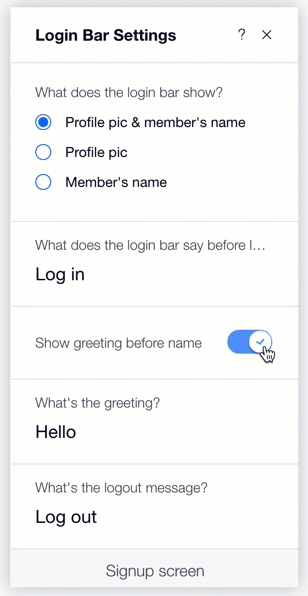
Here is the panel code:
Interact with a collection
You can access your app collections in Blocks from the panel code, and perform various actions, such as query, insert, etc.
You can also access a collection on a site where your app is installed.
Just make sure to use the app namespace.
For example, write this in the panel code to query your app's collection:
See deprecated wix-data Velo example
Connect and test your panel
After making your panel work, don't forget the next steps:
-
Connect your panel to an action button, if you haven't done it yet. When a site builder clicks that action button, your panel will open.
-
Test your panel in the editor to see that it works as planned.