About Custom Panels for Editor React Components
Alpha: Editor React Components are currently in alpha. This feature is subject to change and may have bugs, issues, and limitations. We're actively improving it based on your feedback.
The editor generates auto panels for your Editor React Component automatically from its manifest, and they cover most components well. Build a custom panel instead when you need a specific layout, custom UI controls, or logic an auto panel can't provide, for example combining several manifest fields into one control, validating a value before saving it, or previewing a change before it's applied.
A custom panel doesn't replace the auto panels. Connecting it through a non-reserved custom action adds a new button to the action bar alongside them, so a Wix user gets both. You can replace a specific native panel instead by assigning your custom panel to that native action's reserved key, but that's a separate, deliberate choice. For an example of each, see Build a Custom Panel.
Either way, you use the React Elements API to read and write data and styles yourself, instead of relying on the automatic syncing that auto panels provide.
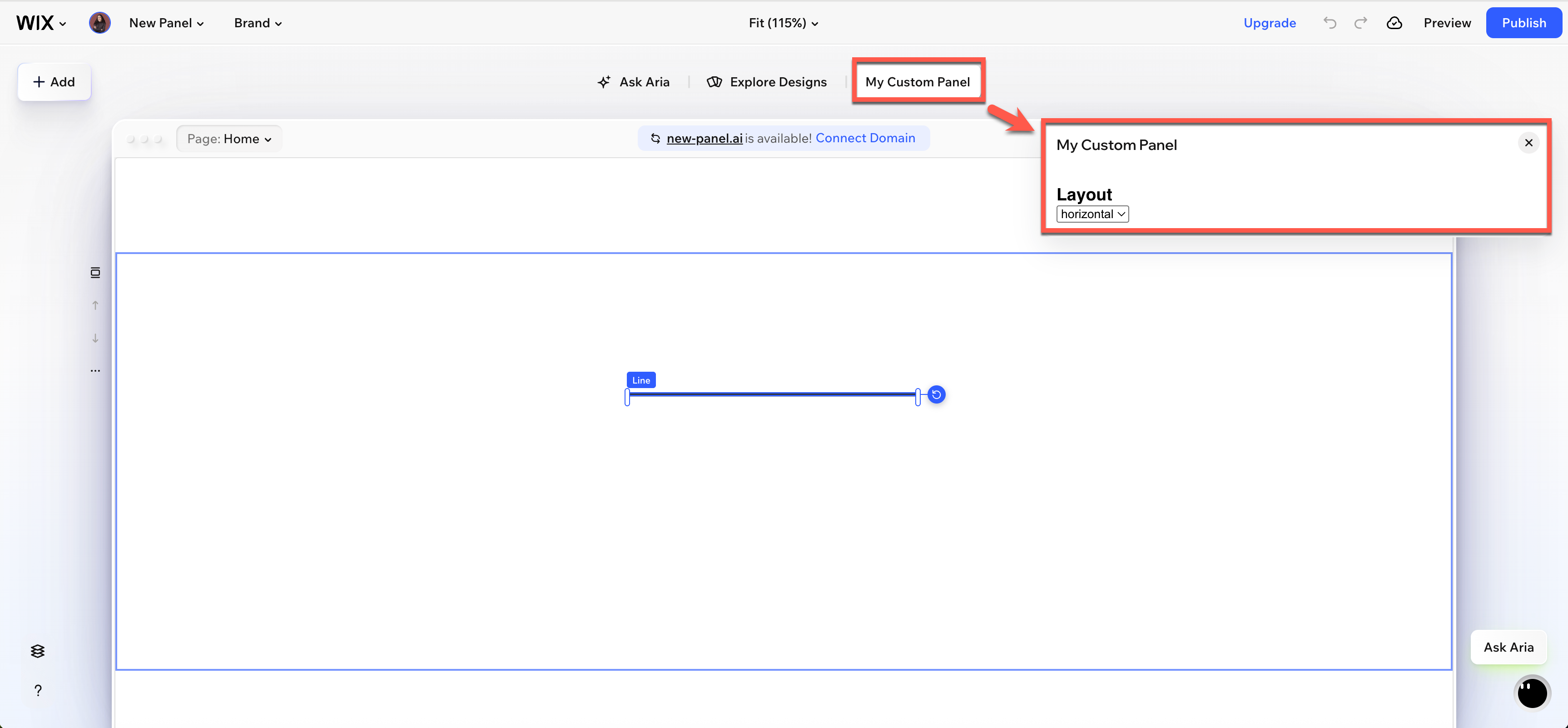
How custom panels work
To add a custom panel to your Editor React Component:
- Create a custom panel as a React component.
- Register it as a separate extension in your app.
- In the manifest, connect it to your Editor React Component using a
customAction.
When a Wix user clicks the component in the editor, the custom panel appears in the action bar.
What you can do from a custom panel
The React Elements API gives your panel access to the following:
- Data: Read and update the values defined in your manifest's
datasection. A custom panel doesn't get its own separate copy of this data: it reads and writes the same fields an auto panel would, so don't declare a second field for something an existing field already represents. - Styles: Read, update, and remove
cssPropertiesandcssCustomPropertiesdefined in your manifest. - Pickers: Open native editor pickers for colors, fonts, media, links, backgrounds, text themes, and sort and filter rules. Most pickers accept one of two types of arguments: a manifest key, so the editor automatically saves the selection to your manifest, or explicit options, so you handle the result and apply it yourself. For more details see Picker arguments.
- Presets: Apply a preset (a named, predefined visual variation of your component) from your panel with
applyPreset(). This updates the preset's standardcssPropertiesand data. - States: Switch between the component's visual states, such as default, hover, or active. This previews the state in the editor only. Unless a state maps to a native CSS
pseudoClass, switching it from a custom panel has no effect on the live site. - Change listeners: Subscribe to changes on the component to keep your panel UI in sync when a Wix user makes changes outside your panel, such as through the editor's native controls.
- Array items: Manage the selected index in array data groups.
Picker arguments
Most picker methods in the React Elements API accept one of two types of arguments:
- Manifest key: Pass a manifest key, such as a
styleItemKeyordataItemKey. The editor reads the current value from the manifest, opens the picker, and automatically writes the result back, with no code from you beyond the call itself. Use this when the picker's result is exactly the value for one manifest property, with nothing else to compute, combine, or check, for example letting a Wix user pick a background color that applies as-is. - Explicit options: Pass an initial value for the picker to display. The editor opens the picker, and when a Wix user selects an item it isn't written back to the manifest automatically. You handle the result and update the component yourself by calling
setData()orsetStyles(). Use this whenever you need to do something with the result before it's saved, such as validating it, deriving other values from it, updating more than one field, or showing it in your panel's own UI before it's applied.
Not every picker supports both: selectSort() and selectFilter() only accept a manifest key, and selectTextTheme() only accepts explicit options. Each method's reference page describes which of these it supports.
Custom panel files
A custom panel requires 2 files in your Editor React Component's extension folder:
panel.tsx: The React component for your panel UI.panel.extension.ts: Registers the panel as an extension usingextensions.editorReactComponentPanel()so the editor can load it.
You also need to register the panel in your app's extensions.ts file and connect it to your component manifest via a customAction. For a step-by-step walkthrough, see Build a Custom Panel.
See also
Last updated: 10 September 2026