Build a Custom Panel for Your Editor React Component
Build a custom panel to control exactly how Wix users can configure your Editor React Component in the editor.
By default, the editor generates auto panels from your manifest's data and style definitions, and they cover most components well. Build a custom panel instead when you need:
- A specific panel layout or custom UI controls
- Logic an auto panel can't provide, for example combining several manifest fields into one control, validating a value before saving it, or previewing a change before it's applied
Connecting your panel through a non-reserved custom action, as this guide does, adds it as a new button in the action bar alongside the auto panels, so a Wix user gets both.
In this article, you'll:
- Create a custom panel component.
- Register it as a separate extension and add it to your app.
- Connect it to your component manifest through a custom action, a button in the editor toolbar that opens your panel instead of the auto-generated one.
Before you begin
Make sure you have the following set up:
Step 1 | Create the panel component
Create a React component that serves as your custom panel.
To create the panel component:
-
In the extension folder for your Editor React Component, create a new file for your panel. For example,
panel.tsx. -
Import
reactElementsfrom@wix/editor. This gives you access to the React Elements API. -
Build your custom panel UI using React. Use
reactElementsmethods to interact with the Editor React Component from your custom panel:- Call
reactElements.getData()andreactElements.getStyles()to read the component's current values and initialize your custom panel UI. - Call methods like
reactElements.setData(),reactElements.setStyles(), orreactElements.applyPreset()to apply changes when a user interacts with your custom panel. - Use
reactElements.onChange()to subscribe to changes and keep your custom panel in sync.
For example,
reactElements.getAppliedPreset()returns the currently applied preset, andreactElements.applyPreset()applies a new one. Also listen withreactElements.onChange(), so the dropdown stays correct if the preset changes outside your panel, including through undo or redo.Copy - Call
Step 2 | Register the panel extension
Register your panel component as an Editor React Component panel extension and add it to your app so it's included in the build.
To register the panel extension:
-
In the extension folder for your Editor React Component, create a file for the panel extension. For example,
panel.extension.ts. -
Export
extensions.editorReactComponentPanel()to register the panel with the following properties:id: A UUID that uniquely identifies your panel. Generate a UUID.displayName: A name for the panel extension.contentType: Set to'code'to register a panel built from a React component.code.bundleUrl: The bundle URL for your panel's React component file. Import it from the component file's path with a?urlsuffix so your build tool resolves it to a URL.size: The dimensions of the panel in the editor.height: The panel height in pixels, as a number. Required. Minimum 150. A CSS value such as'100vh'isn't valid here.width: The panel width. Accepted values are'SMALL','MEDIUM', and'LARGE'.
Copy
To add the panel to your app:
-
Open the
extensions.tsfile for your app. -
Import the panel extension and add it using
.use().Copy
Step 3 | Connect the panel to your component
Add a custom action in the component manifest that connects your panel to the component.
To connect the panel:
-
Open the extension file for your Editor React Component. This is the file where you call
extensions.editorReactComponent(). -
Inside the
editorElementobject, add acustomActionsproperty. Set theactionTypeto'panel'to tell the editor this action opens a panel, then reference your panel'sidin thepanelIdfield.Note: Choose a key for your custom action that isn't one of the reserved native action keys (
settings,design,media,manageItems,dashboard). Reusing one of those keys overrides that native action's slot, so your panel doesn't open when a Wix user clicks it. For the full list, see Native and Custom Actions.CopyThe
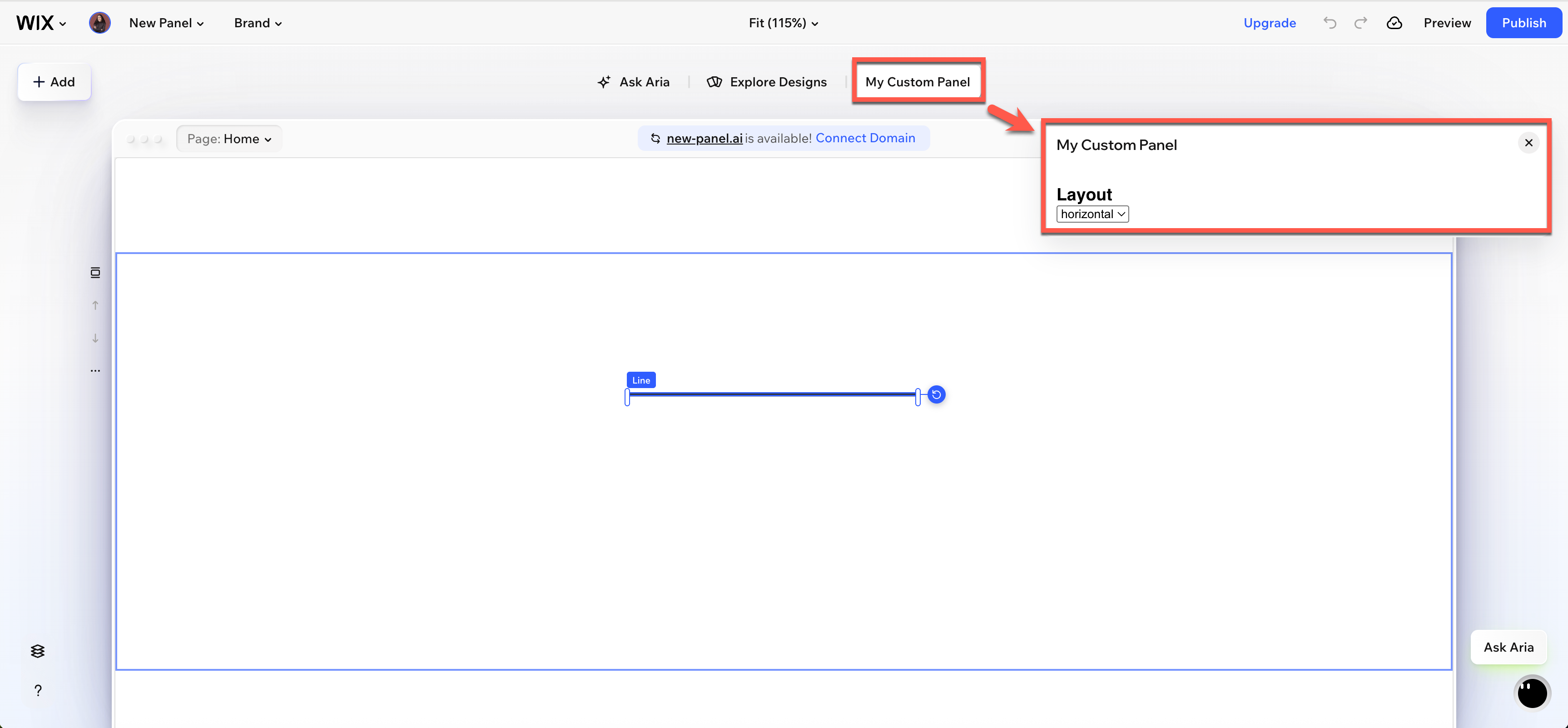
displayNamevalue appears as a button in the action bar, the toolbar that appears when a Wix user selects your Editor React Component in the editor, and as the title at the top of the panel when it opens.
Replace a native panel instead of adding one
The steps above add your custom panel as a new button, alongside the auto-generated ones. To replace a native panel, such as Settings or Design, with your custom panel instead, give that native action's key an execution under actions (not customActions):
Clicking Settings now opens your custom panel instead of the auto-generated one. For the full list of native action keys, see Native and Custom Actions.
See also
Last updated: 10 September 2026